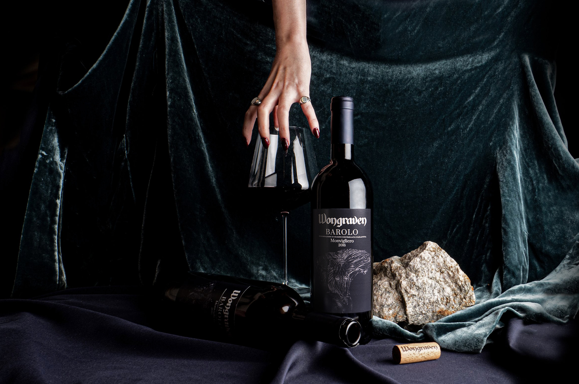
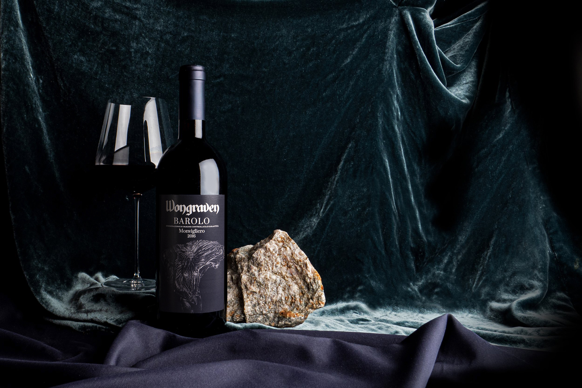
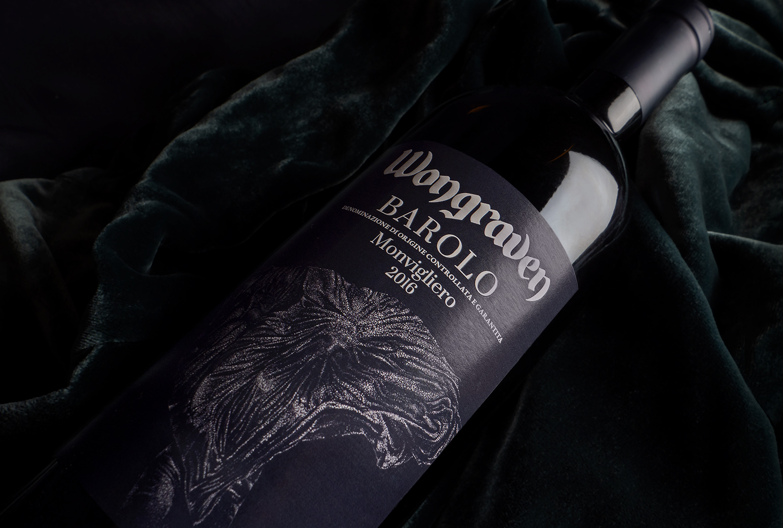
Wongraven Barolo Monvigliero
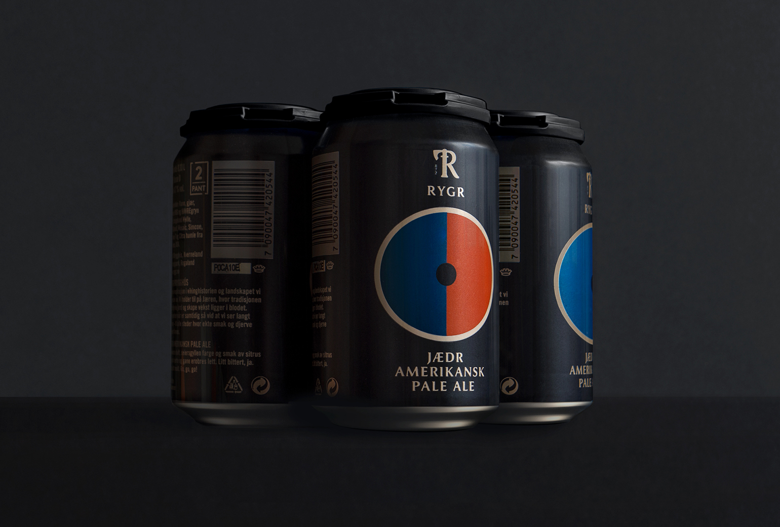
RYGR Brygghús
RYGR Brygghús
RYGR Brygghús
Wongraven Barolo Monvigliero
Brand identity / packaging
Packaging
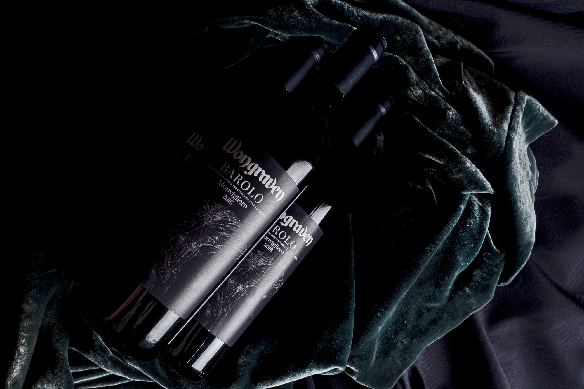
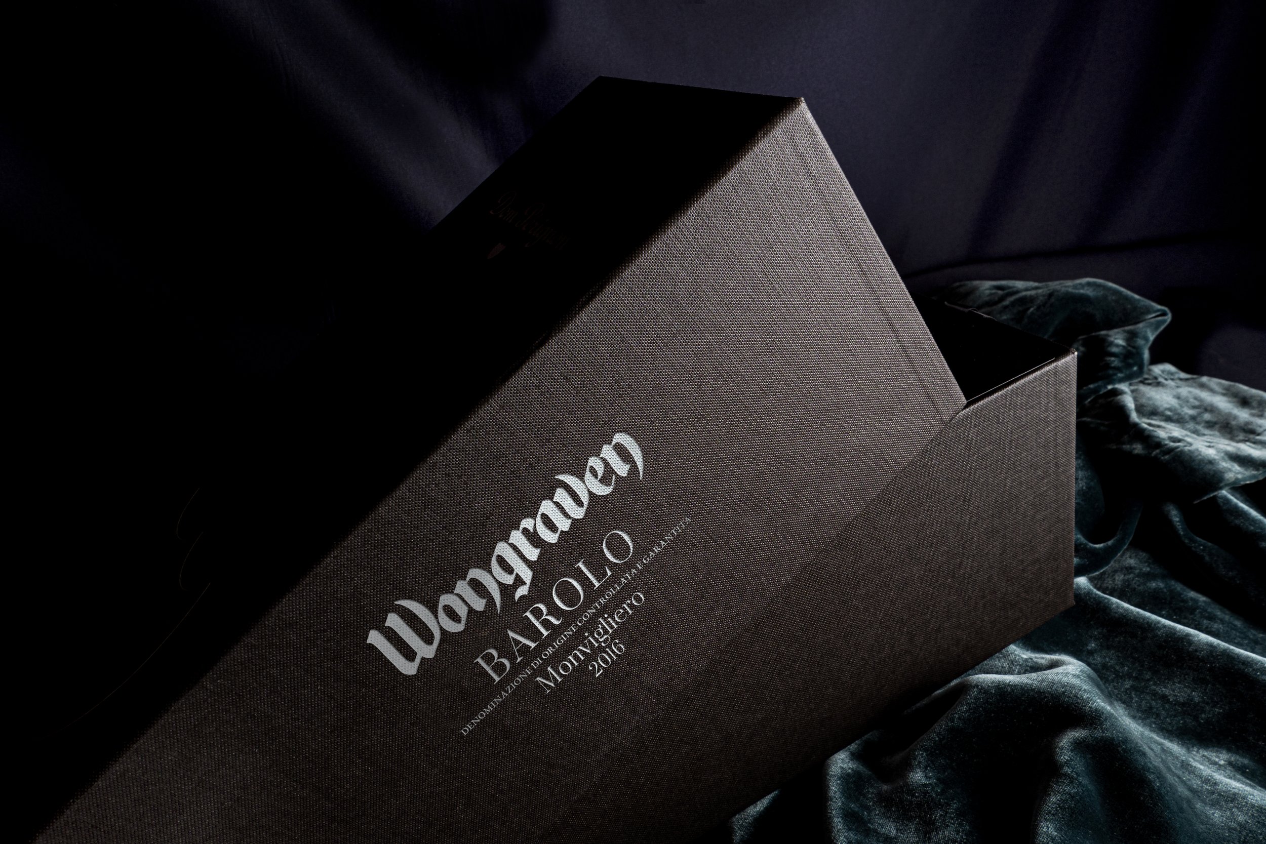
A new addition to Sigurd Wongraven's wine portfolio. Monvigliero is a vineyard located in the village of Verduno which is widely held to be one of the best in the entire Barolo DOCG production zone. Here in the very north of the appellation, the vines enjoy a southern exposure in white soils on top of Sant’Agata fossil marl. Grapes grown at the Monvigliero vineyard are known for producing wines which are particularly fragrant, delicate and elegant, yet with impressive depth, body and harmony.
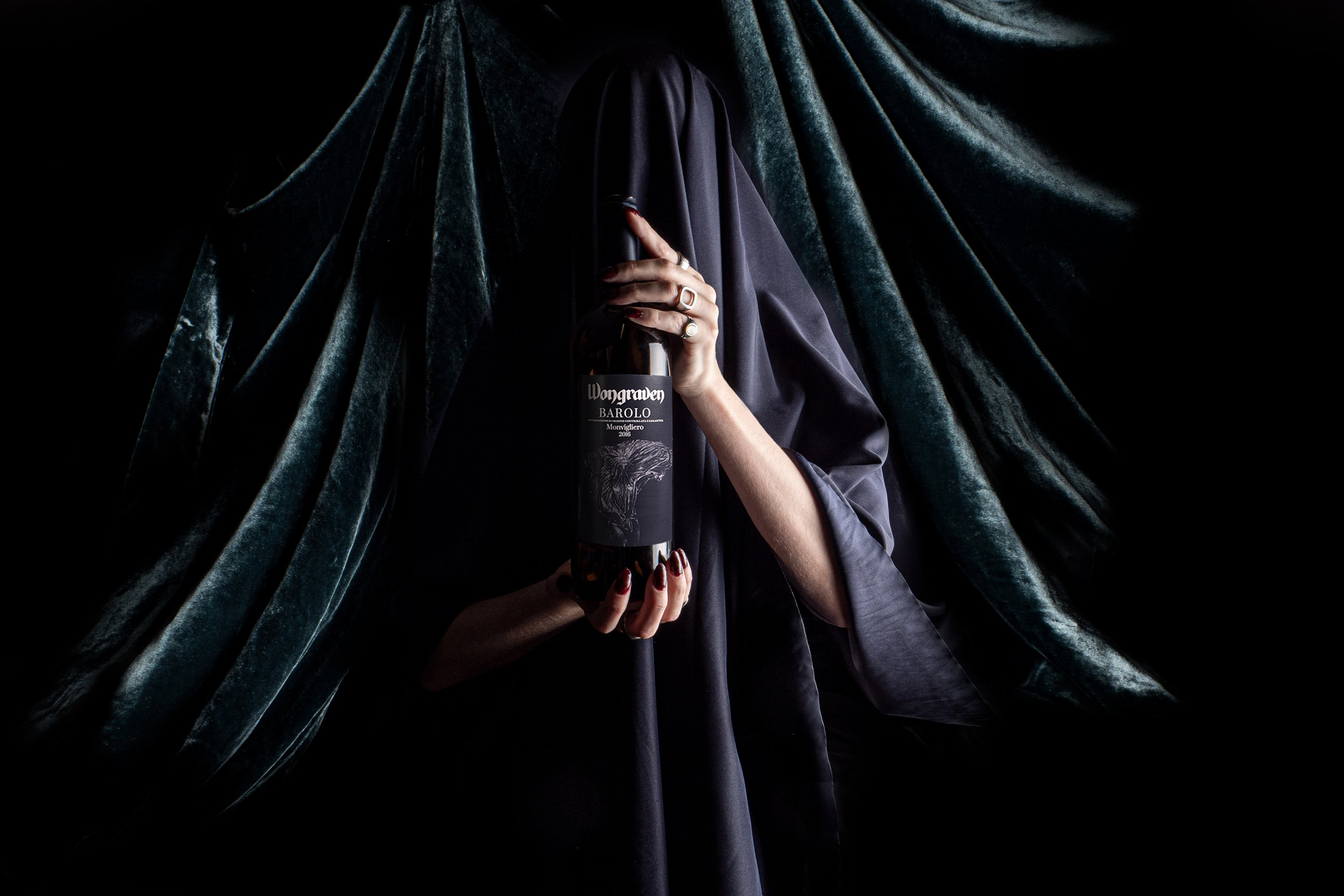
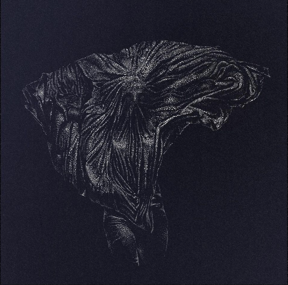
The design concept is to show a fragrant, delicate and elegant wine as a tribute to the woman's elegance with velvety soft taste and movement. The illustration is hand-drawn to reflect the knowledge and craftsmanship of Monvigliero, and the overall design impression has a dark mysterious elegance that represents the best in the Barolo production zone.
RYGR Brygghús is a local brewery by Norske Bryggerier (Norwegian Breweries) and is part of the company's strategy to establish local breweries along the Norwegian coastline. RYGR is the original Norse name for the western region of Norway, Rogaland. The area is known for its rich Viking history, particularly the famous and great naval battle fought in Hafrsfjord around year 872 which led to the unification of Norway.
Frank based the design concept on this proud Viking saga and alongside the vikings excellent craftsmanship and rich trading culture. Using shields for the main design, Frank created a system of endless possibilities, embracing any new type of beer using both patterns and colors in combinations which allows to make numerous and distinct series with a clear difference between the beer types.
The product names are from the region named from the viking era. Hafr is Hafrsfjord. Jædr is the original name for the beautiful place Jæren, and Haugr is their name for the town Haugesund on the west coast. The logo is developed from a viking axe to focus on the craftsmanship and the brewery is also located in Øksenevad (øks=axe).
A new addition to Sigurd Wongraven's wine portfolio. Monvigliero is a vineyard located in the village of Verduno which is widely held to be one of the best in the entire Barolo DOCG production zone. Here in the very north of the appellation, the vines enjoy a southern exposure in white soils on top of Sant’Agata fossil marl. Grapes grown at the Monvigliero vineyard are known for producing wines which are particularly fragrant, delicate and elegant, yet with impressive depth, body and harmony.
The design concept is to show a fragrant, delicate and elegant wine as a tribute to the woman's elegance with velvety soft taste and movement. The illustration is hand-drawn to reflect the knowledge and craftsmanship of Monvigliero, and the overall design impression has a dark mysterious elegance that represents the best in the Barolo production zone.
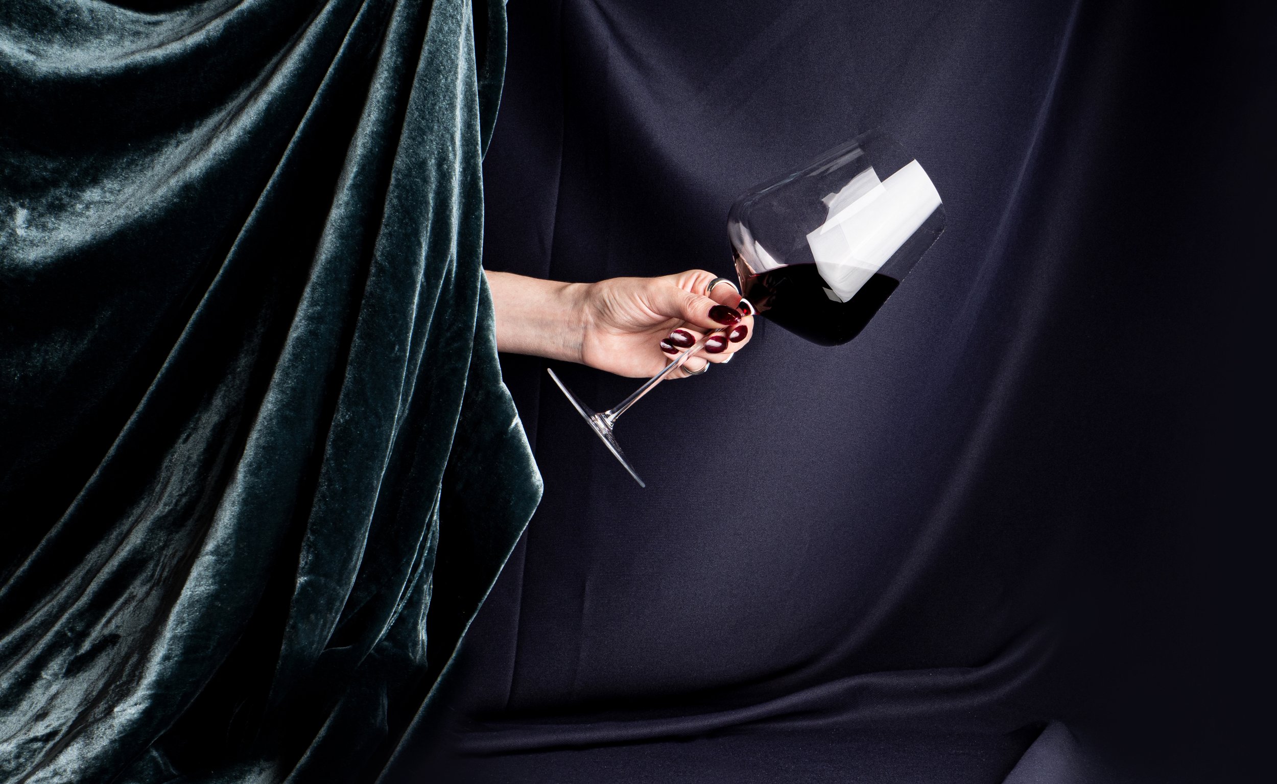
Graphic design & Art Direction: Fredrik Melby & Geir Lysbakken
Illustration: Remi Juliebø/Deformat (based on an photo by Fred Jonny, courtesy of AntiDenim)
Photo: Fredrik Melby & Geir Lysbakken
Model: Sara Flikkeid
Graphic design & Art Direction: Fredrik Melby & Geir Lysbakken
Illustration: Remi Juliebø/Deformat (based on an photo by Fred Jonny, courtesy of AntiDenim)
Photo: Fredrik Melby & Geir Lysbakken
Model: Sara Flikkeid
Work
Onklp PilsnerPackaging
Telemark BryggeriPackaging
ValkyrienBranding
Wongraven Barolo MonviglieroPackaging
PAPAYAIdentity
RYGRPackaging
TINE YTPackaging
SpekeloftetPackaging
Agder BryggeriPackaging
O.F.HaldPackaging
Norske BryggerierBranding
DevoldBrand Development
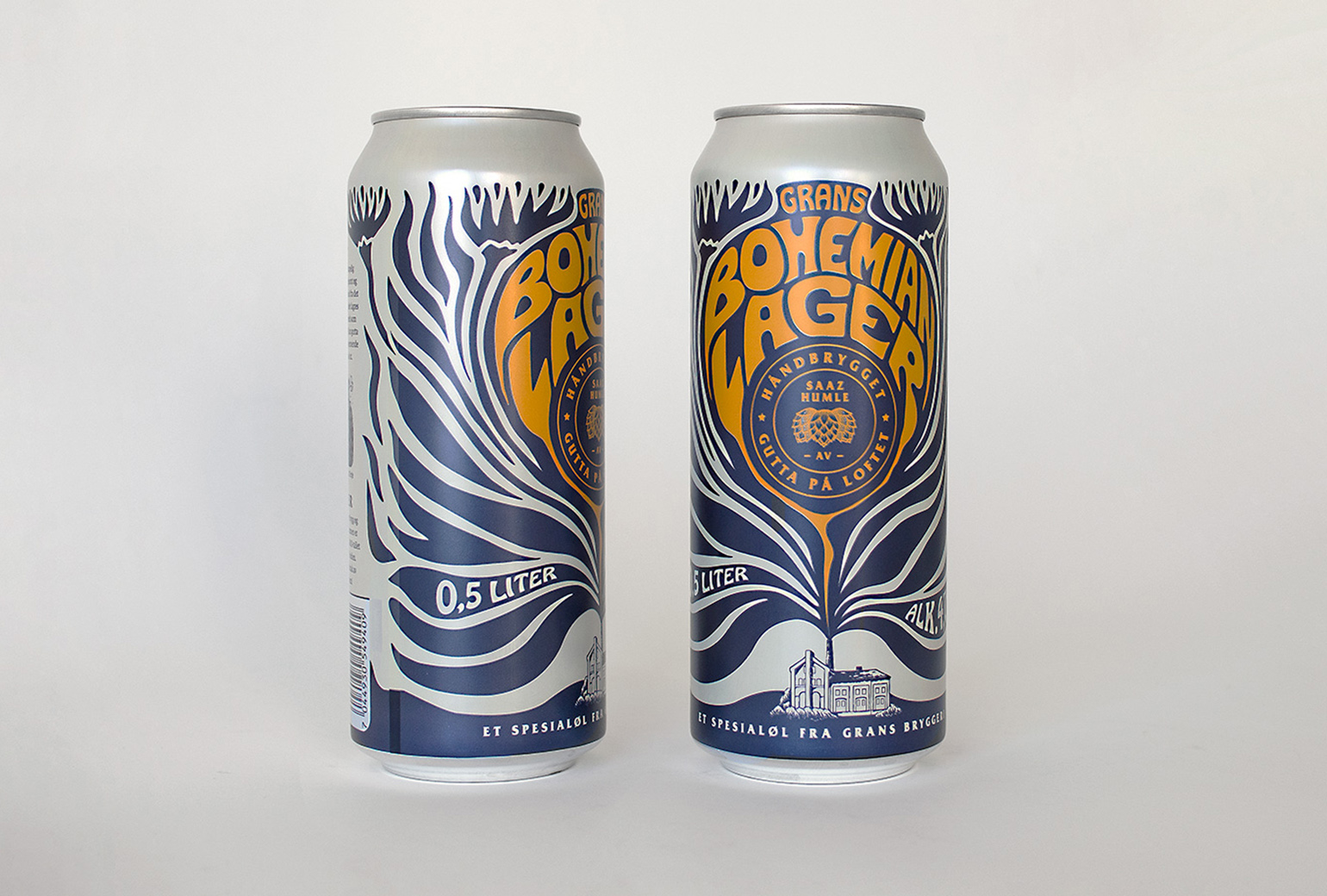
Bohemian LagerPackaging
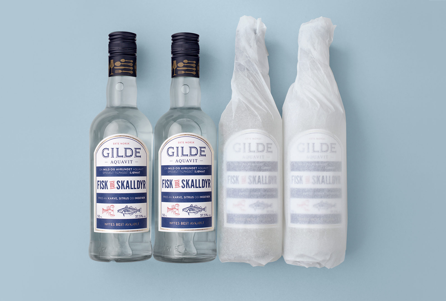
Gilde AquavitPackaging
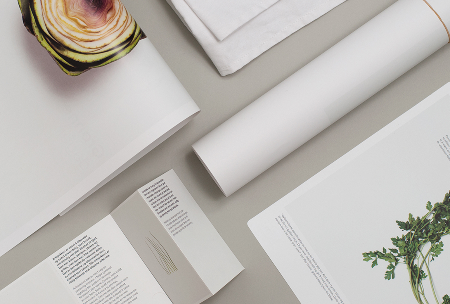
Bama StorkjøkkenBrand Development
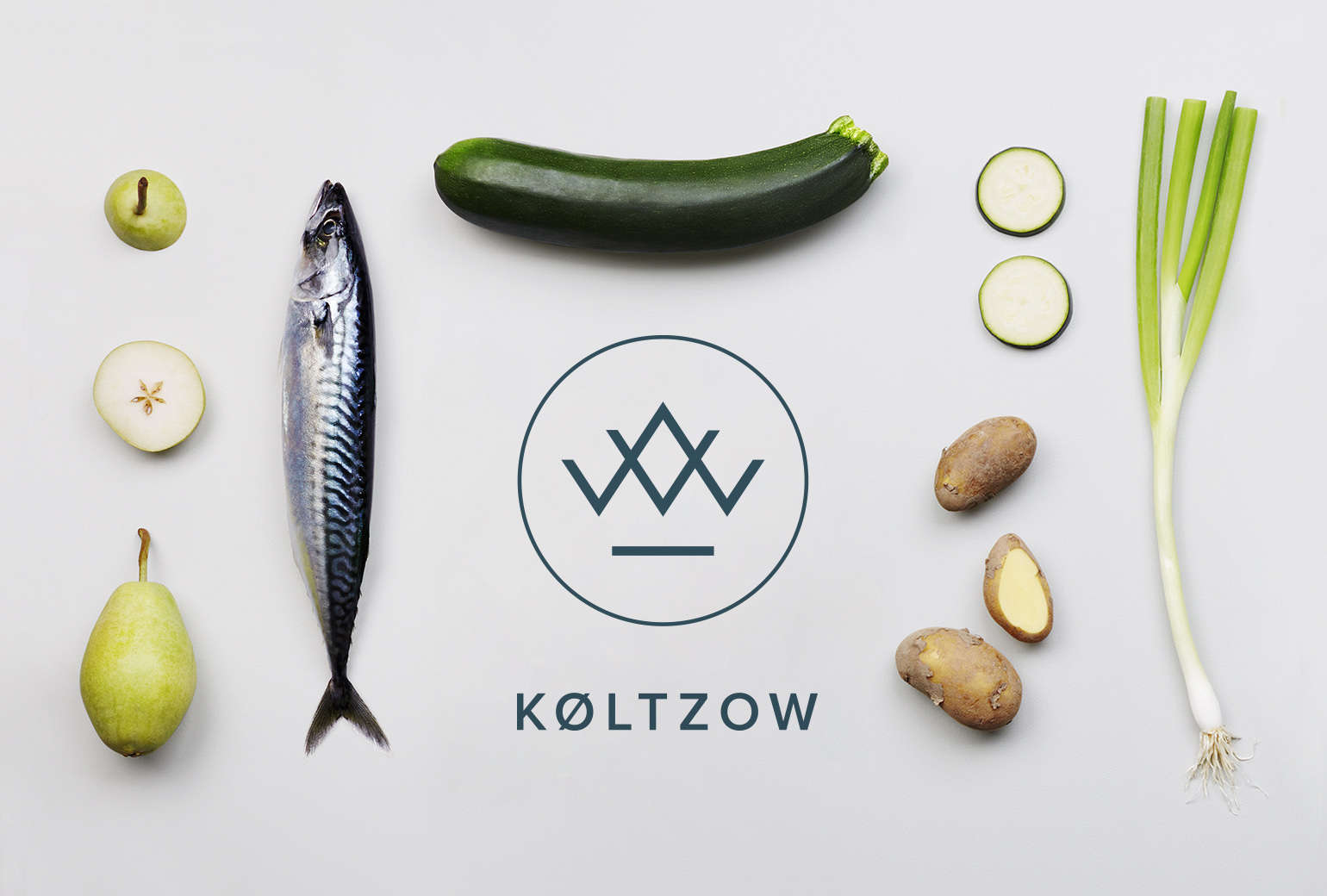
KøltzowBrand Identity
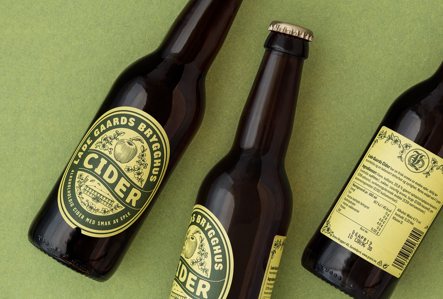
Lade Gaards CiderPackaging Design
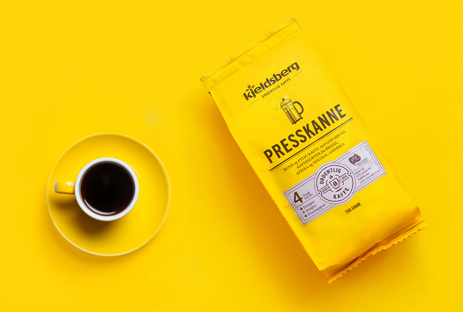
Kjeldsberg KaffePackaging Design
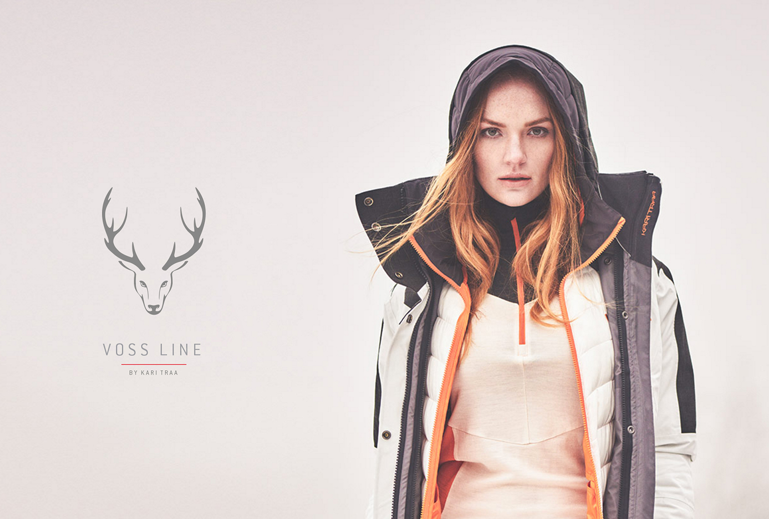
Lille PBrand Identity
Gilde juleaquavitPackaging
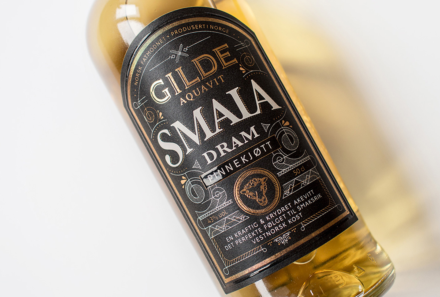
VosslineBrand identity / packaging