Telemark Bryggeri
Brand Identity / Packaging
Agency: SMFB Dinamo
Client: Telemark Bryggeri
Design: Geir Solem Lysbakken / Fredrik Melby
Project manager: Karianne Stenby
Consultant: Kristian Kristiansen
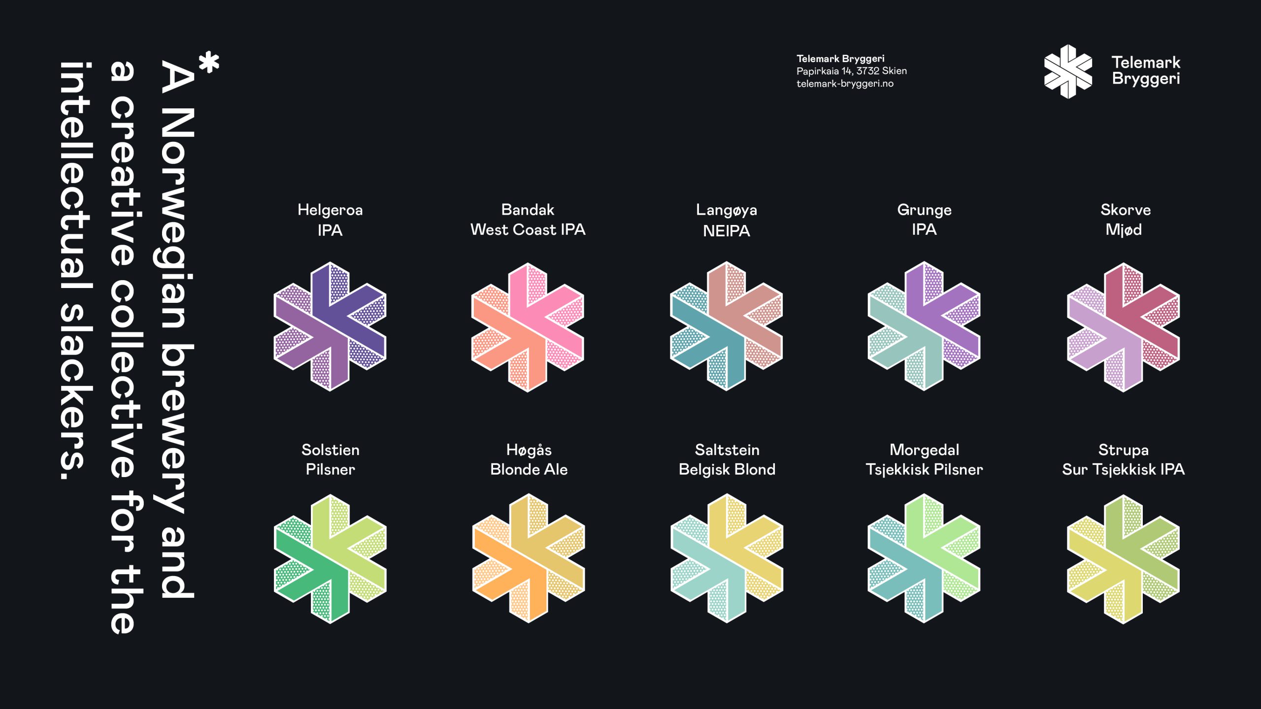
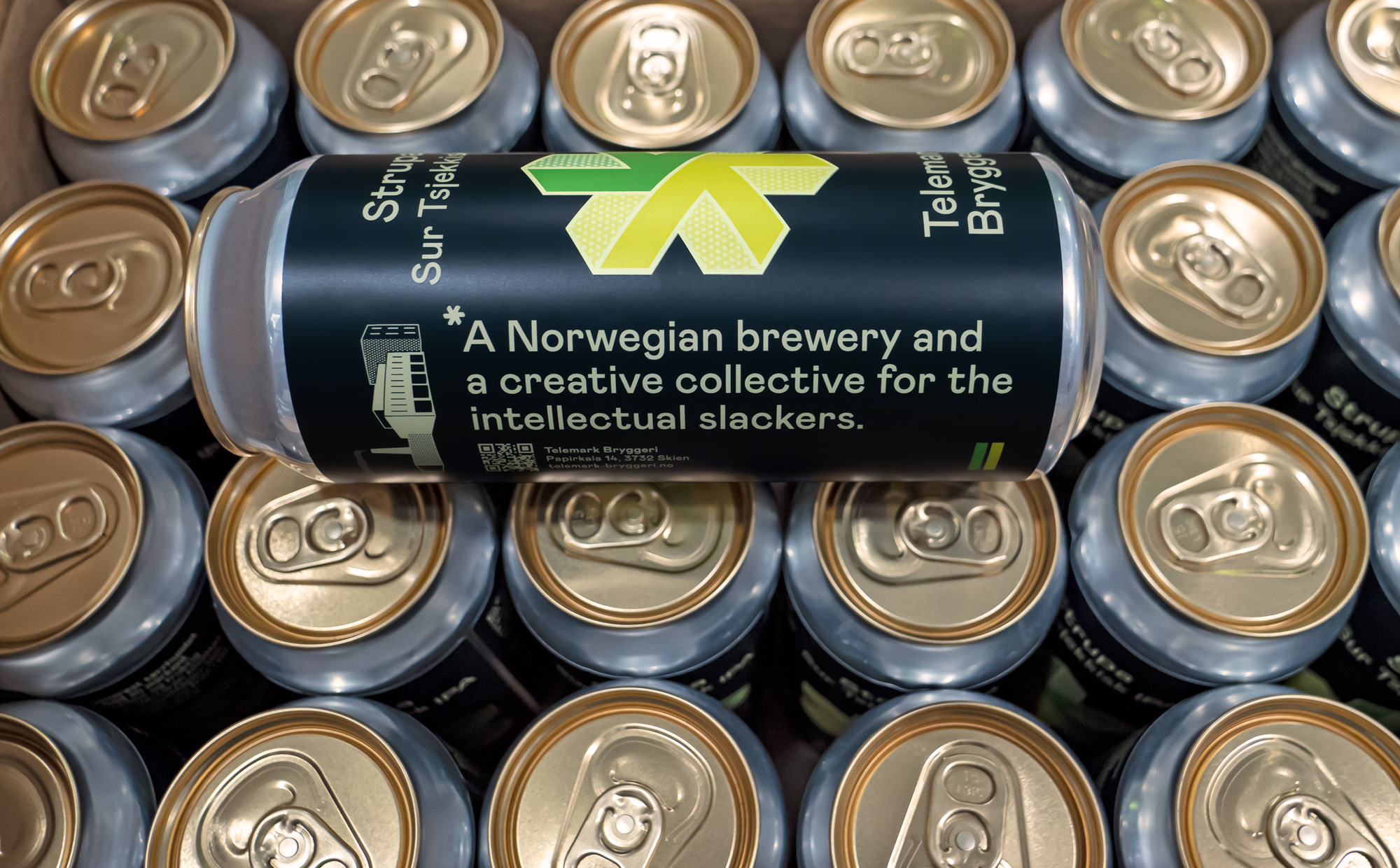
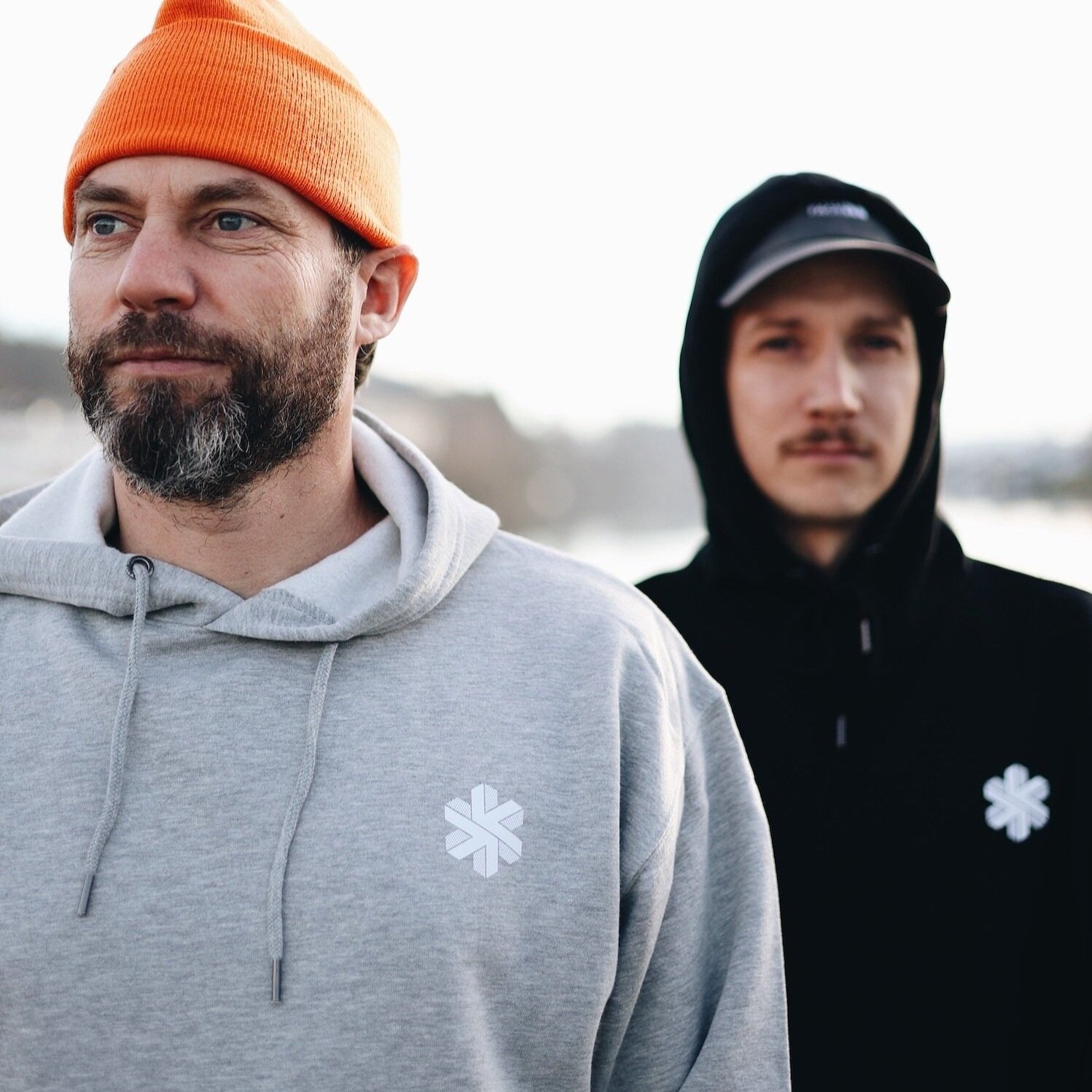
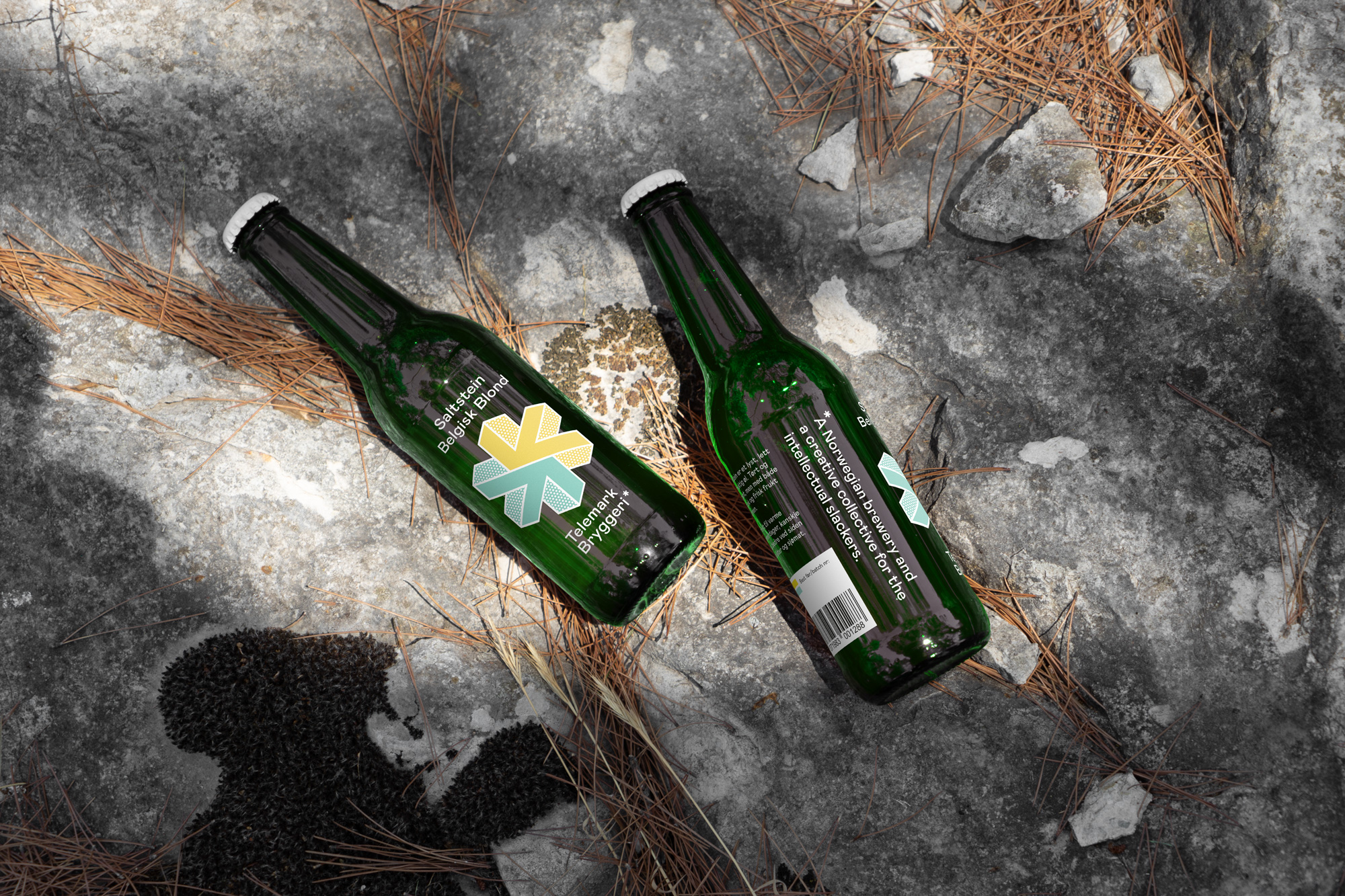
For centuries, Telemark has been known for its rich cultural tradition in southern Norway. Today, Telemark is diversity. Telemark is nature and industry. It is robbers, board culture, hip-hop and Japs. These combinations of extremes are well represented in the local brewery, Telemark Bryggeri.
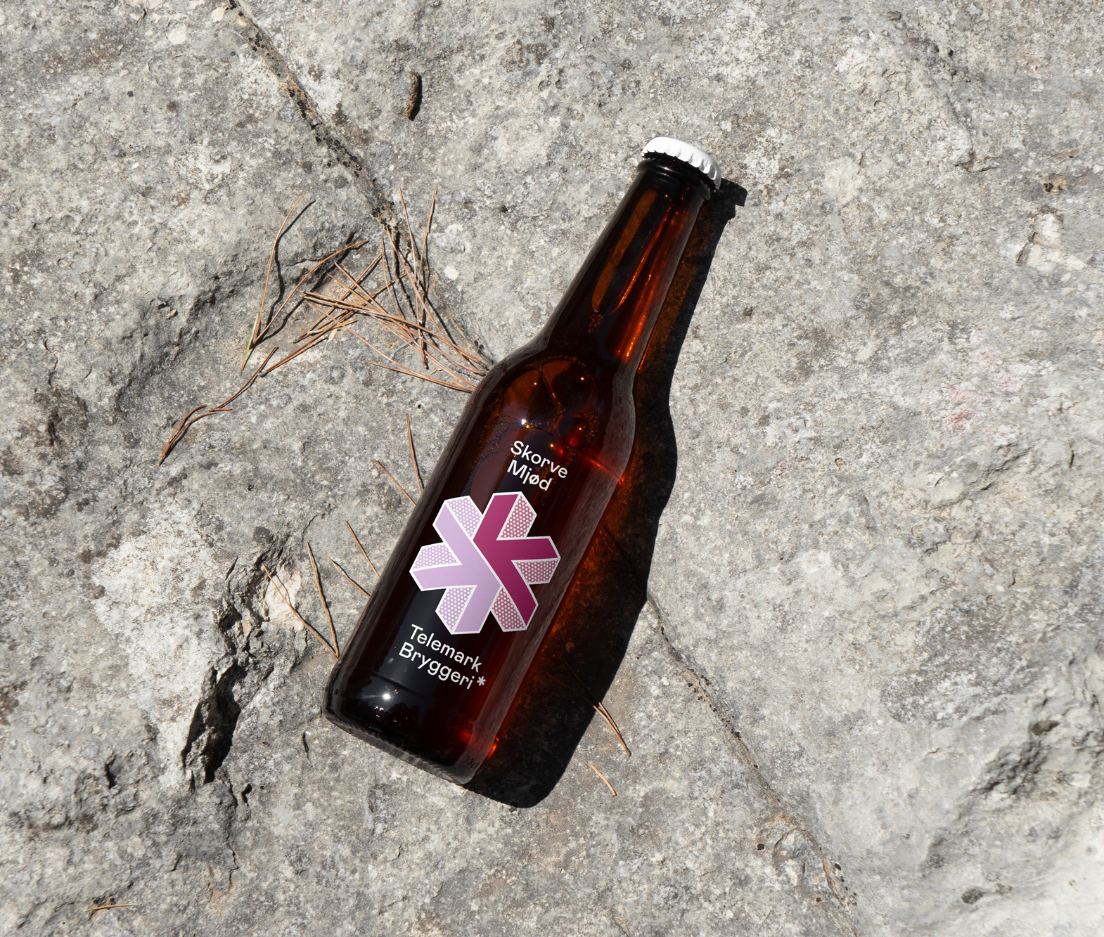
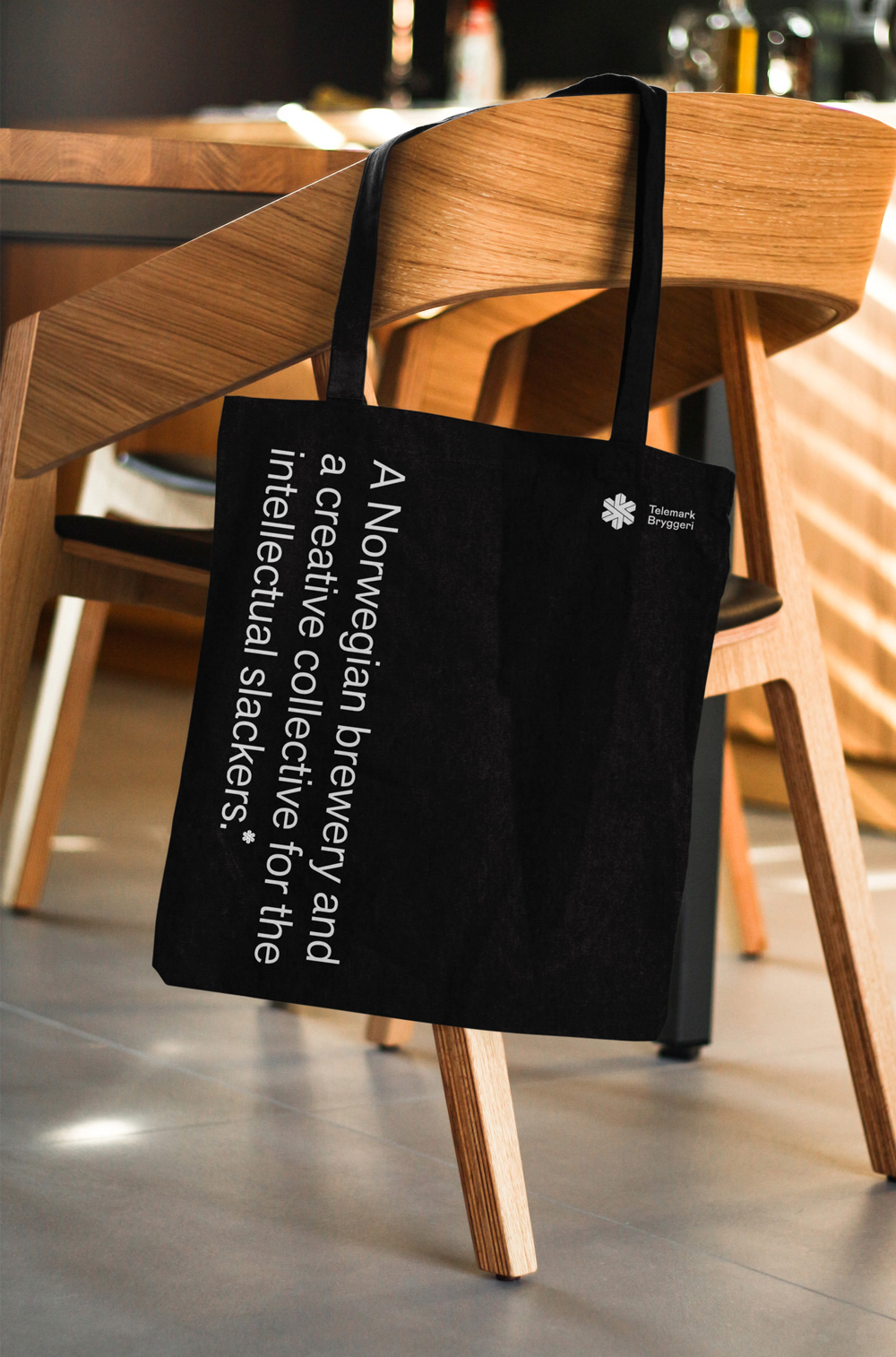
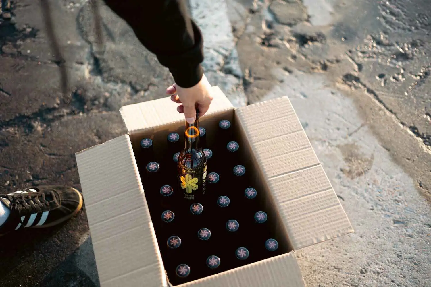
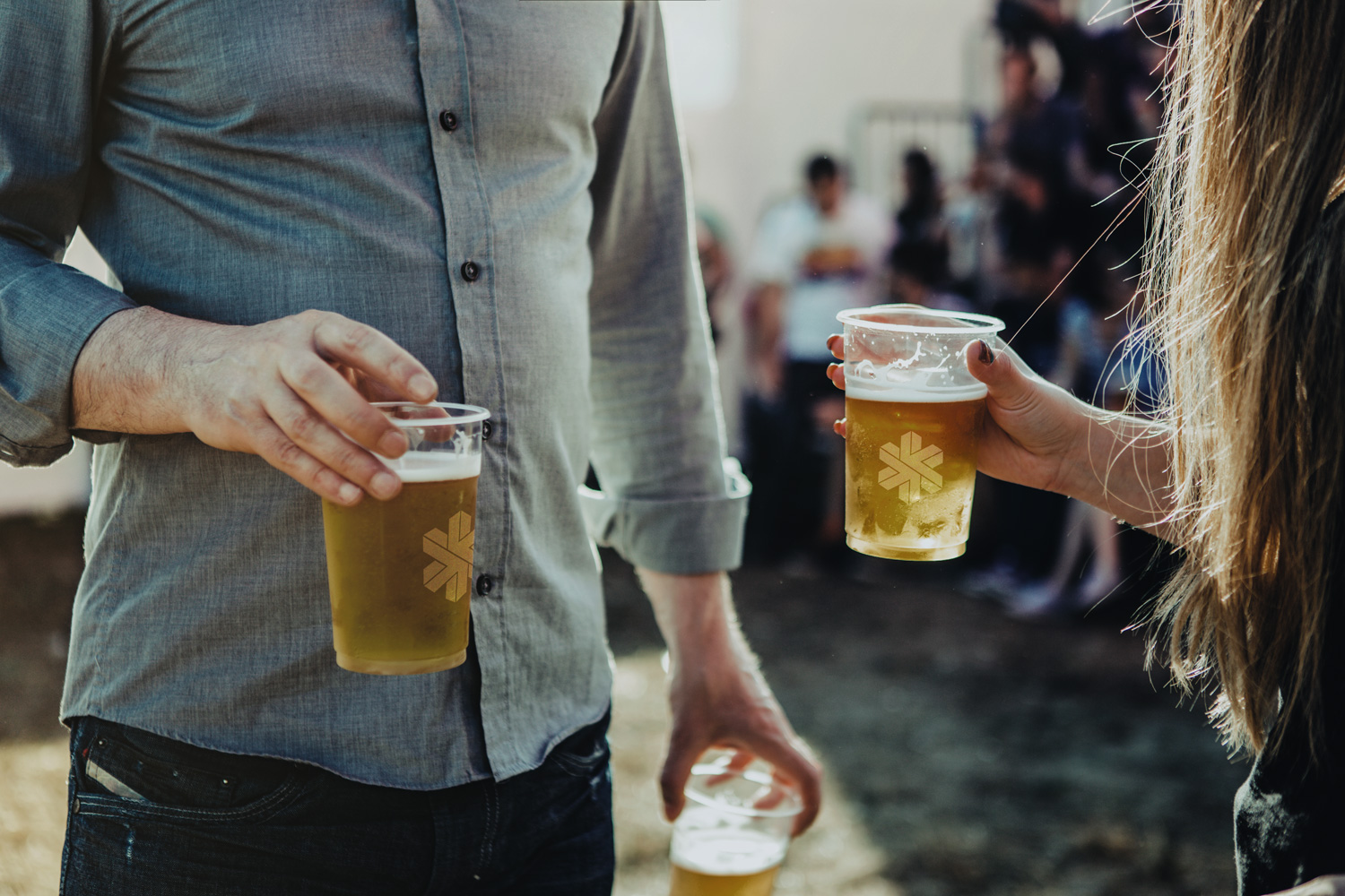
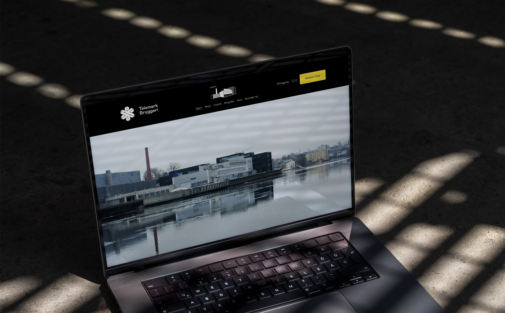
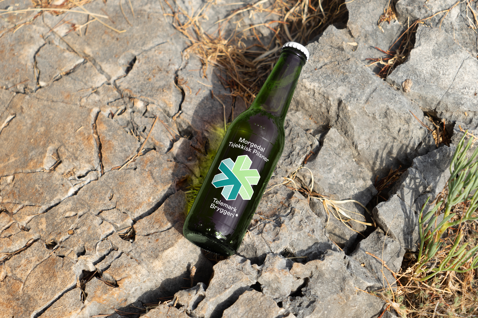
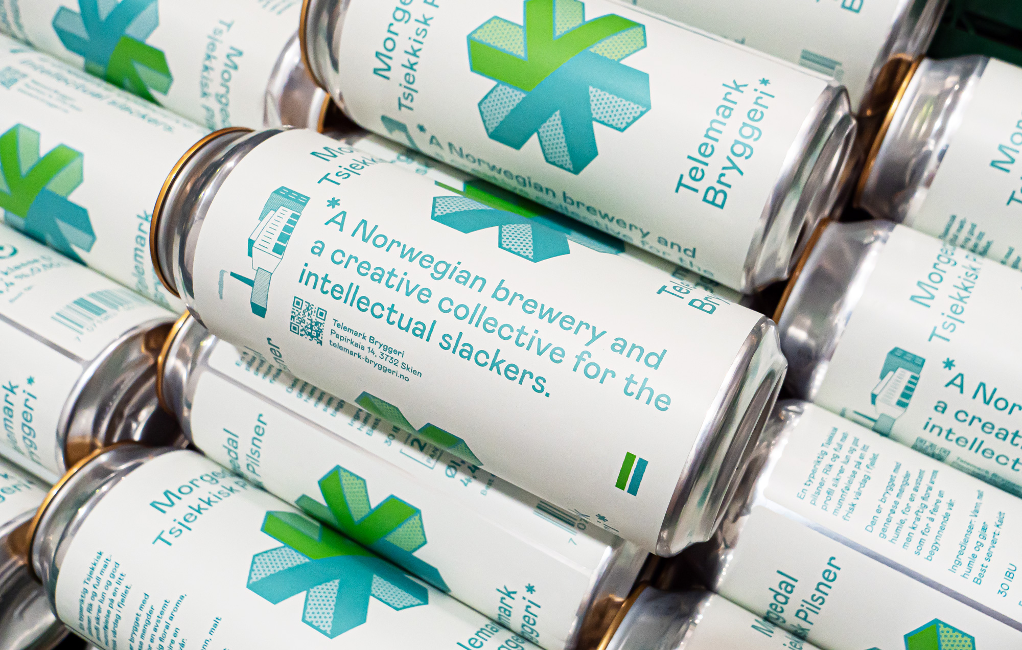
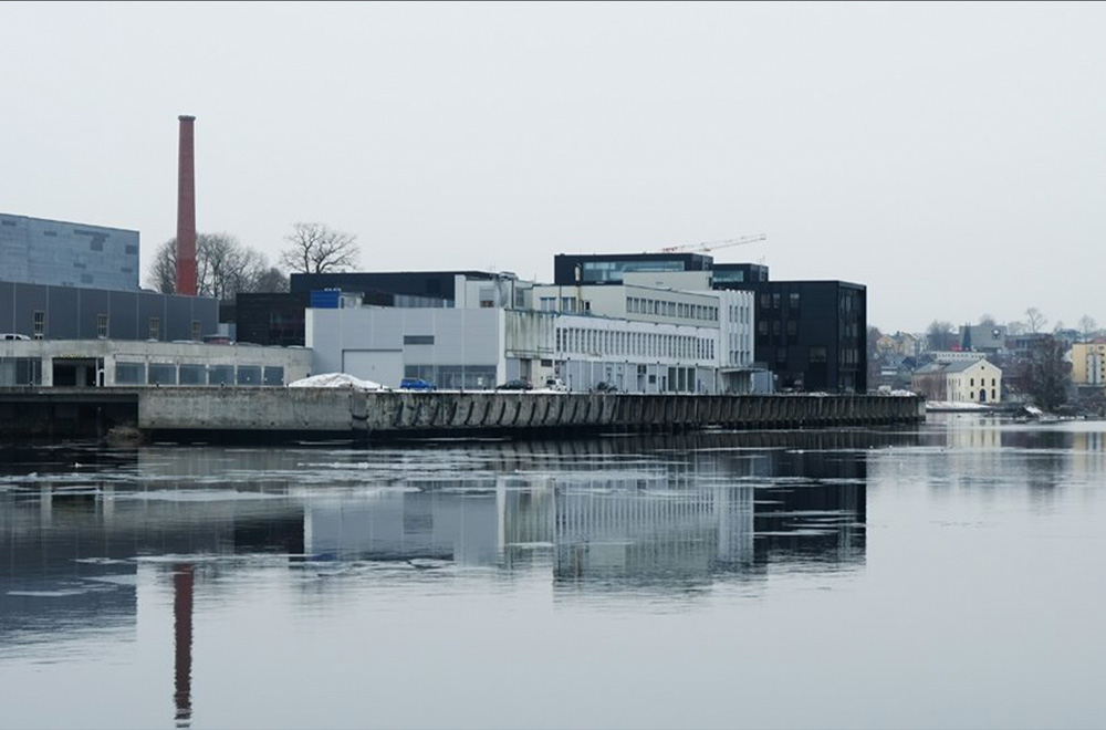
Next to making beer, it is a meeting point. A place where opposites meet. Where beer and culture go hand in hand. This concept was developed with a symbol that represents a meeting point →← which also solved flavor combinations for any types of beer. A design and concept for a brewery by and for a diverse people. The water of the Telemark river (Telemarkkanalen) is widely known for its high quality. That’s why Telemark Bryggeri’s location is perfect – sitting at the river mouth in the factory area of Skien. Where nature meets industry, tradition meets innovation, and skaters meet suits – over a beer.
Work
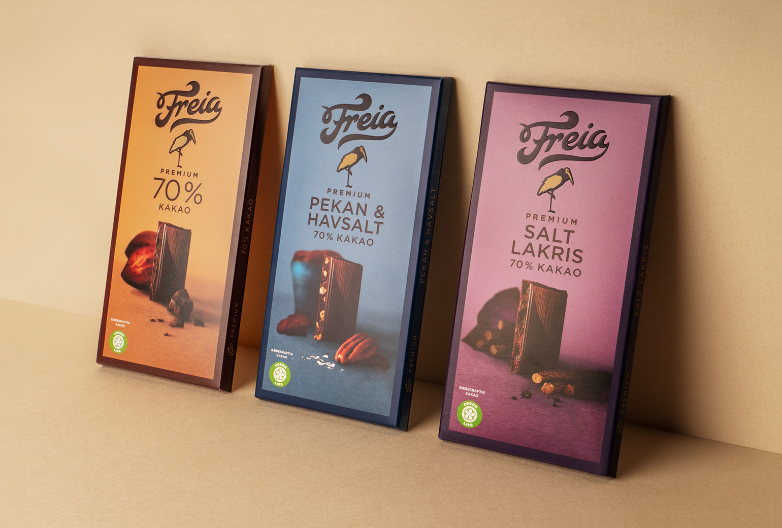
Freia PremiumPackaging
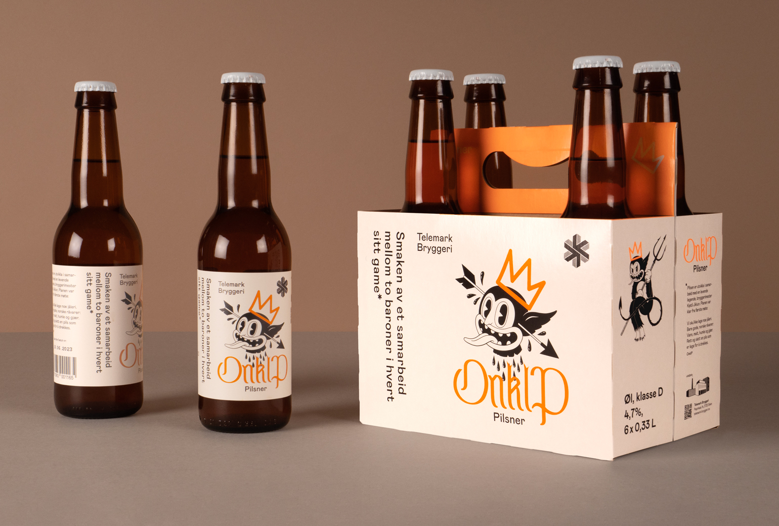
Onklp PilsnerPackaging
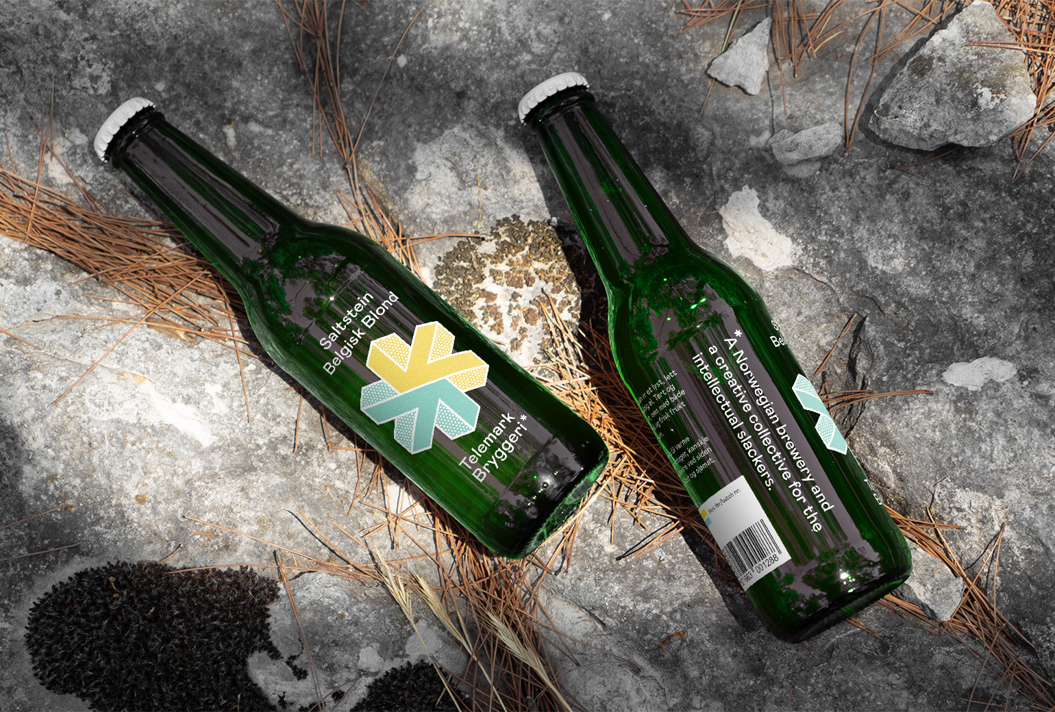
Telemark BryggeriPackaging
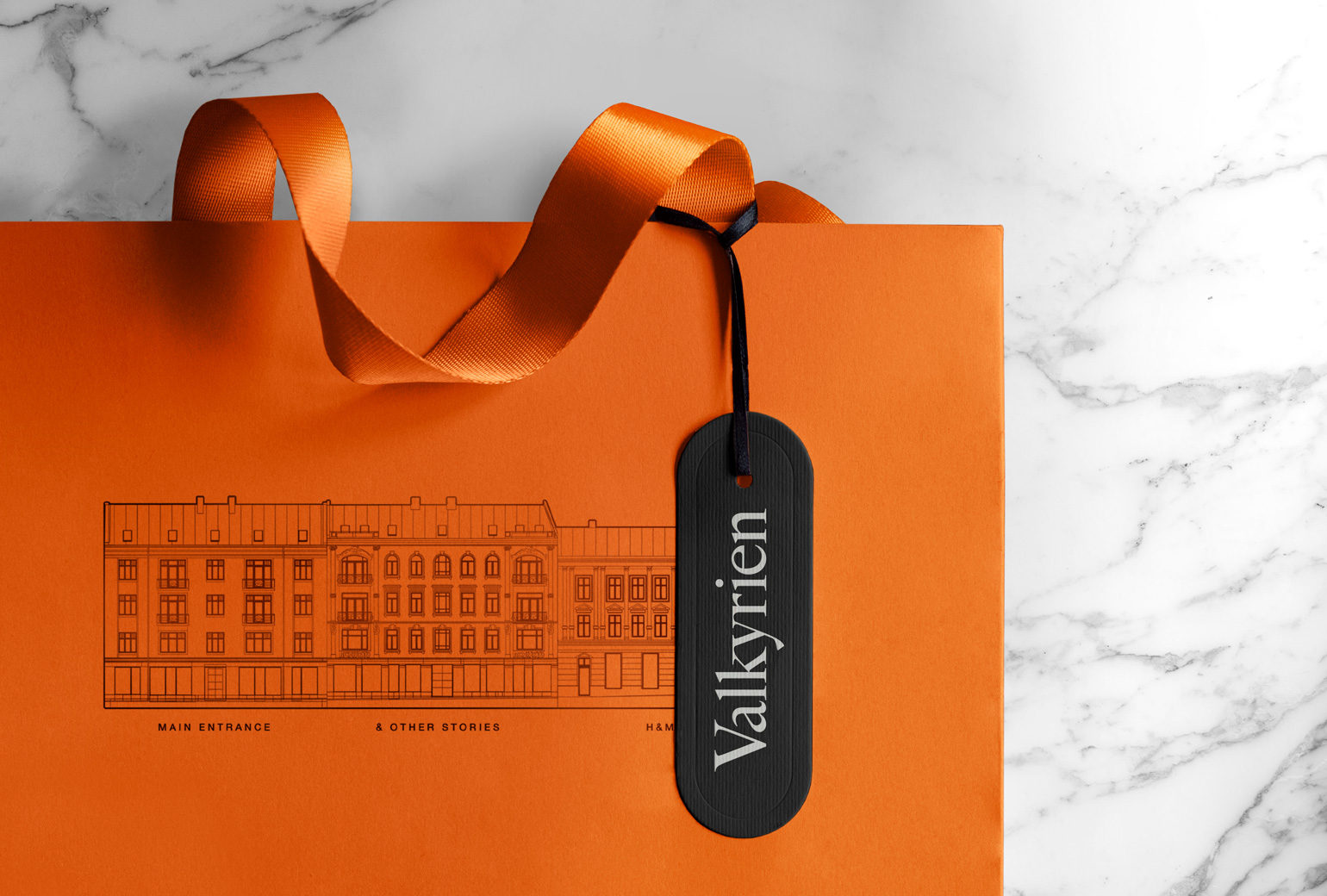
ValkyrienBranding
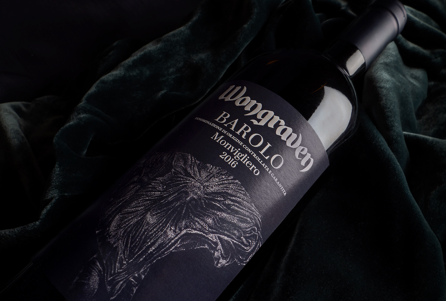
Wongraven Barolo MonviglieroPackaging
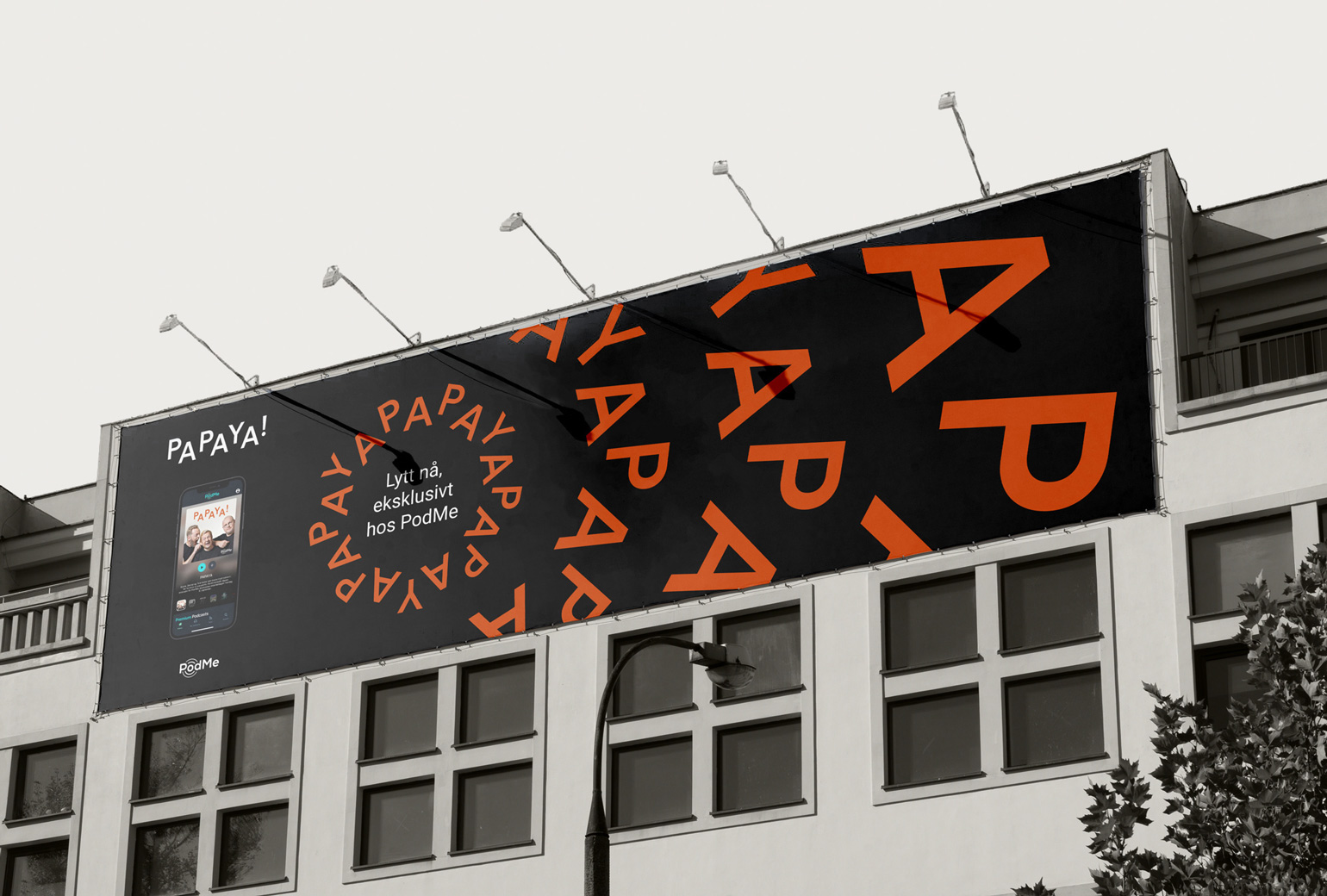
PAPAYAIdentity
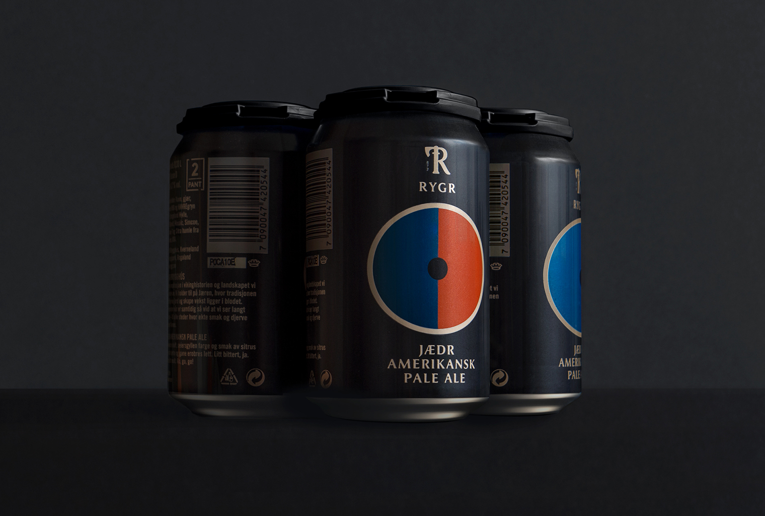
RYGRPackaging

TINE YTPackaging
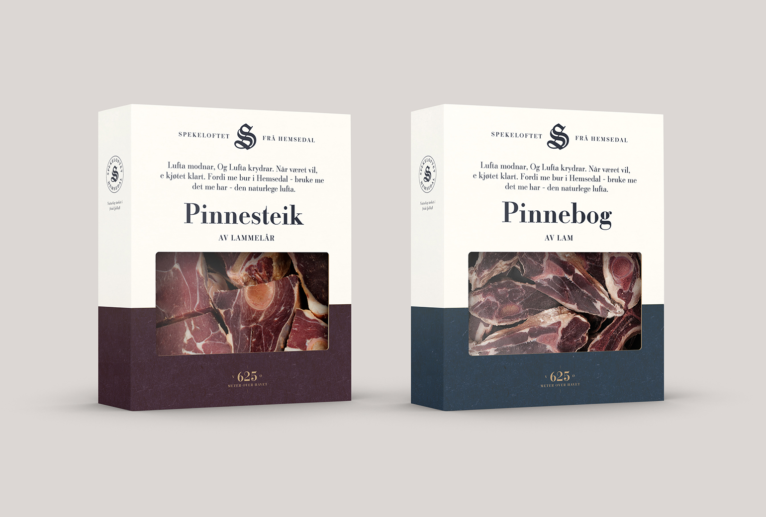
SpekeloftetPackaging
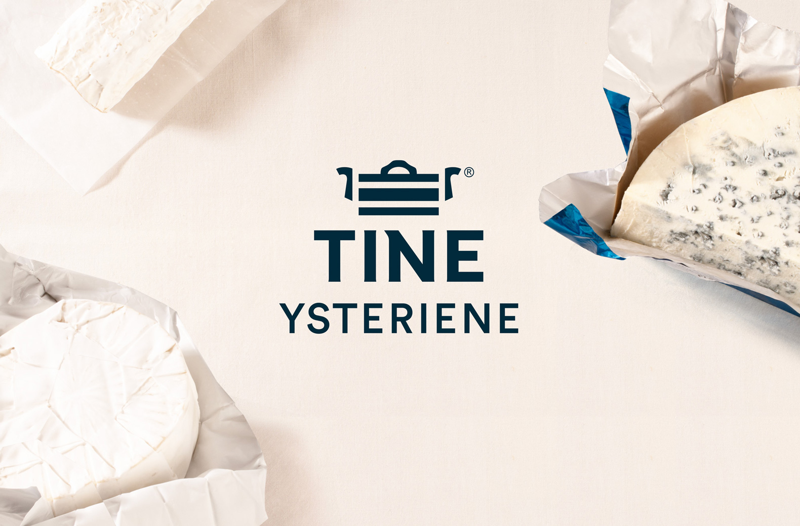
TINE YsterierPackaging
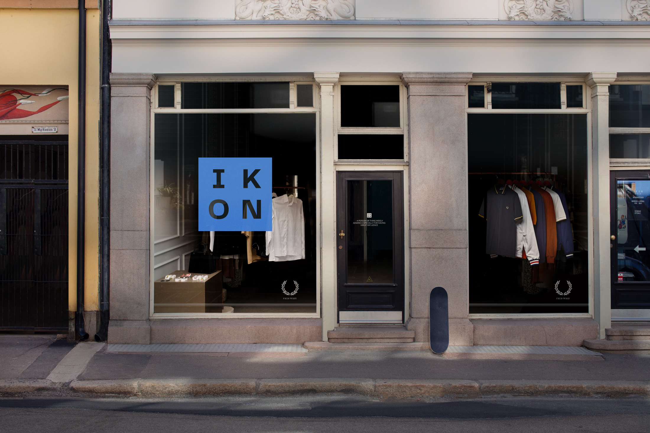
IKONBrand Identity
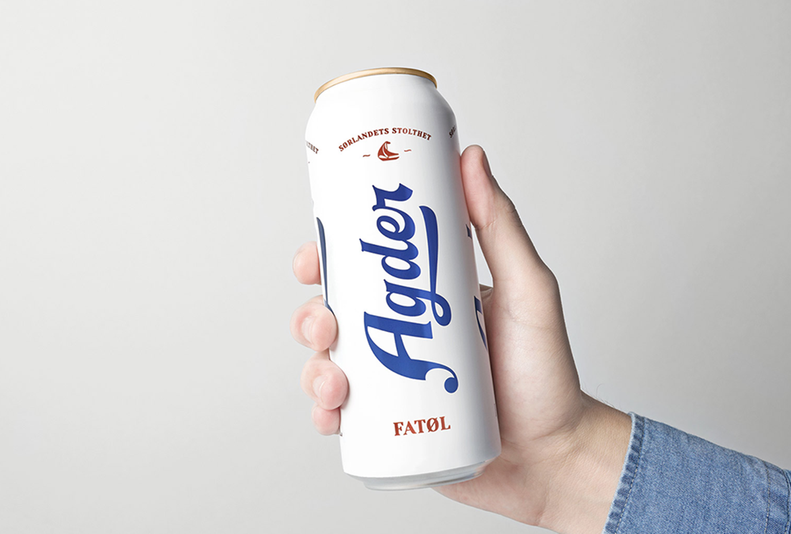
Agder BryggeriPackaging
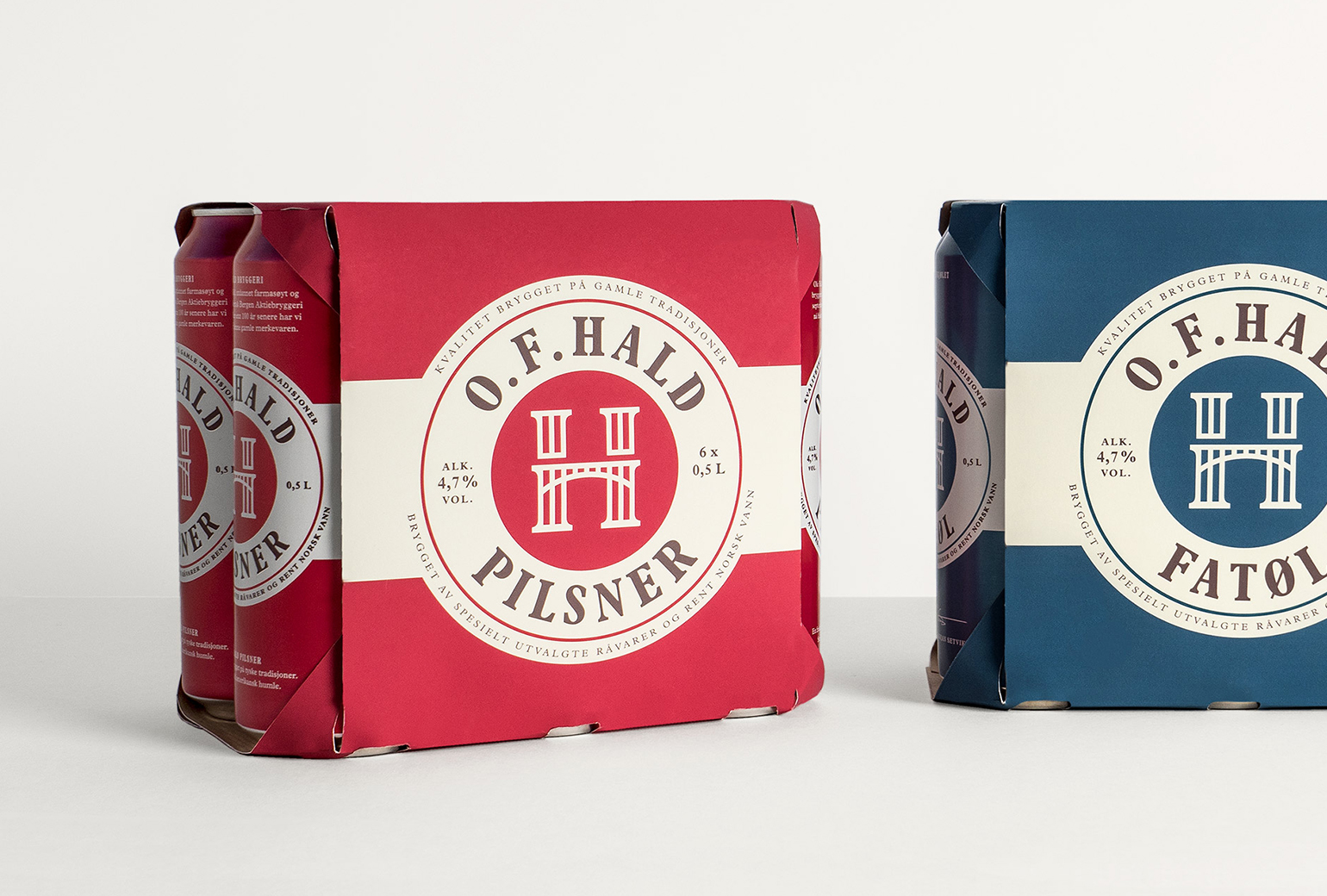
O.F.HaldPackaging
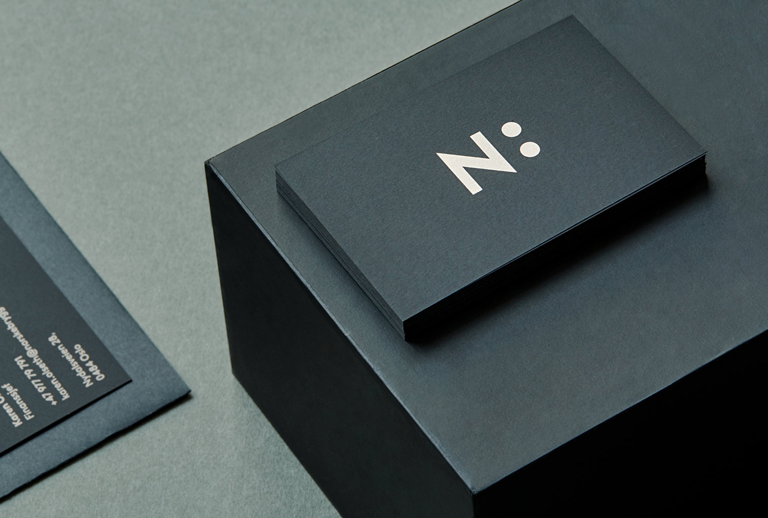
Norske BryggerierBranding
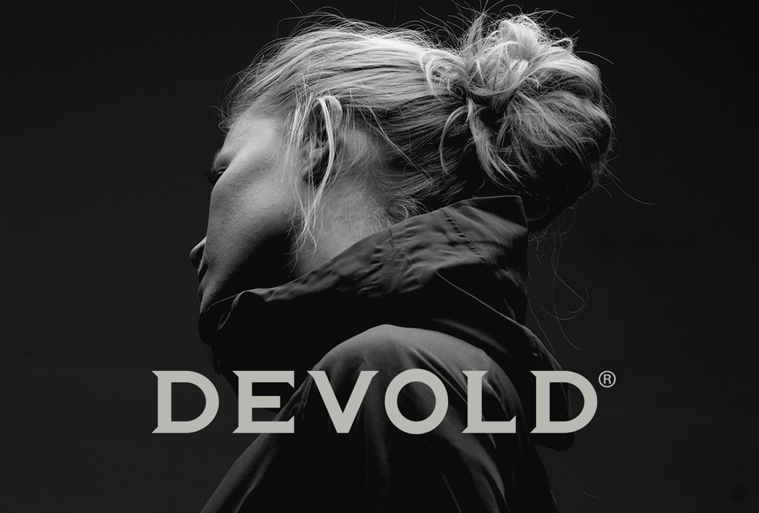
DevoldBrand Development
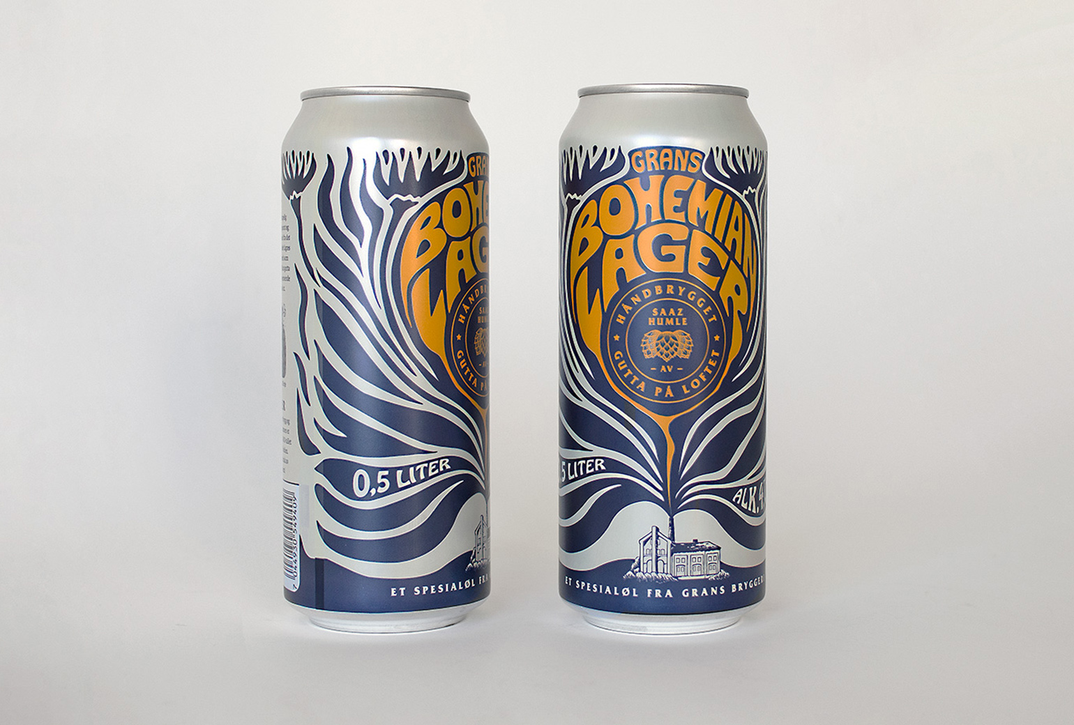
Bohemian LagerPackaging
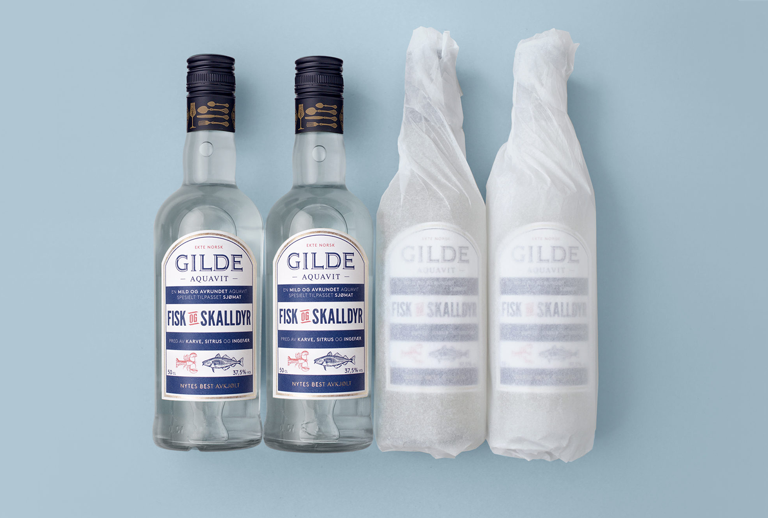
Gilde AquavitPackaging
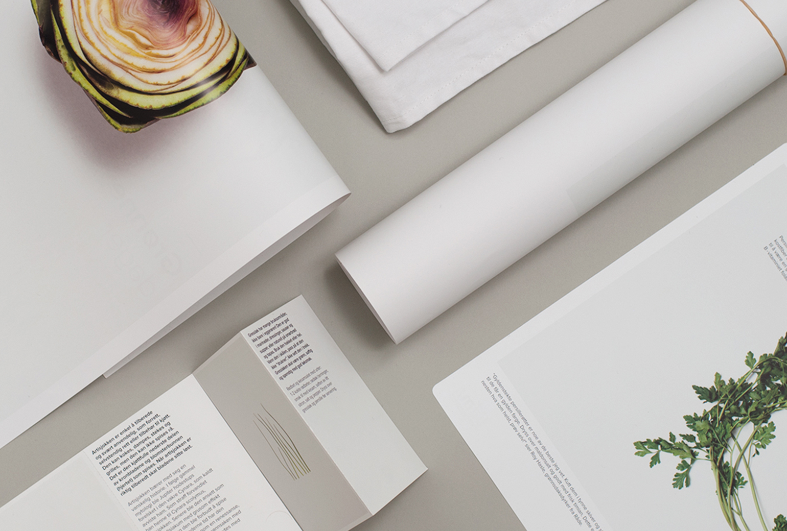
Bama StorkjøkkenBrand Development
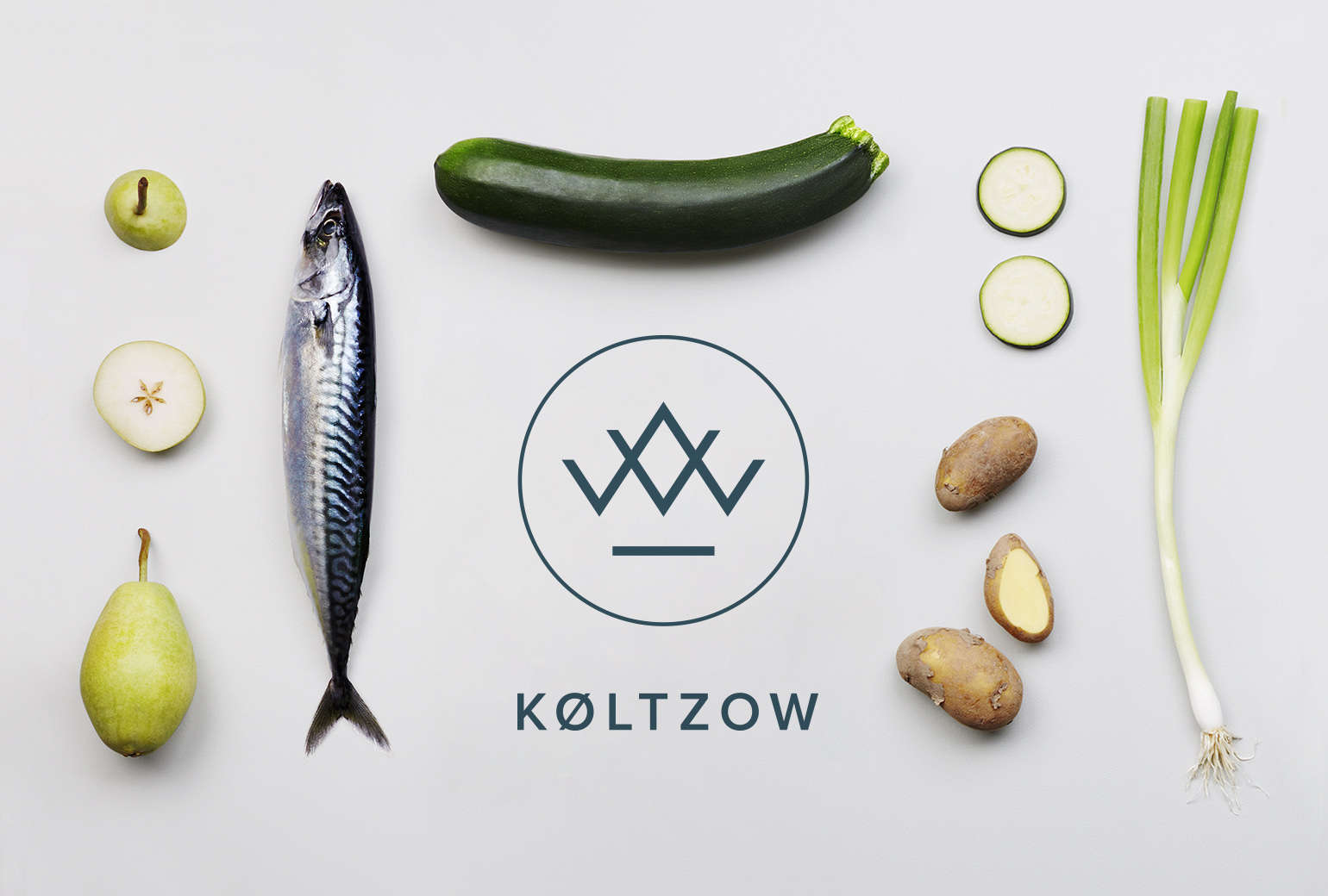
KøltzowBrand Identity
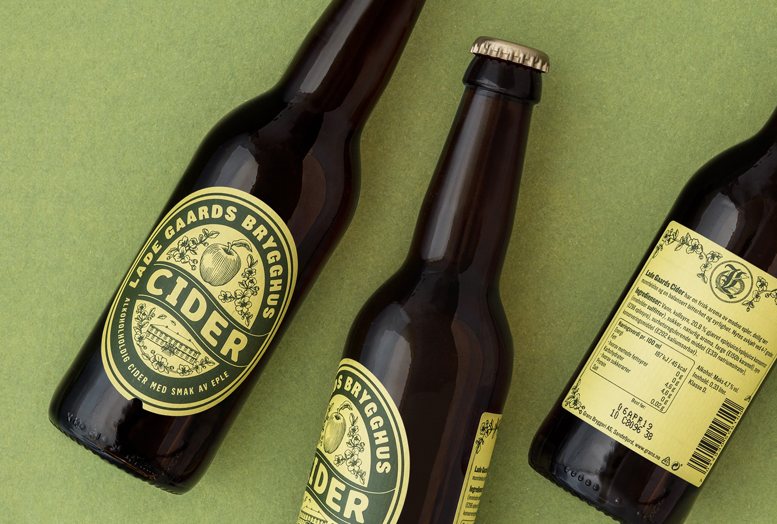
Lade Gaards CiderPackaging Design
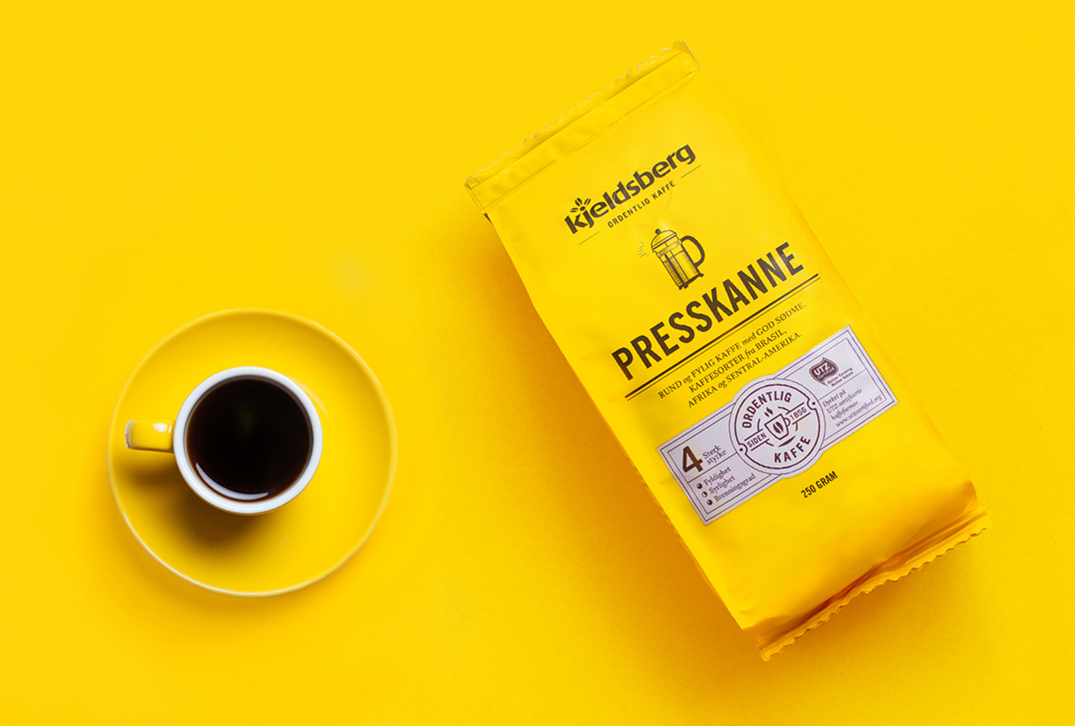
Kjeldsberg KaffePackaging Design
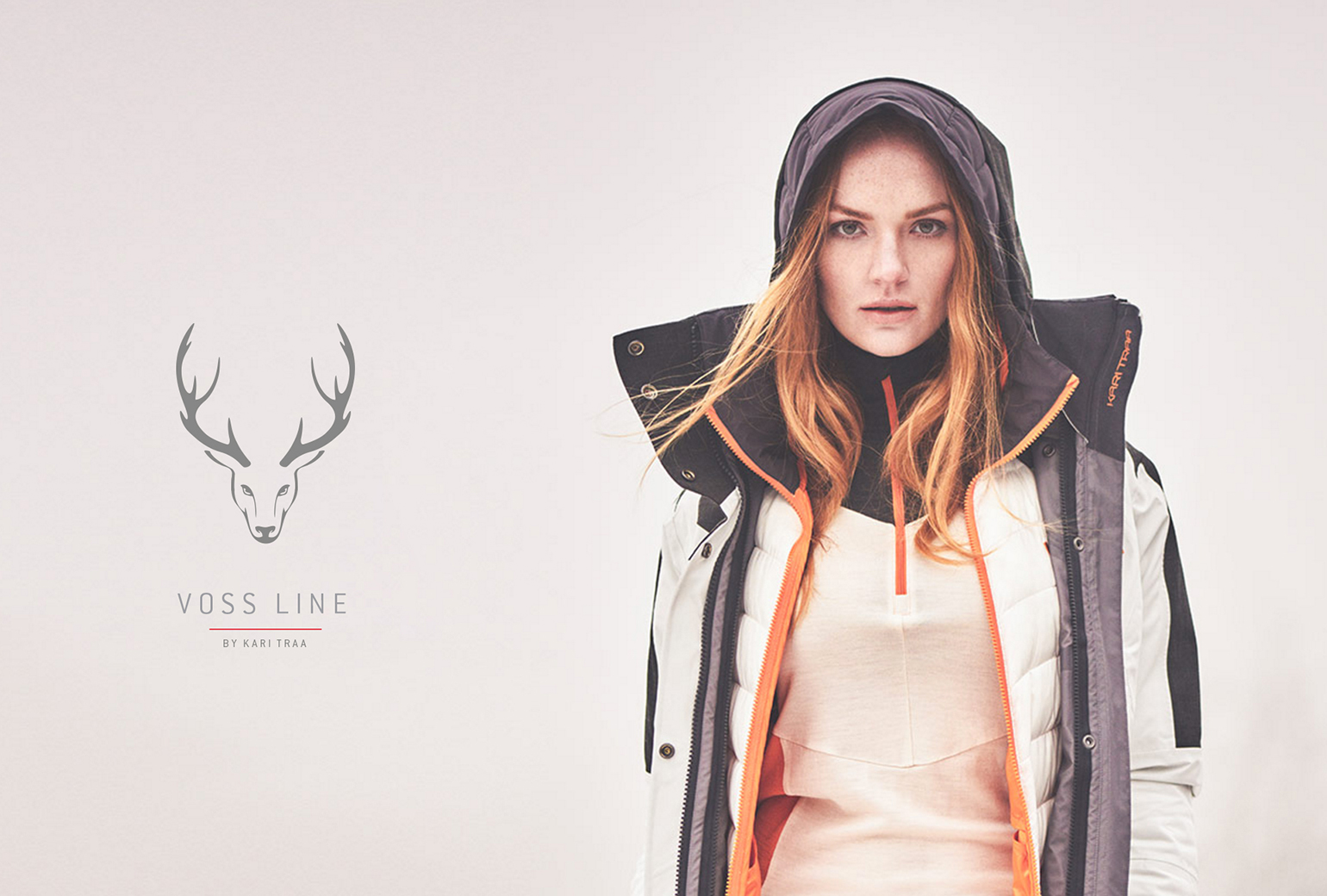
VosslineBrand identity / packaging
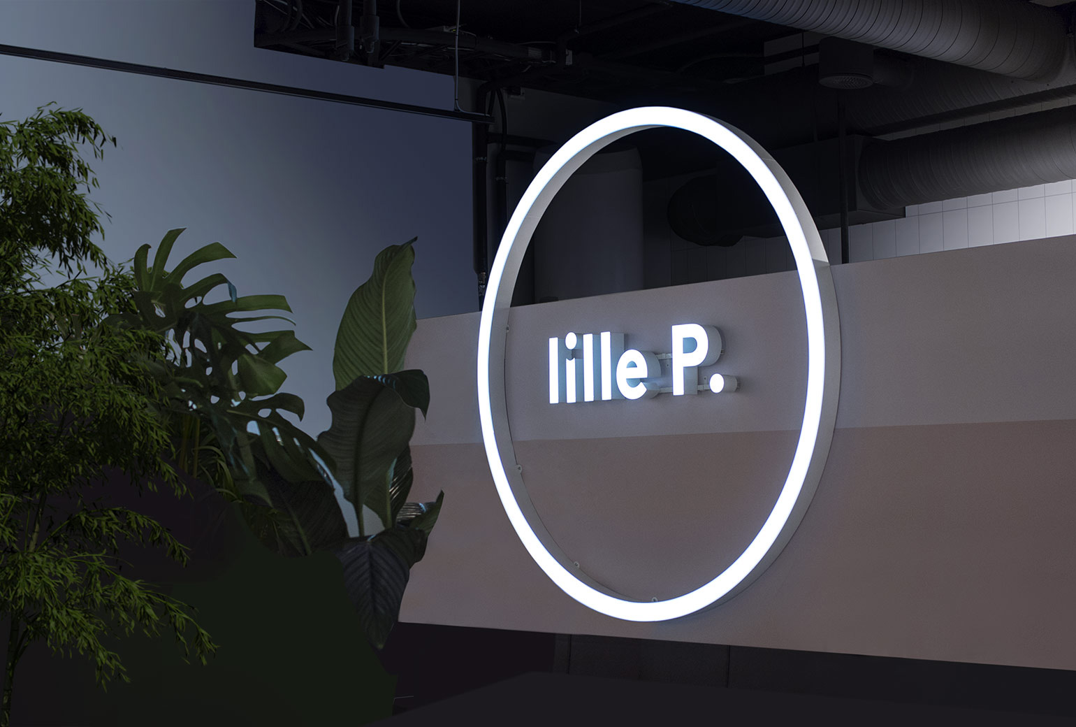
Lille PBrand Identity
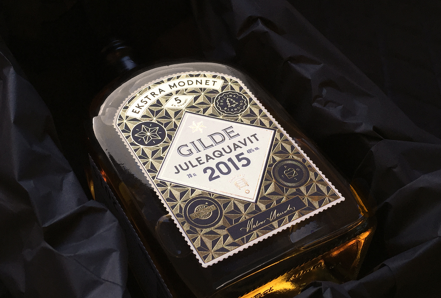
Gilde juleaquavitPackaging
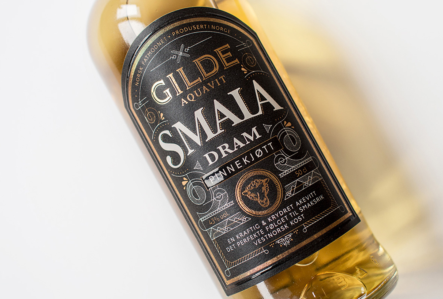
Gilde Aquavit - SmalaPackaging