Valkyrien
Brand Identity
Agency: SMFB Dinamo (Frank)
Client: Fram Eiendom / Mellbye Arkitektur Interiør AS
Design / AD: Geir Solem Lysbakken / Sara Flikkeid / Ida Mortensen
Foto: Geir Solem Lysbakken / Sara Flikkeid
Motion: Marius Wathne
Project manager: Karianne Stenby
Consultant: Oscar Michaelsen
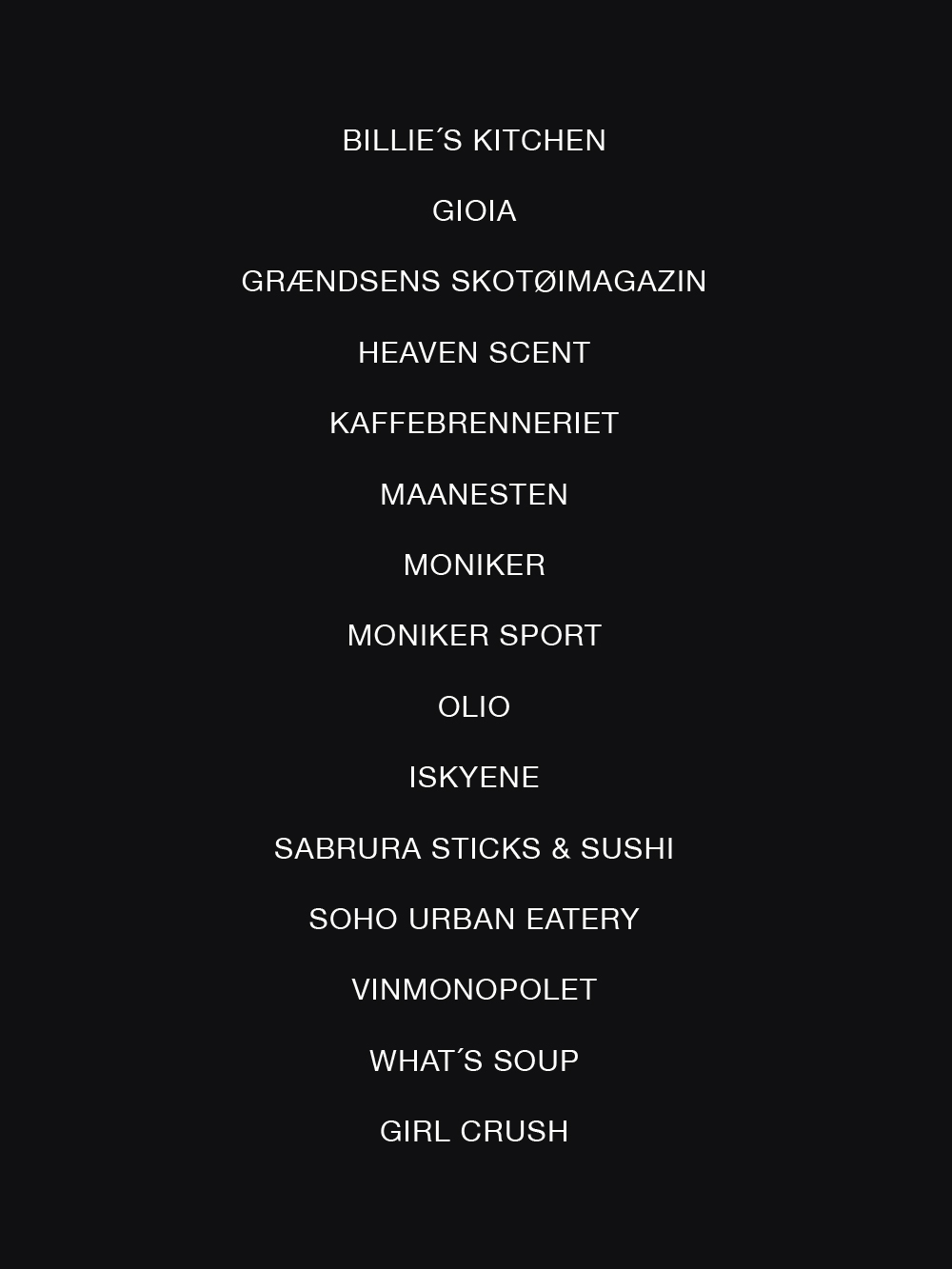
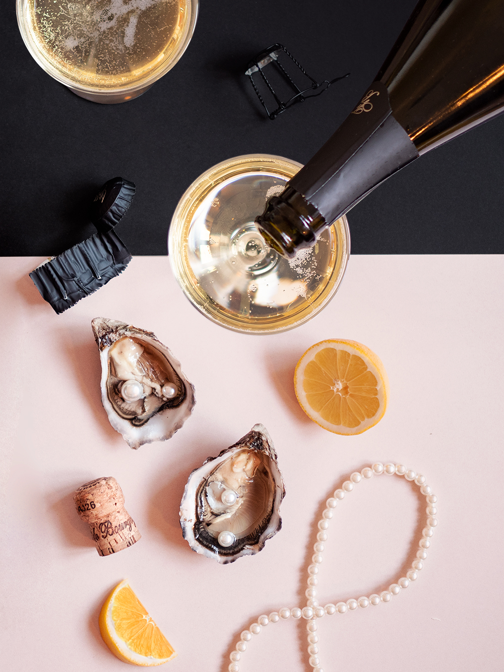
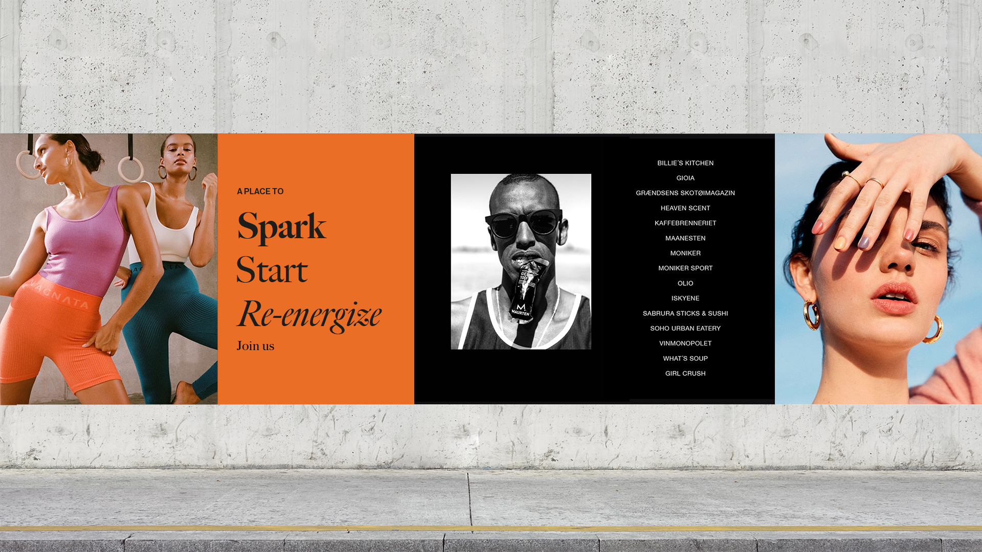
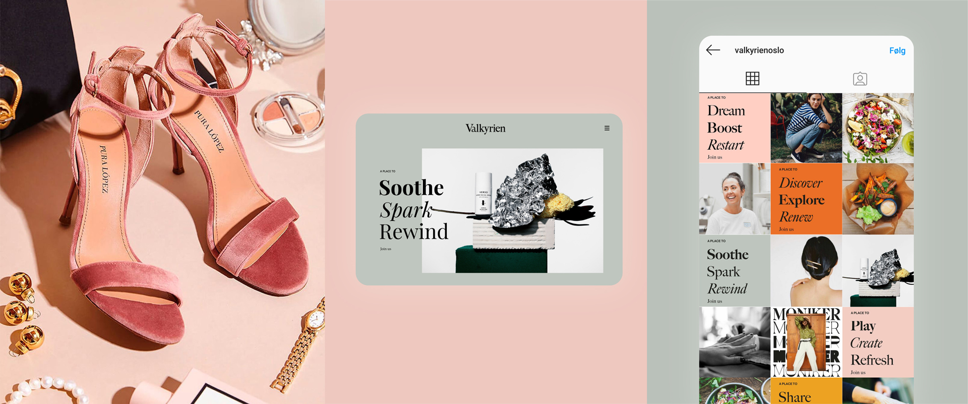
Welcome to Valkyrien, a completely new shopping experience at Majorstuen Oslo. Valkyrie is a treasure chest filled with great experiences, good tastes and inspiring fashion.
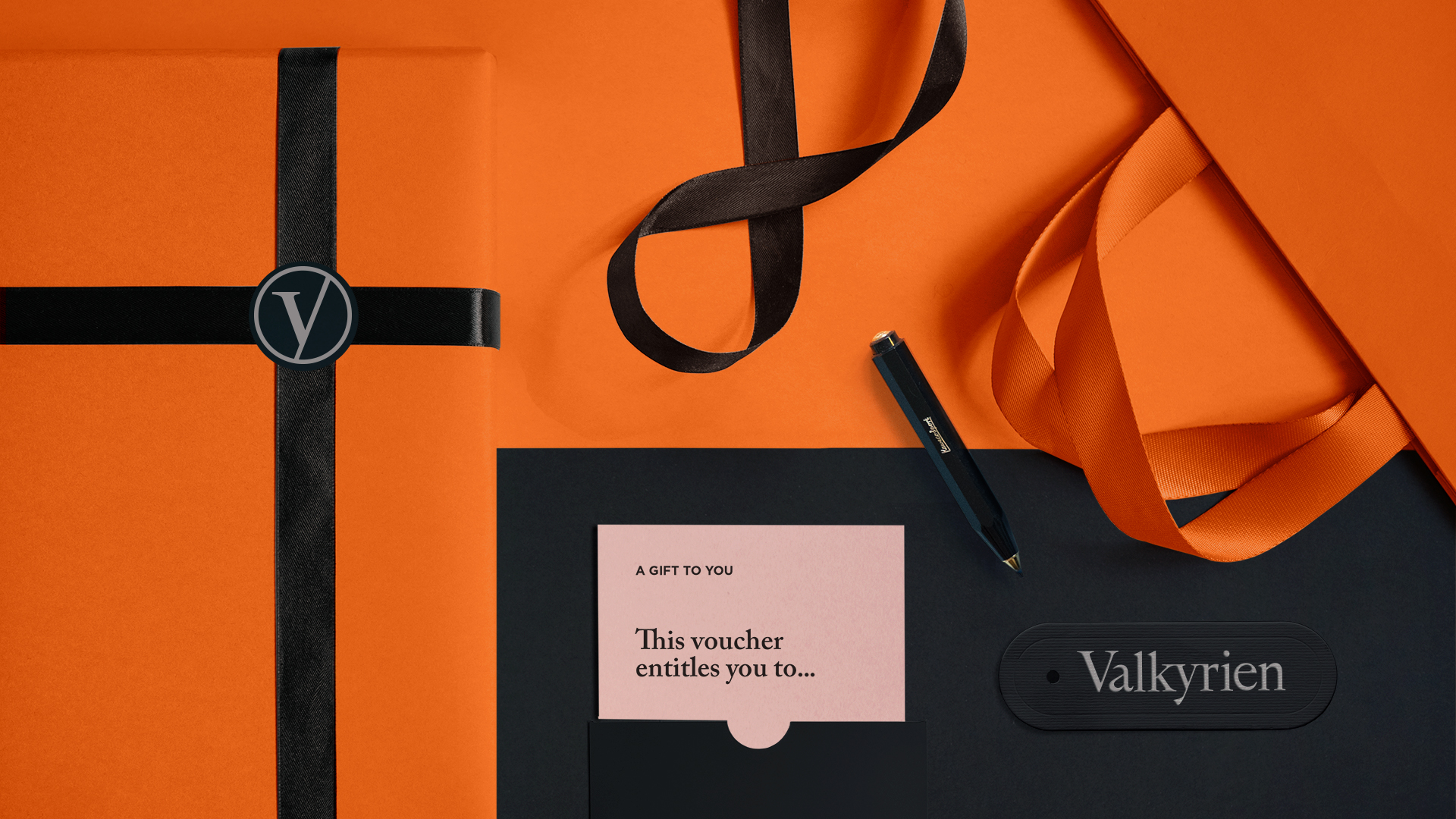
The communication challenge with this project was to make a concept that was inspiring, appealing and commucative in digital as well as print and to represent the different shops. The identity is simplified with black neutral as a base and colours in system to be used with different style and expressions.
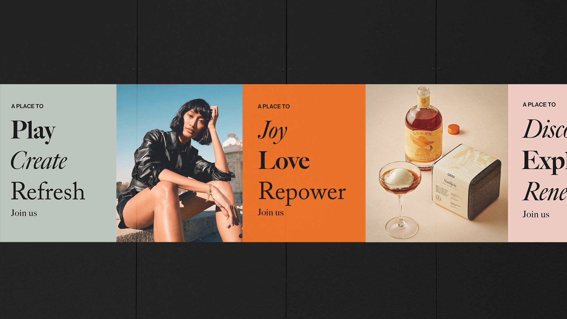
This is an environment that speaks to the emotions, a place of discovery, where people want to hang out and drop by. Where they come for fun and entertainment, to be surprised. Supporting this forward-facing retail aspiration, the architectural style of Valkyrien combines elements old and new to create a unique experience for discerning shoppers.
This is an environment that speaks to the emotions, a place of discovery, where people want to hang out and drop by. Where they come for fun and entertainment, to be surprised. Supporting this forward-facing retail aspiration, the architectural style of Valkyrien combines elements old and new to create a unique experience for discerning shoppers.
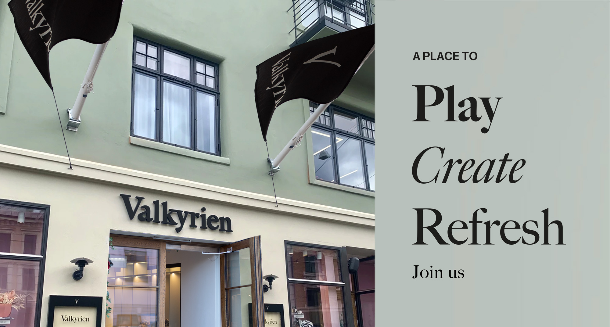
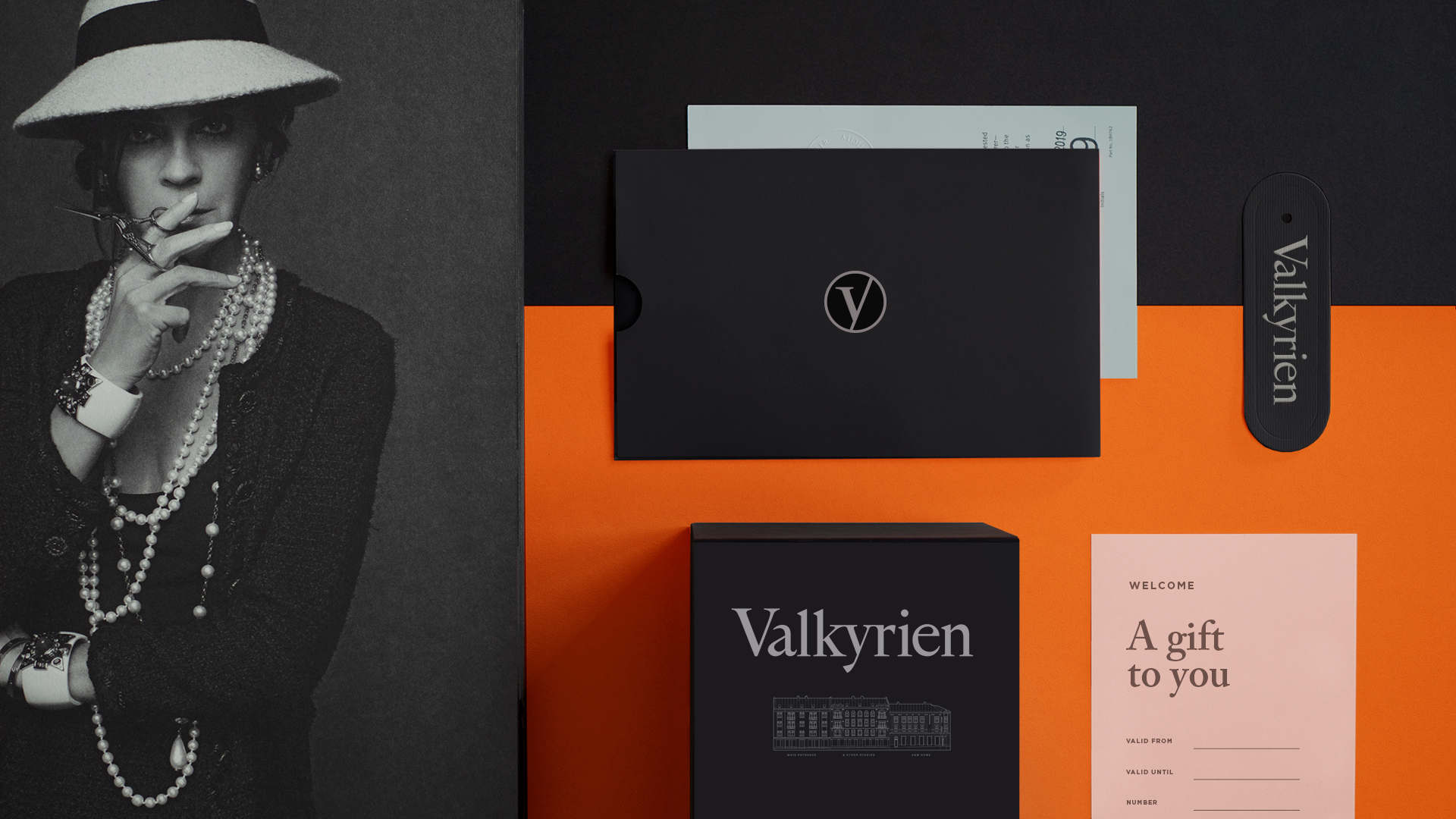
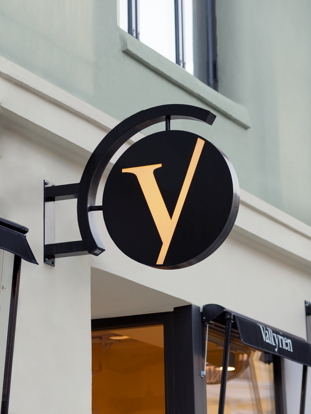
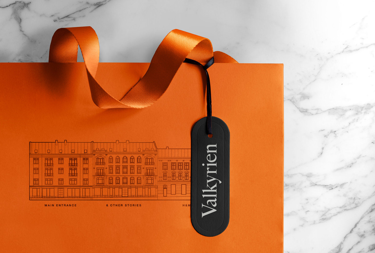
The name Valkyrien comes from a subway station that is closed. The buildings are located next to a large Y (V) shape and this is the main inspiration for the logo symbol. The identity is built on classic craftsmanship in typography with a color palette that in combination creates a bridge between, reverence and fashion lifestyle.
The name Valkyrien comes from a subway station that is closed. The buildings are located next to a large Y (V) shape and this is the main inspiration for the logo symbol. The identity is built on classic craftsmanship in typography with a color palette that in combination creates a bridge between, reverence and fashion lifestyle.


Work
Freia PremiumPackaging
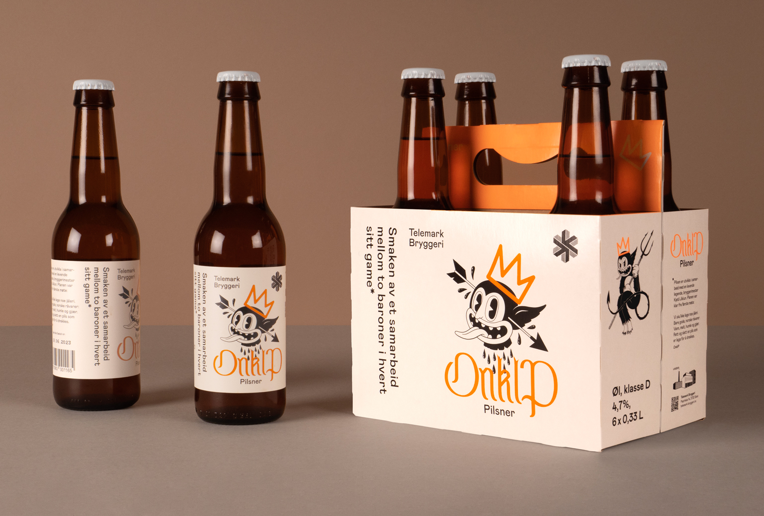
Onklp PilsnerPackaging
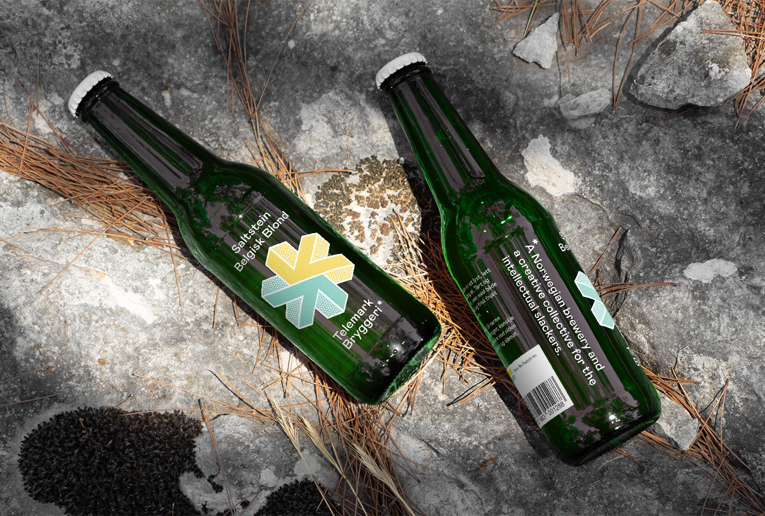
Telemark BryggeriPackaging
ValkyrienBranding
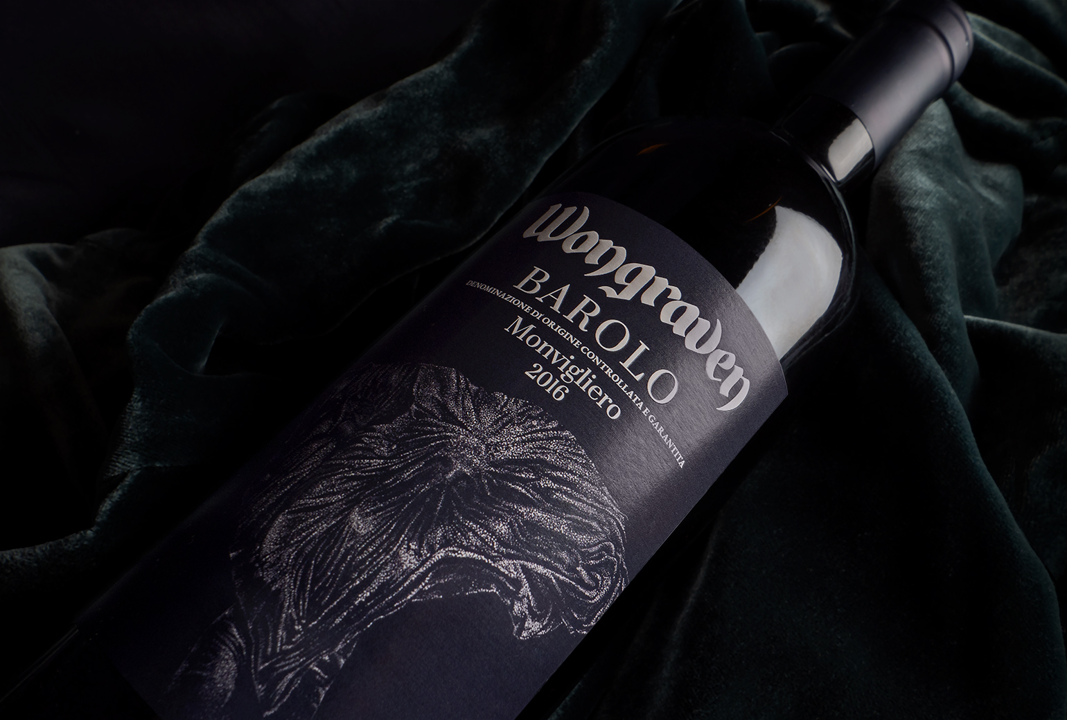
Wongraven Barolo MonviglieroPackaging
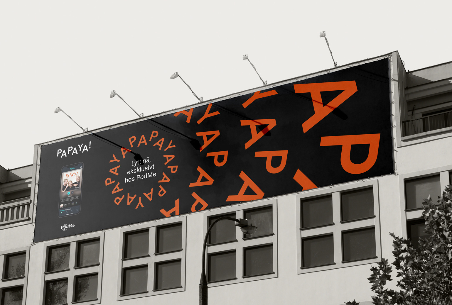
PAPAYAIdentity
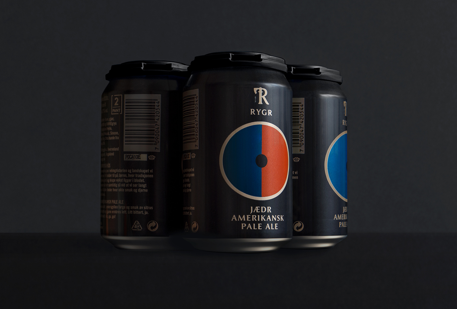
RYGRPackaging
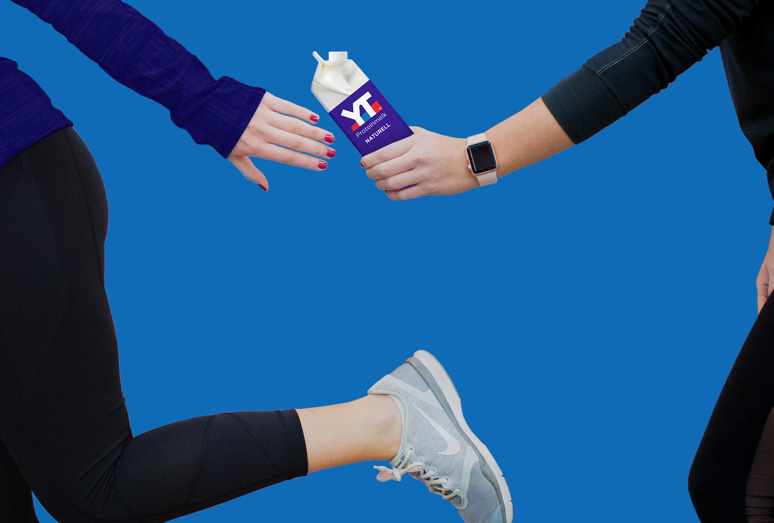
TINE YTPackaging
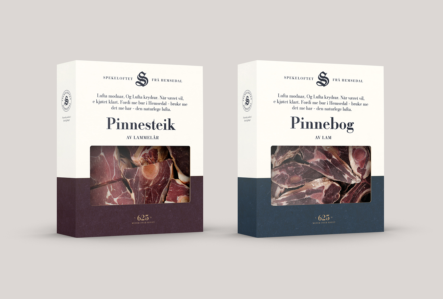
SpekeloftetPackaging
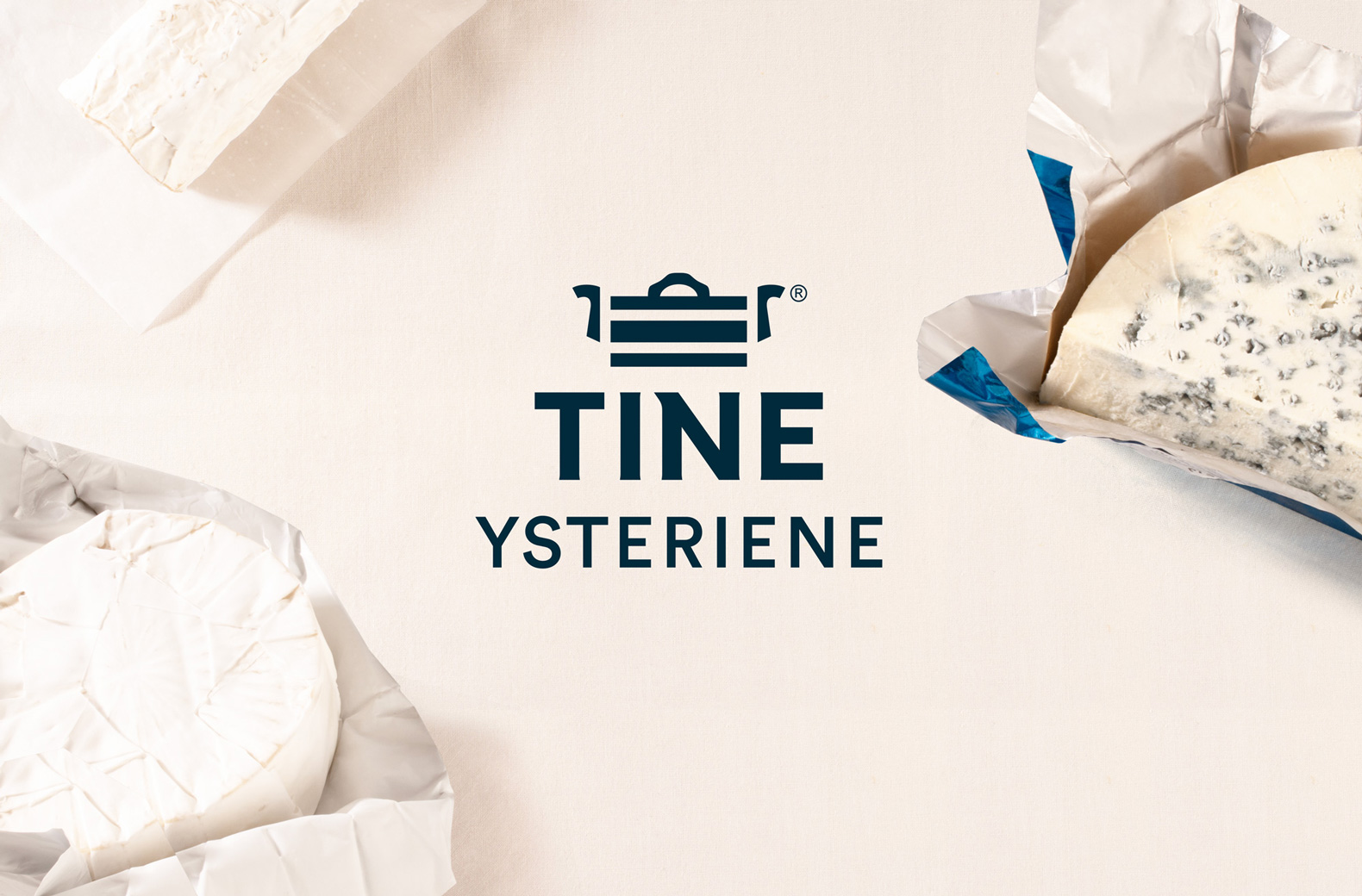
TINE YsterierPackaging
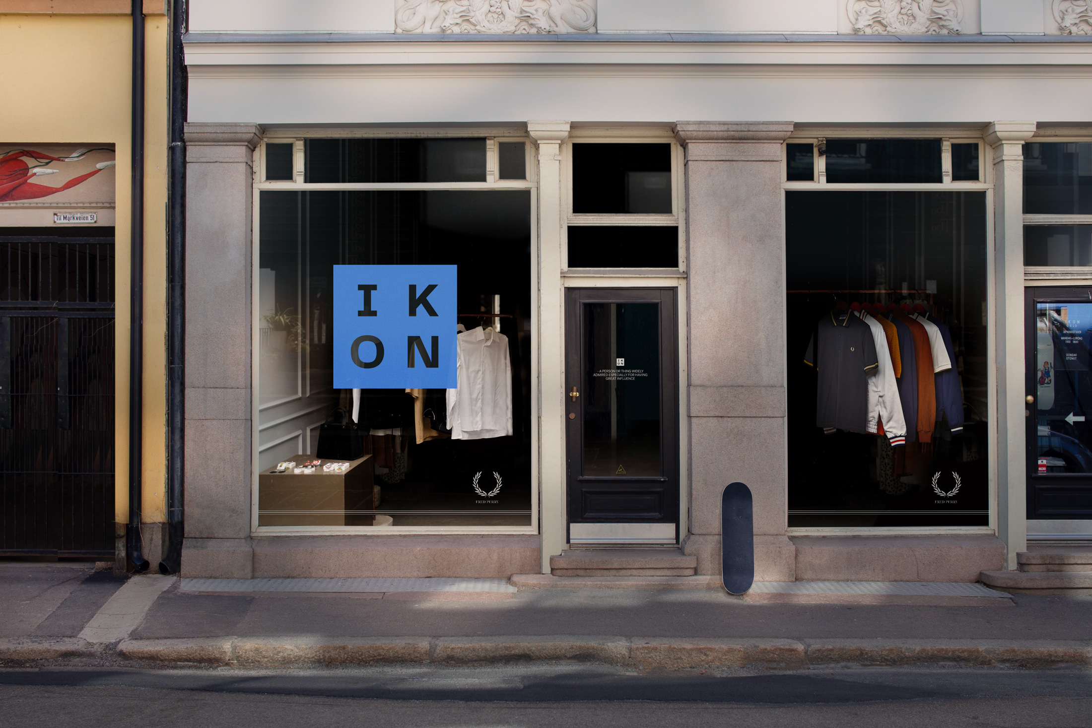
IKONBrand Identity
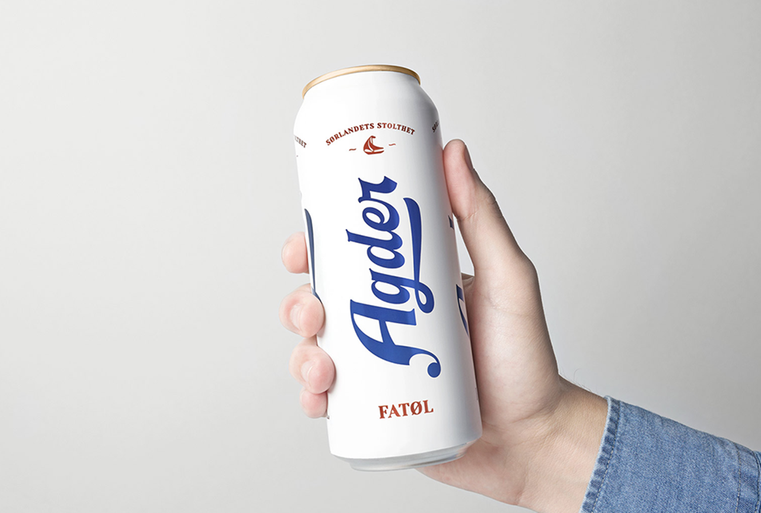
Agder BryggeriPackaging
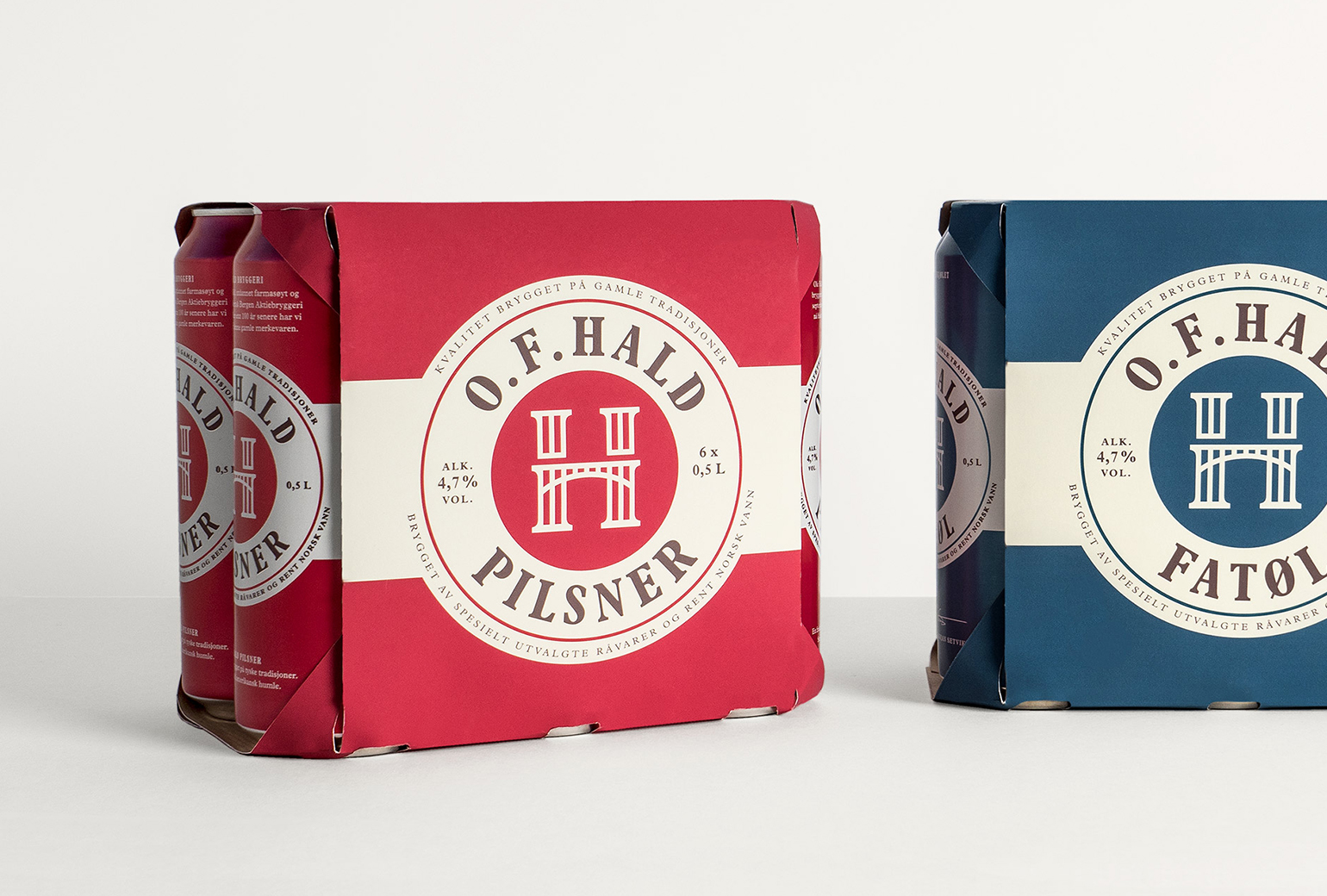
O.F.HaldPackaging
Norske BryggerierBranding
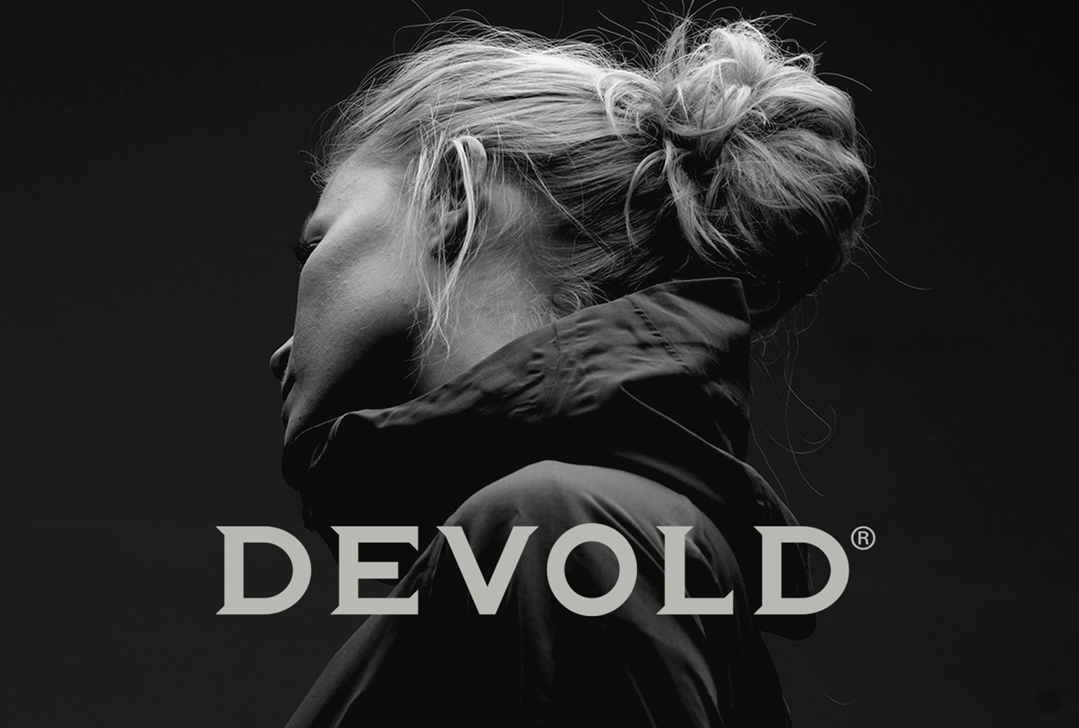
DevoldBrand Development
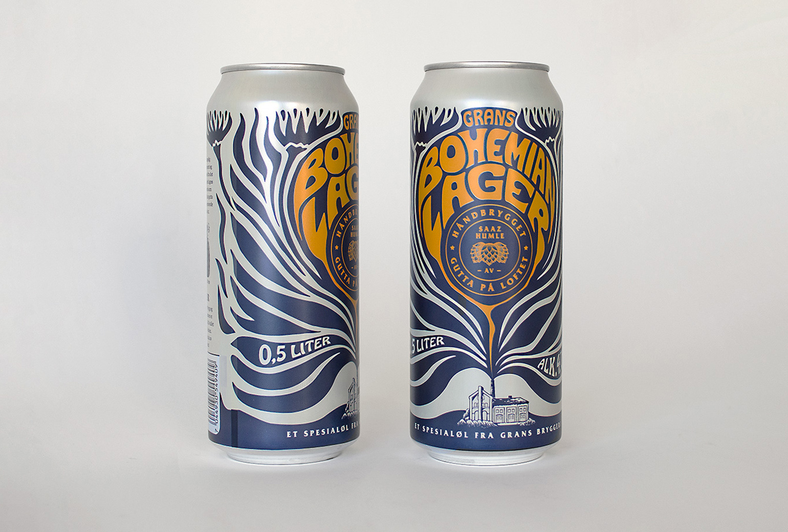
Bohemian LagerPackaging
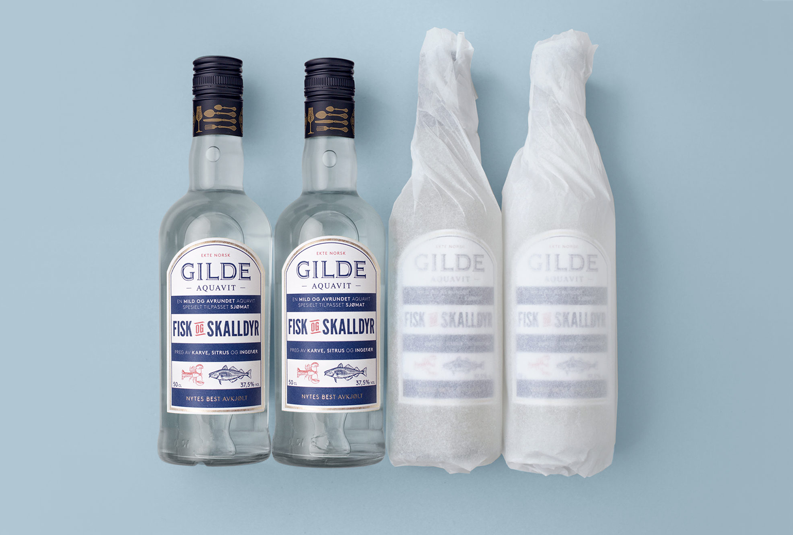
Gilde AquavitPackaging
Bama StorkjøkkenBrand Development
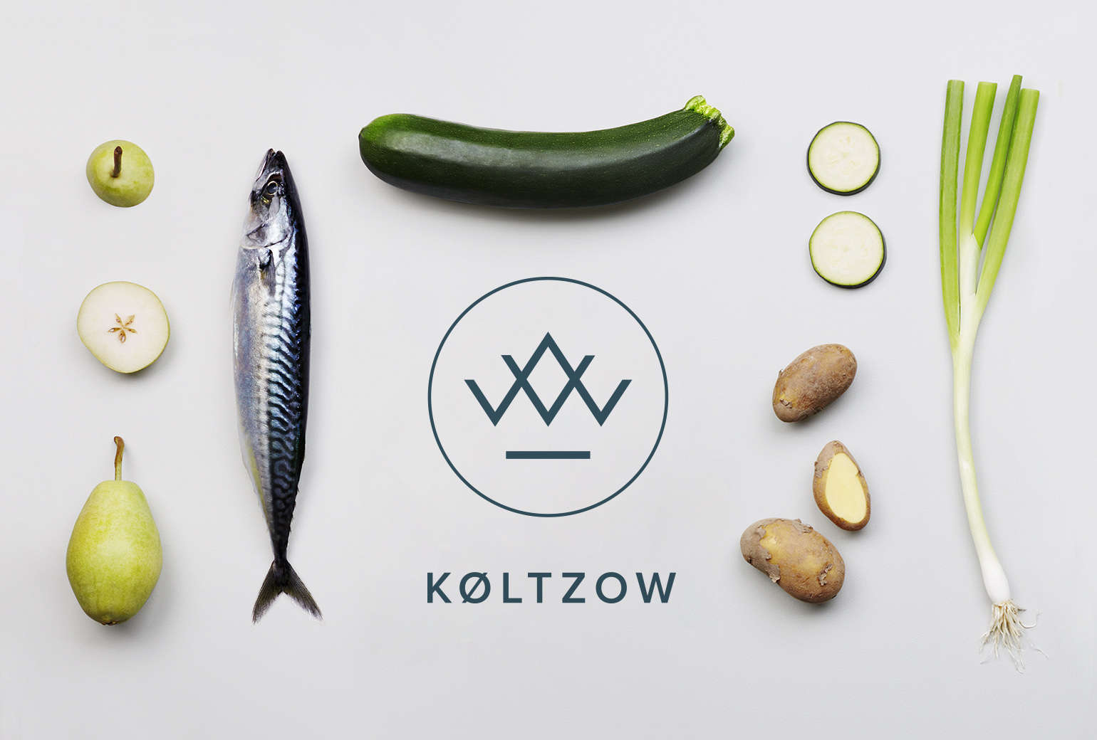
KøltzowBrand Identity
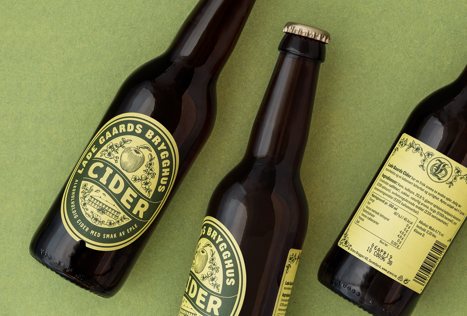
Lade Gaards CiderPackaging Design
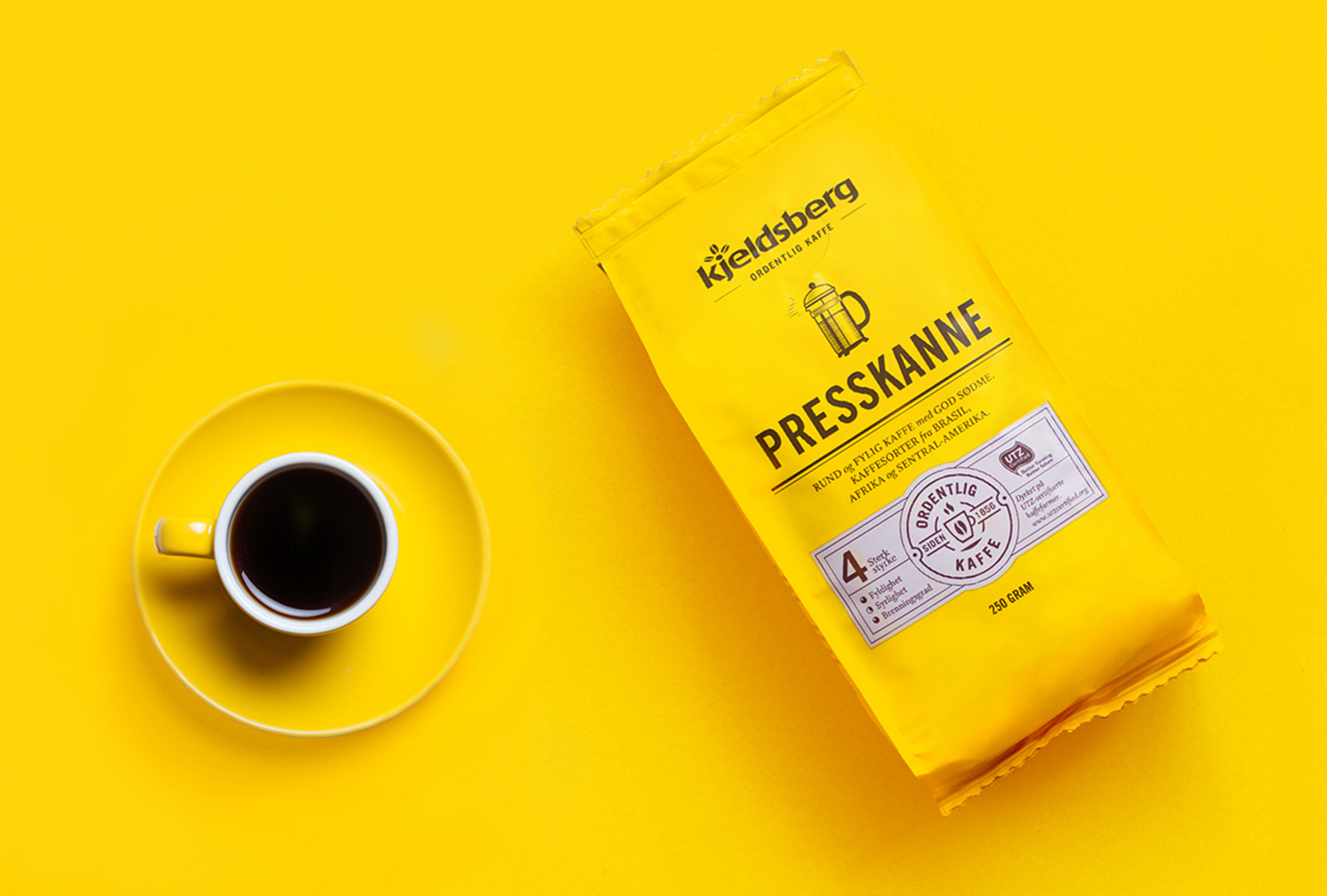
Kjeldsberg KaffePackaging Design
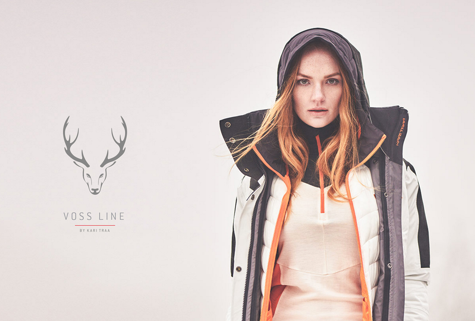
VosslineBrand identity / packaging
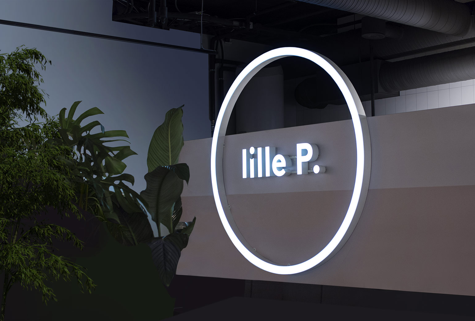
Lille PBrand Identity
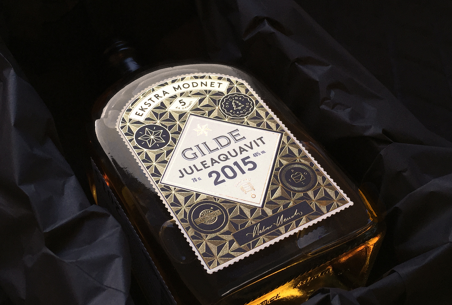
Gilde juleaquavitPackaging
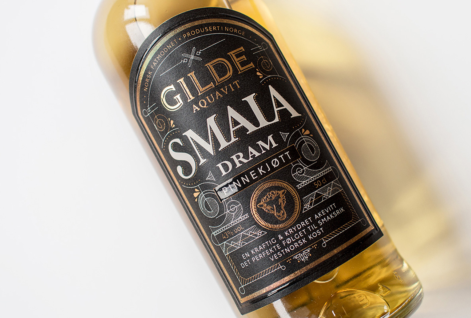
Gilde Aquavit - SmalaPackaging