RYGR Brygghús
Brand Identity / Packaging
Agency: SMFB Dinamo (Frank)
Client: Rema 1000
Design: Geir Solem Lysbakken / Marius Wathne
Text: Sune Parker
Foto: Tommy Andresen / Roman Jøe (Lysebotn) / Geir Solem Lysbakken
Model: David McInnes
Project manager: Karianne Stenby
Consultant: Oscar Michaelsen
Visuelt Diploma
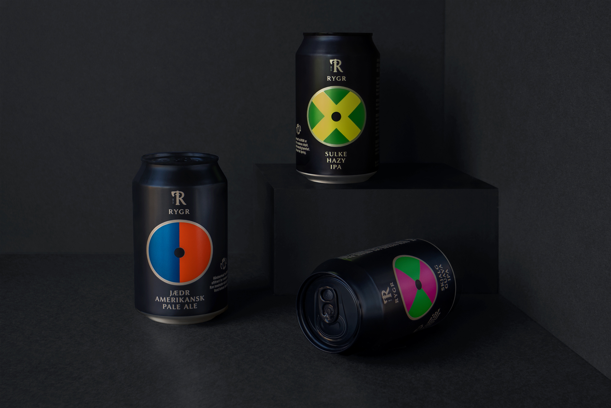
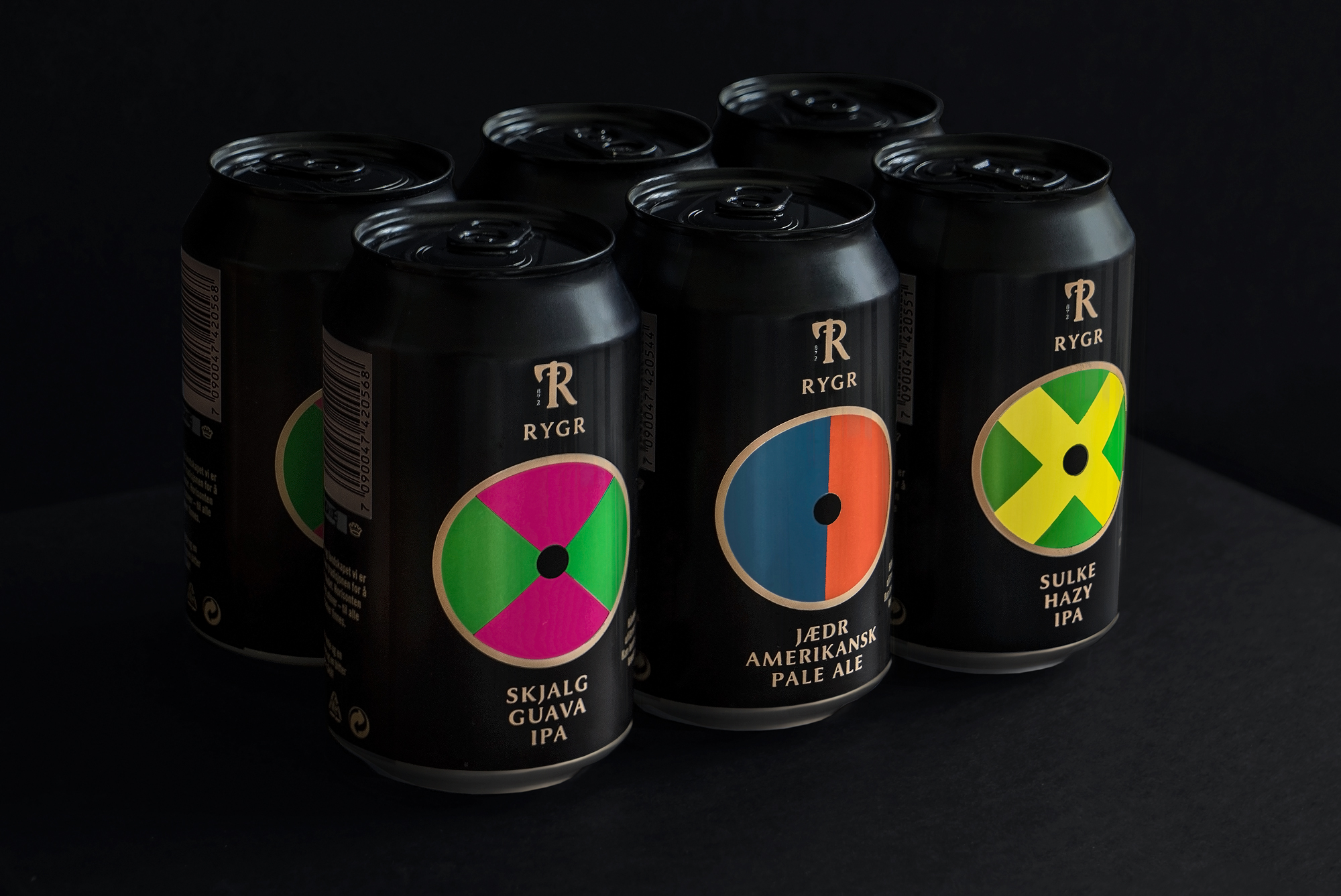
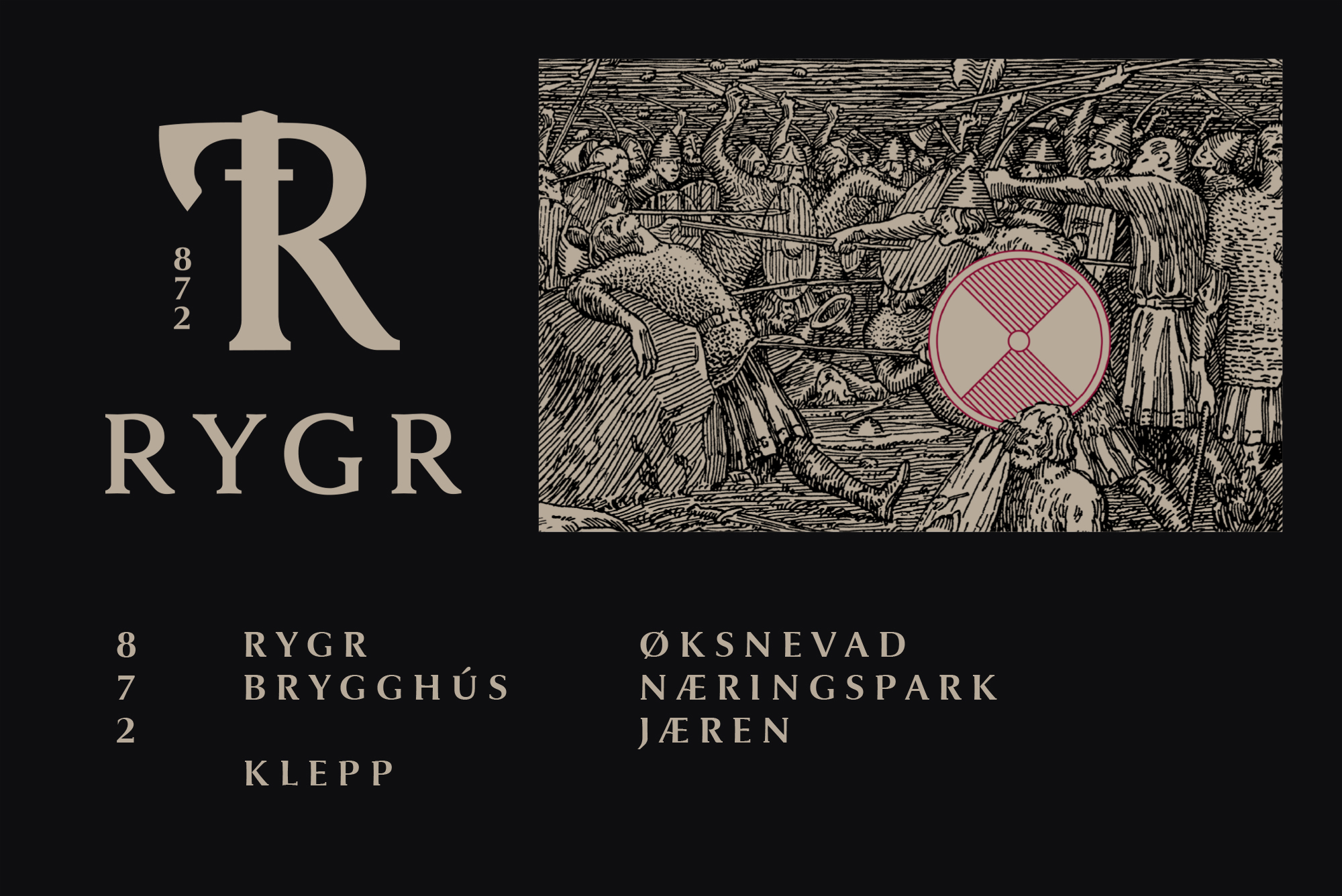
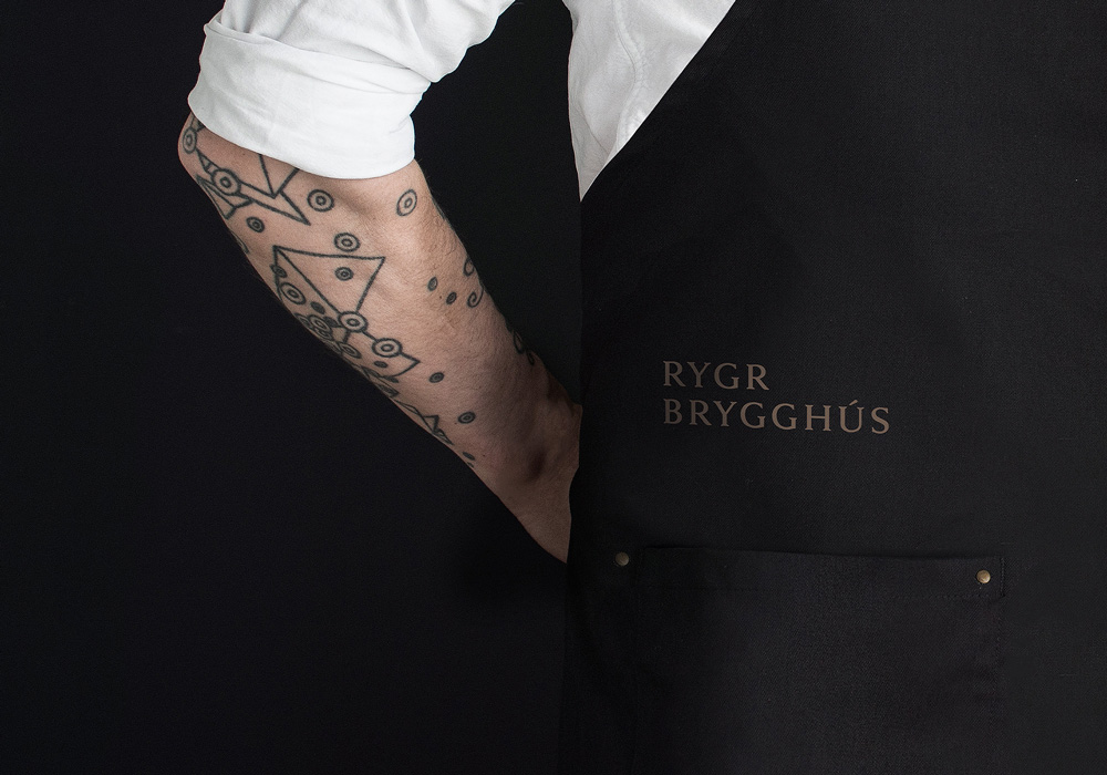
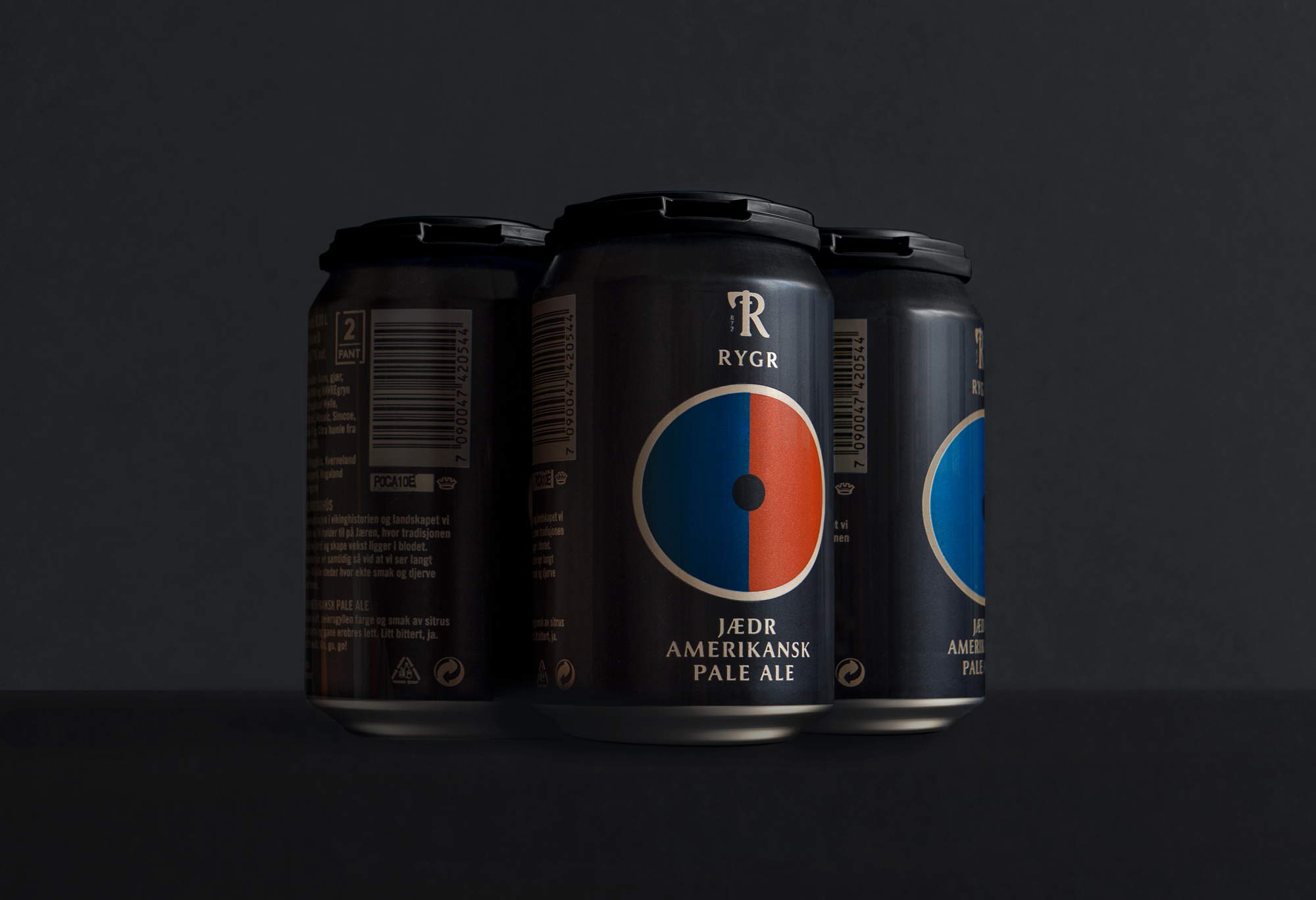
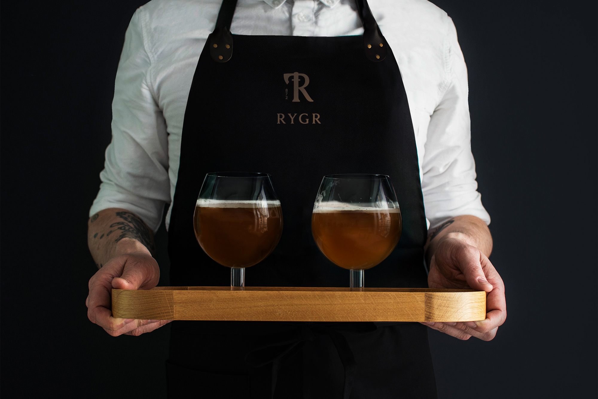
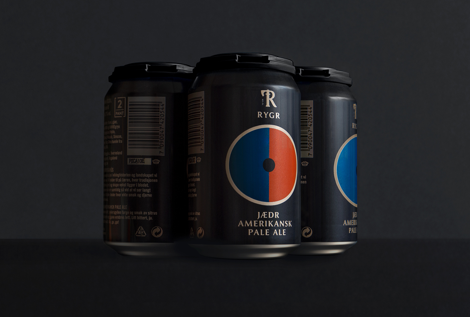
RYGR Brygghús is a local brewery by Norske Bryggerier (Norwegian Breweries) and is part of the company's strategy to establish local breweries along the Norwegian coastline. RYGR is the original Norse name for the western region of Norway, Rogaland. The area is known for its rich Viking history, particularly the famous and great naval battle fought in Hafrsfjord around year 872 which led to the unification of Norway.
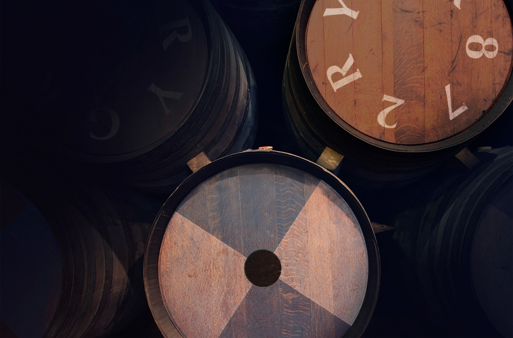
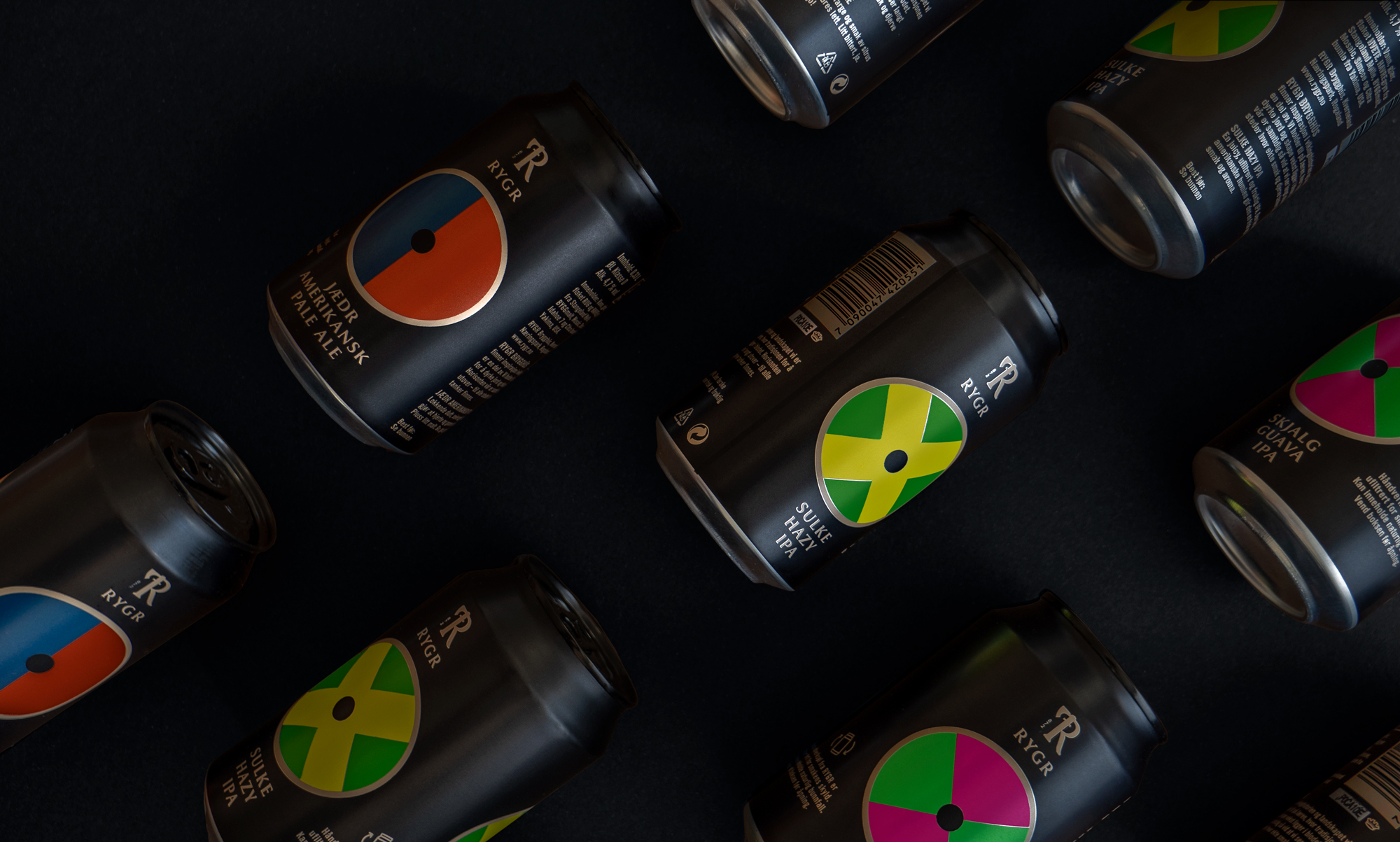
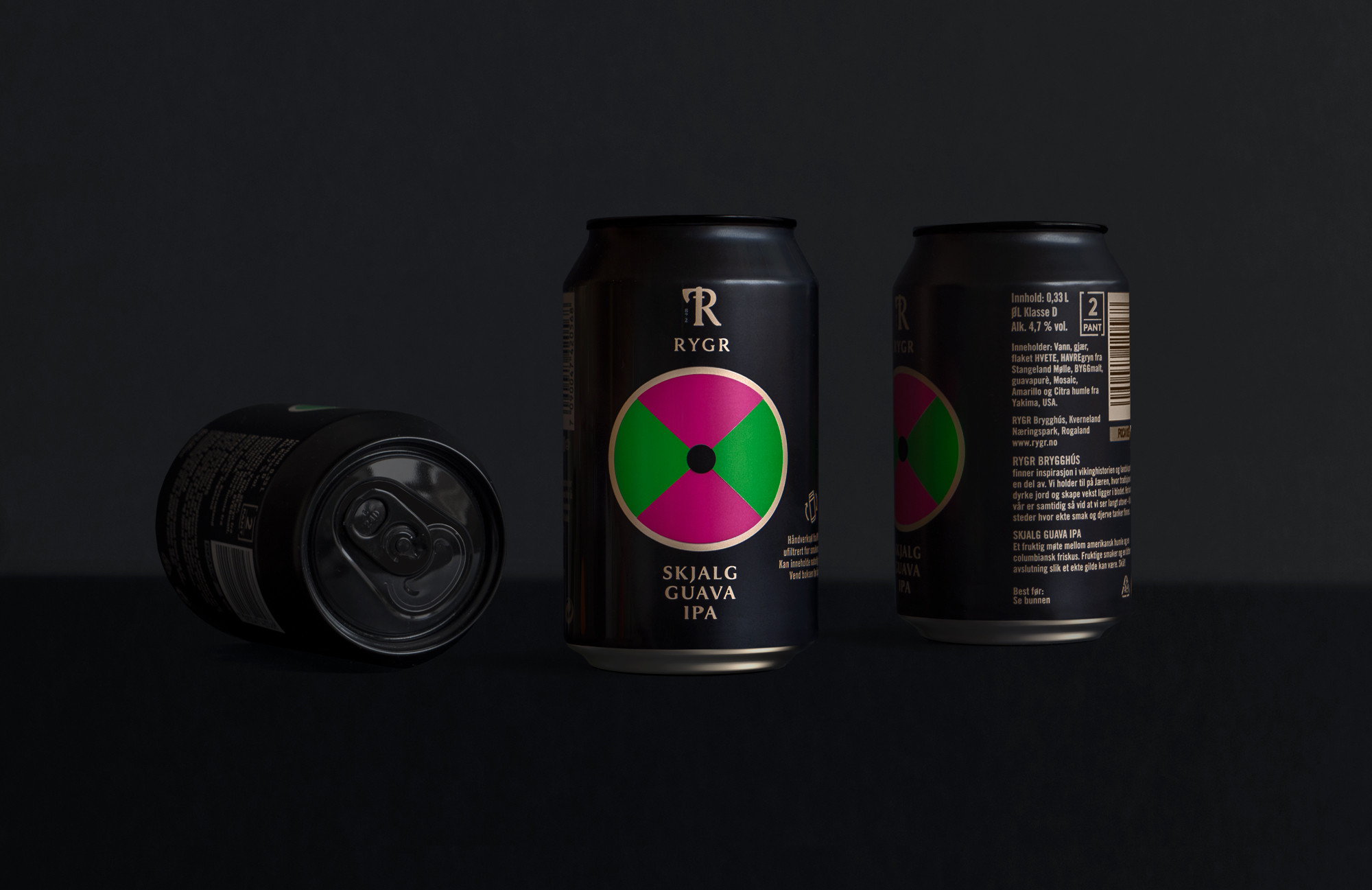
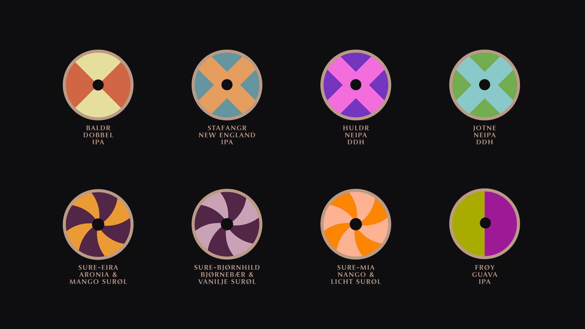
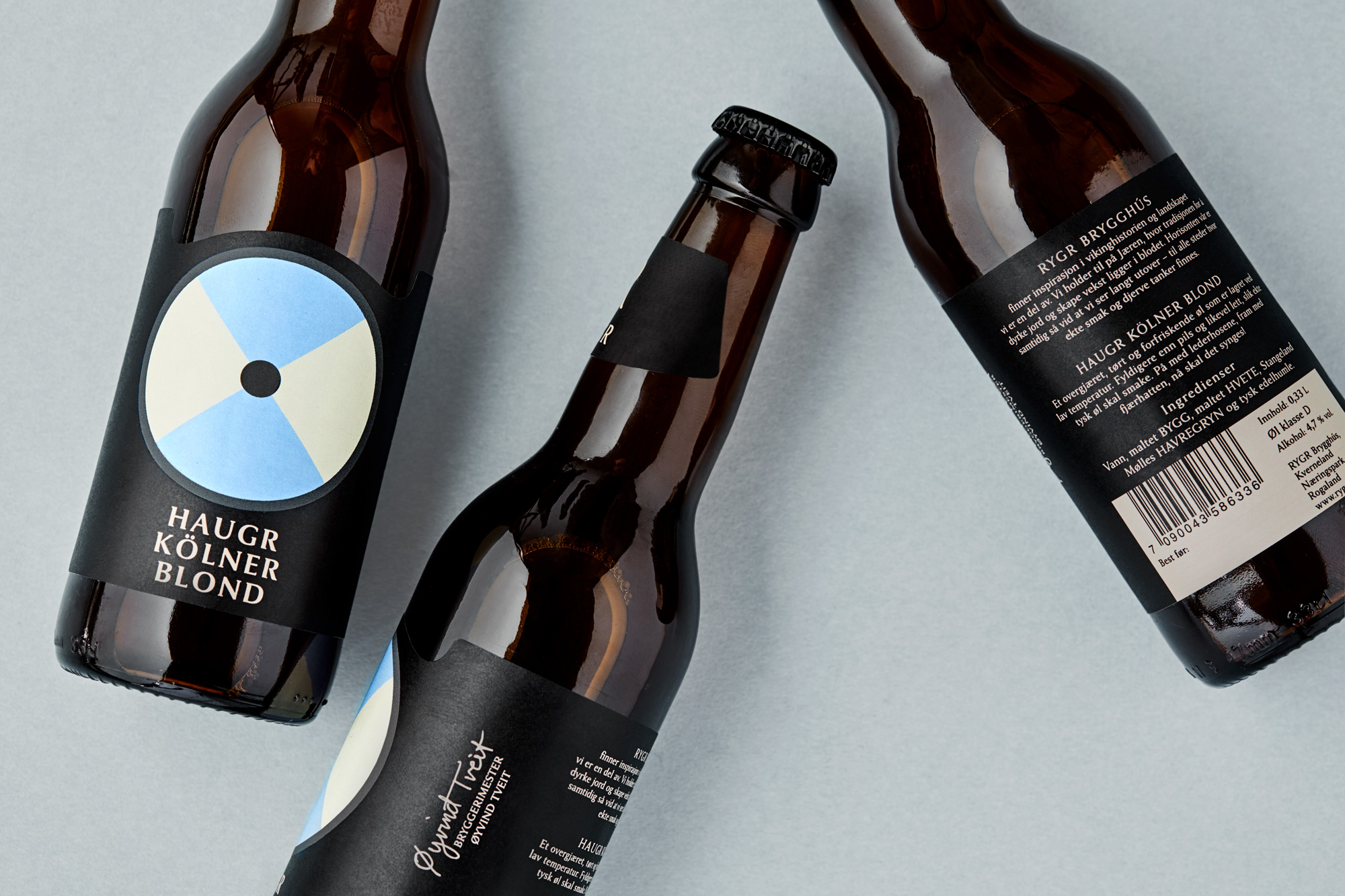
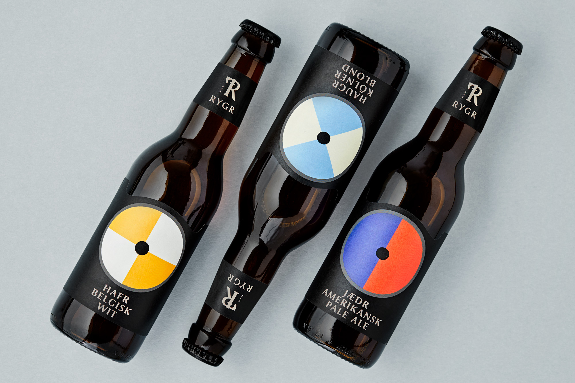
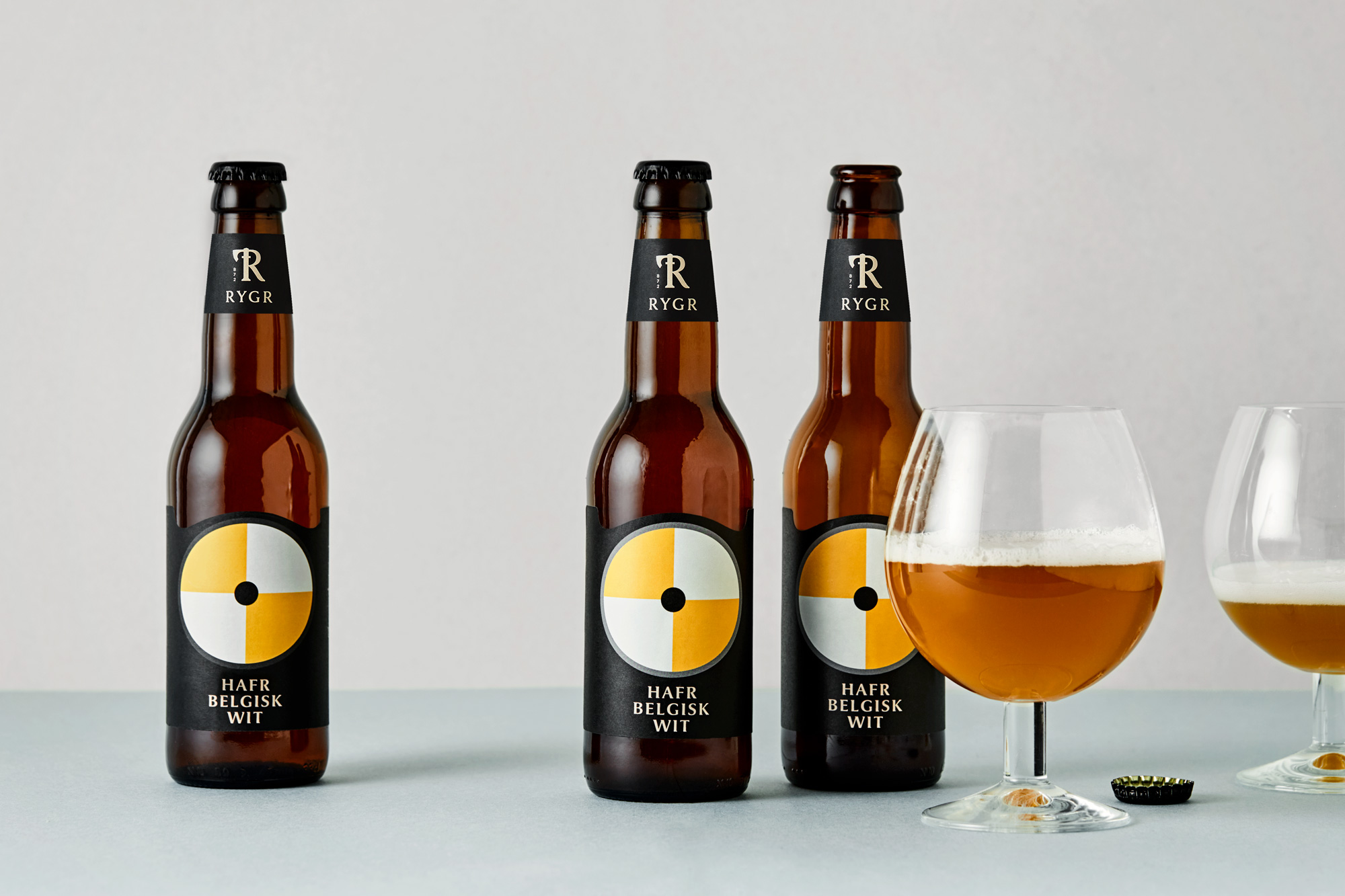
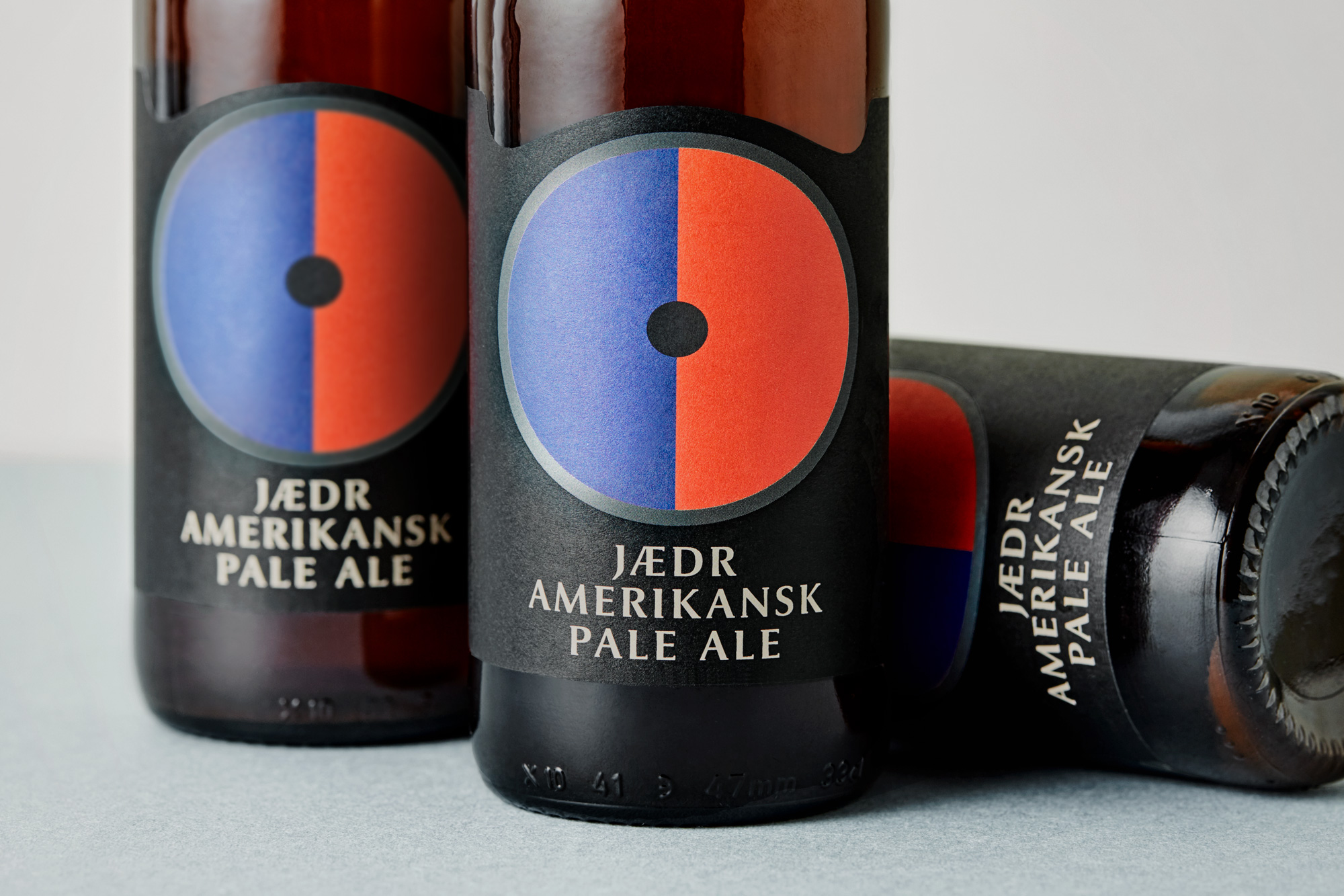
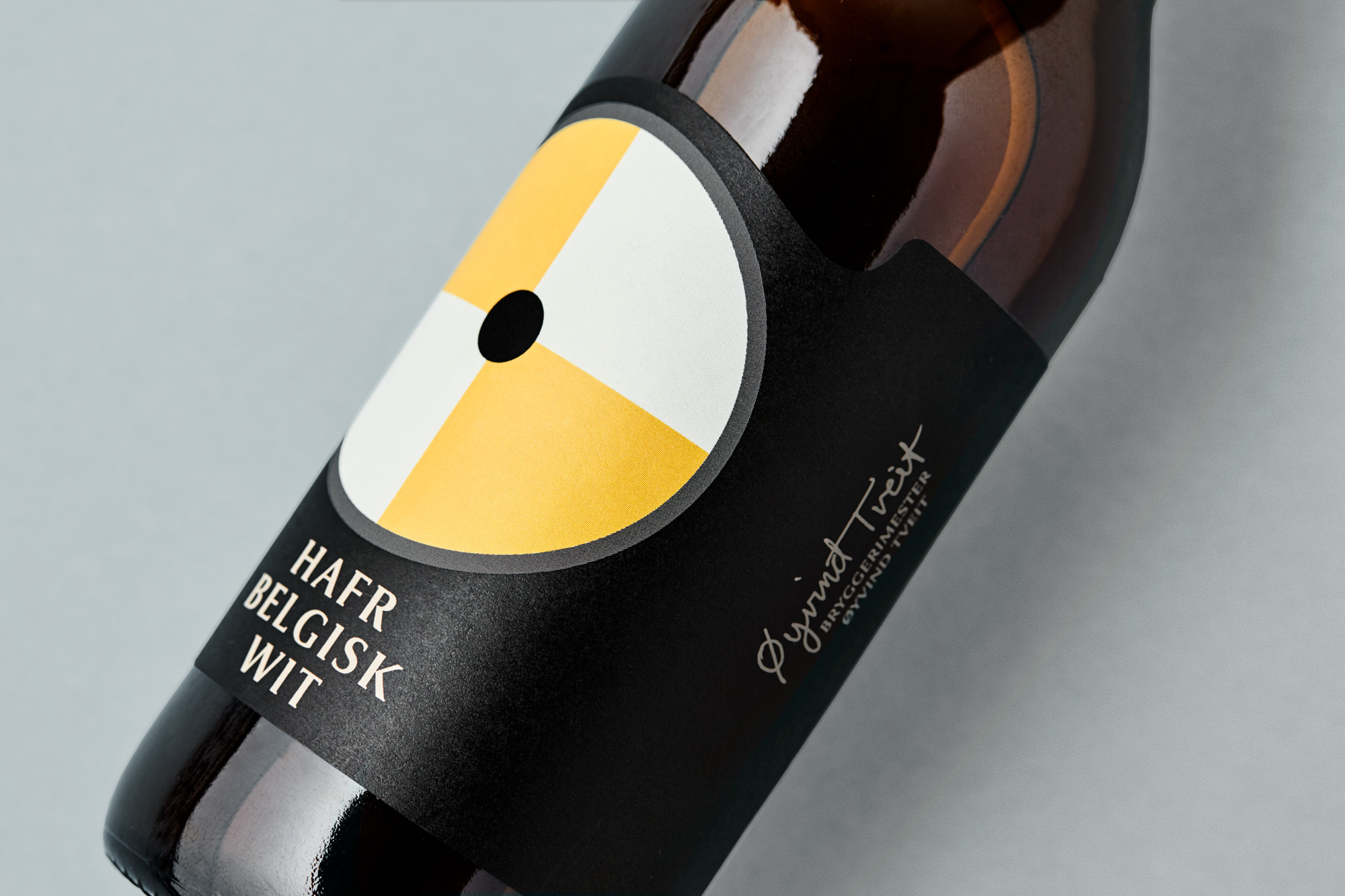
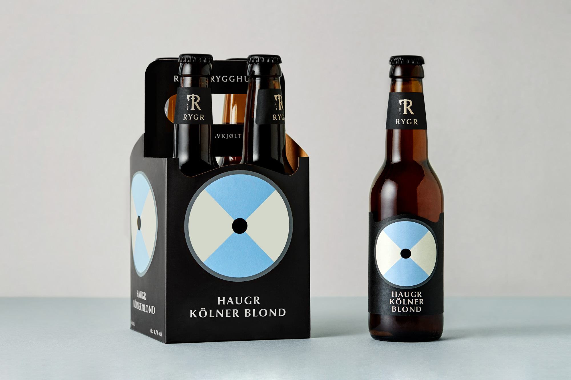
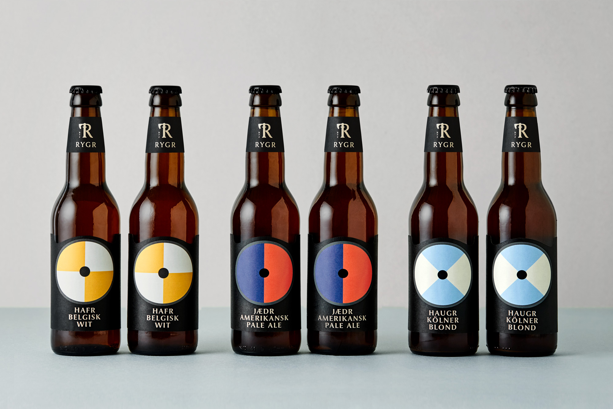
The design concept is based on the proud Viking saga and the excellent craftsmanship and rich trading culture. Using shields for the main design and a system of endless possibilities, embracing any new type of beer using both patterns and colors in combinations which allows numerous and distinct series with a clear difference between the beer types.
The product names are from the region named from the viking era. Hafr is Hafrsfjord. Jædr is the original name for the beautiful place Jæren, and Haugr is their name for the town Haugesund on the west coast. The logo is developed from a viking axe to focus on the craftsmanship and the brewery is also located in Øksenevad (øks=axe).


Work
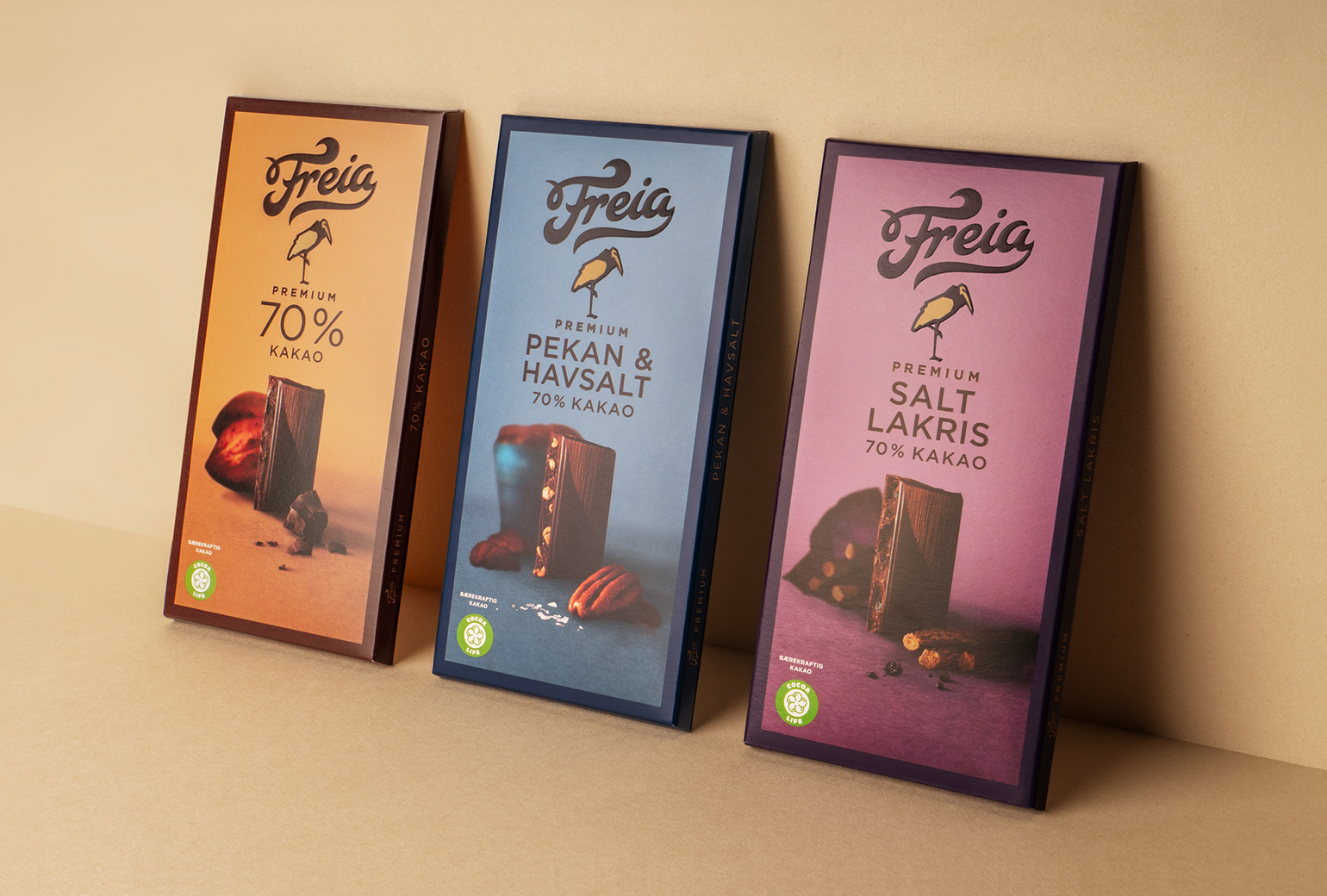
Freia PremiumPackaging
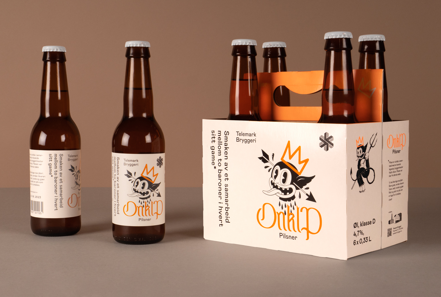
Onklp PilsnerPackaging
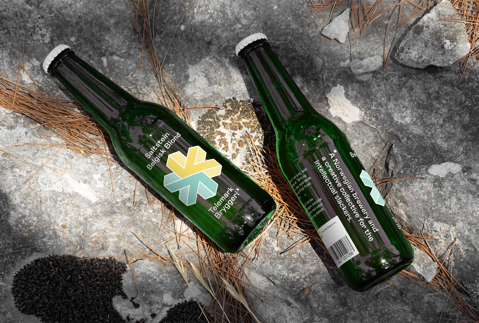
Telemark BryggeriPackaging
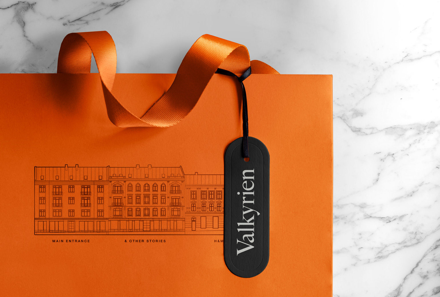
ValkyrienBranding
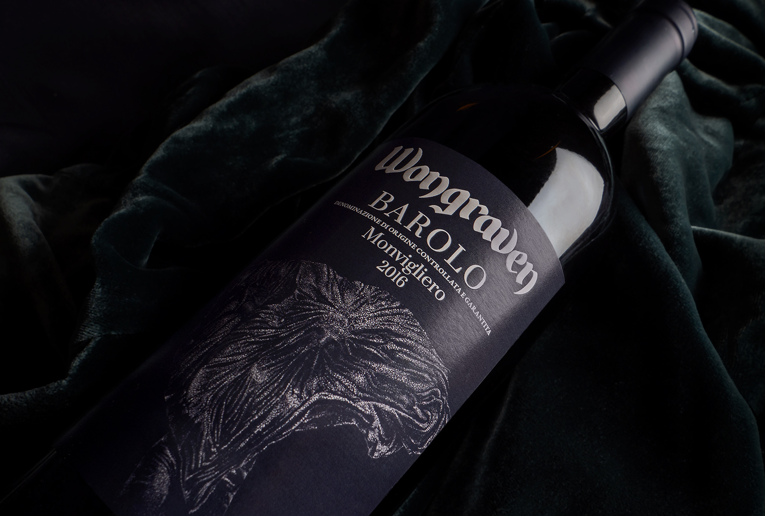
Wongraven Barolo MonviglieroPackaging
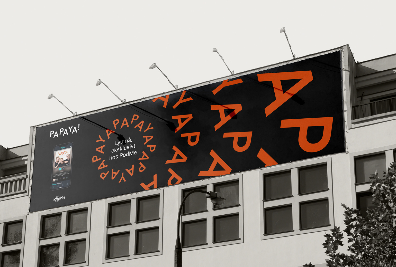
PAPAYAIdentity
RYGRPackaging
TINE YTPackaging
SpekeloftetPackaging
TINE YsterierPackaging
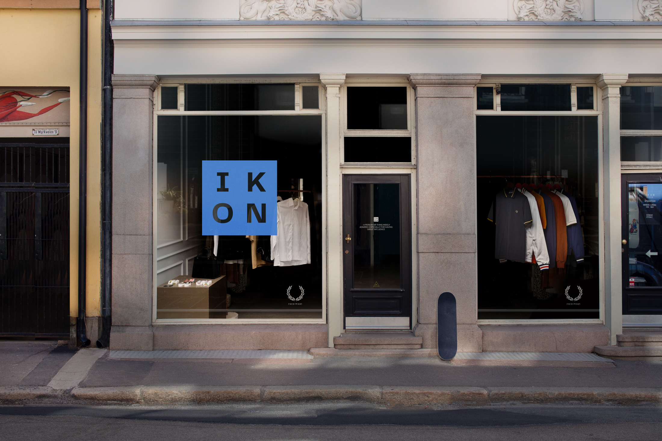
IKONBrand Identity
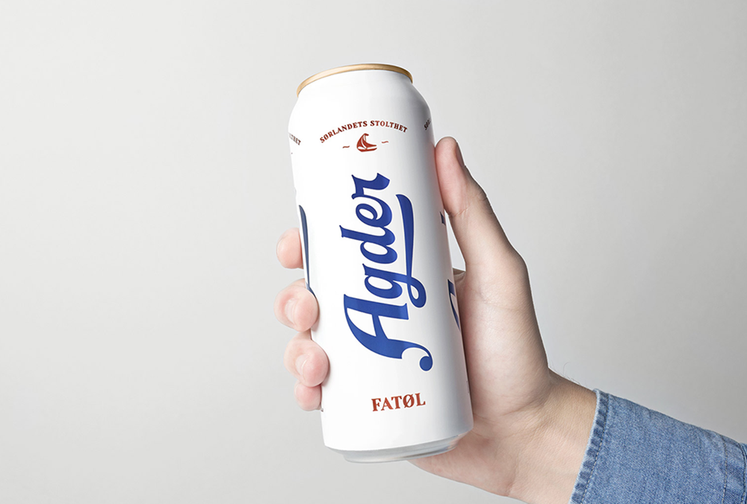
Agder BryggeriPackaging
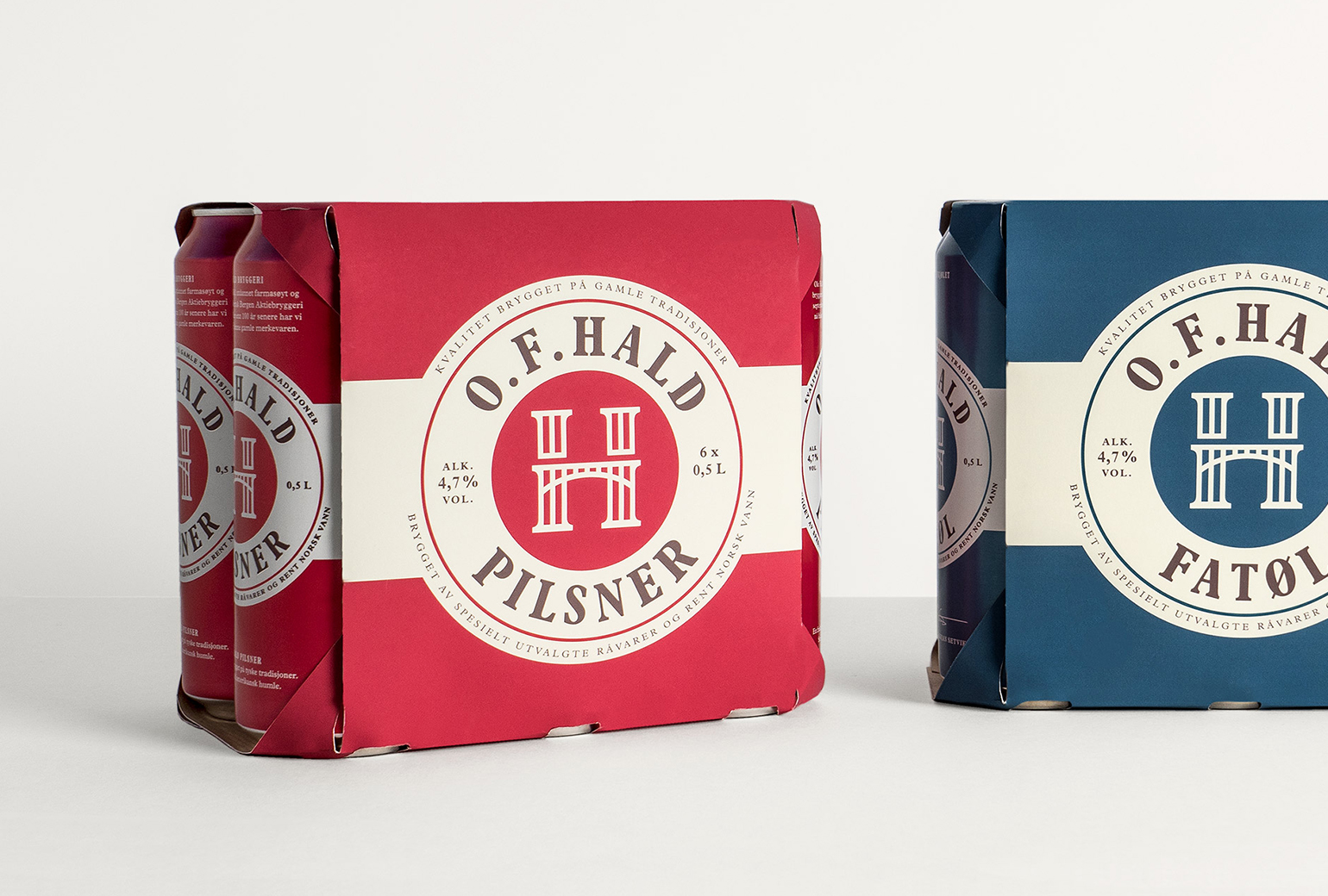
O.F.HaldPackaging
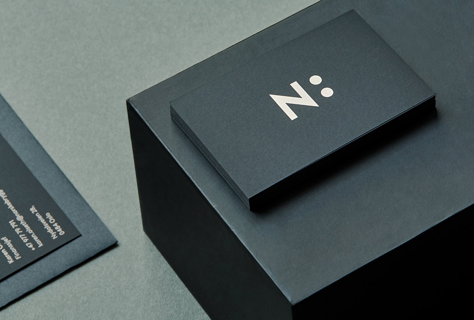
Norske BryggerierBranding
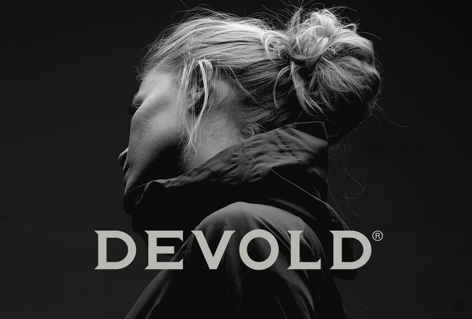
DevoldBrand Development
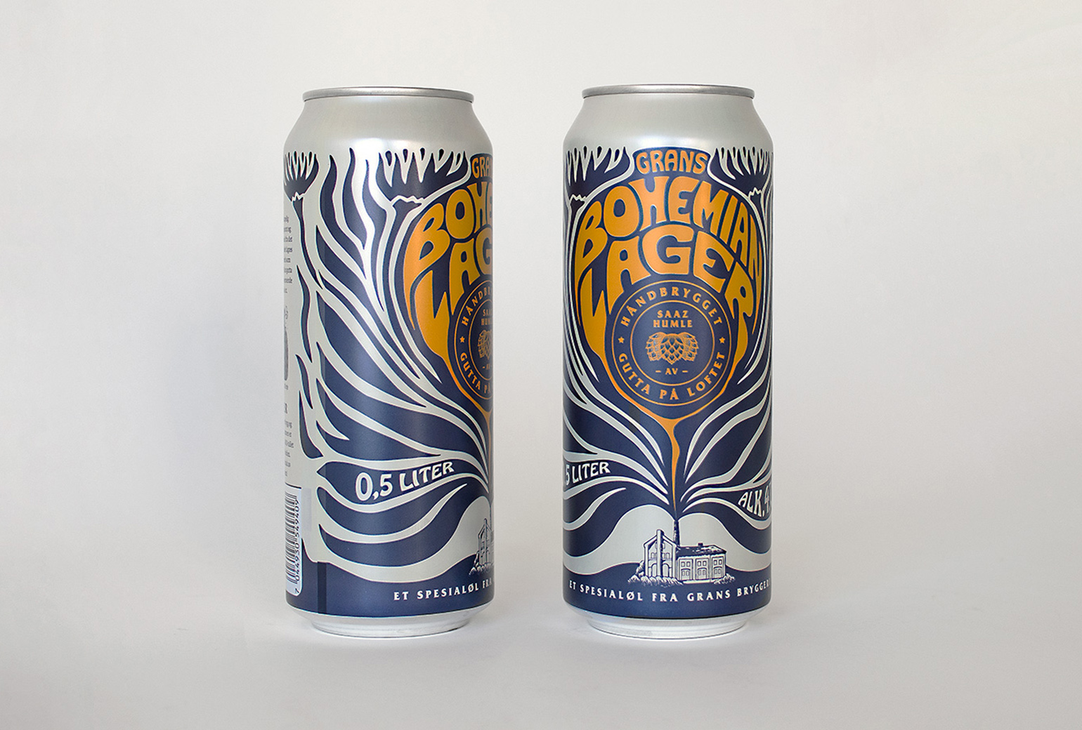
Bohemian LagerPackaging
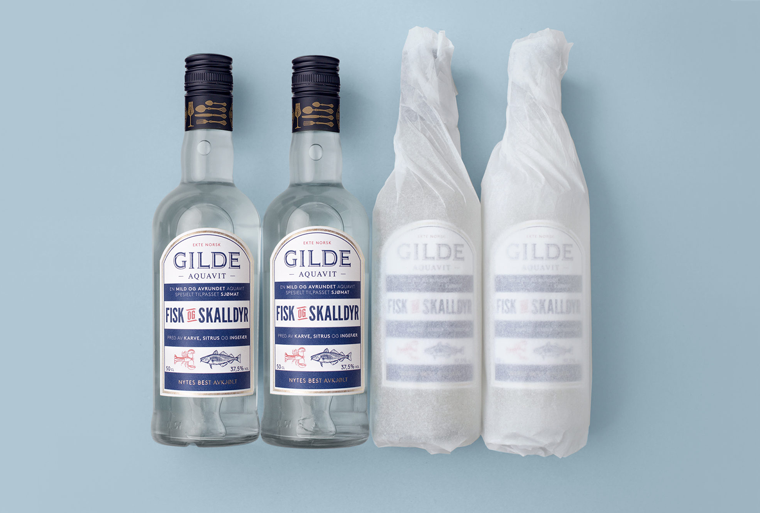
Gilde AquavitPackaging
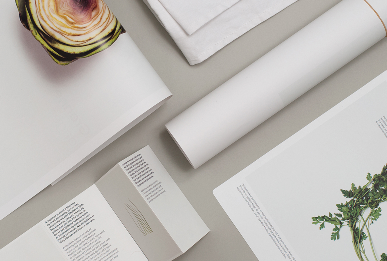
Bama StorkjøkkenBrand Development
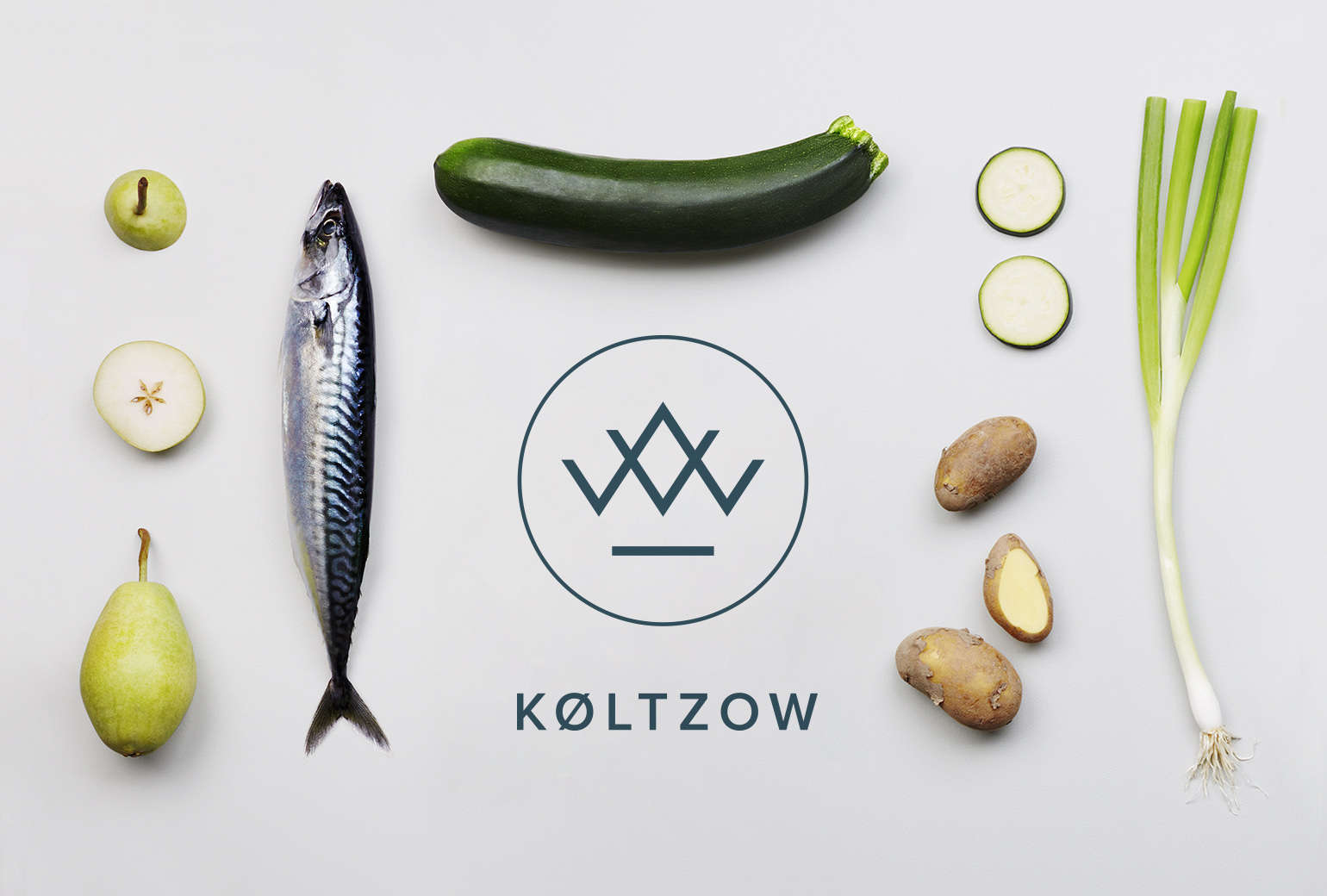
KøltzowBrand Identity
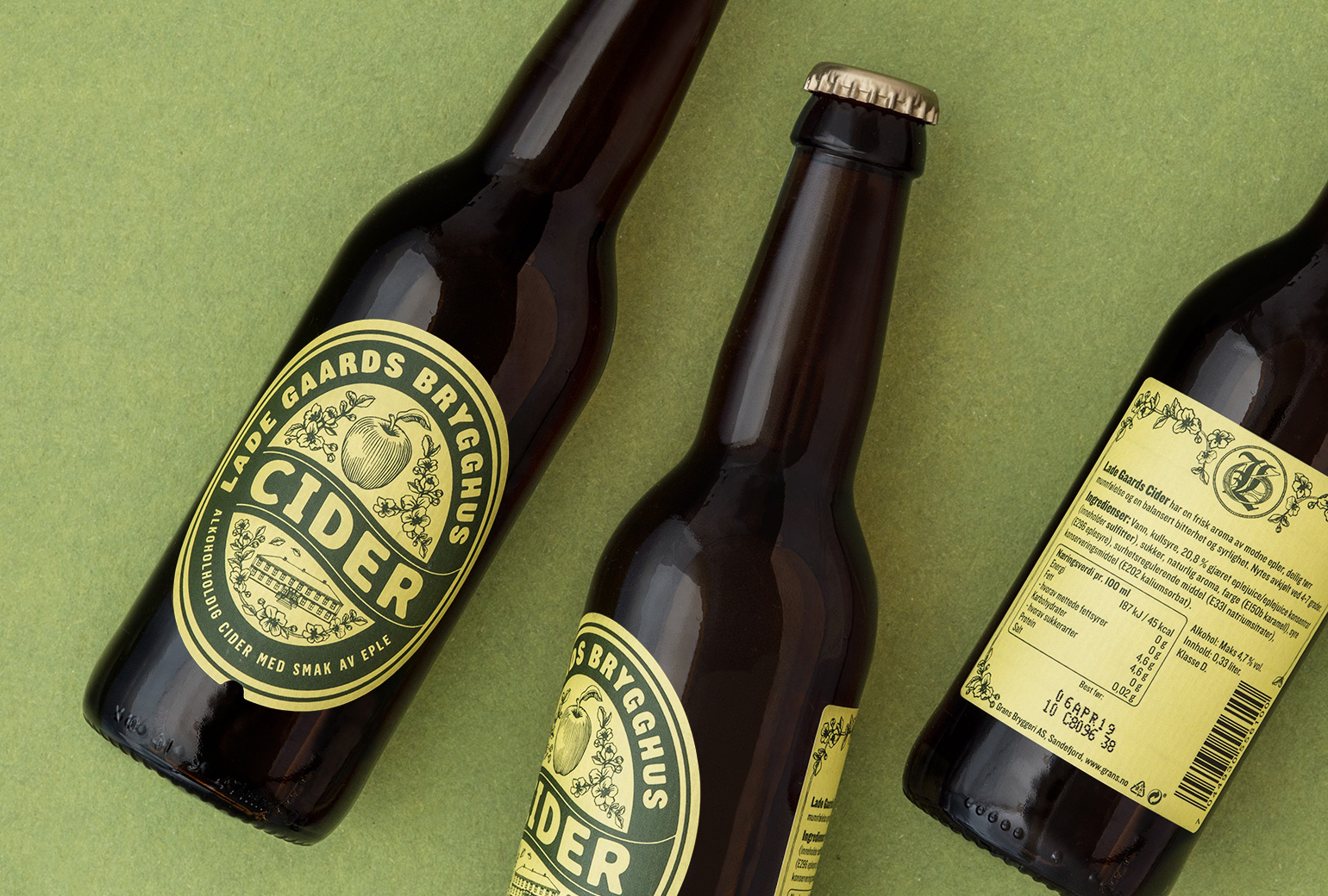
Lade Gaards CiderPackaging Design
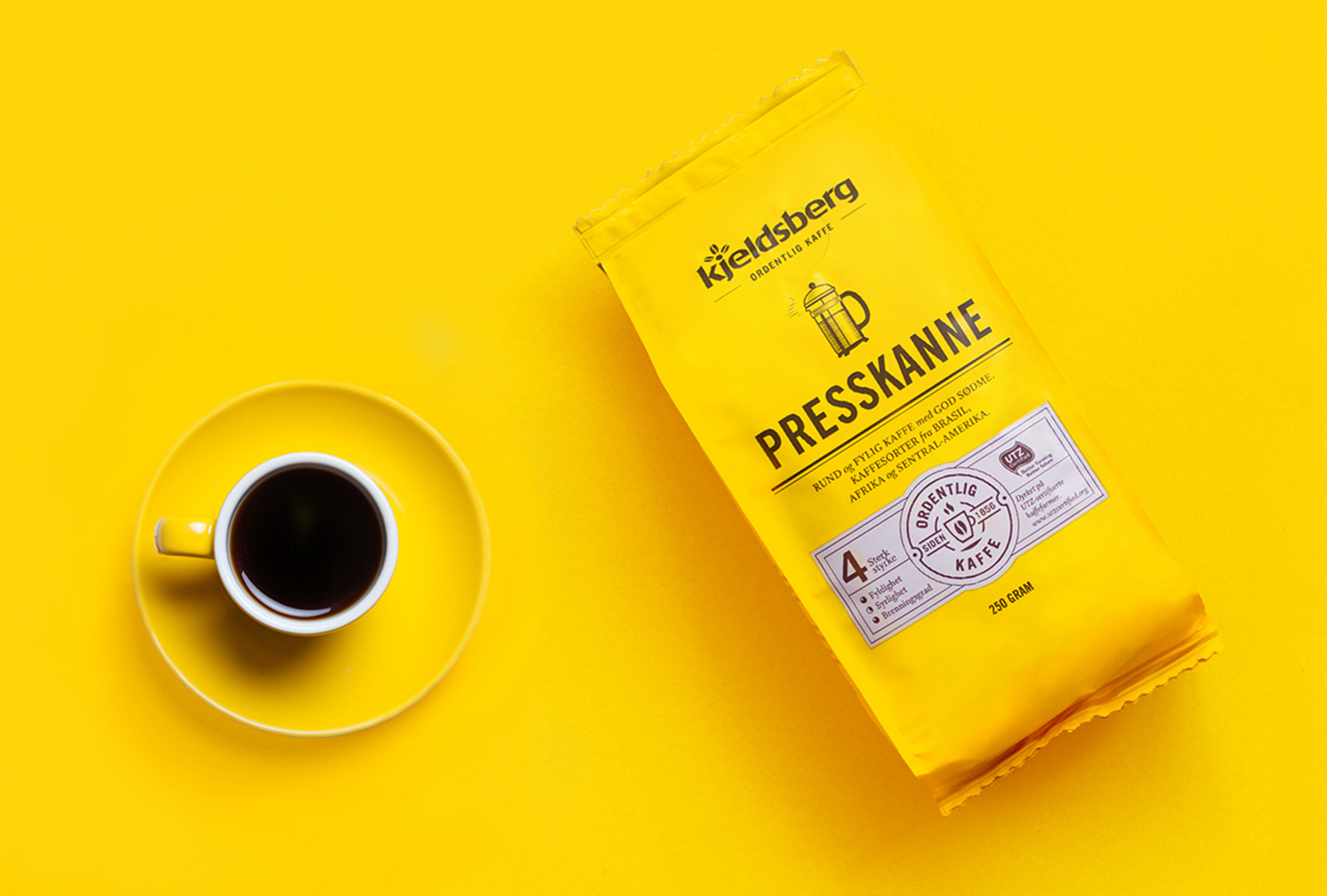
Kjeldsberg KaffePackaging Design

VosslineBrand identity / packaging
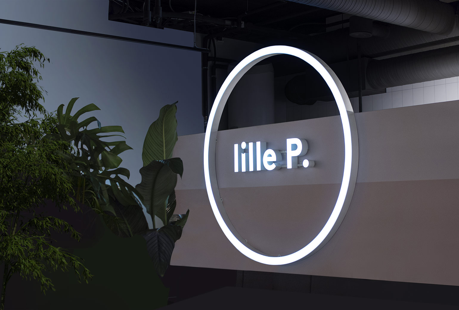
Lille PBrand Identity
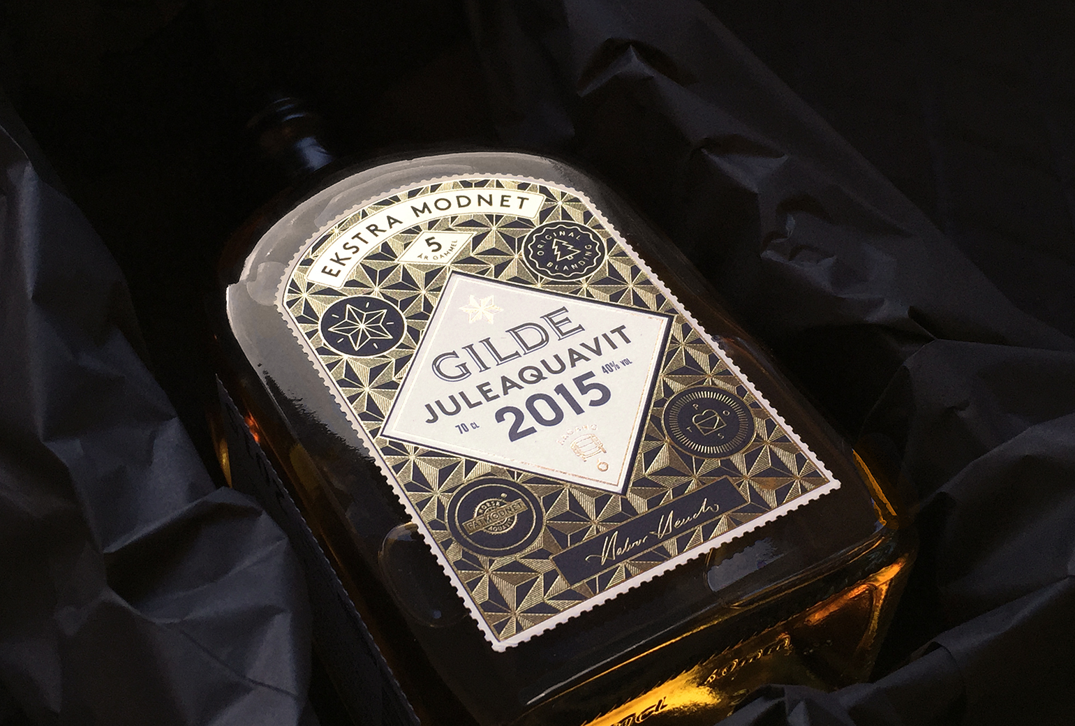
Gilde juleaquavitPackaging
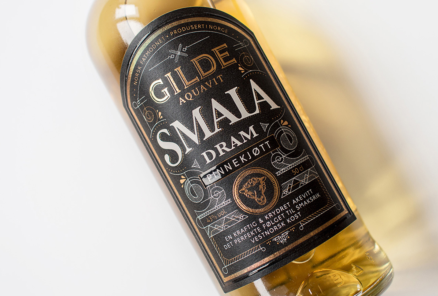
Gilde Aquavit - SmalaPackaging