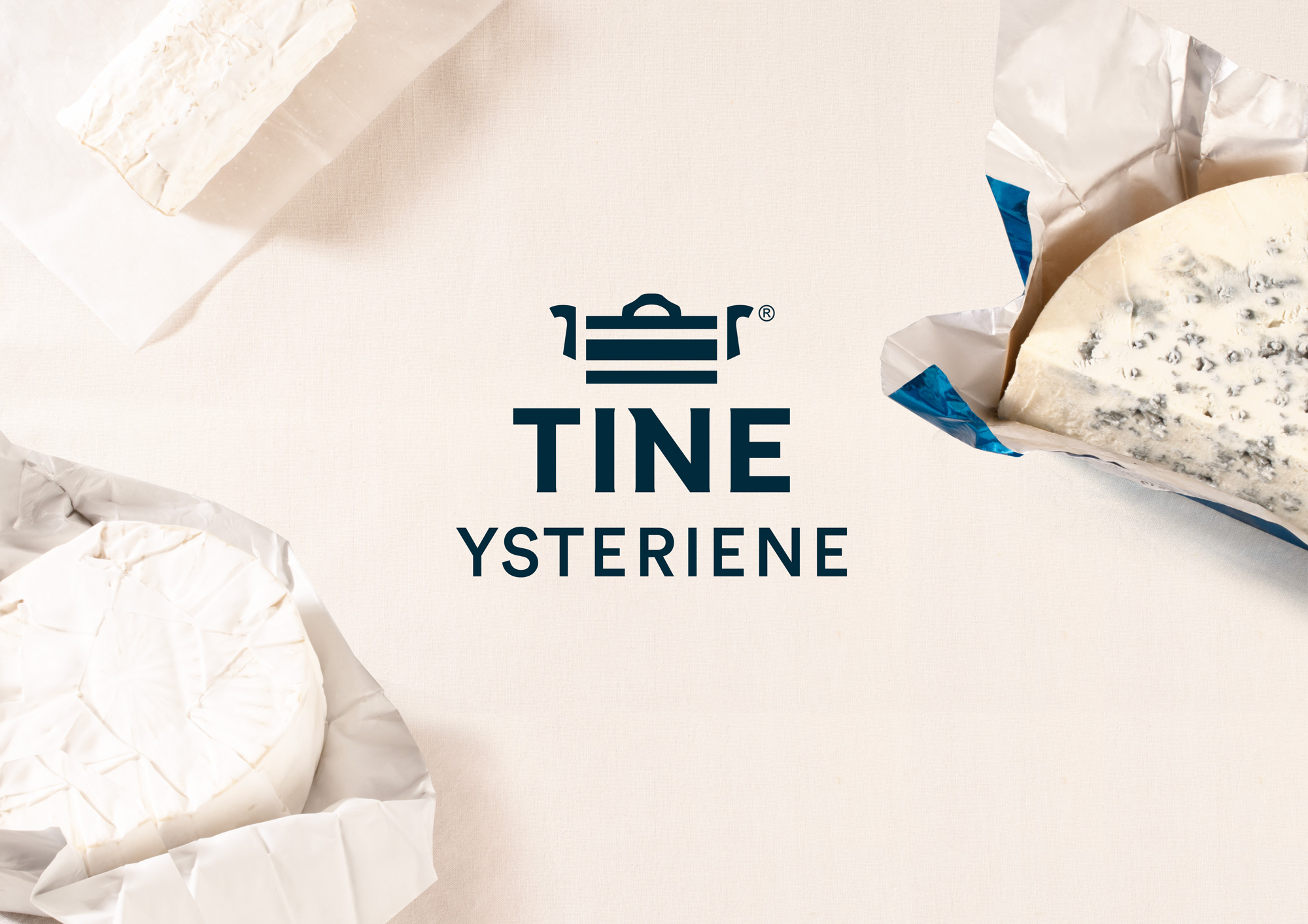
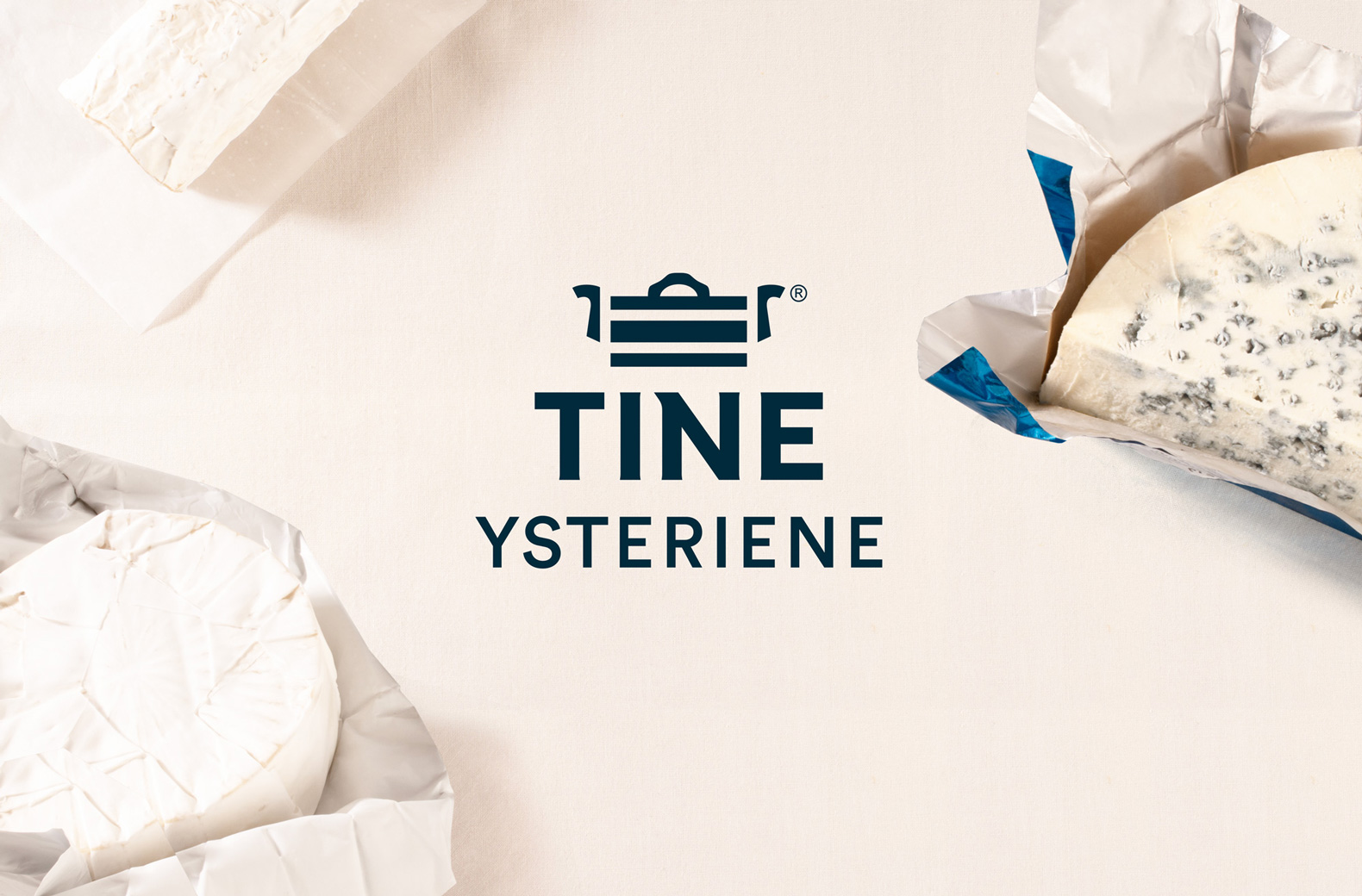
TINE Ysteriene
Packaging
Agency: Dinamo Design
Client: TINE SA
Design: Geir Solem Lysbakken
Project manager: Karianne Stenby
Product photo: Veslemøy Vråskar
Case photo: Dinamo Design
F
TINE SA is Norway's largest producer, distributor and exporter of dairy products. Tine has several small dairies (Ysterier) that have had their own identities, independent of each other. Based on the new strategy of TINE, there is a need to gather the independent dairies into a system with elements from the main series, in order to strengthen the brand of TINE as a whole.
The dairies also have different hierarchies in terms of type of cheese versus place name, as well as many different shapes of the products themselves, which in turn creates a challenge for a new overall design. How then do we create a system that takes care of distinctive characteristics, while at the same time strengthening the brand with a comprehensive serial character?
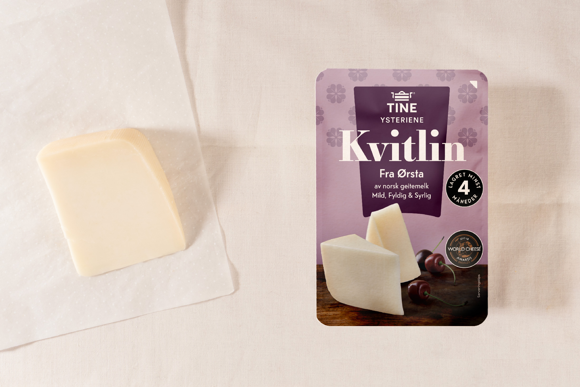
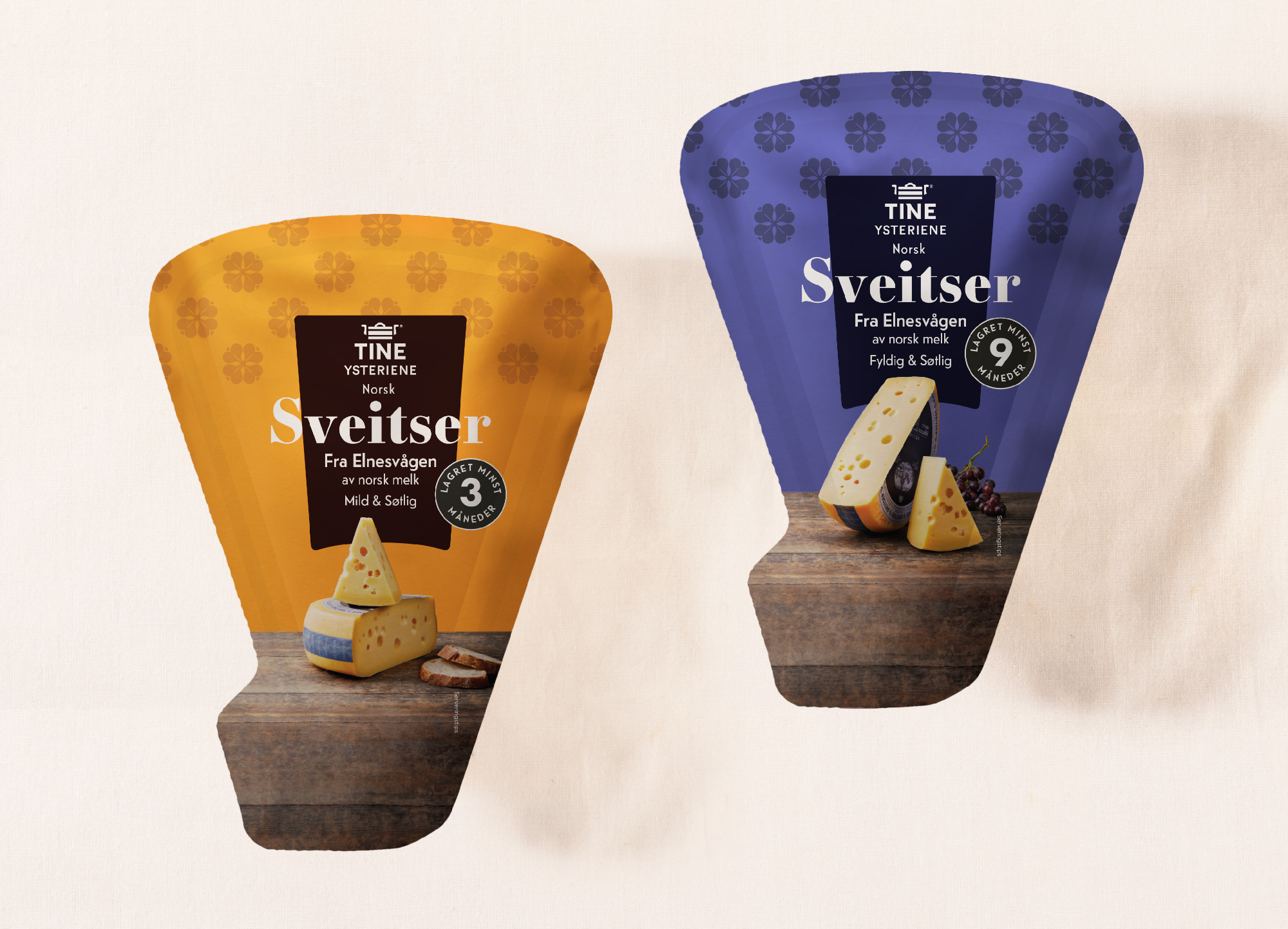
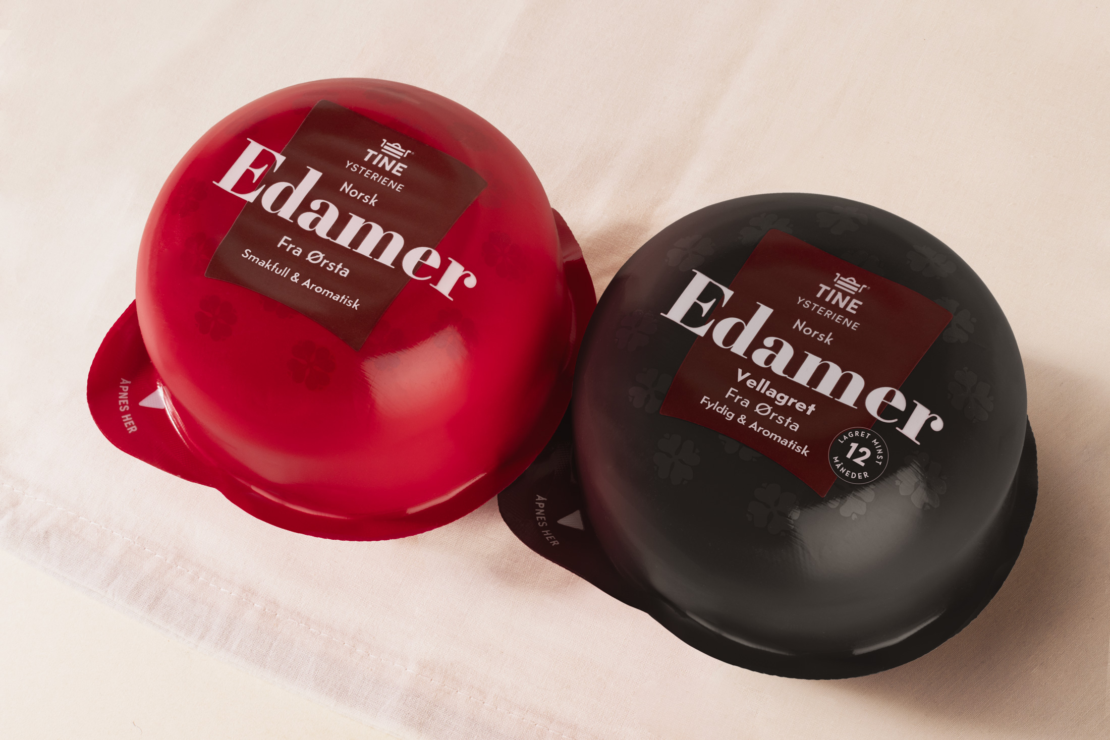
TINE Ysteriene is a collective term for all the small cheeseries and is set with a typography that should compliment the TINE logo in form and legibility. The goal was to create a serie of marks with a distinctive character.
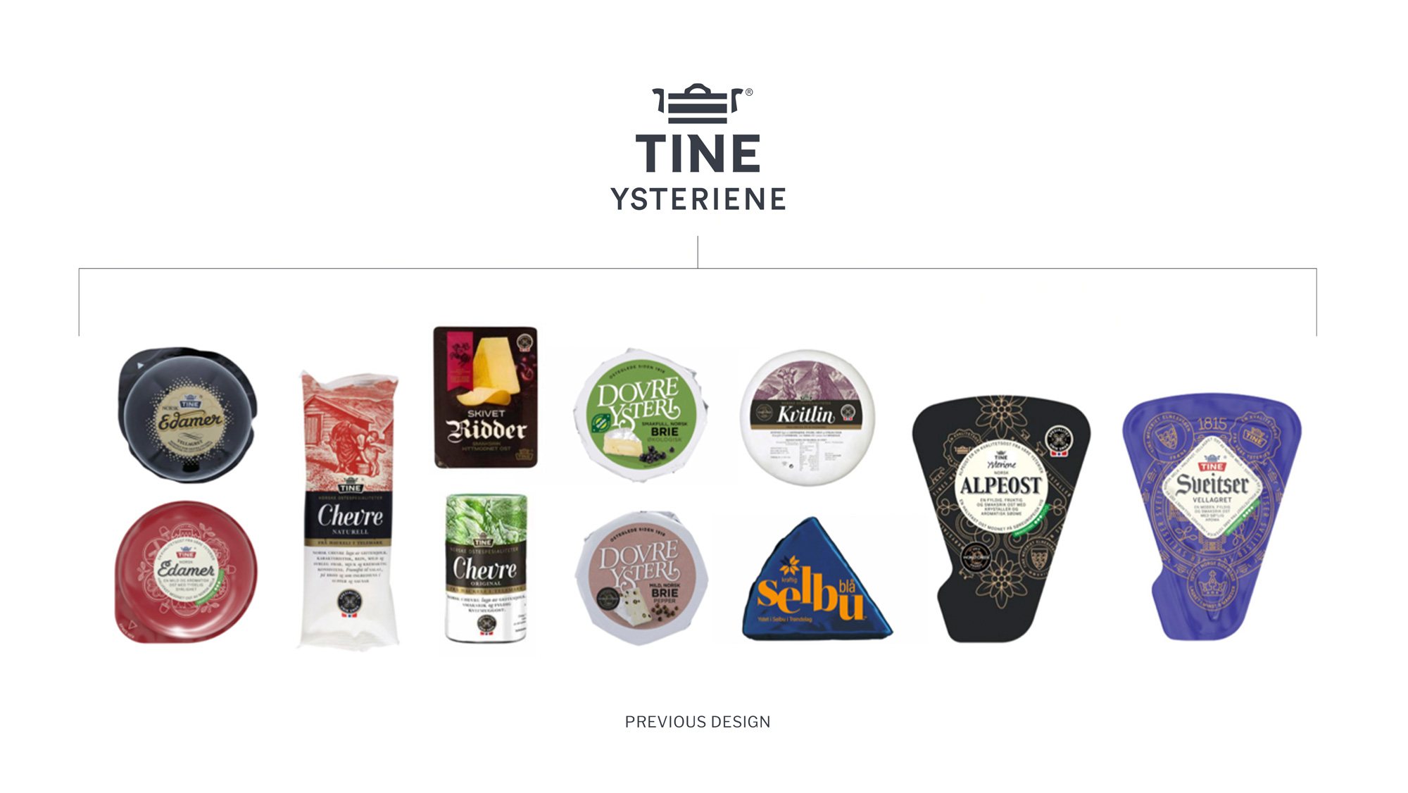
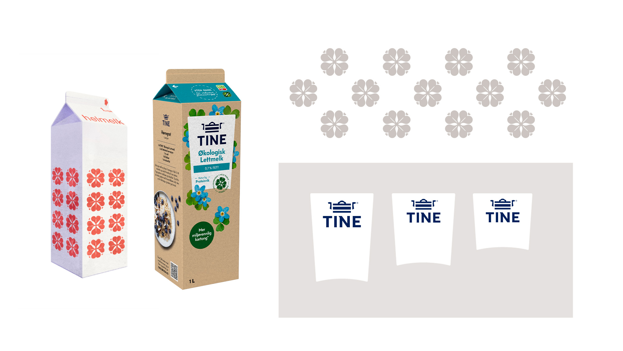
The small identities have value with elements, typography and colors that have developed for loyal buyers for large and small customer groups locally and nationally over time. The goal of the new design was to develop a system that takes care of valuable colors and combinations but still had a system for TINE Ysterier. An overarching system that leaves room for individuality with elements. [Page 2] → Elements from main level and the historical TINE - flower as element.
The small identities have value with elements, typography and colors that have developed for loyal buyers for large and small customer groups locally and nationally over time. The goal of the new design was to develop a system that takes care of valuable colors and combinations but still had a system for TINE Ysterier. An overarching system that leaves room for individuality with elements. [Page 2] → Elements from main level and the historical TINE - flower as element.
The small identities have value with elements, typography and colors that have developed for loyal buyers for large and small customer groups locally and nationally over time. The goal of the new design was to develop a system that takes care of valuable colors and combinations but still had a system for TINE Ysterier. An overarching system that leaves room for individuality with elements. [Page 2] → Elements from main level and the historical TINE - flower as element.


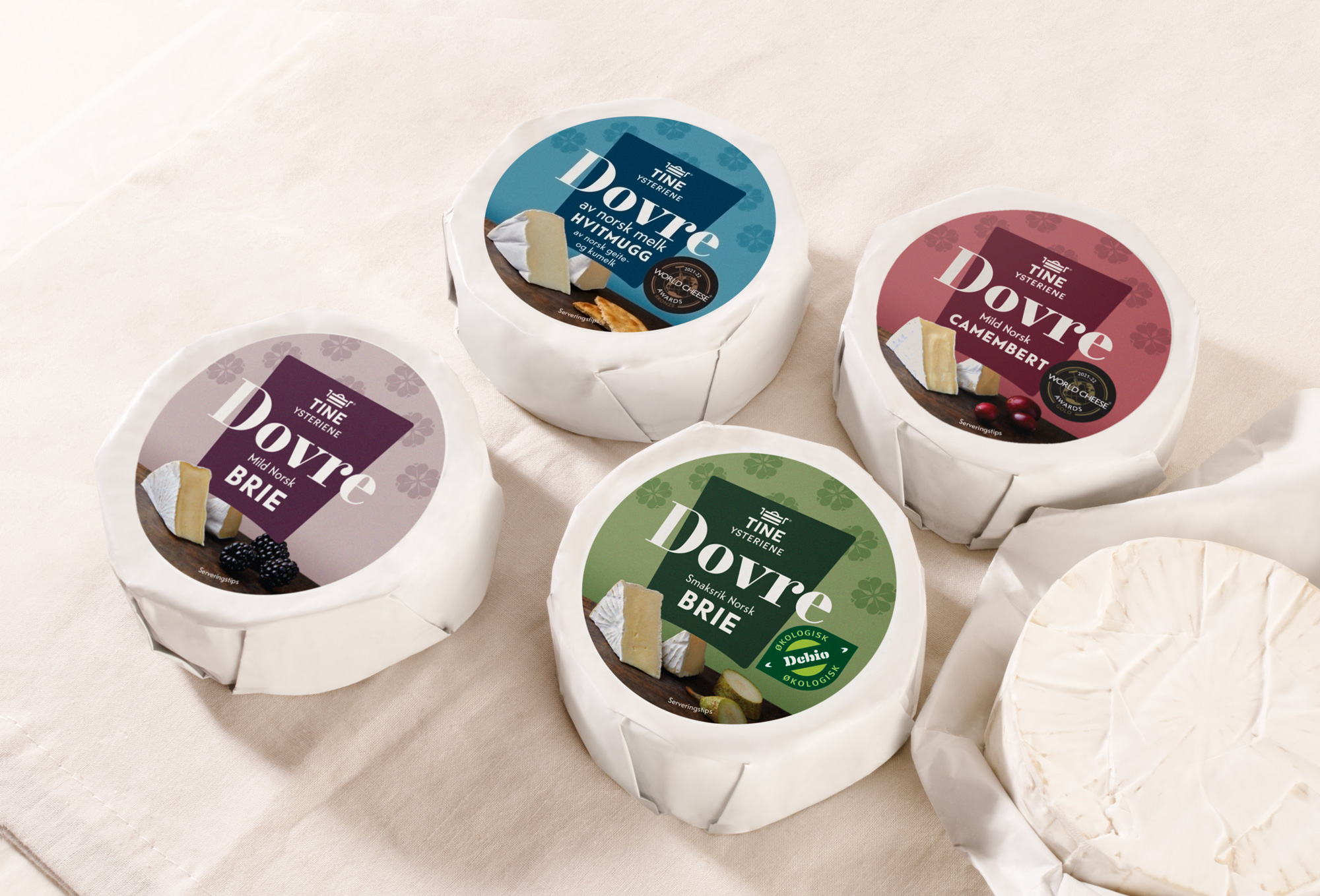
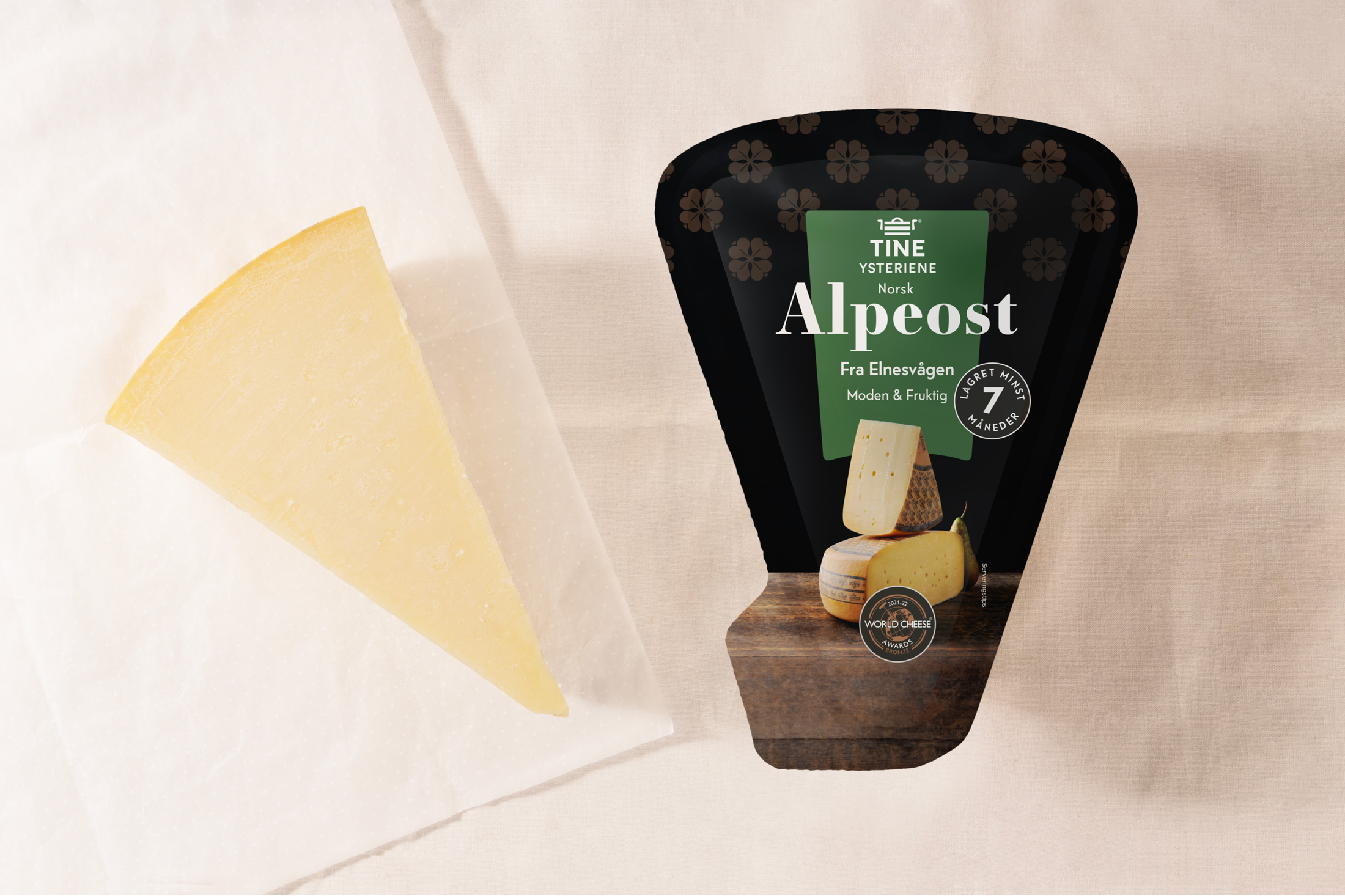
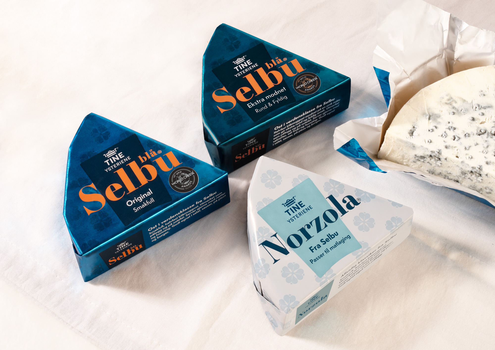
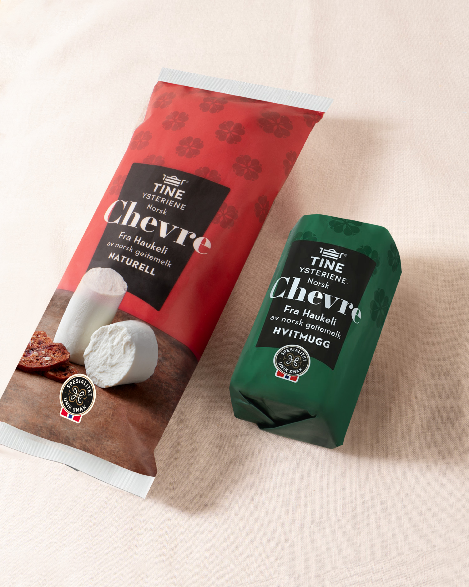
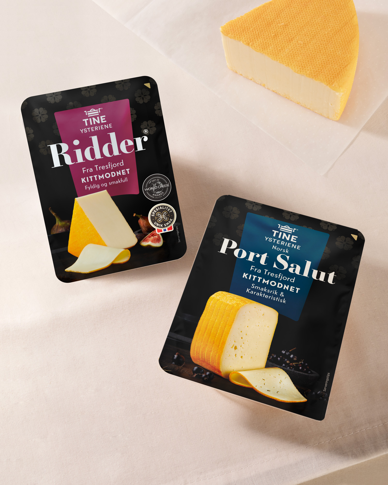
The solution works for location names vs type of cheese as the main name of the product. A dominant serif typeface that is placed above the TINE shape to represent the craft, location and type of cheese.
The pattern with the well-known TINE flower is reused at the top of the shape for richness and belonging to the history of TINE. Colors can be used with great variety to preserve history and the importance of personal touch and taste. The solution works to take care of distinctive features, but with a clear sender in a set form.
Work
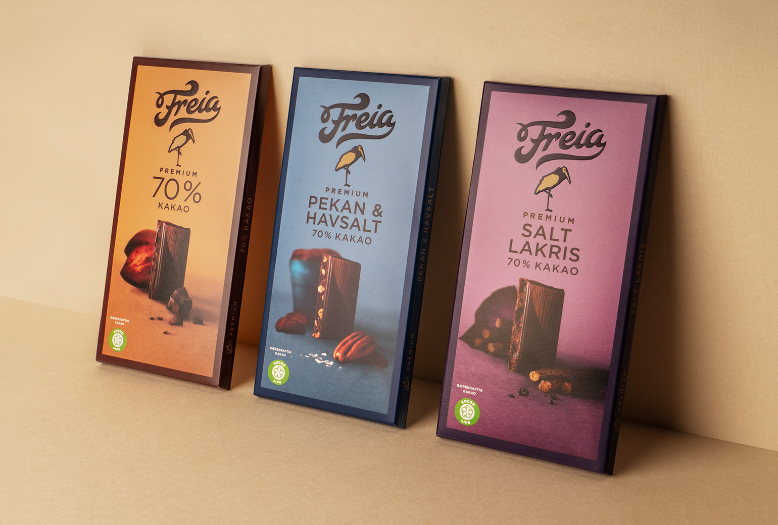
Freia PremiumPackaging
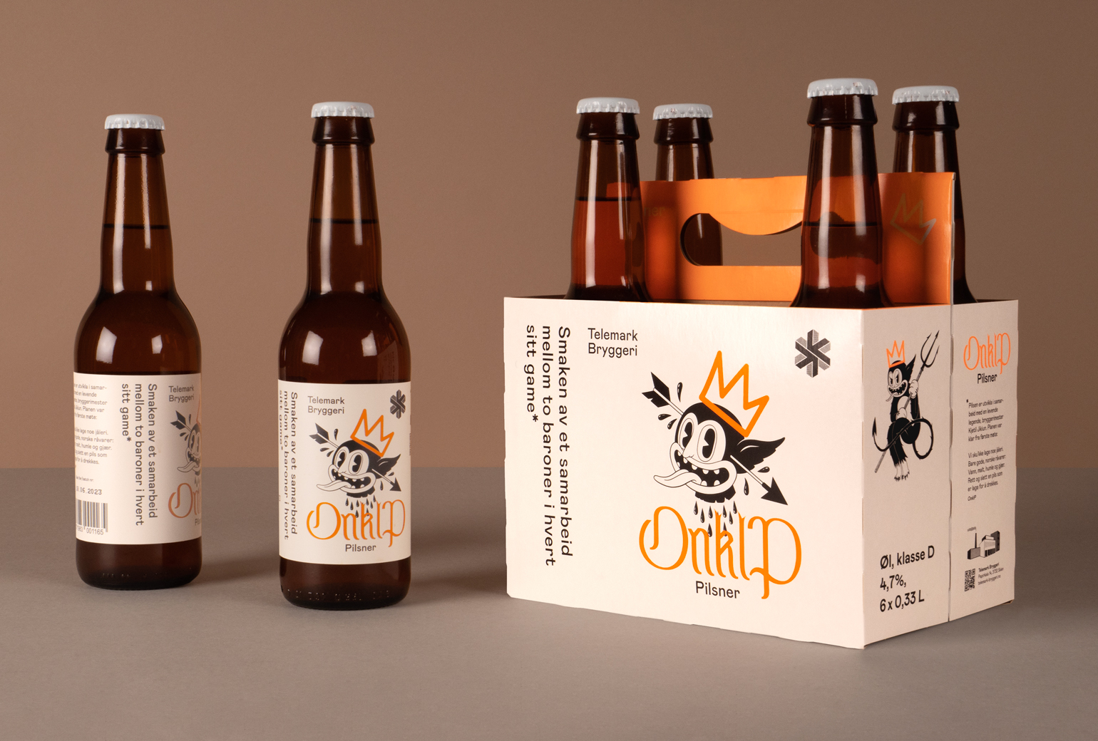
Onklp PilsnerPackaging
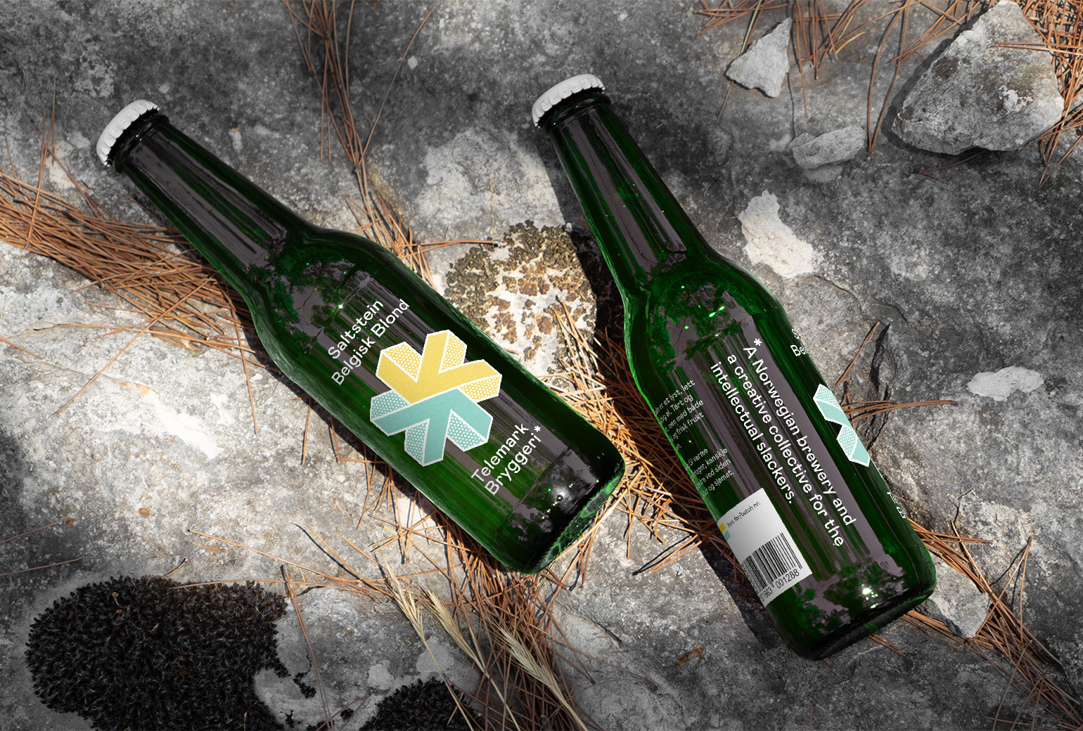
Telemark BryggeriPackaging
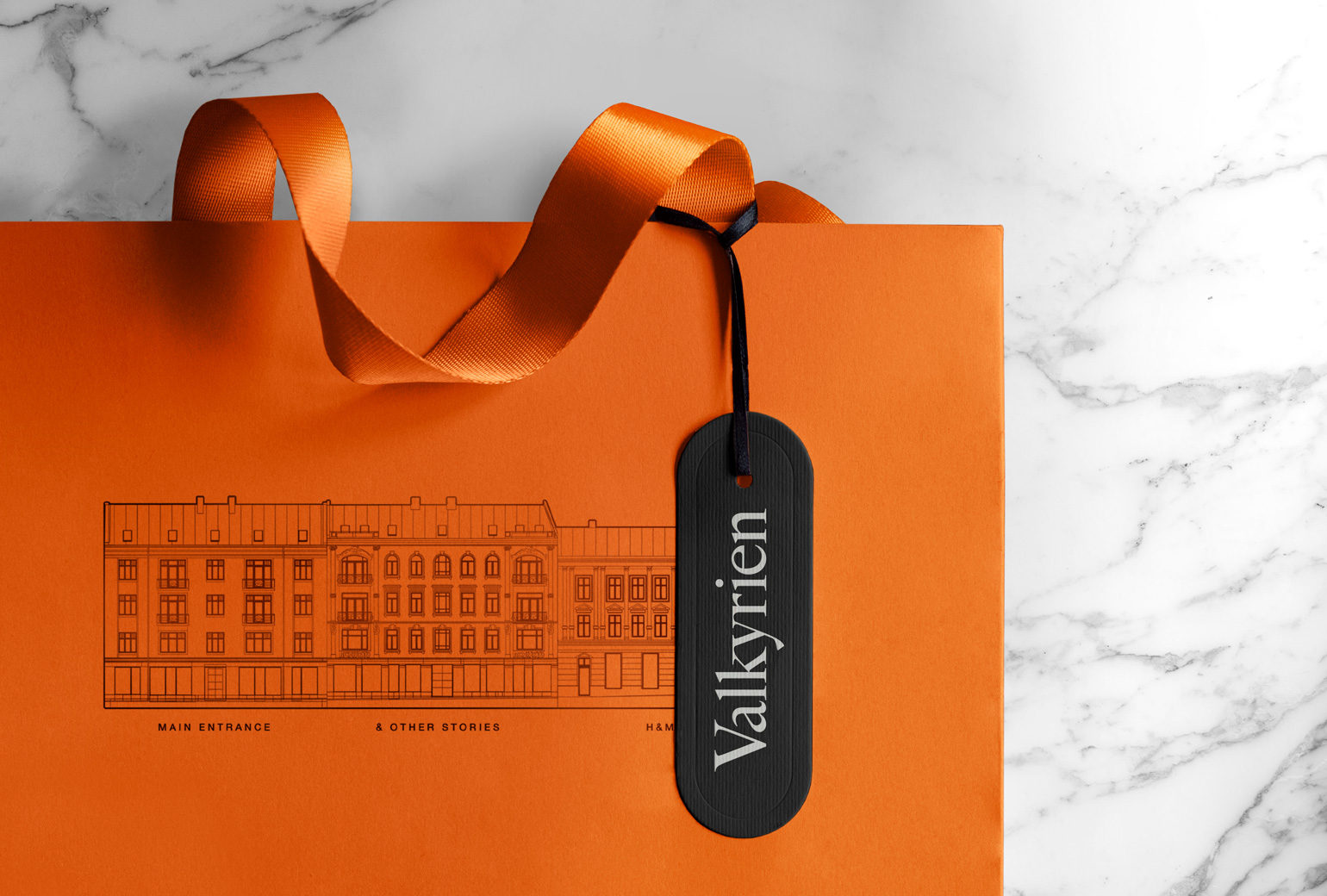
ValkyrienBranding
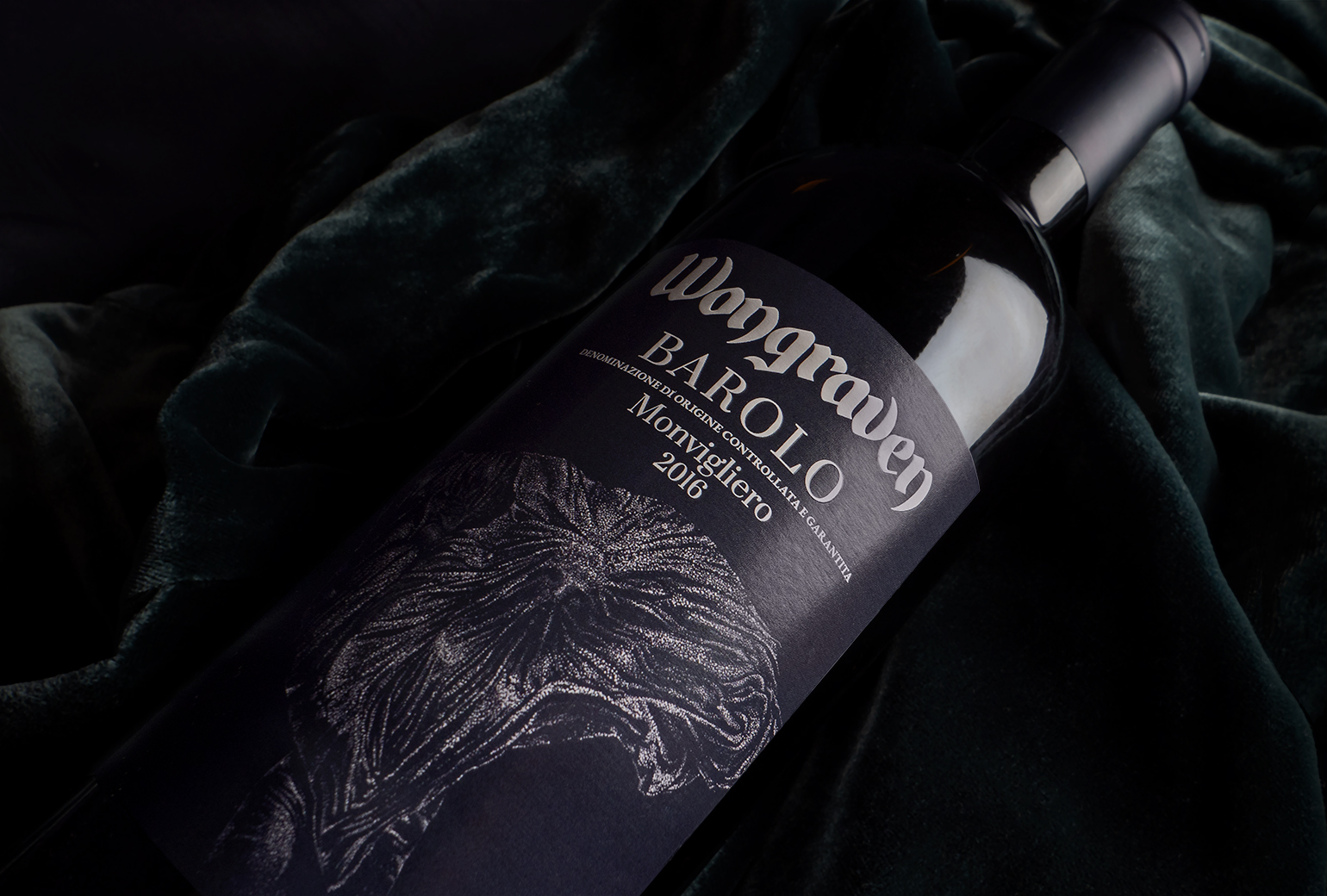
Wongraven Barolo MonviglieroPackaging
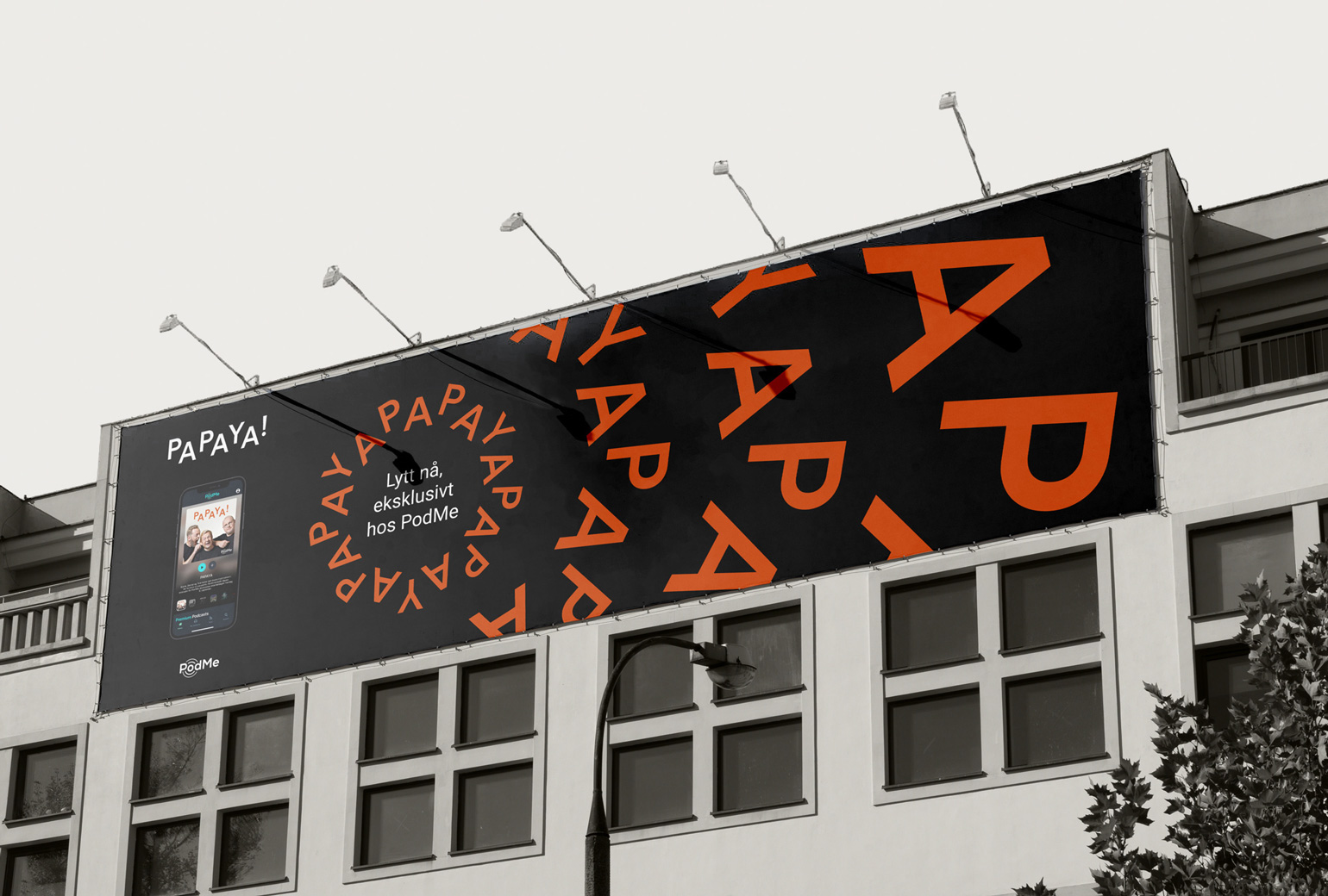
PAPAYAIdentity
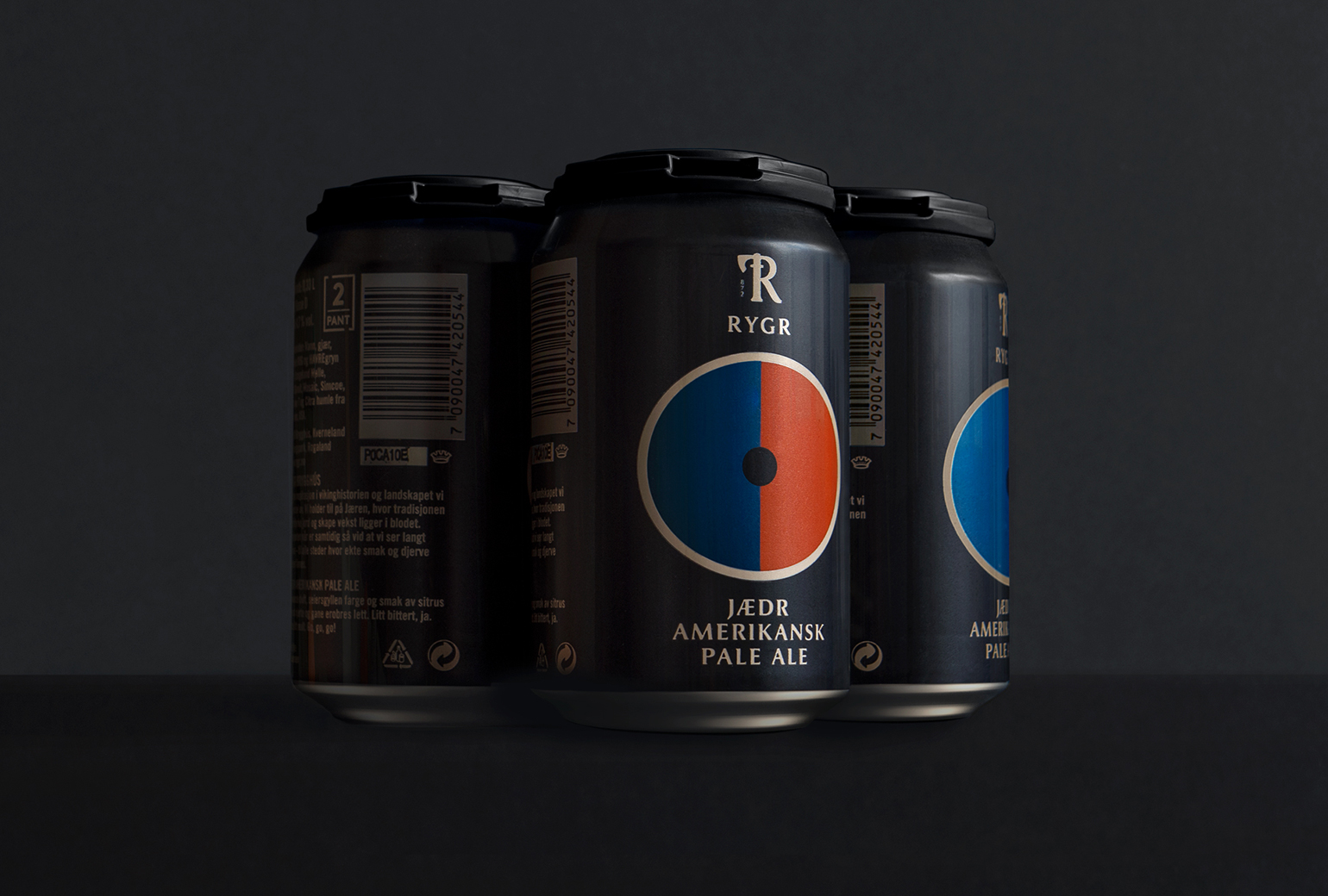
RYGRPackaging
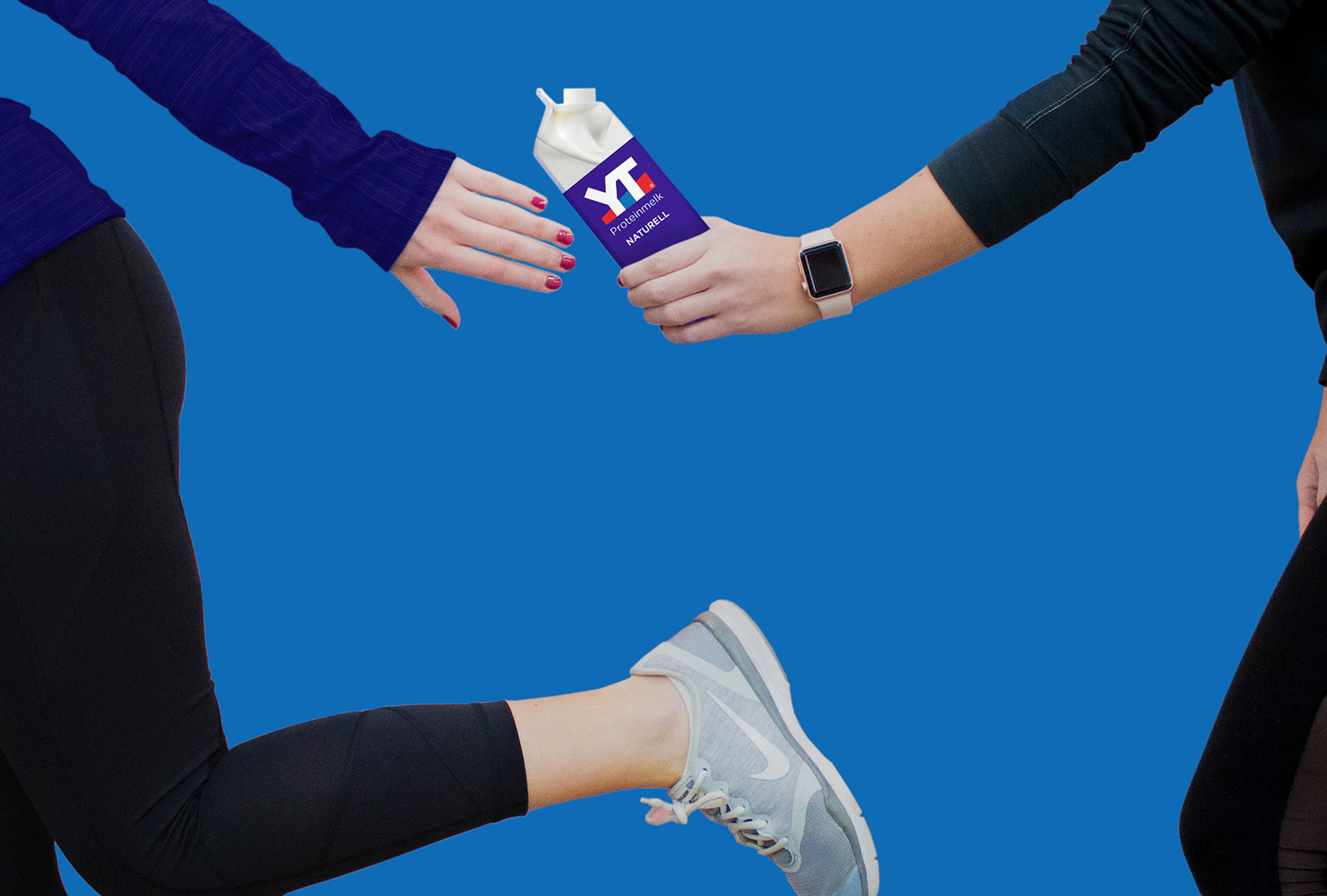
TINE YTPackaging
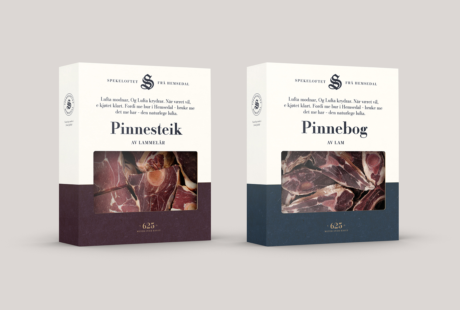
SpekeloftetPackaging
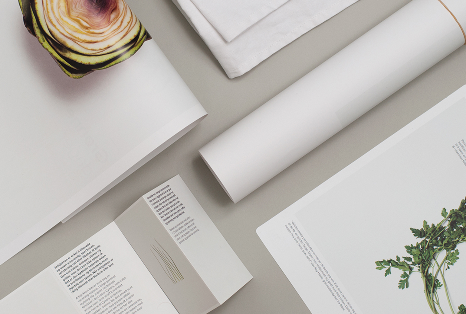
TINE YsterierPackaging
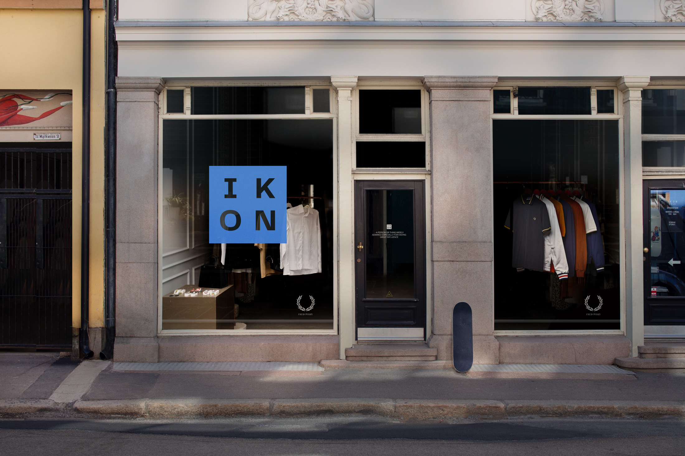
IKONBrand Identity
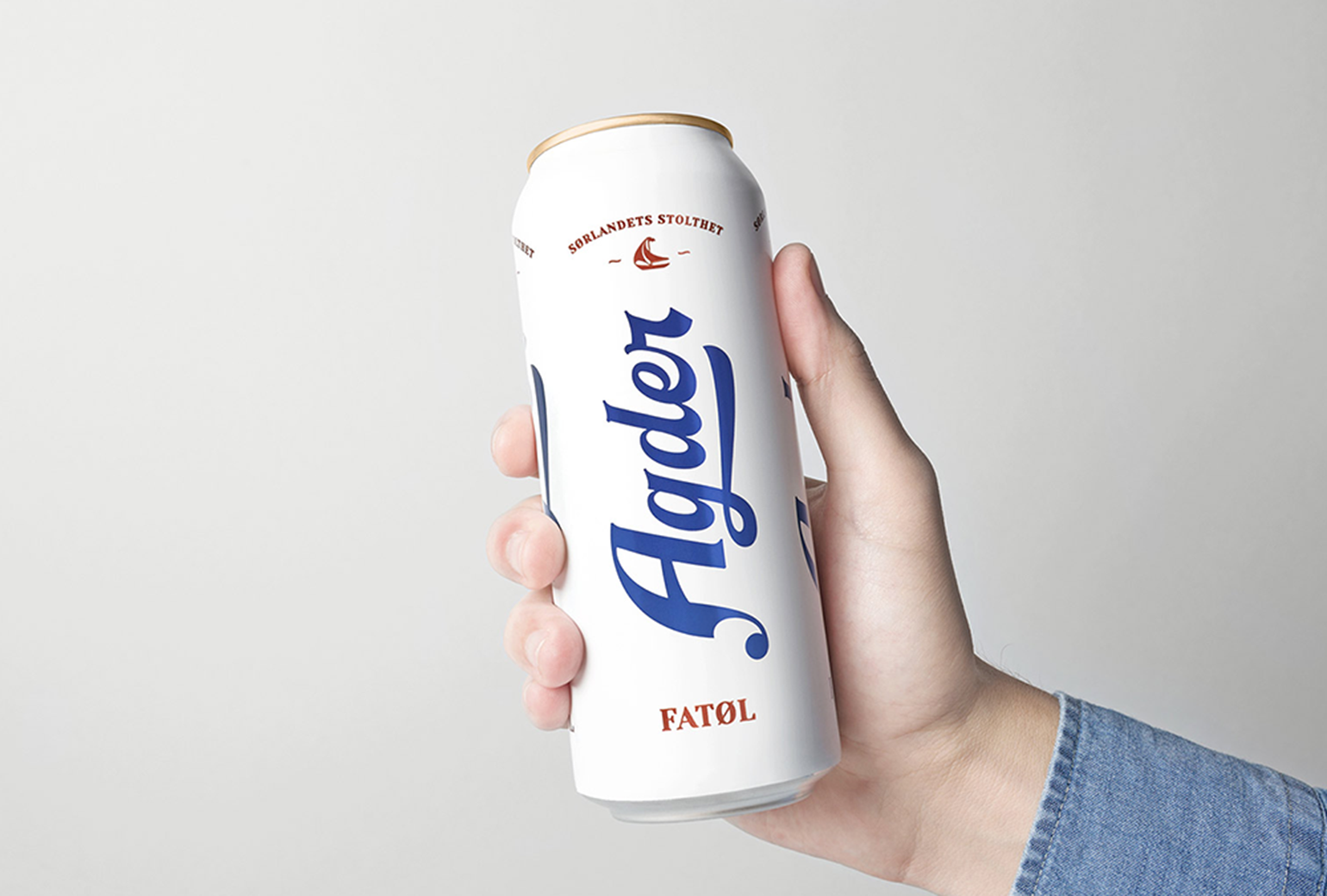
Agder BryggeriPackaging
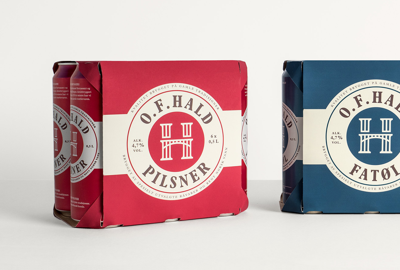
O.F.HaldPackaging
Norske BryggerierBranding
DevoldBrand Development
Bohemian LagerPackaging
Gilde AquavitPackaging
Bama StorkjøkkenBrand Development
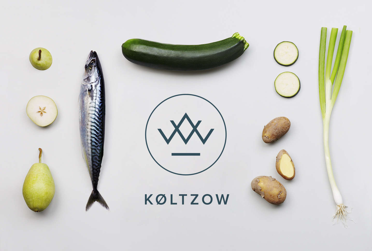
KøltzowBrand Identity
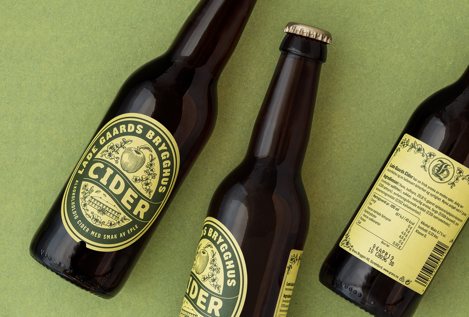
Lade Gaards CiderPackaging Design
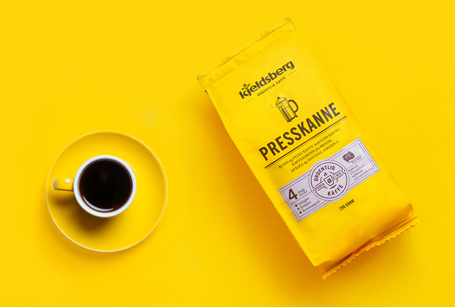
Kjeldsberg KaffePackaging Design
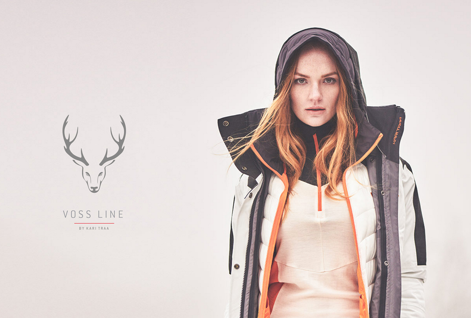
VosslineBrand identity / packaging
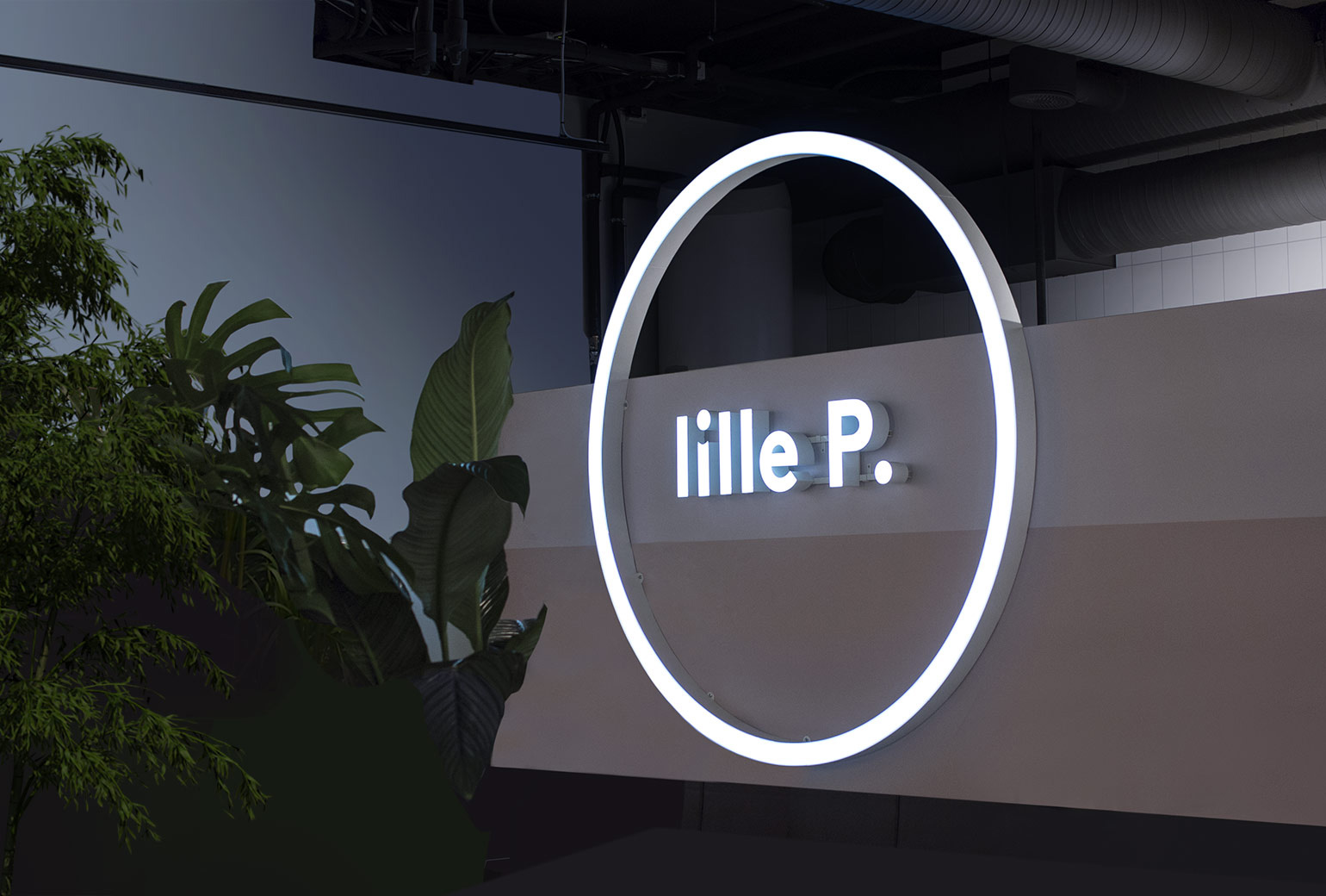
Lille PBrand Identity
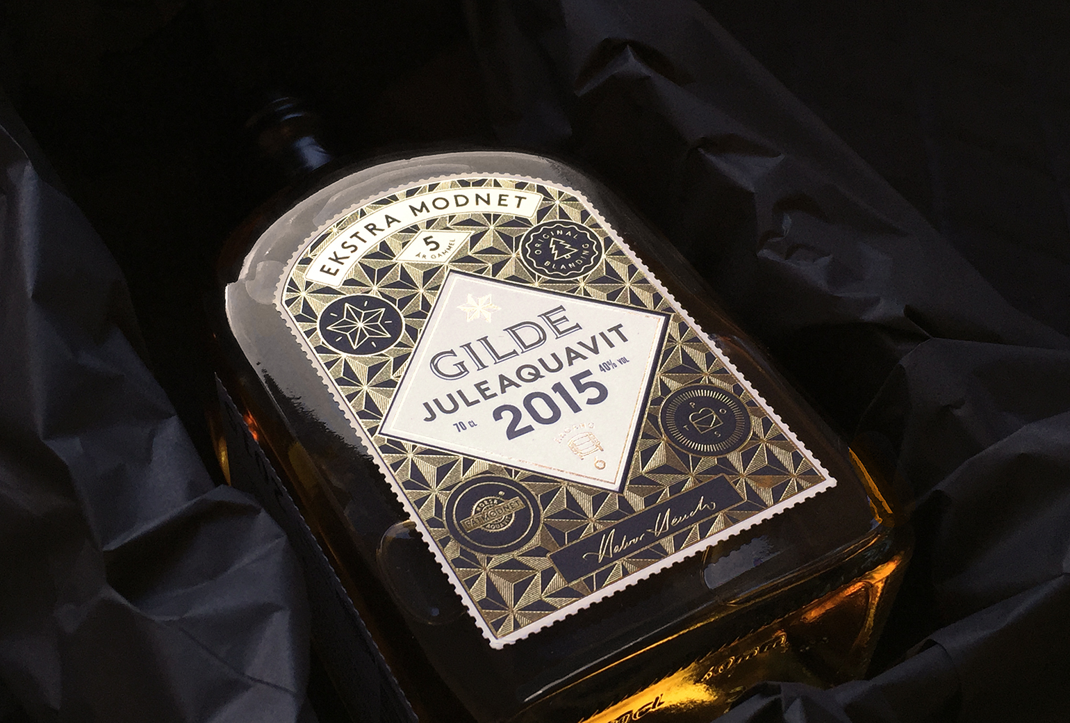
Gilde juleaquavitPackaging
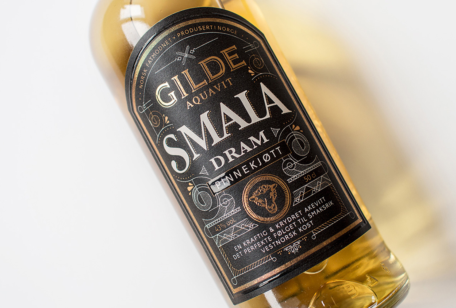
Gilde Aquavit - SmalaPackaging