Freia Premium
Packaging
Agency: Dinamo Design
Client: Mondelez Norway
Design: Geir Solem Lysbakken
Motion: Kasper Bergquist & Mikkel Såghus
Project manager: Nina Nguyen
Consultant: Lill Hege Sæther
Freia is part of Mondelēz International
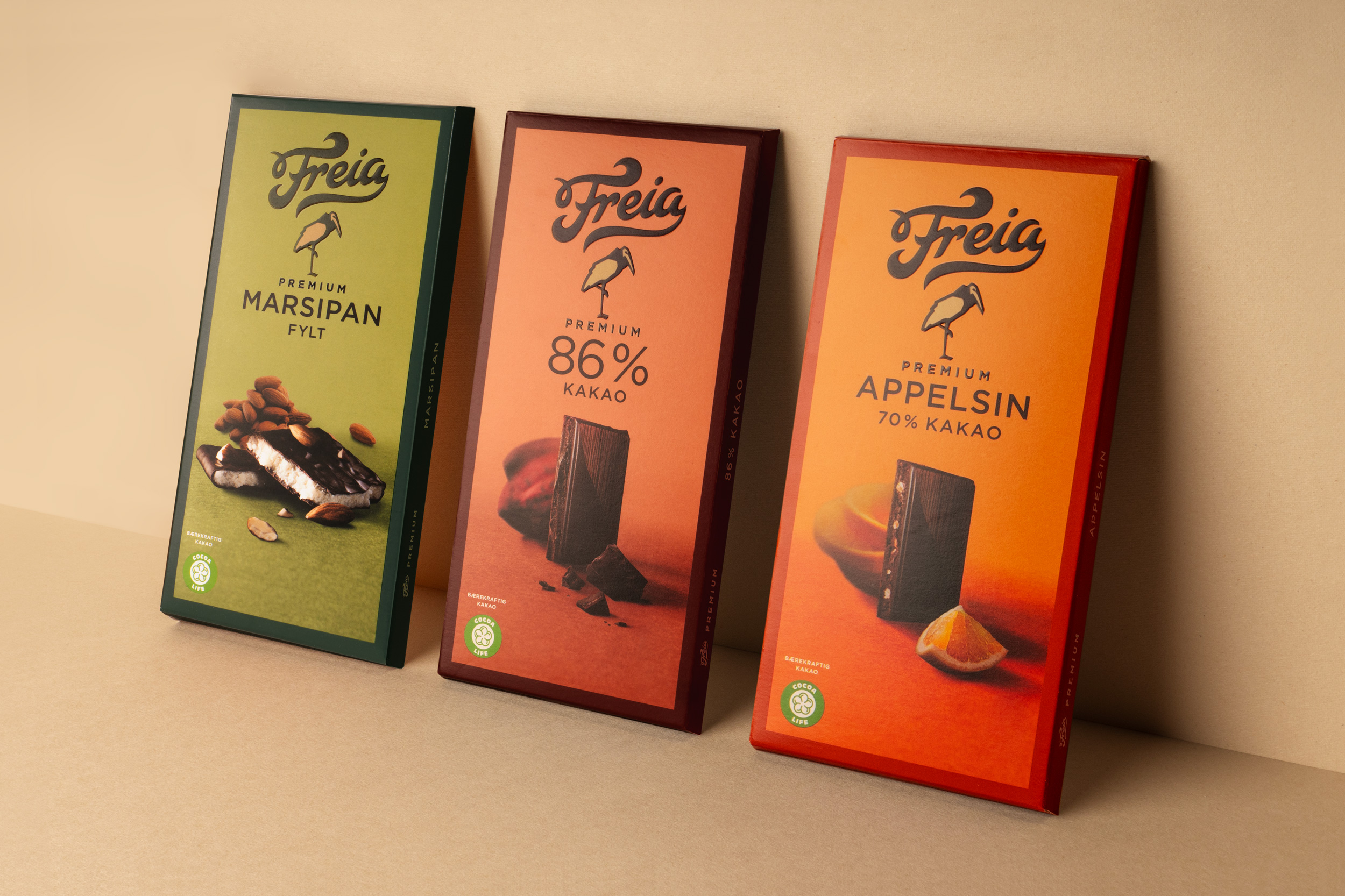
The chocolate company Freia, with its long history since 1889, has a special place in norwegian hearts. The premium series is the best chocolate Freia has to offer in its product range. In order to increase taste differentiation, and modernize the series for a larger target group, a new design was needed.
Part of the new design project was to explore if we could use the marabou-stork in a more important role as in earlier days of packaging design. The stork joined the brand in 1907 as an illustration on a cacao packaging. Since then it has always been with the brand as a additional icon, but over time has become less used overall in packaging.


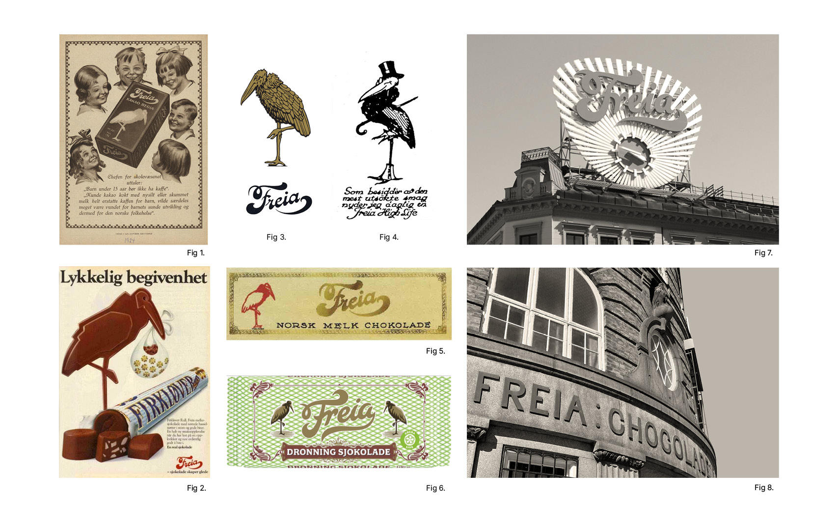
- Fig 1, 2,3 & 4: The stork was created by a drawing contest for a can of cacao in 1907 by Oscar Carl Augen Kristoffersen, and later had a central role in packaging and advertising. Fig 5: Example of how the design was on chocolate bar with stork (1913). Fig 6: The use of stork on classic chocolate line for pastry making. Fig 7: The famous signage in Oslo of the Freia logo which is the main logo on most of products. Fig 8: Typography on Freia factory at Rodeløkka in Oslo which has been here since 1889. Page 2: → Previous premium design.

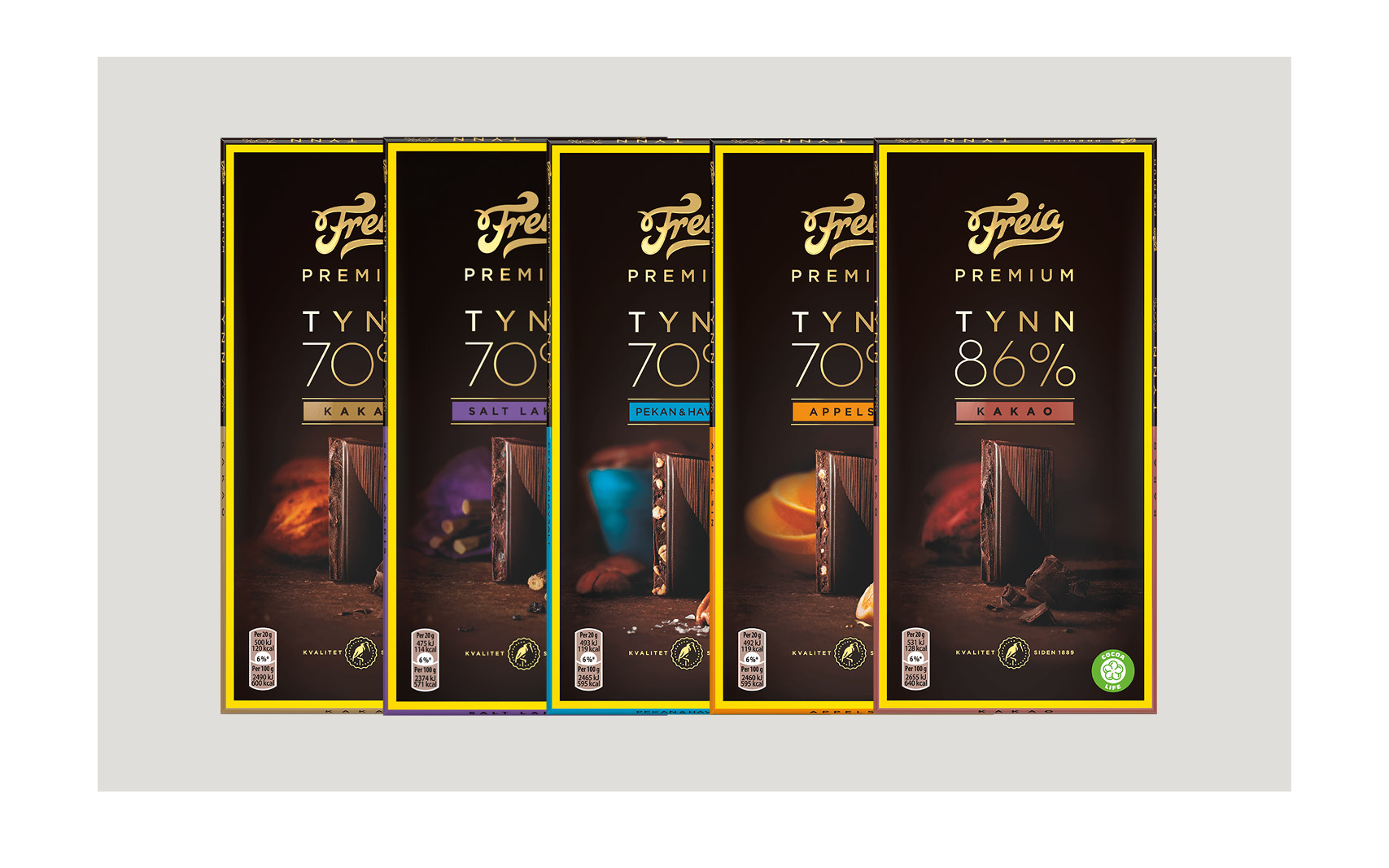
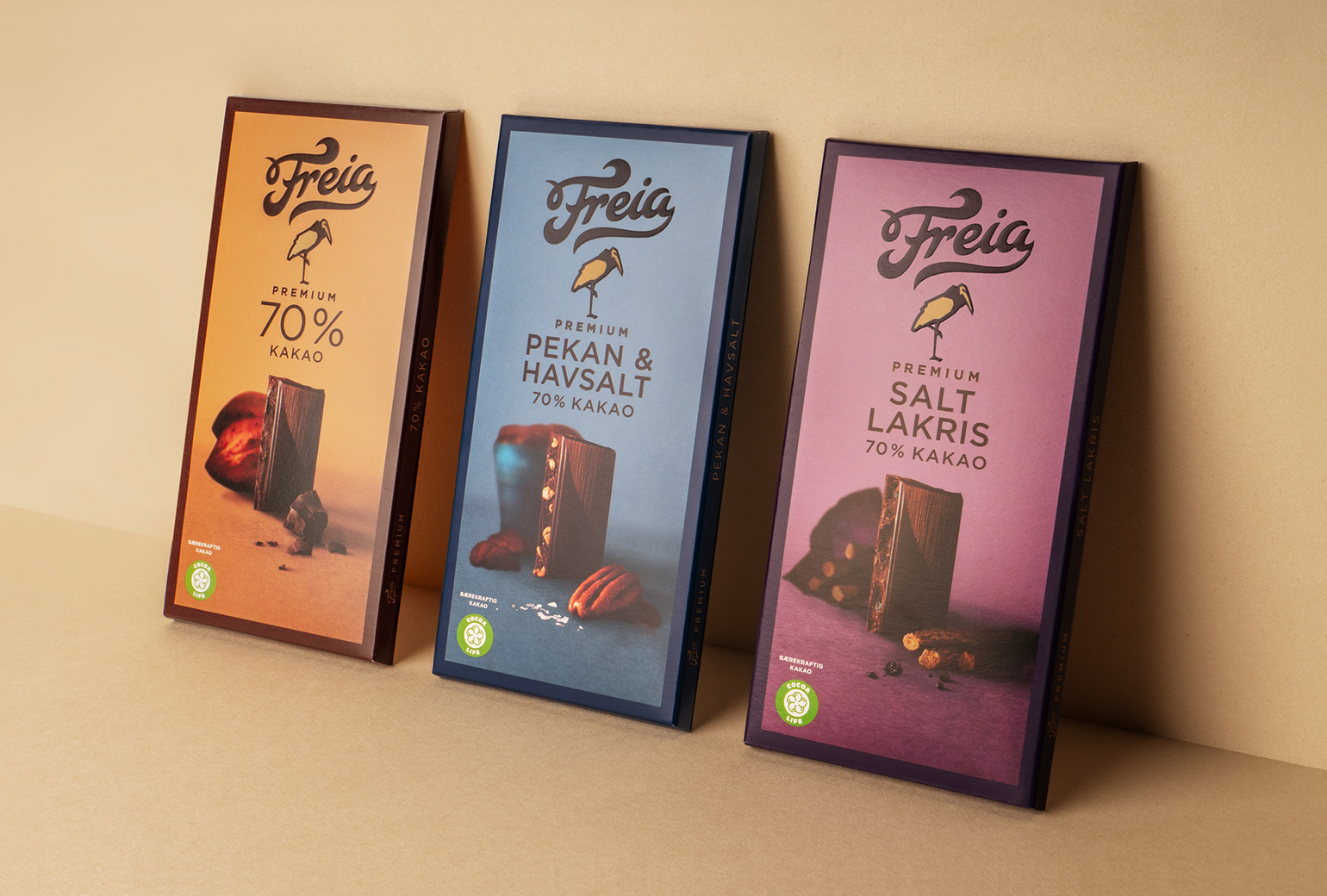
The solution was to let the stork regain a central role associated with the premium segment, as well as increase taste and differentiation within the range with a brighter design to attract new target groups. The series is easier to discover and tastes "more", with a colorful series touch while the story of Freia is reinforced by the stork having regained a prominent role in the design.
The advantage of allowing the stork to regain such a role is that it has a pride of premium, while at the same time the design becomes stronger for its history. This combined with letting taste play a more dominant role in a brighter design for greater differentiation in the series. The design is more playful and easier to remember, as well as true to history and still a premium expression.


Work
Freia PremiumPackaging
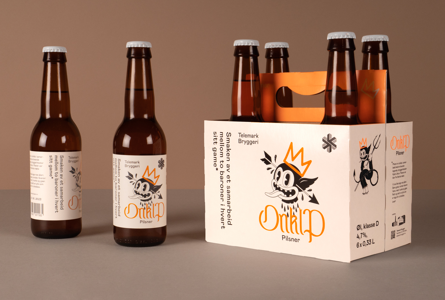
Onklp PilsnerPackaging
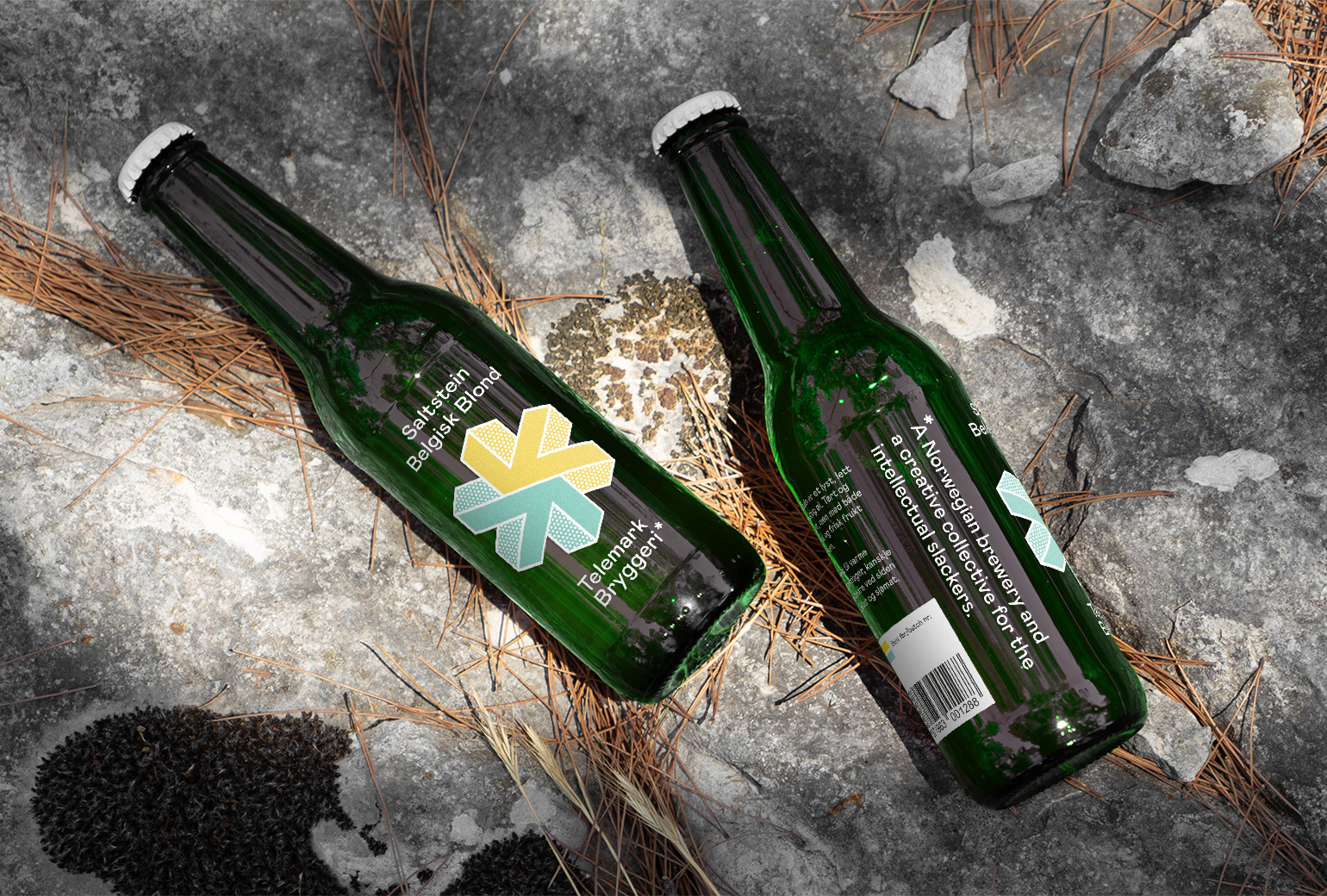
Telemark BryggeriPackaging
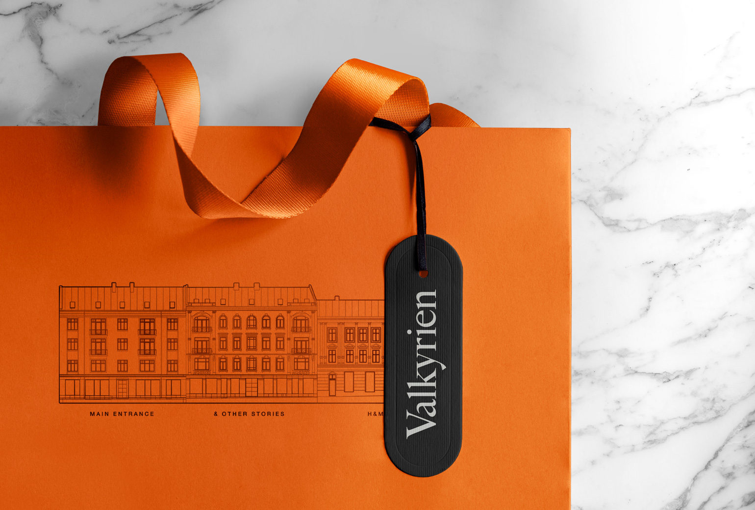
ValkyrienBranding
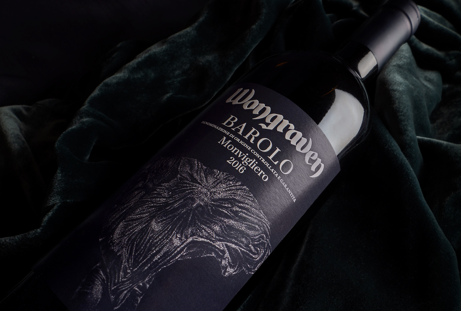
Wongraven Barolo MonviglieroPackaging
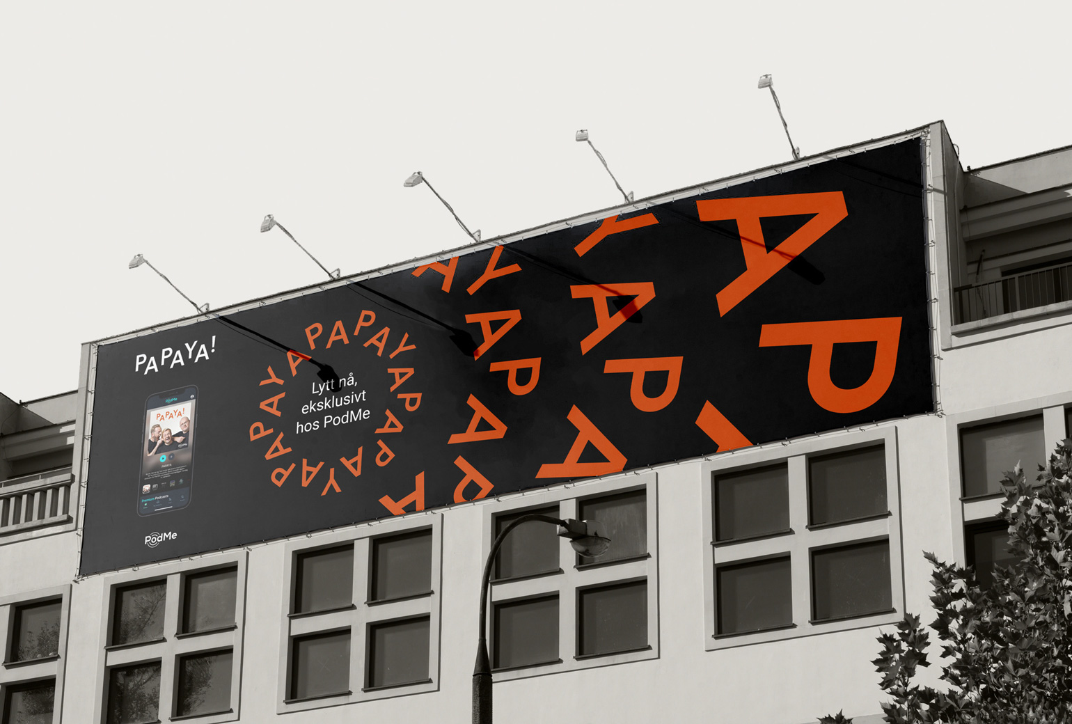
PAPAYAIdentity
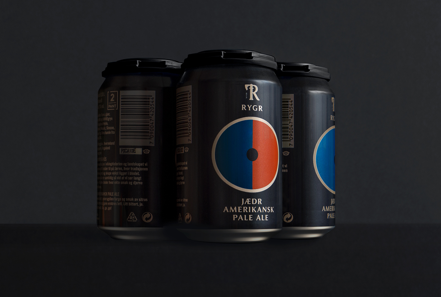
RYGRPackaging
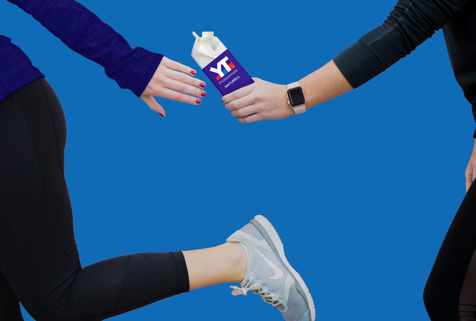
TINE YTPackaging
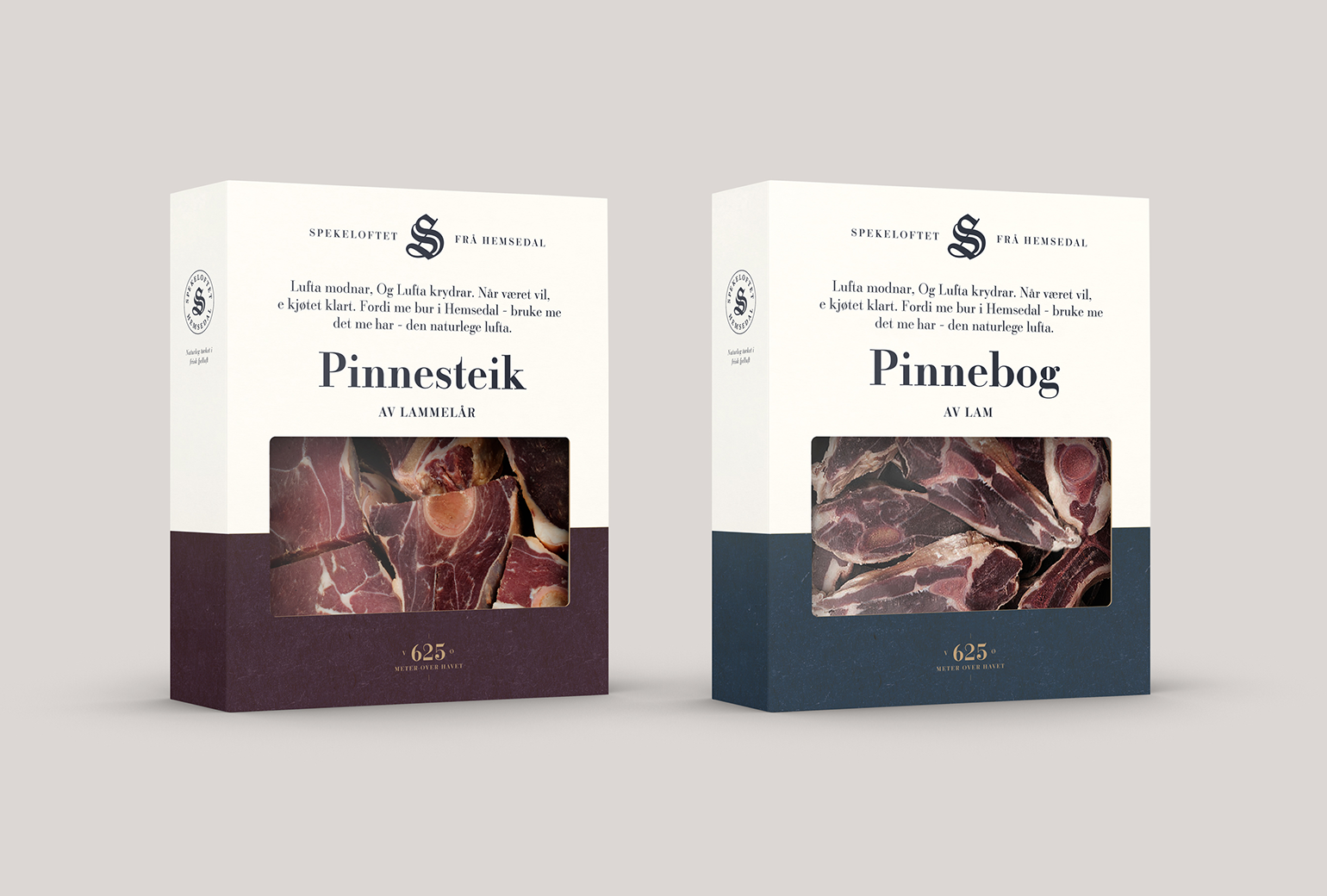
SpekeloftetPackaging
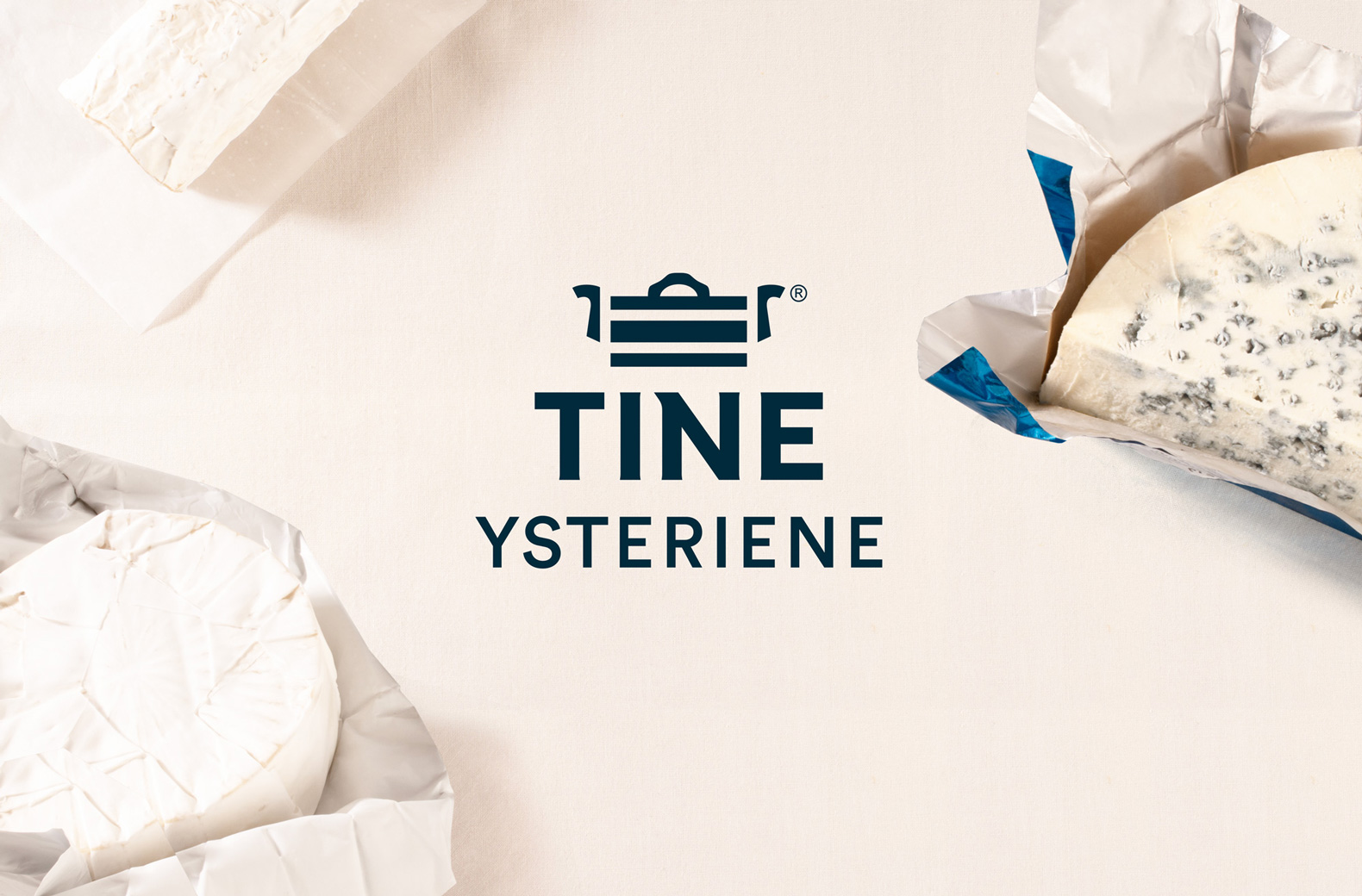
TINE YsterierPackaging
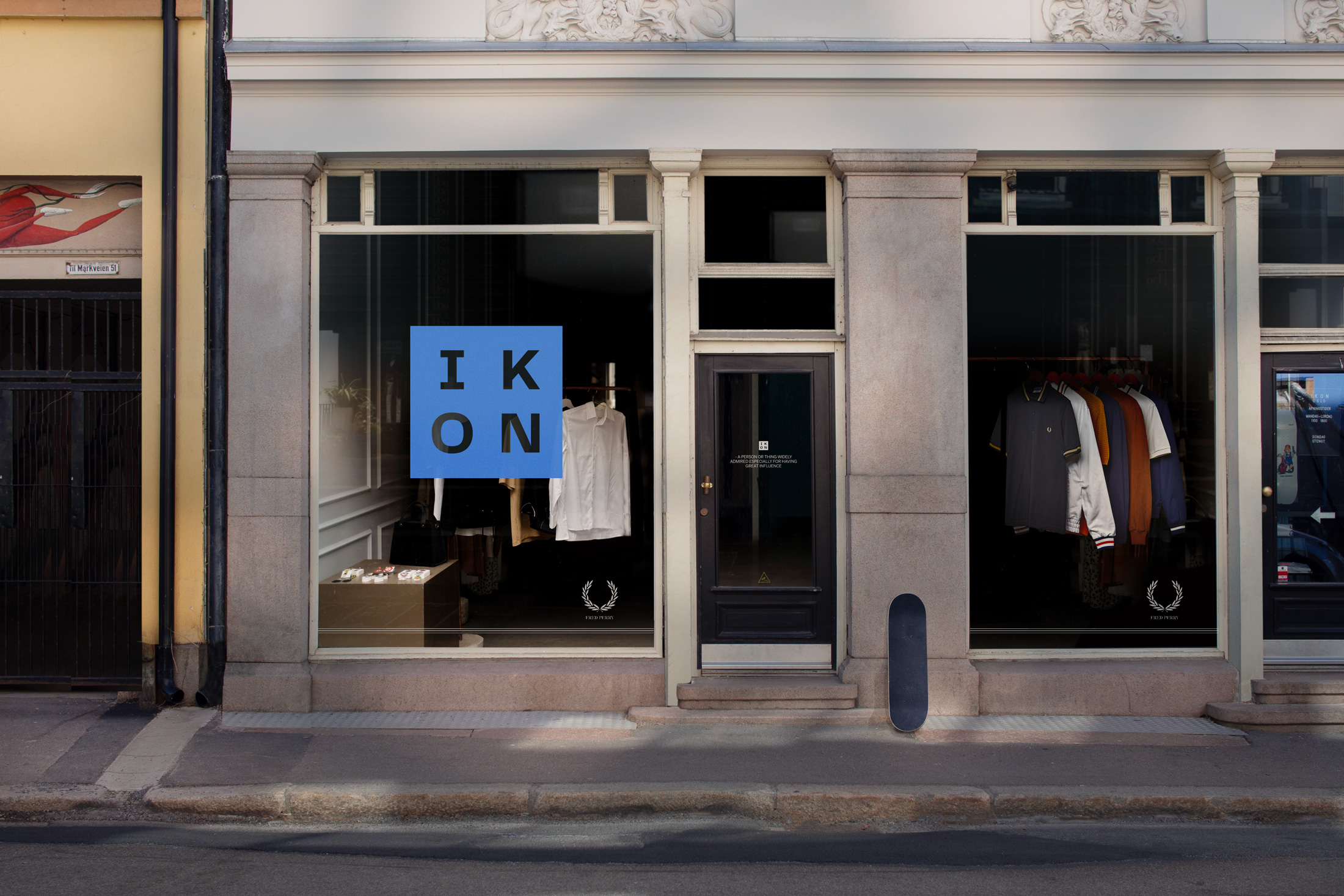
IKONBrand Identity
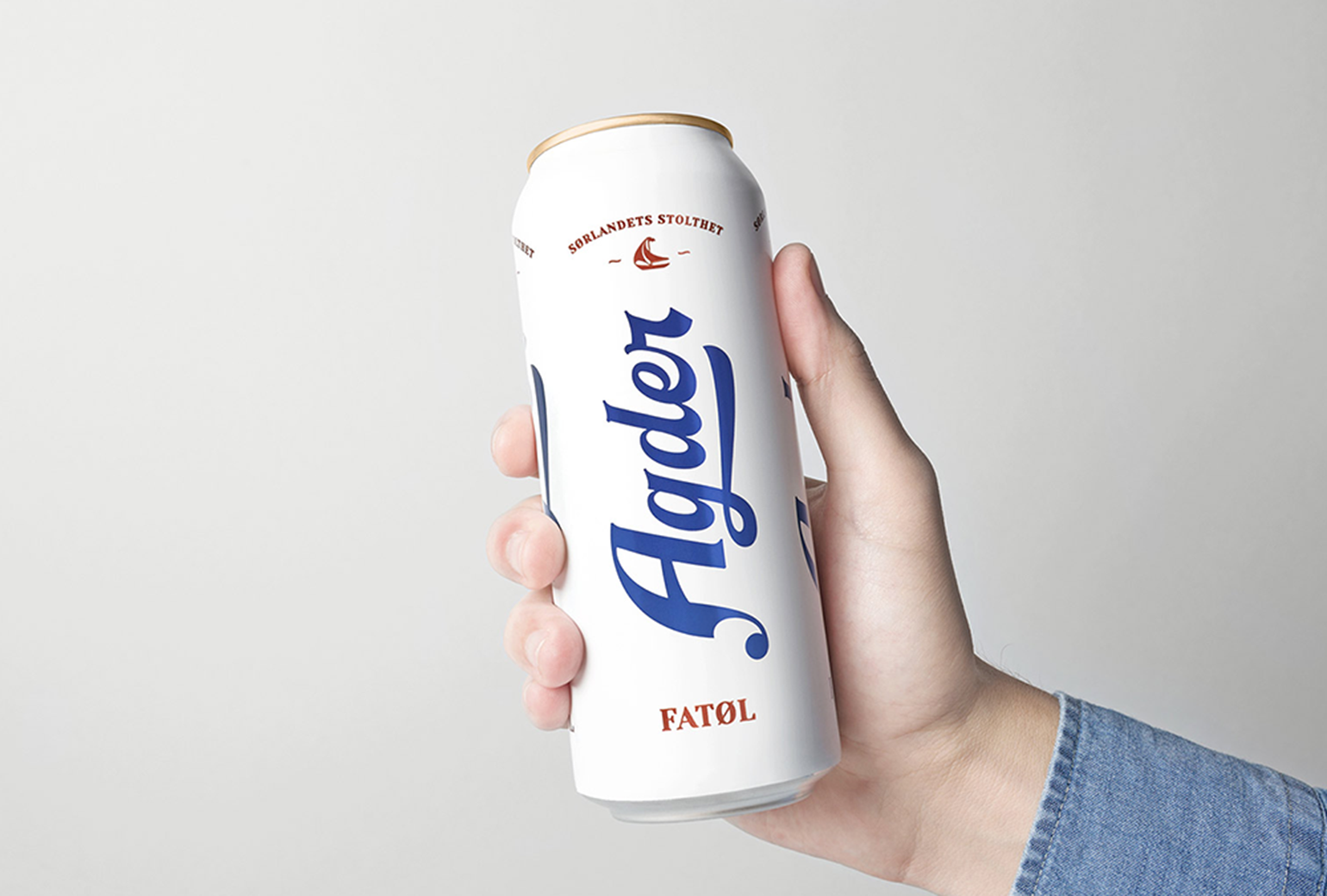
Agder BryggeriPackaging
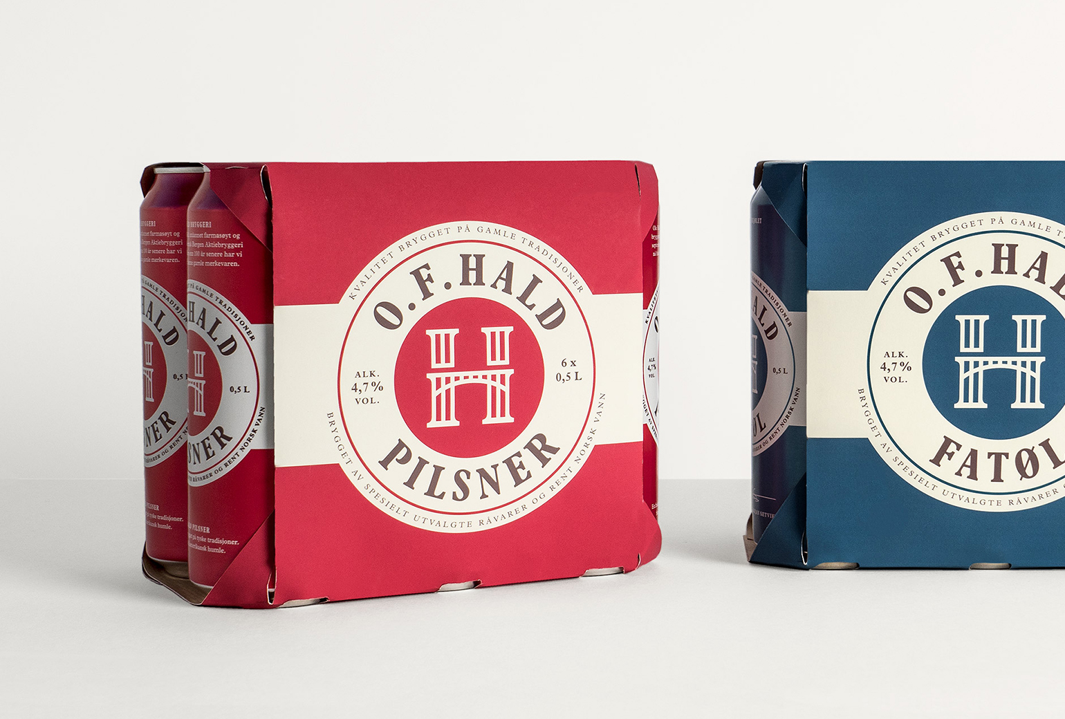
O.F.HaldPackaging
Norske BryggerierBranding
DevoldBrand Development
Bohemian LagerPackaging
Gilde AquavitPackaging
Bama StorkjøkkenBrand Development
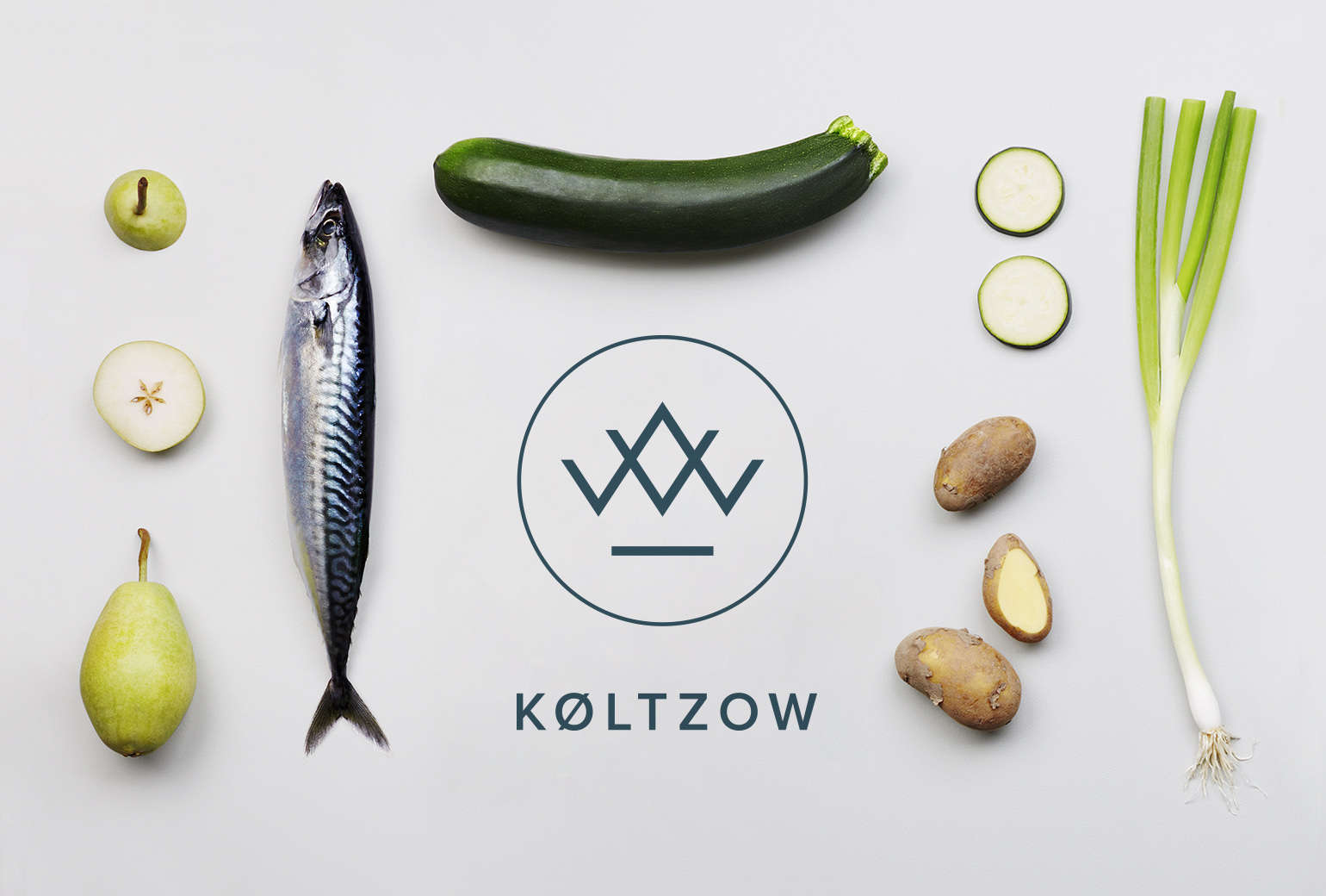
KøltzowBrand Identity
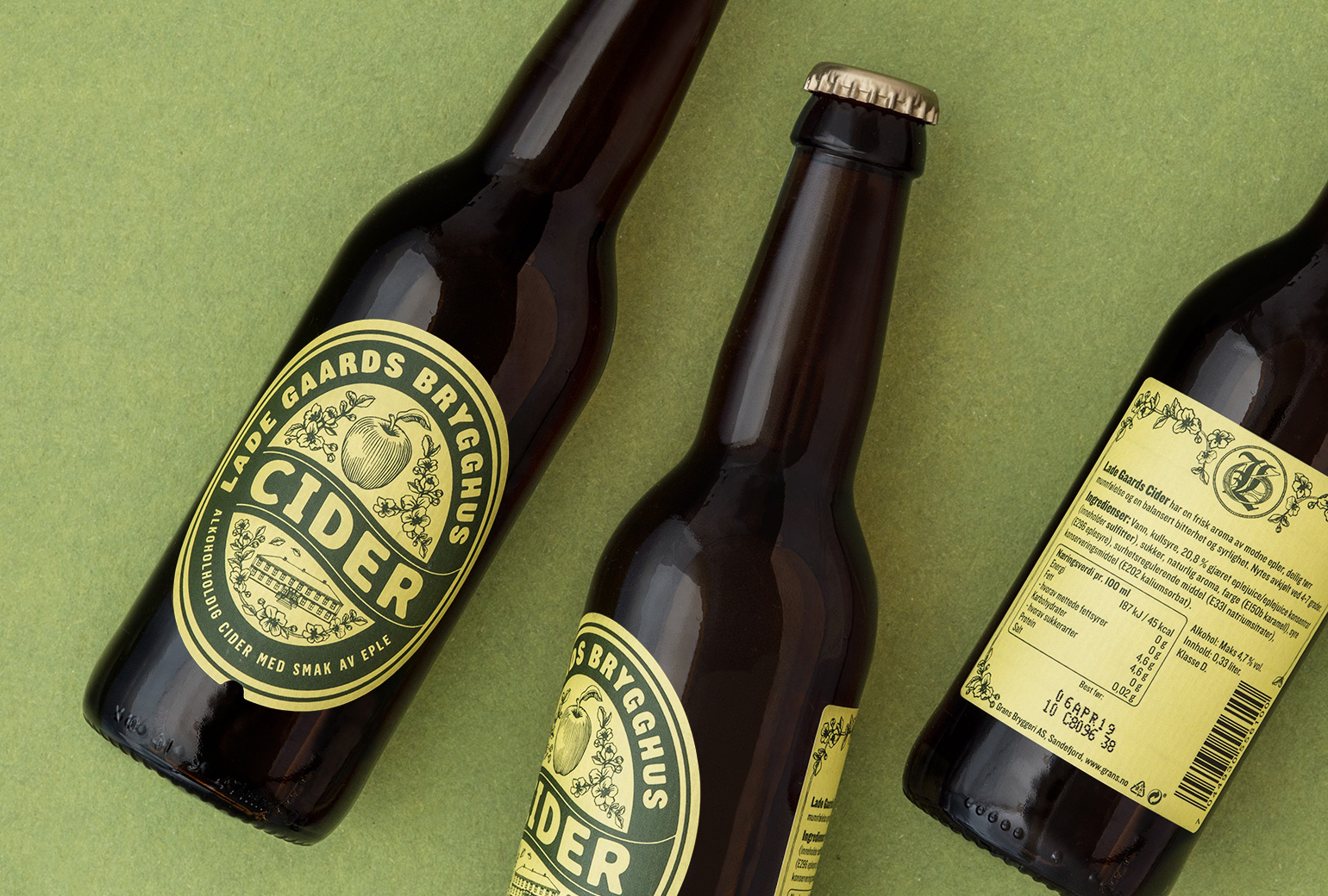
Lade Gaards CiderPackaging Design
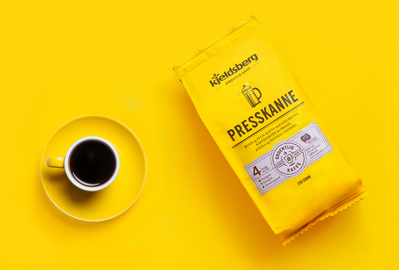
Kjeldsberg KaffePackaging Design
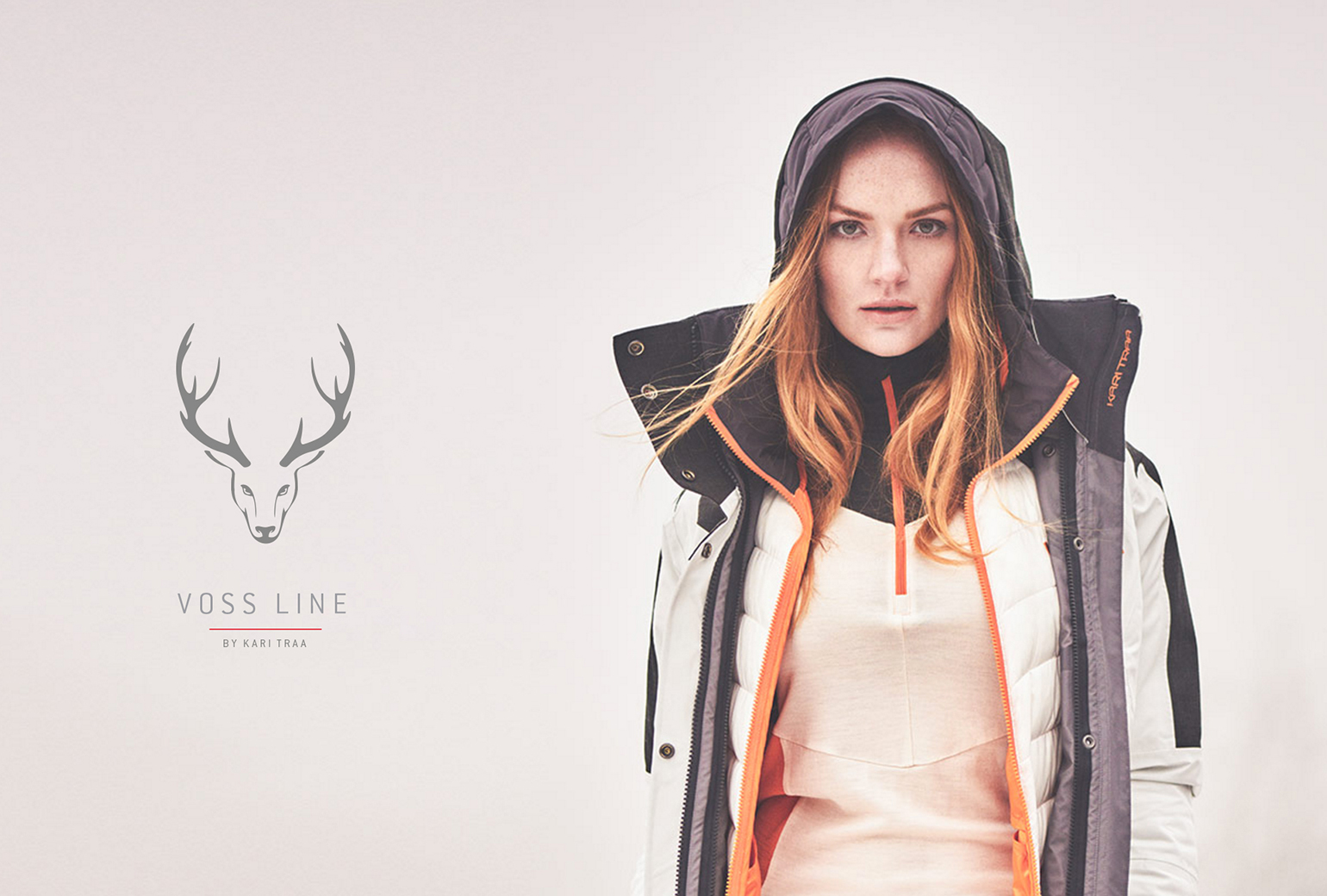
VosslineBrand identity / packaging
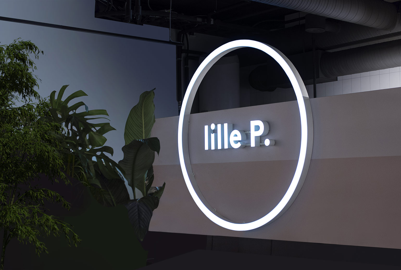
Lille PBrand Identity
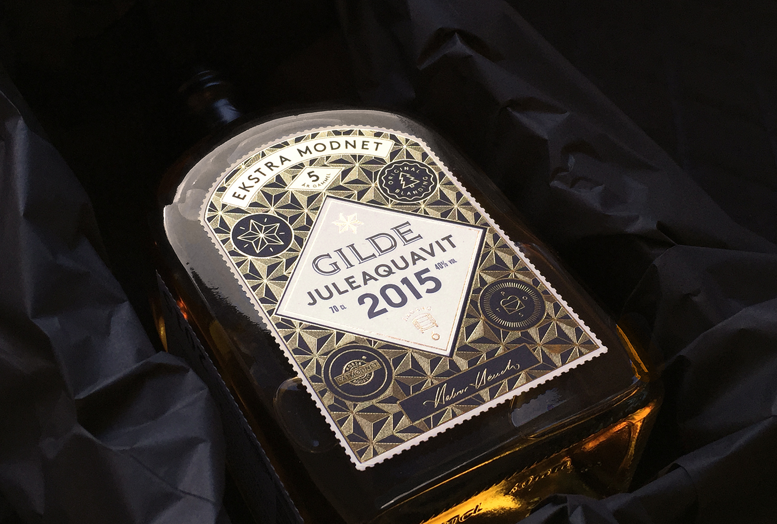
Gilde juleaquavitPackaging
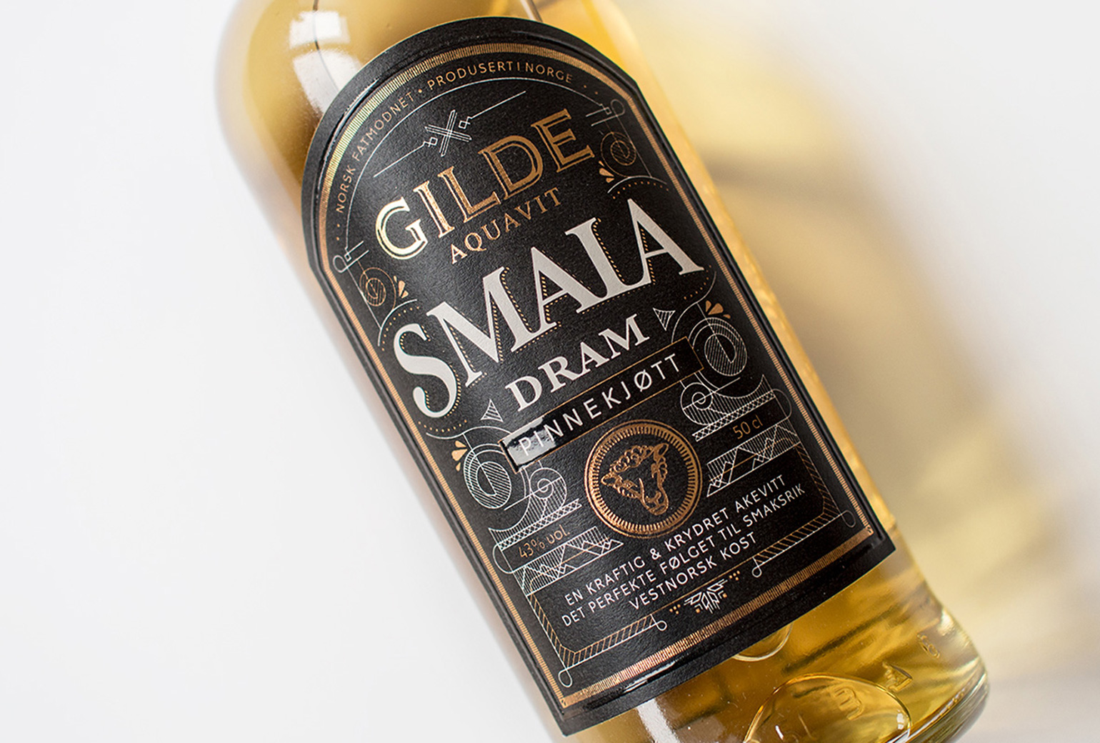
Gilde Aquavit - SmalaPackaging