Agder Bryggeri
Brand Identity / Packaging
Agency: SMFB Dinamo (Frank)
Client: Rema 1000
Design: Geir Solem Lysbakken / Marius Wathne
Photo: Erik Fuglseth, Adam Read
Visuelt Diploma
Featured on BP&O
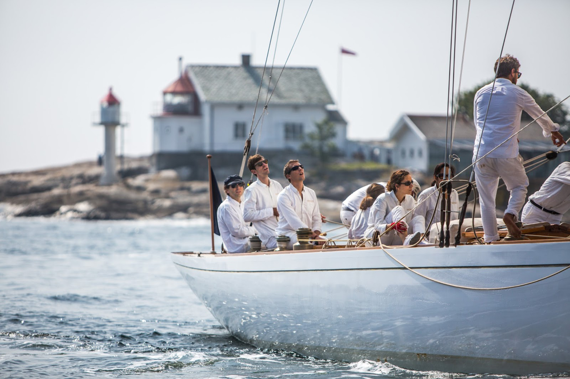
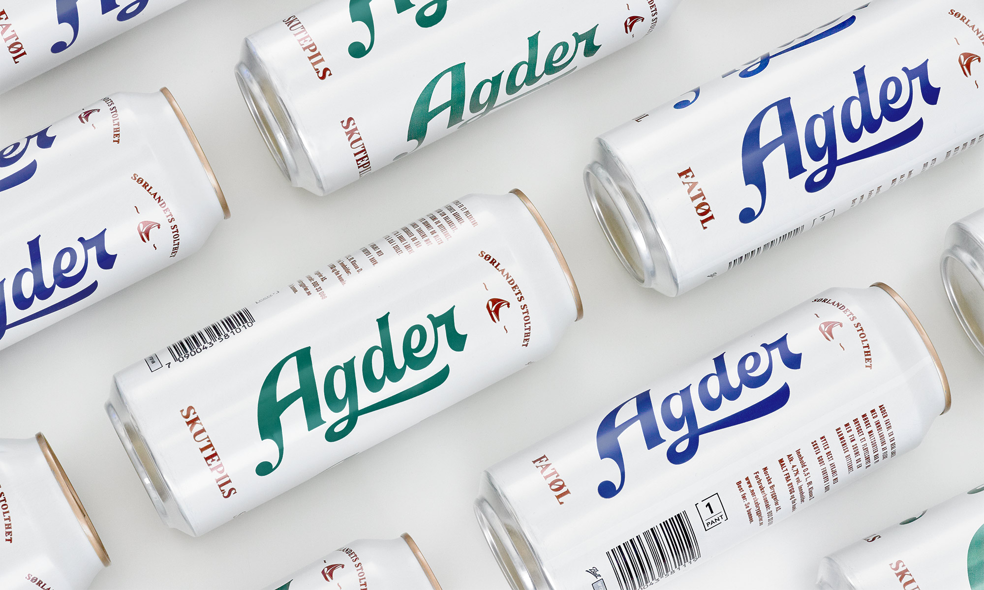
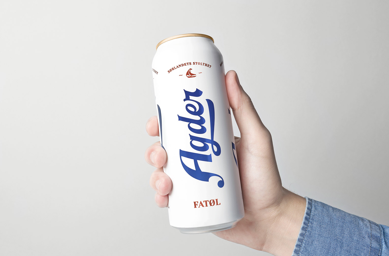
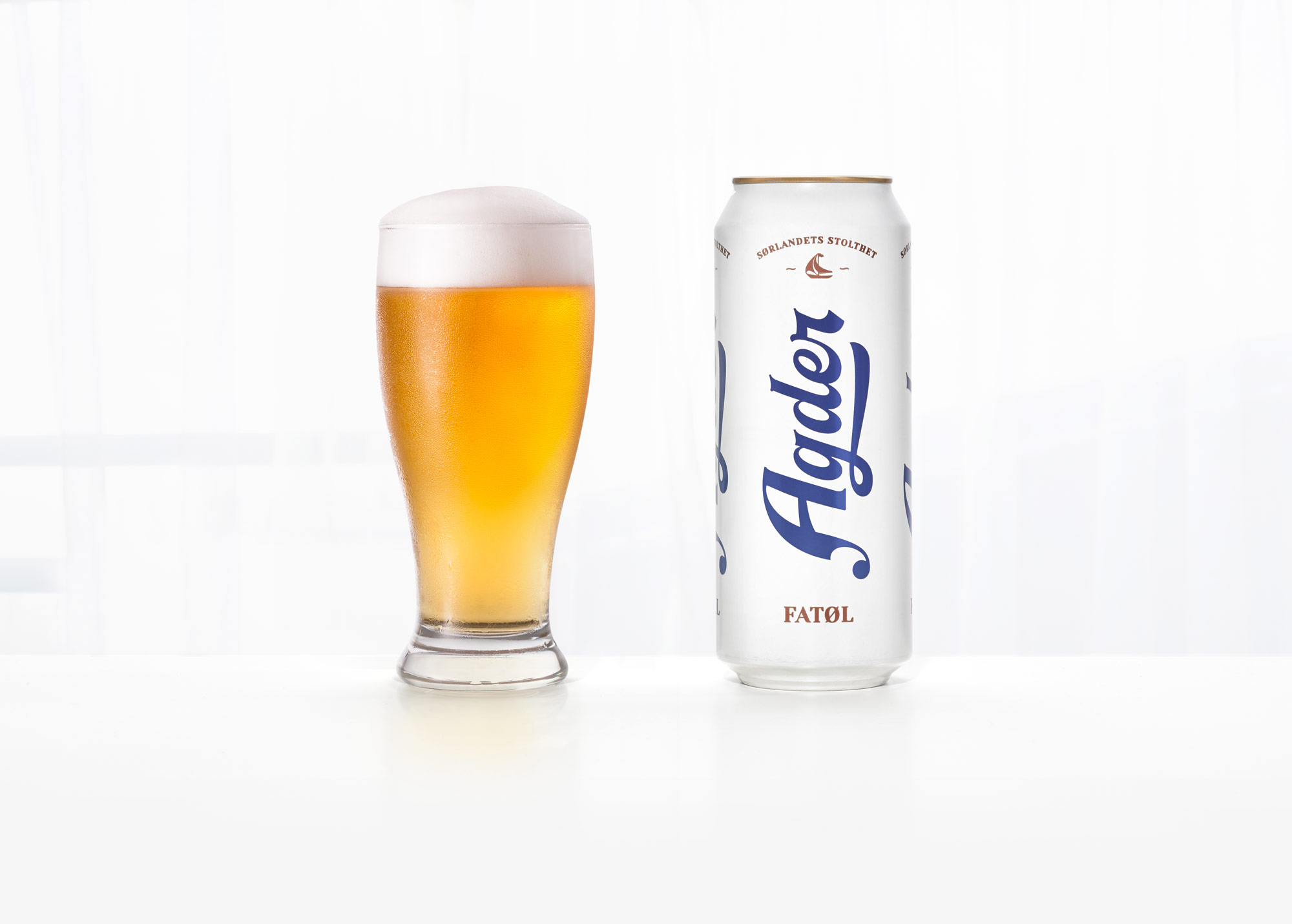
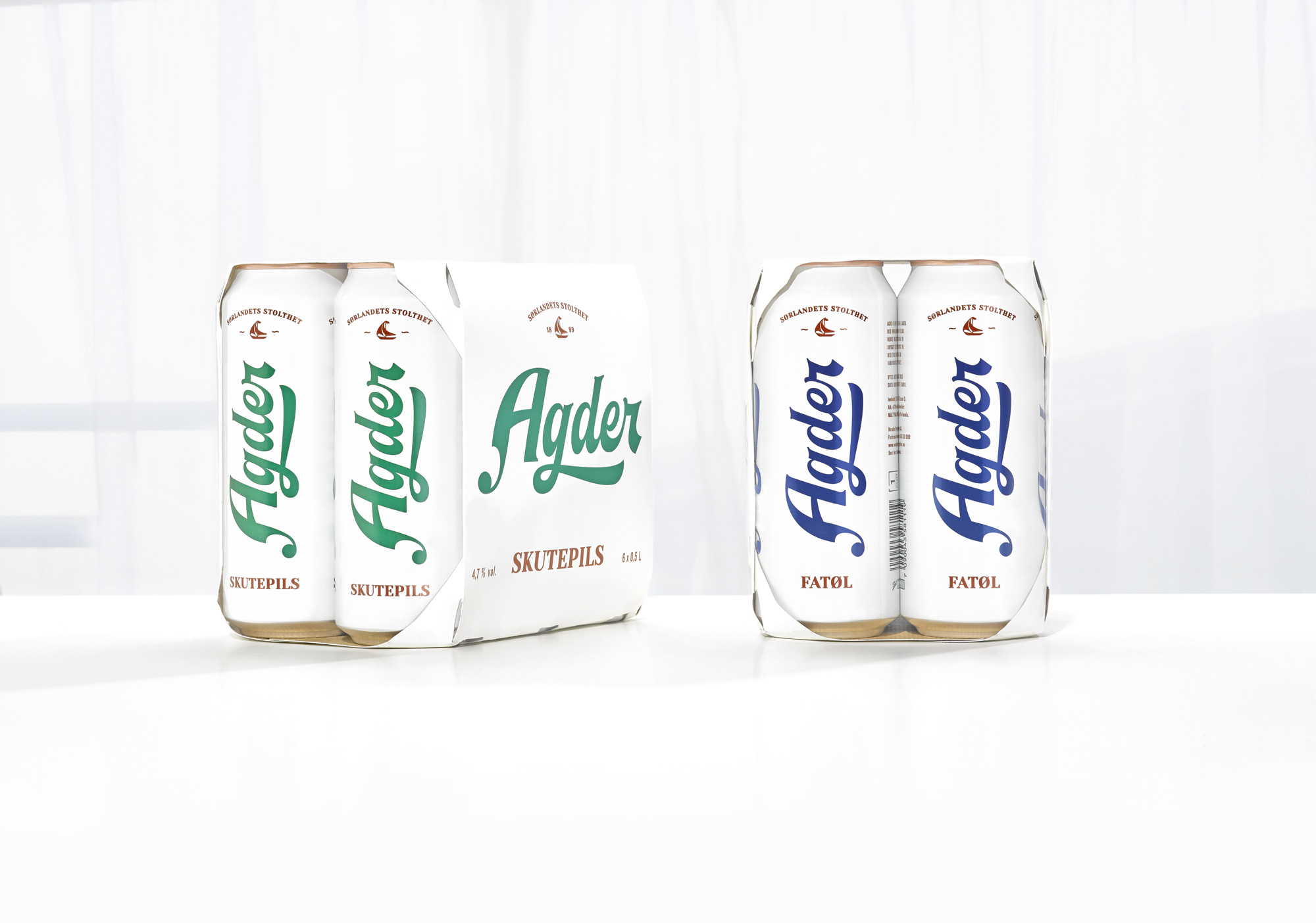
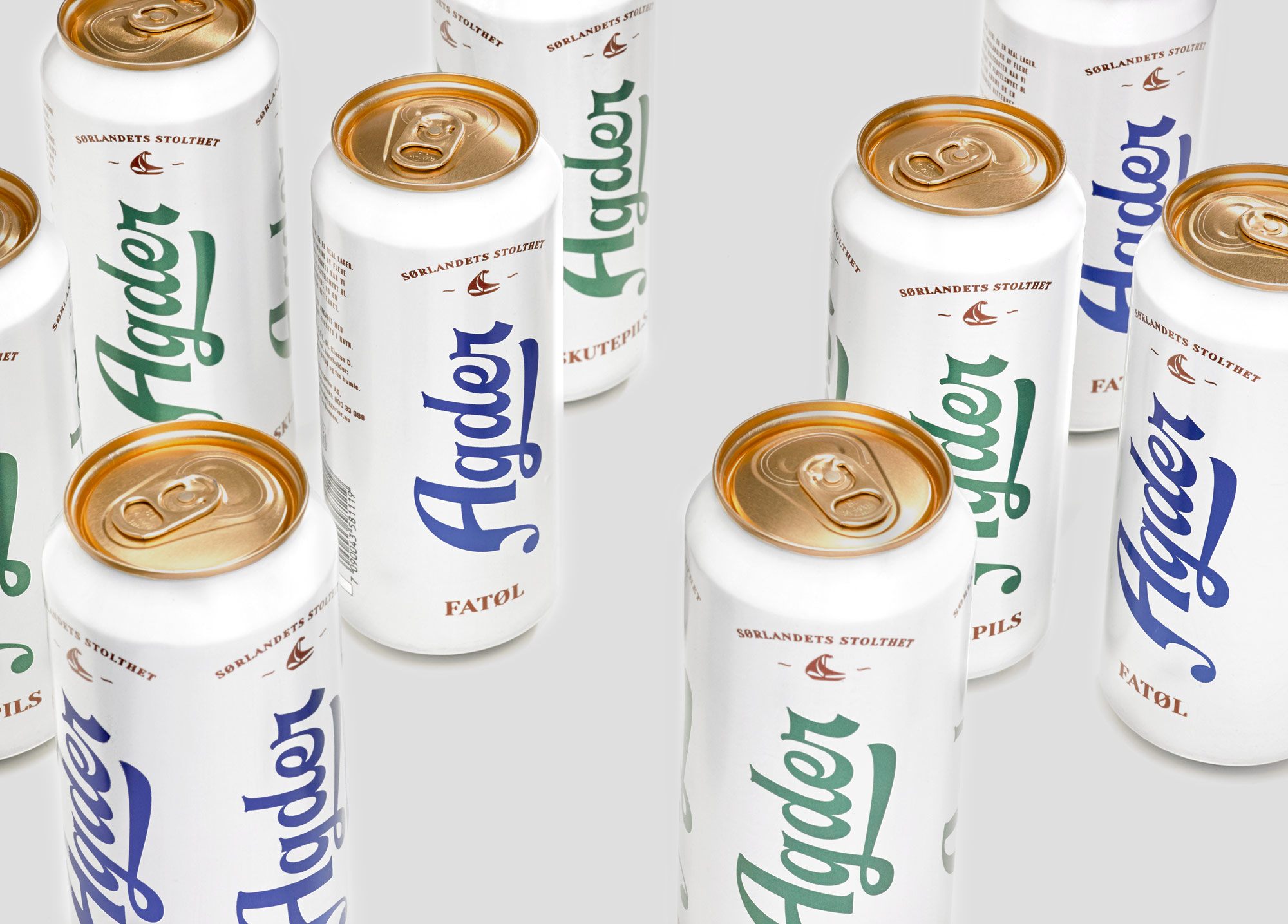
Agder Bryggeri is one of many historic breweries in Norway. The brewery went out of business in 1904, but was brought back to life through an national initiative by Norske Bryggerier (Norwegian Breweries) and is part of the company's locally produced beer strategy. This beer is only sold in the southern region of Norway (Agder).
The concept is inspired by the Agder area with its white houses, good sailing and long history and tradition. The design was built around a typographic handcrafted logo that should reflect this. The predominant use of white is unusual for a beer design, but it makes the beer stand out in what can be a dark and over designed category.
Work
Freia PremiumPackaging
Onklp PilsnerPackaging
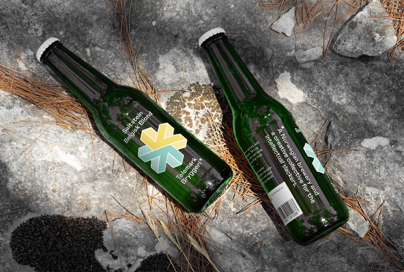
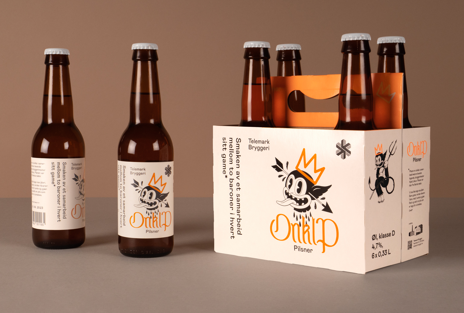
Telemark BryggeriPackaging
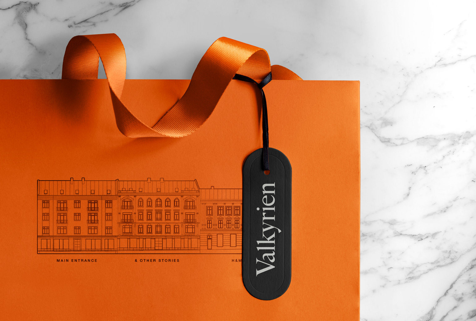
ValkyrienBranding
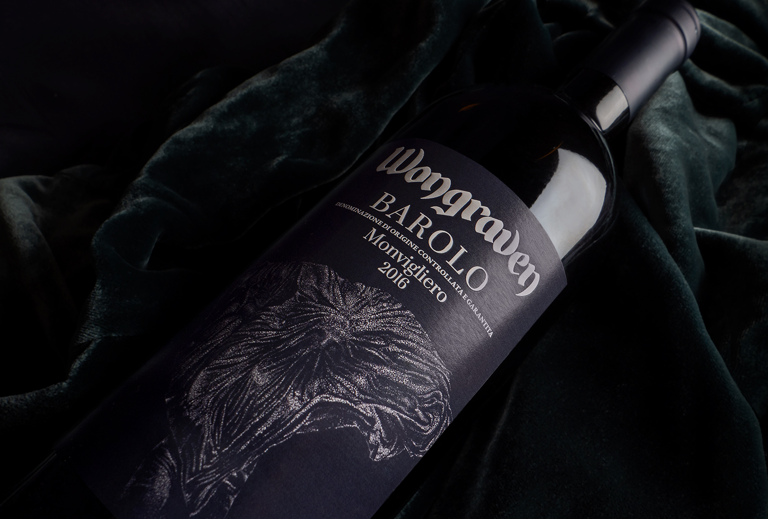
Wongraven Barolo MonviglieroPackaging
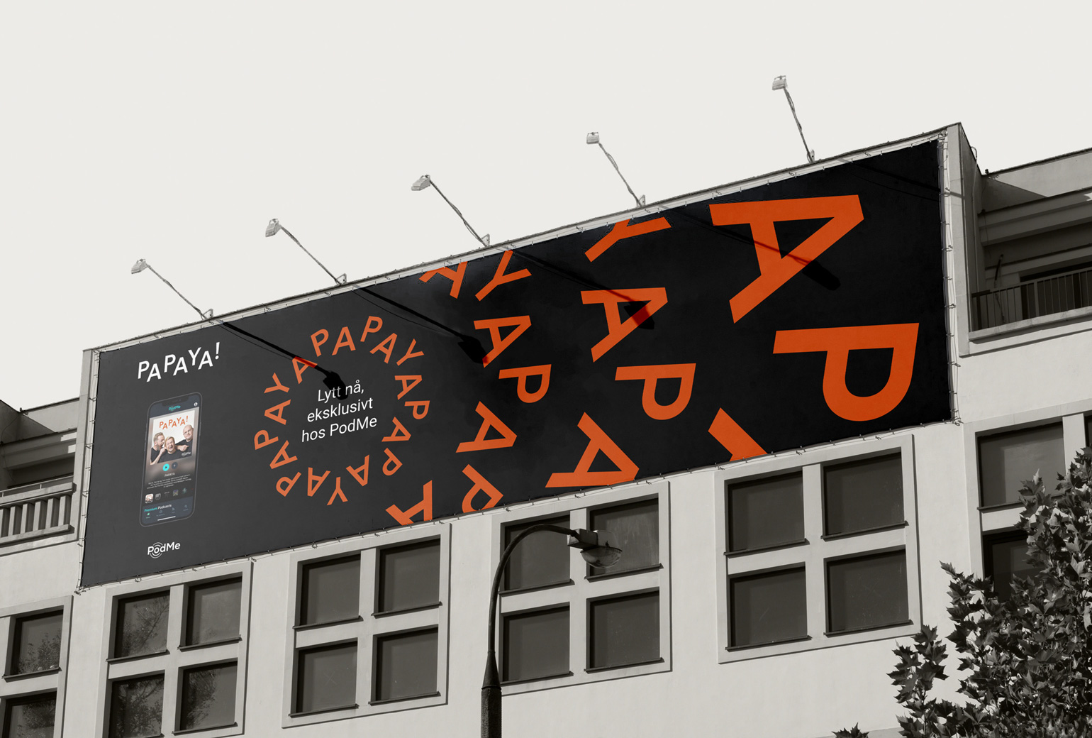
PAPAYAIdentity
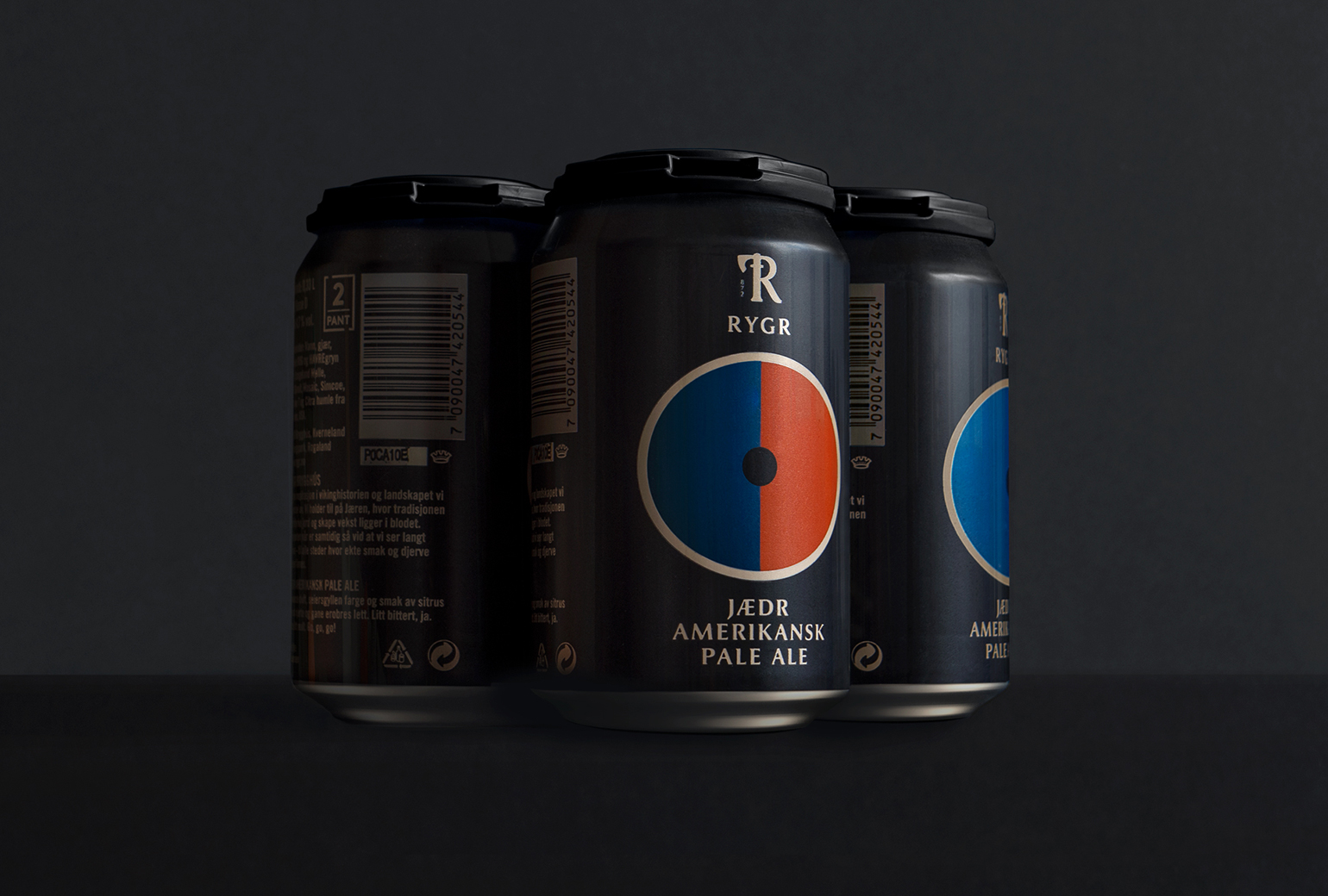
RYGRPackaging

TINE YTPackaging
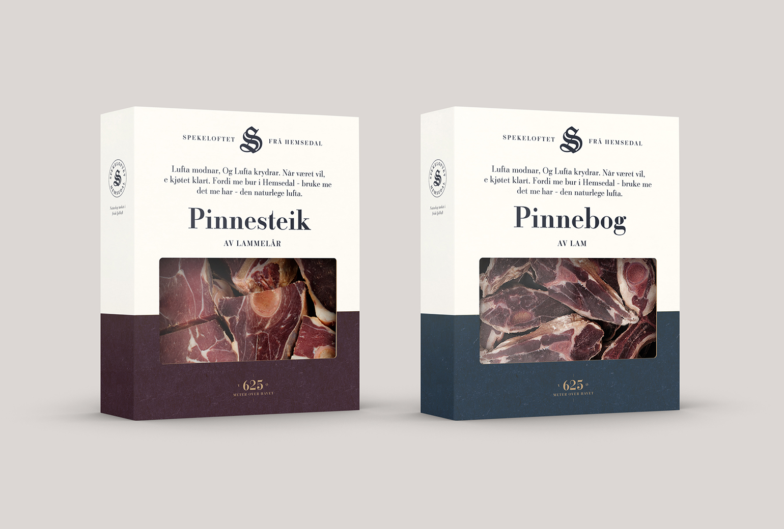
SpekeloftetPackaging
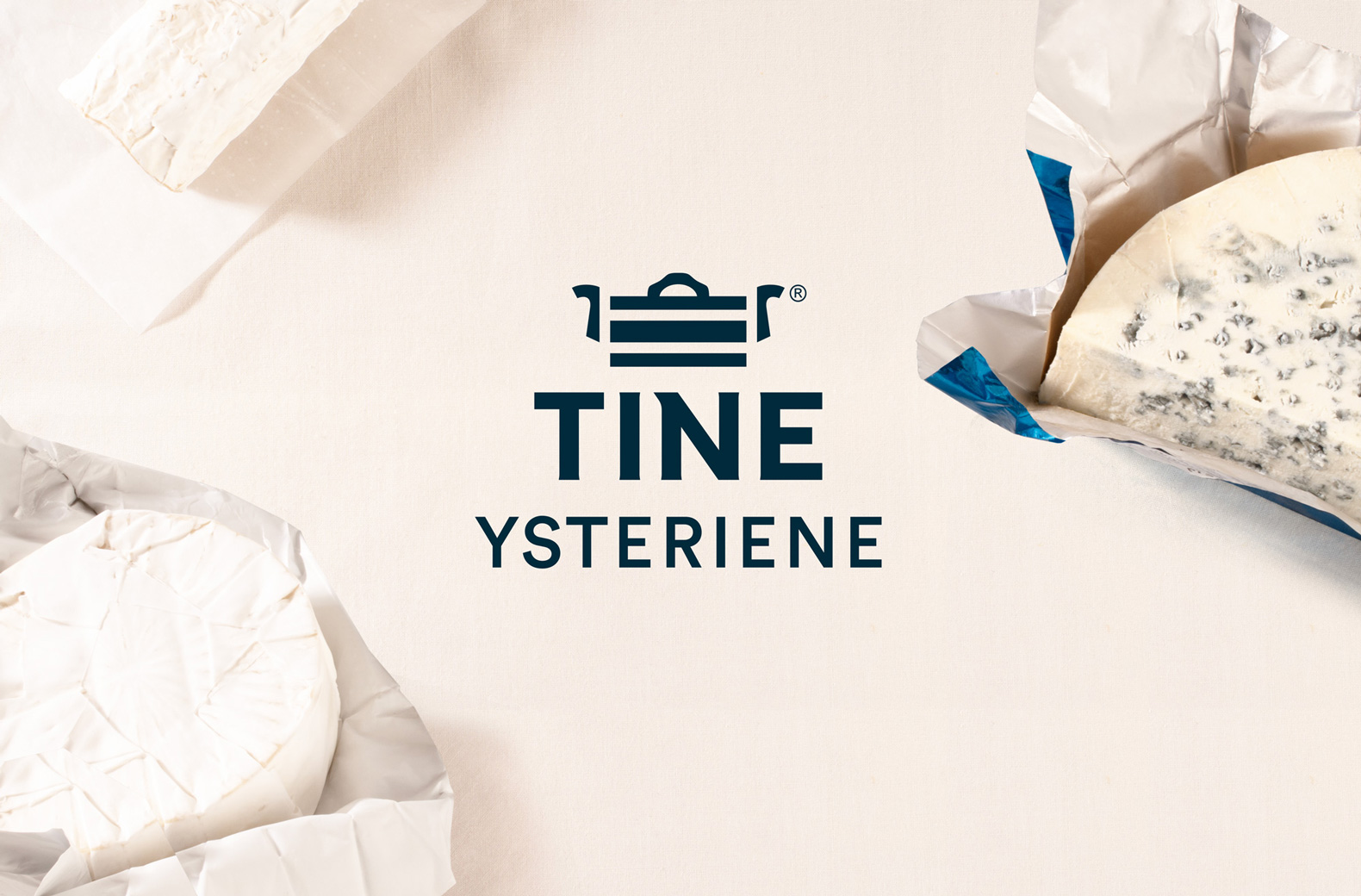
TINE YsterierPackaging
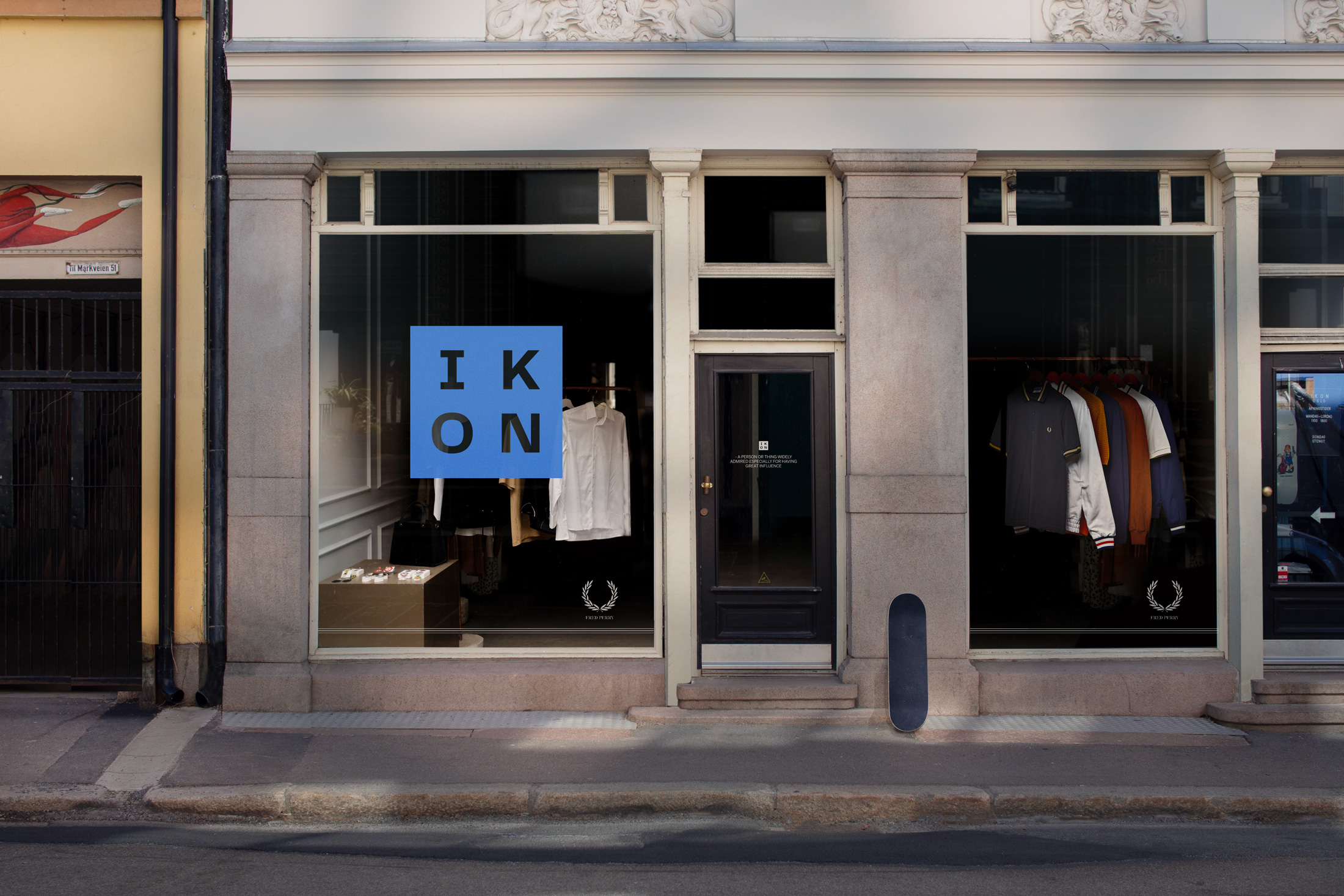
IKONBrand Identity
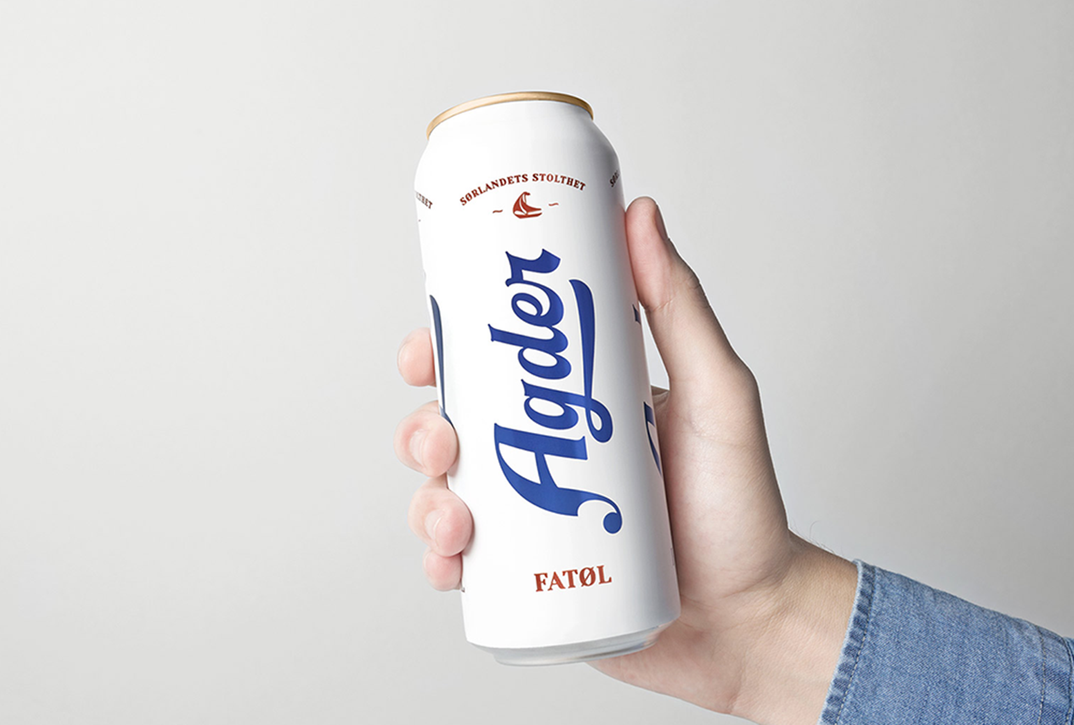
Agder BryggeriPackaging
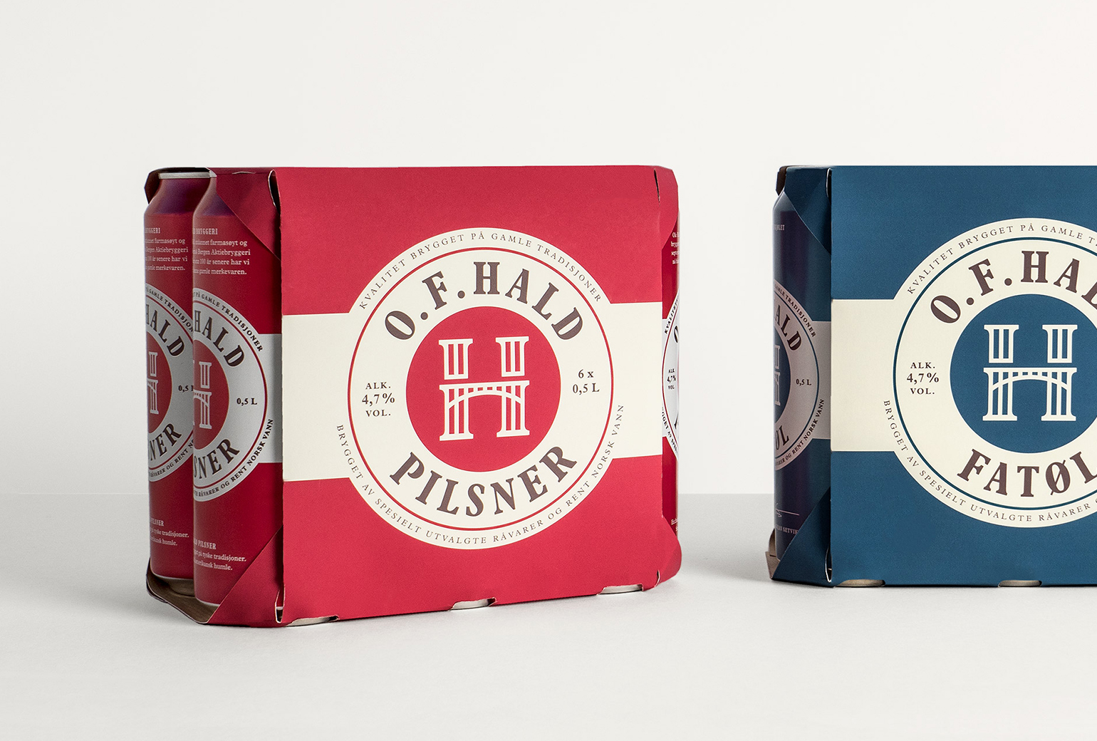
O.F.HaldPackaging
Norske BryggerierBranding
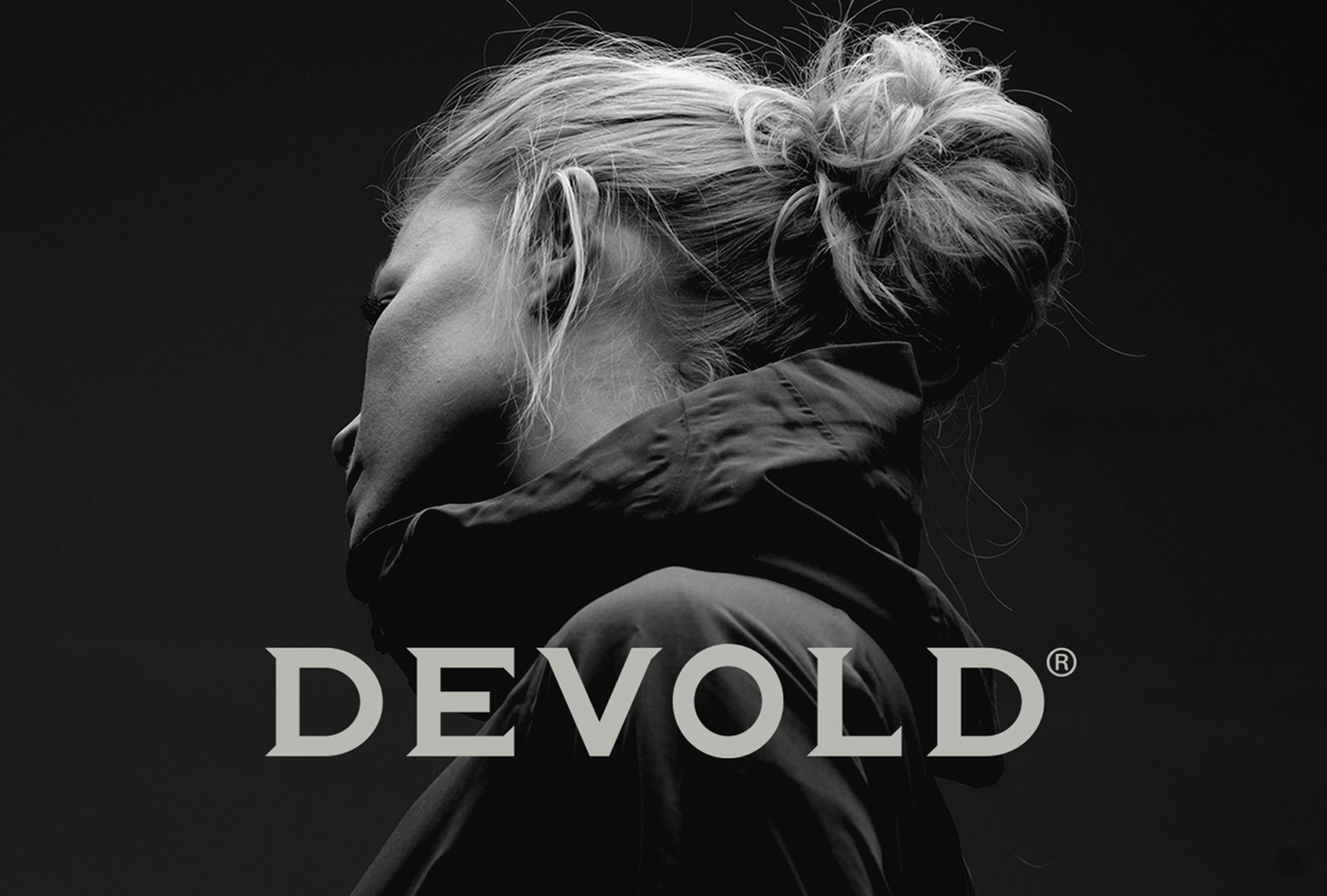
DevoldBrand Development
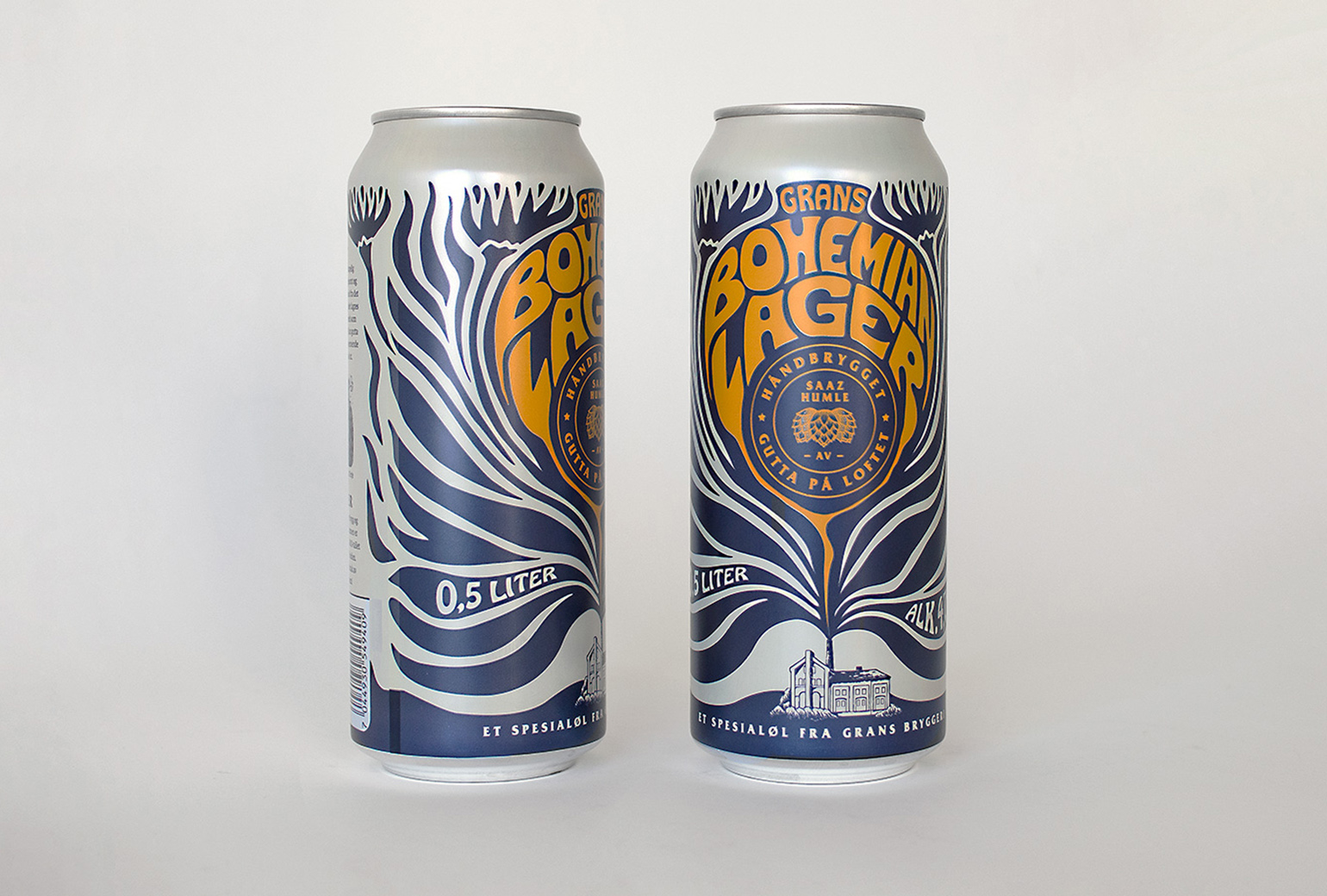
Bohemian LagerPackaging
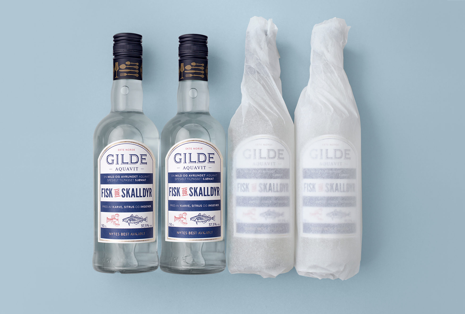
Gilde AquavitPackaging
Bama StorkjøkkenBrand Development
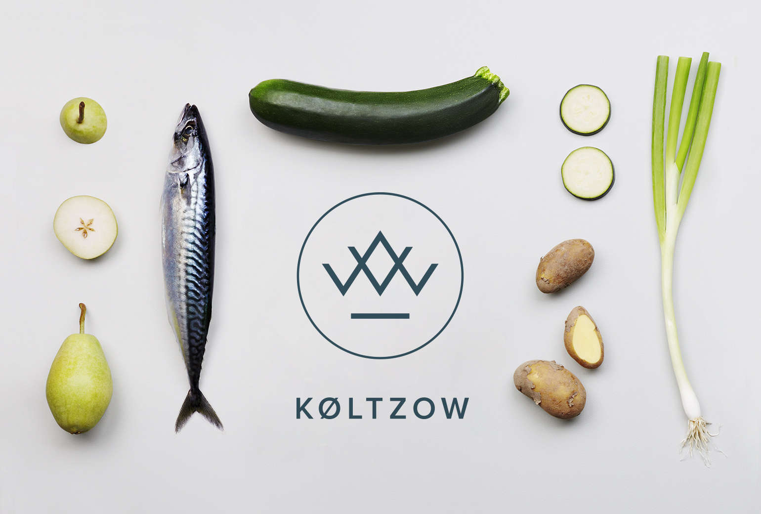
KøltzowBrand Identity
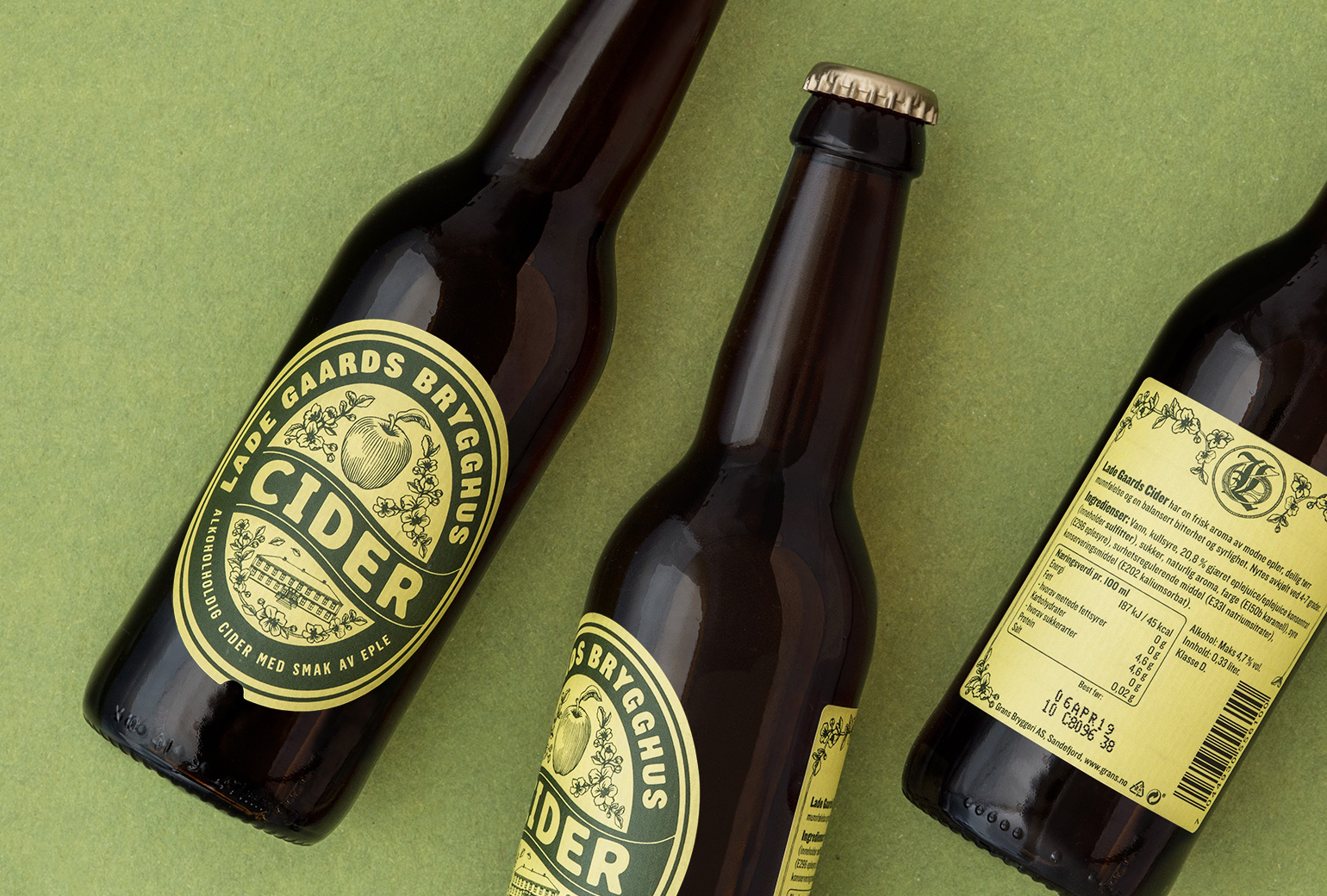
Lade Gaards CiderPackaging Design
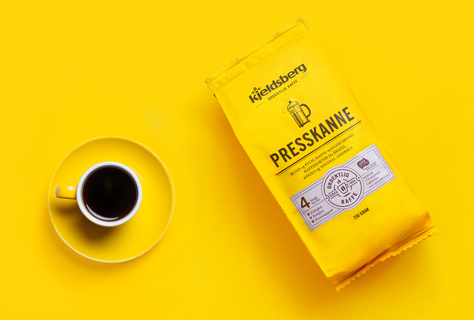
Kjeldsberg KaffePackaging Design

VosslineBrand identity / packaging
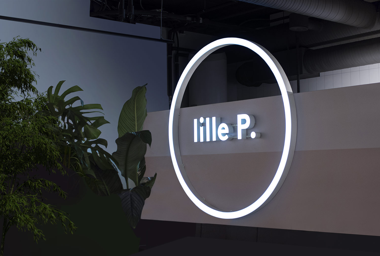
Lille PBrand Identity
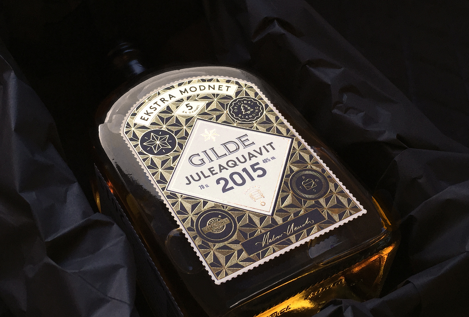
Gilde juleaquavitPackaging
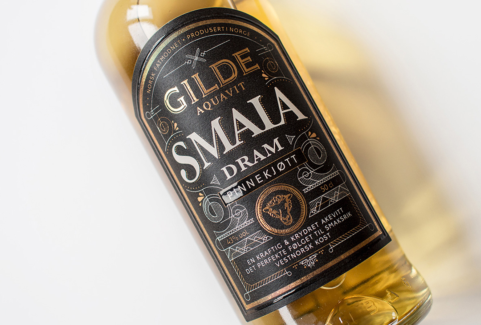
Gilde Aquavit - SmalaPackaging