TINE YT
Packaging
TINE YT
Packaging
TINE YT Packaging
TINE YT
Packaging
TINE YT
Packaging
Agency: SMFB Dinamo
Client: TINE
Design: Geir Solem Lysbakken
Repro/design: Dorthe Torgersen
Motion: Sindre Broager Grøn
Text: Andrea Pharo Ronde
Project manager: Karianne Stenby
Consultant: Oscar Michaelsen
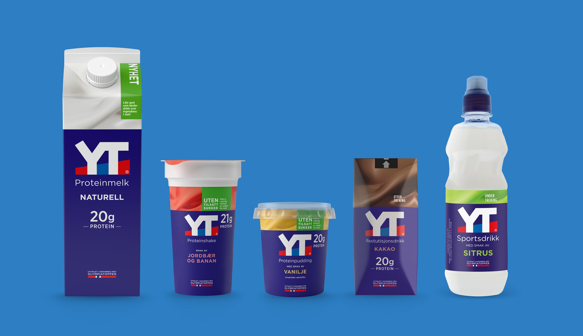
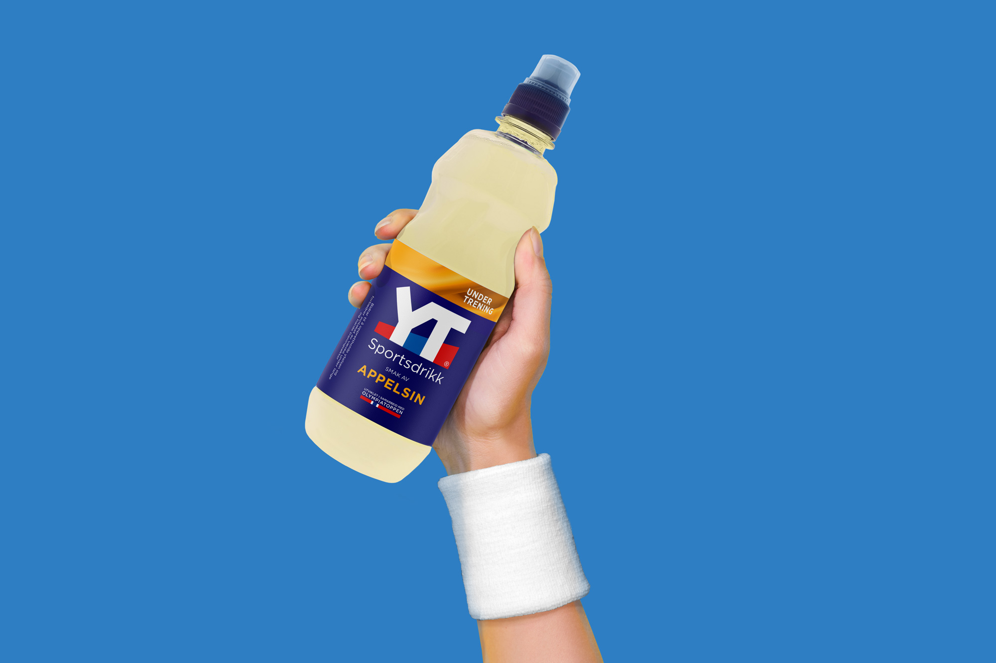
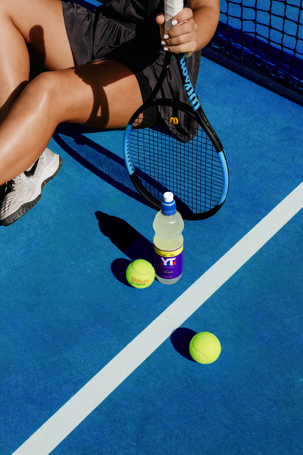
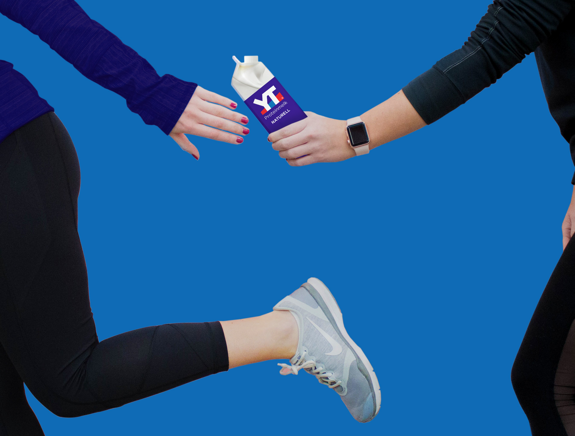
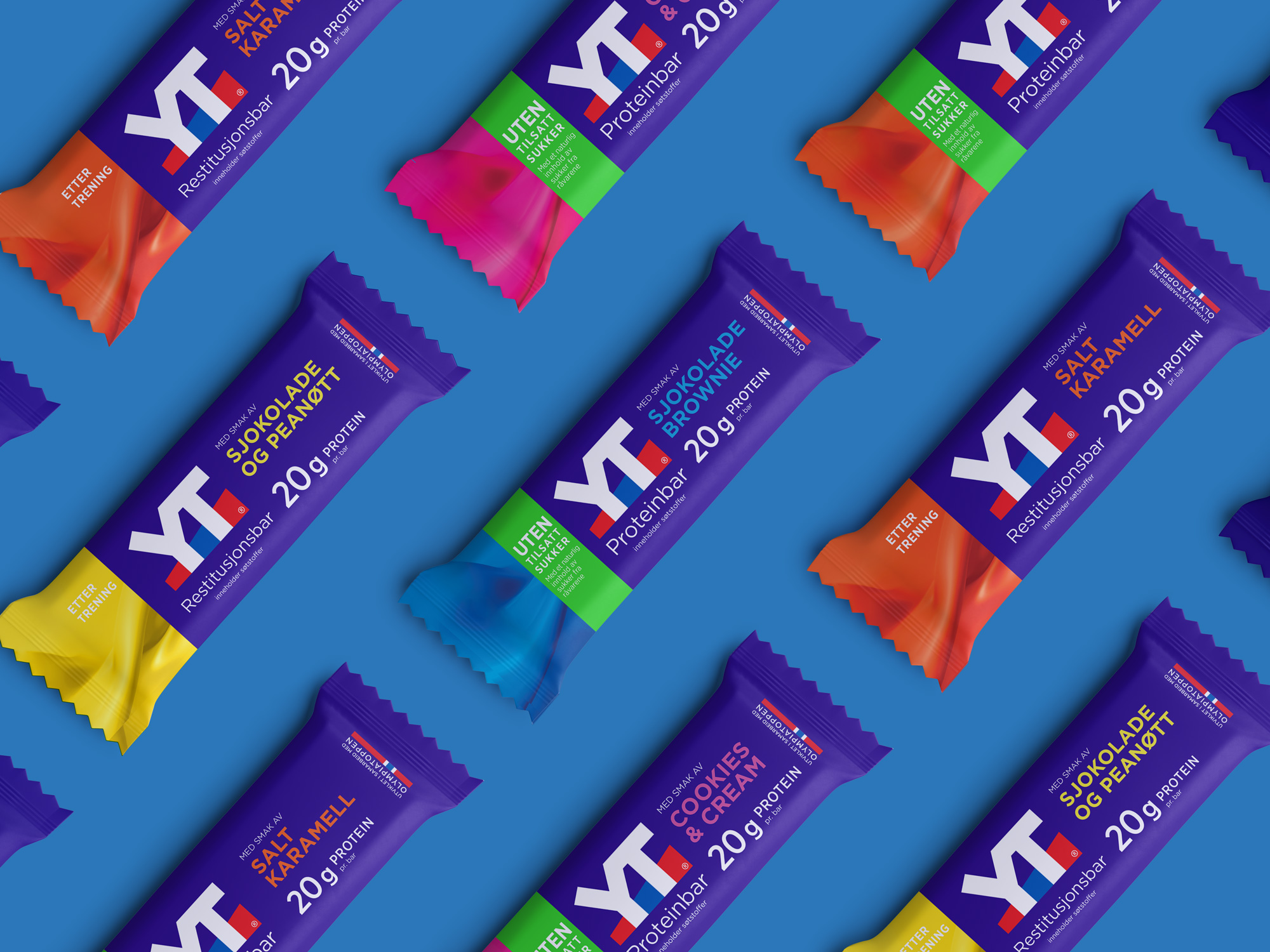
TINE YT® is a series of foods and drinks for those who exercise. YT® was developed in collaboration with the nutrition department at Olympiatoppen. YT® means to perform in Norwegian, and TINE YT® provides the right refill before, during and after training so that you can perform at your best and get your strength back faster afterwords.
The redesign had a clear goal to make the packaging bolder and more blue for a stronger serie. The flavour got a large area in the top for better tasting selction. The solution had to work on cross of product range all from dairy, bars, pudding to sports drinks and woth or without added sugar.
Work
Freia PremiumPackaging
Onklp PilsnerPackaging
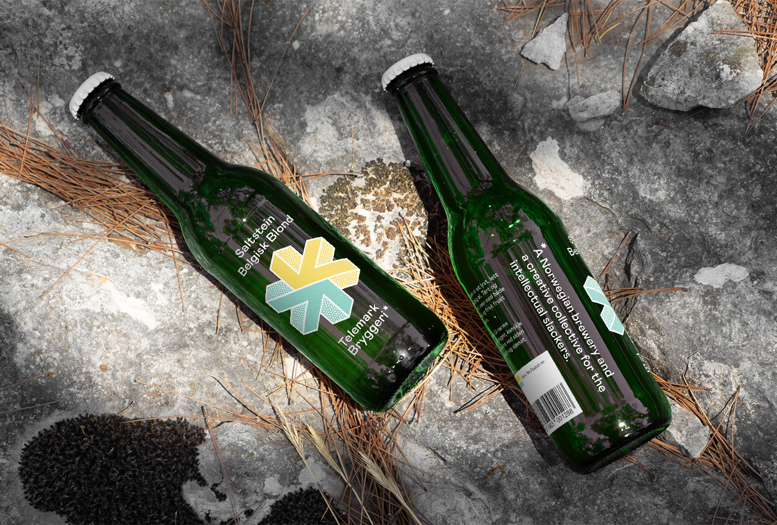
Telemark BryggeriPackaging
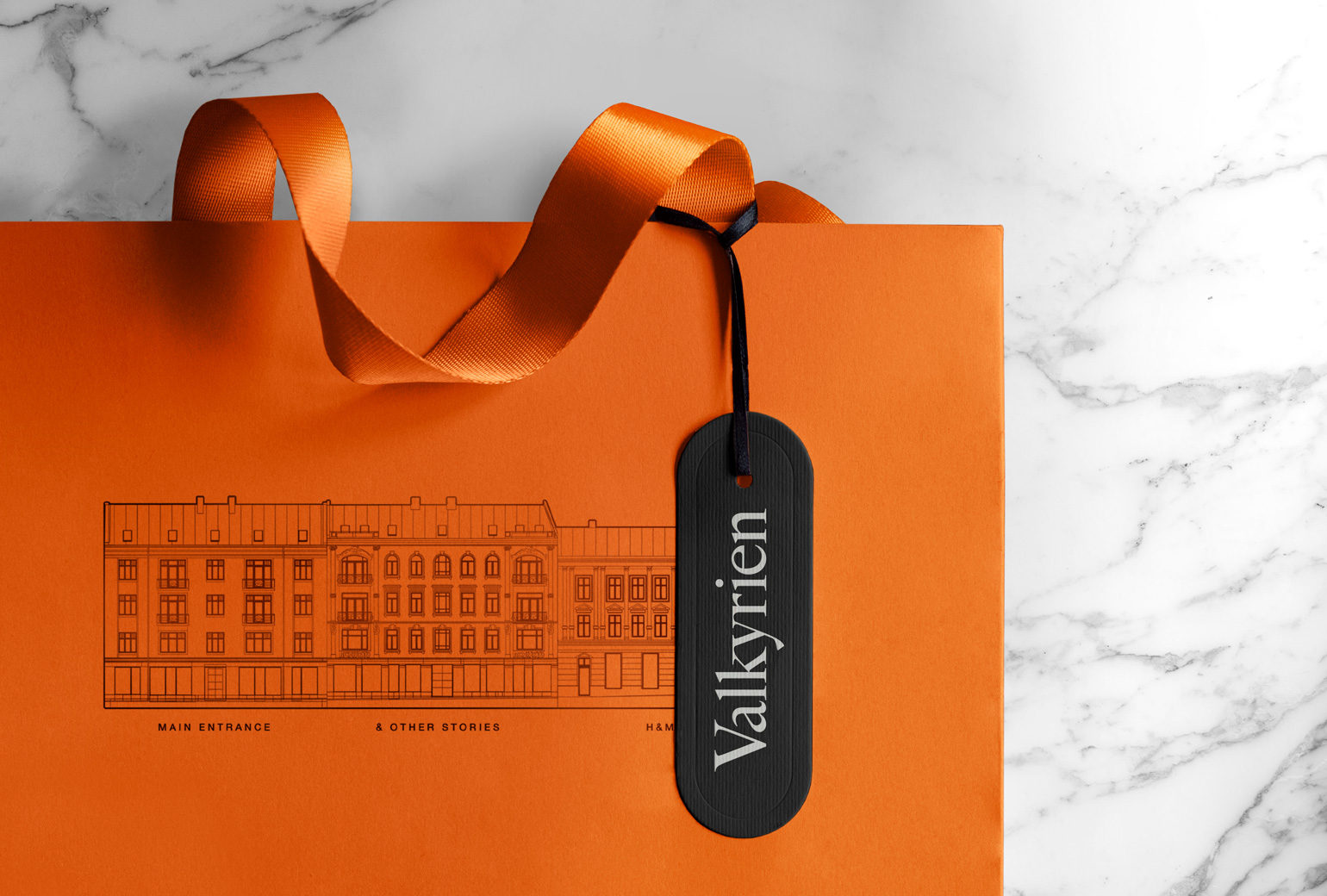
ValkyrienBranding
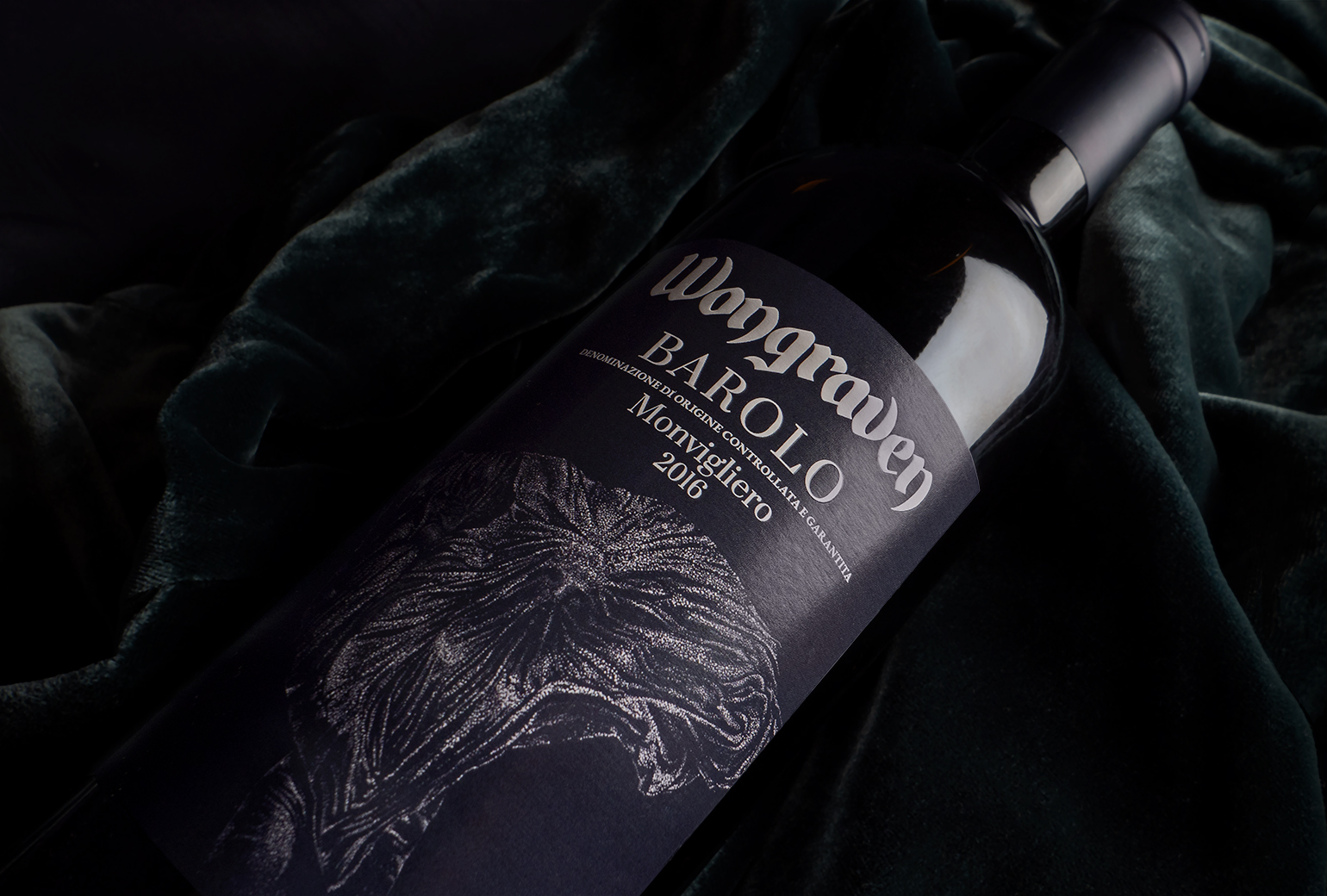
Wongraven Barolo MonviglieroPackaging
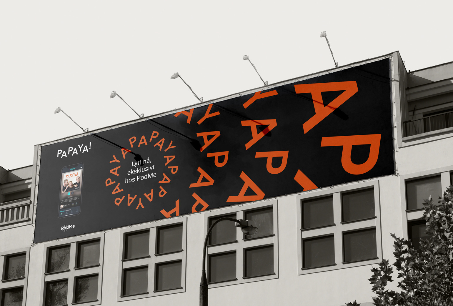
PAPAYAIdentity
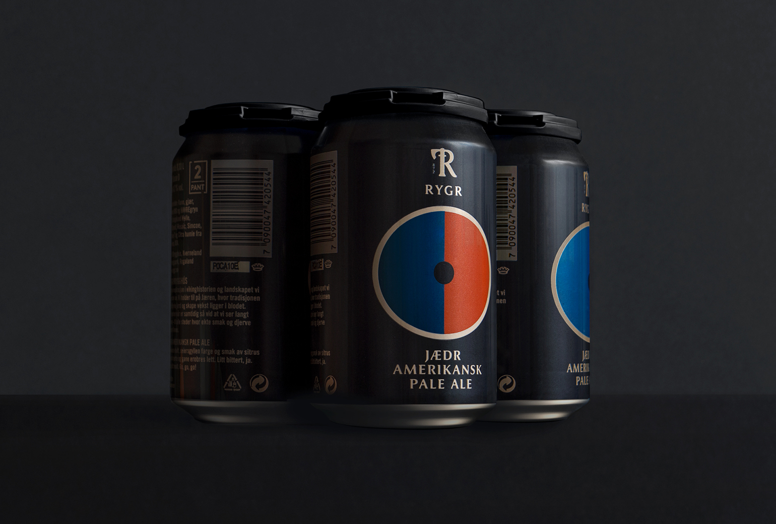
RYGRPackaging
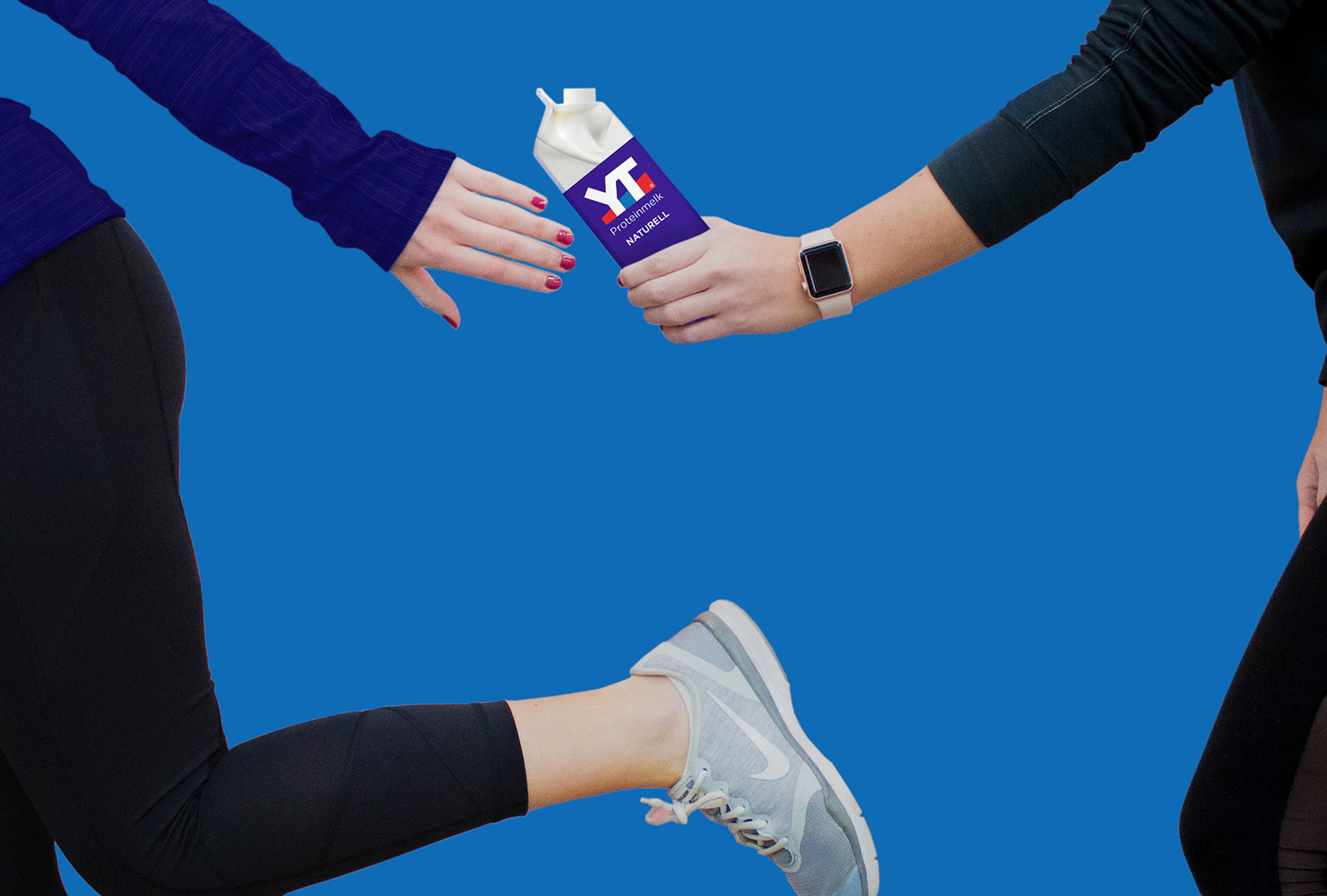
TINE YTPackaging
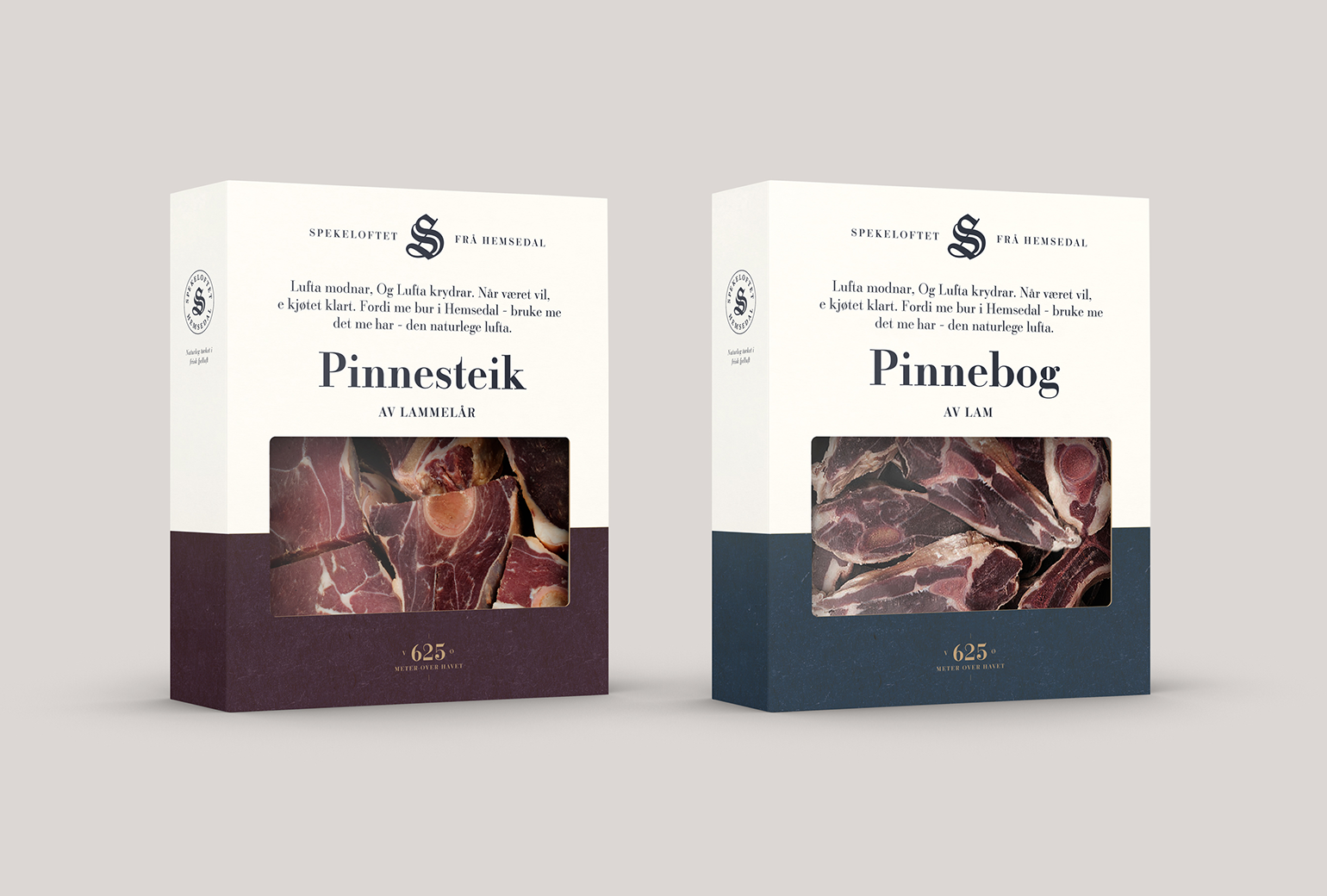
SpekeloftetPackaging
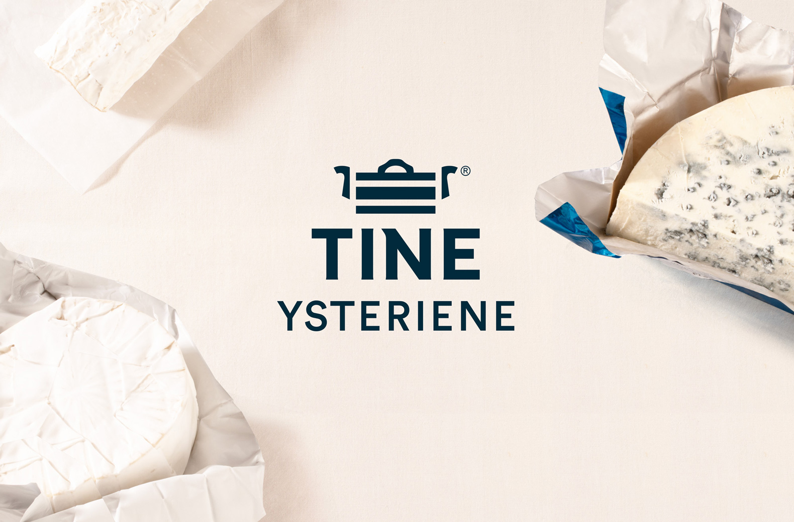
TINE YsterierPackaging
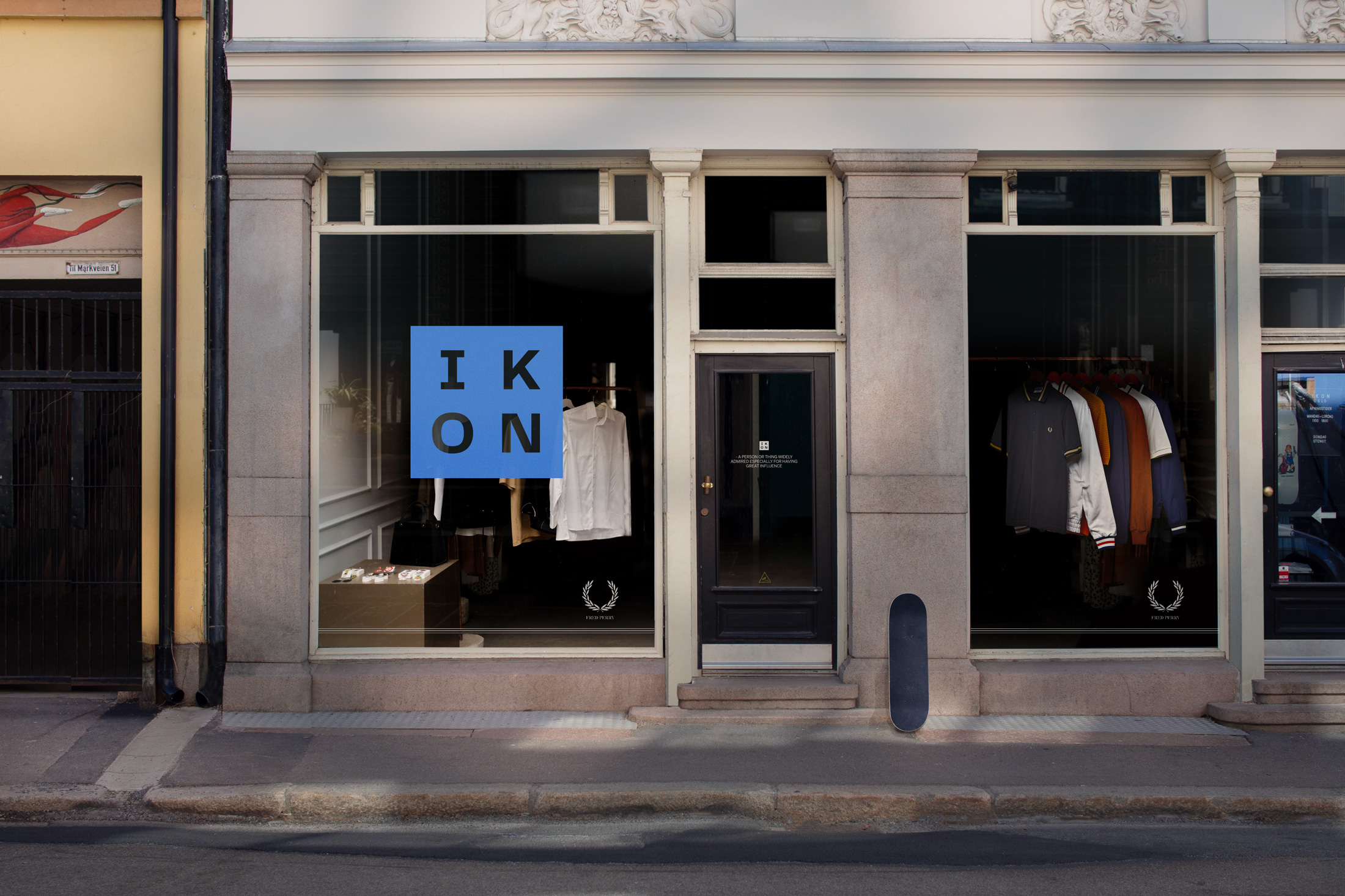
IKONBrand Identity
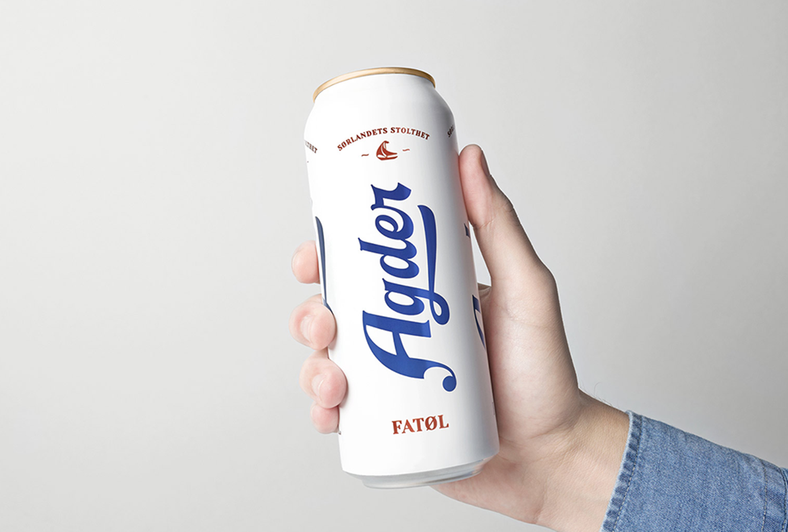
Agder BryggeriPackaging
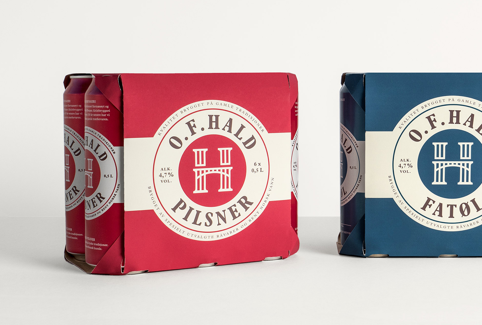
O.F.HaldPackaging
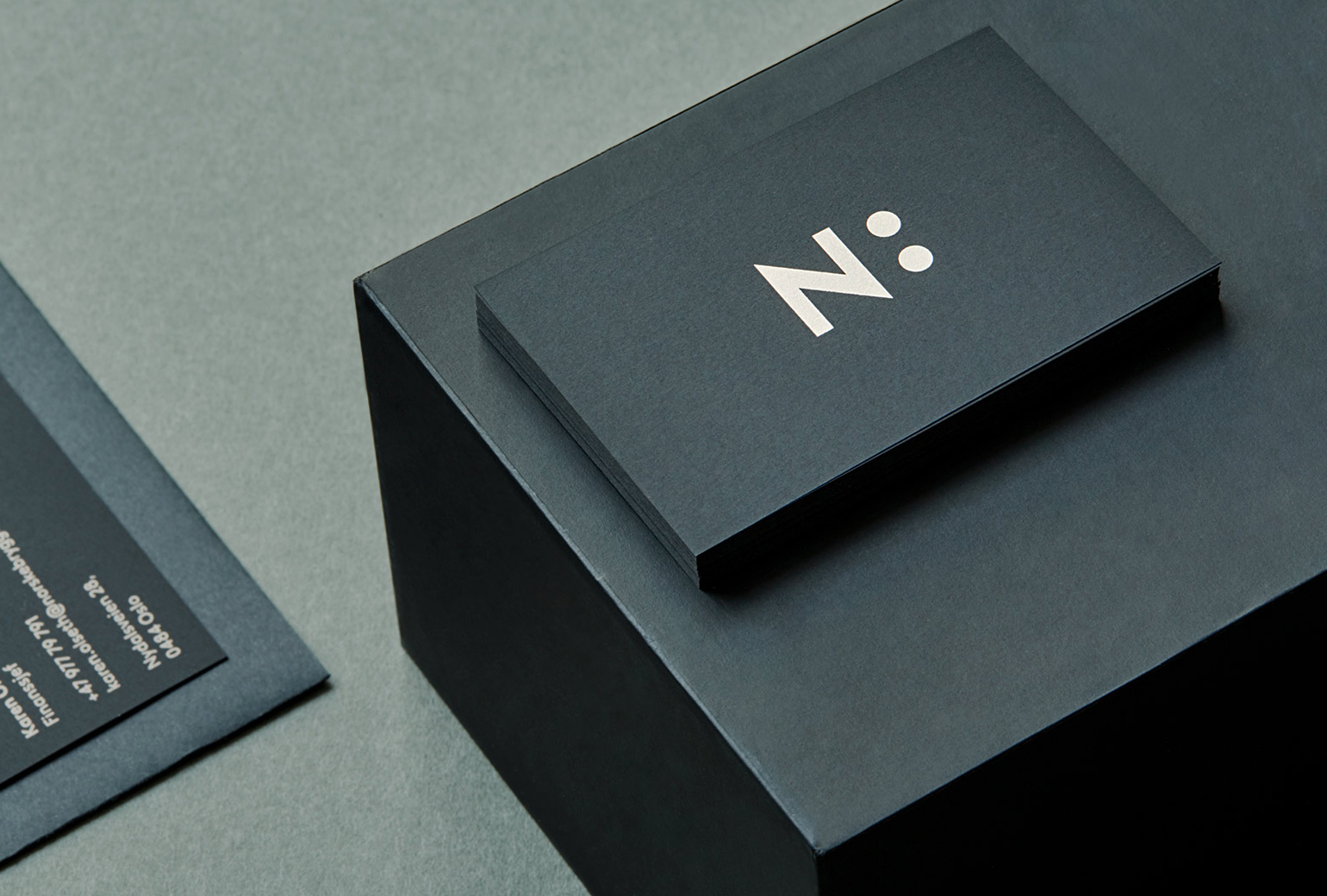
Norske BryggerierBranding
DevoldBrand Development
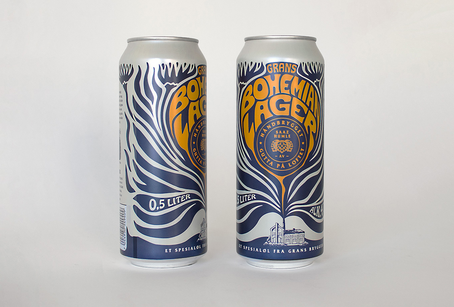
Bohemian LagerPackaging
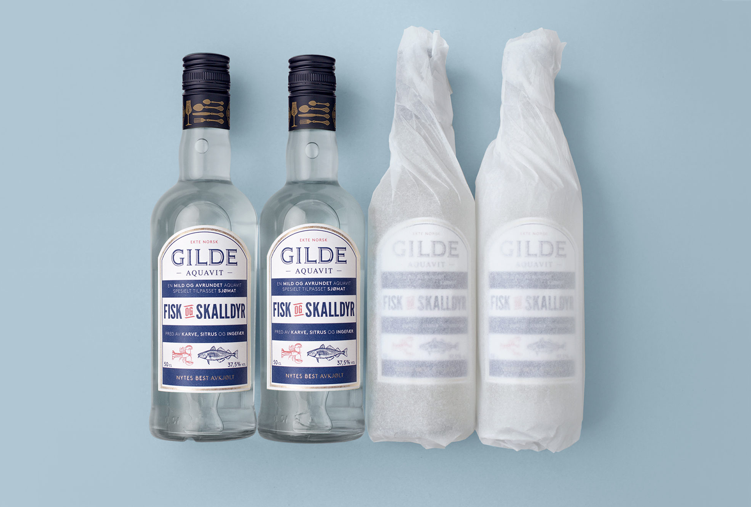
Gilde AquavitPackaging
Bama StorkjøkkenBrand Development
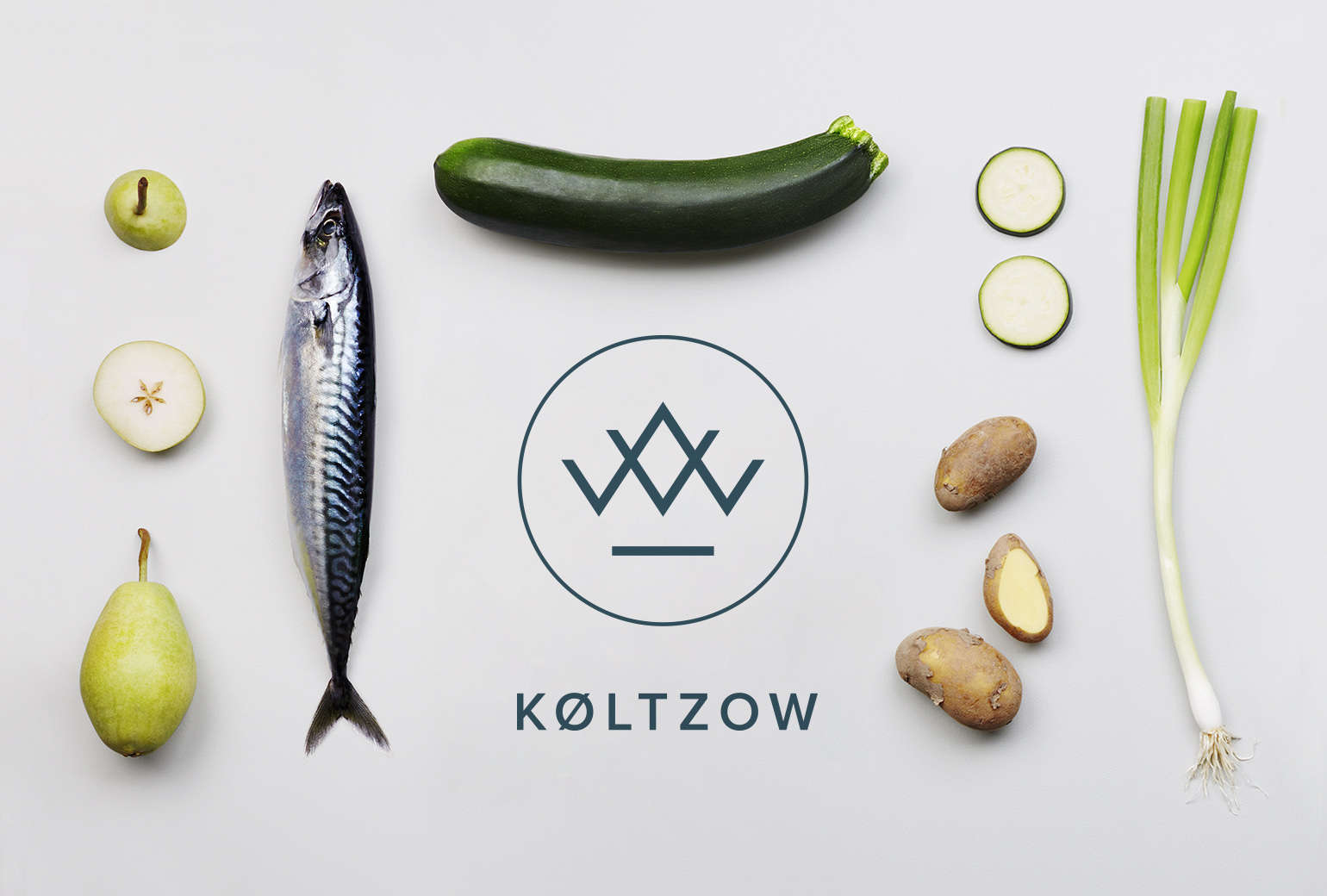
KøltzowBrand Identity
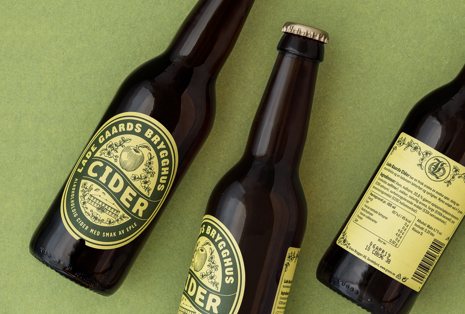
Lade Gaards CiderPackaging Design
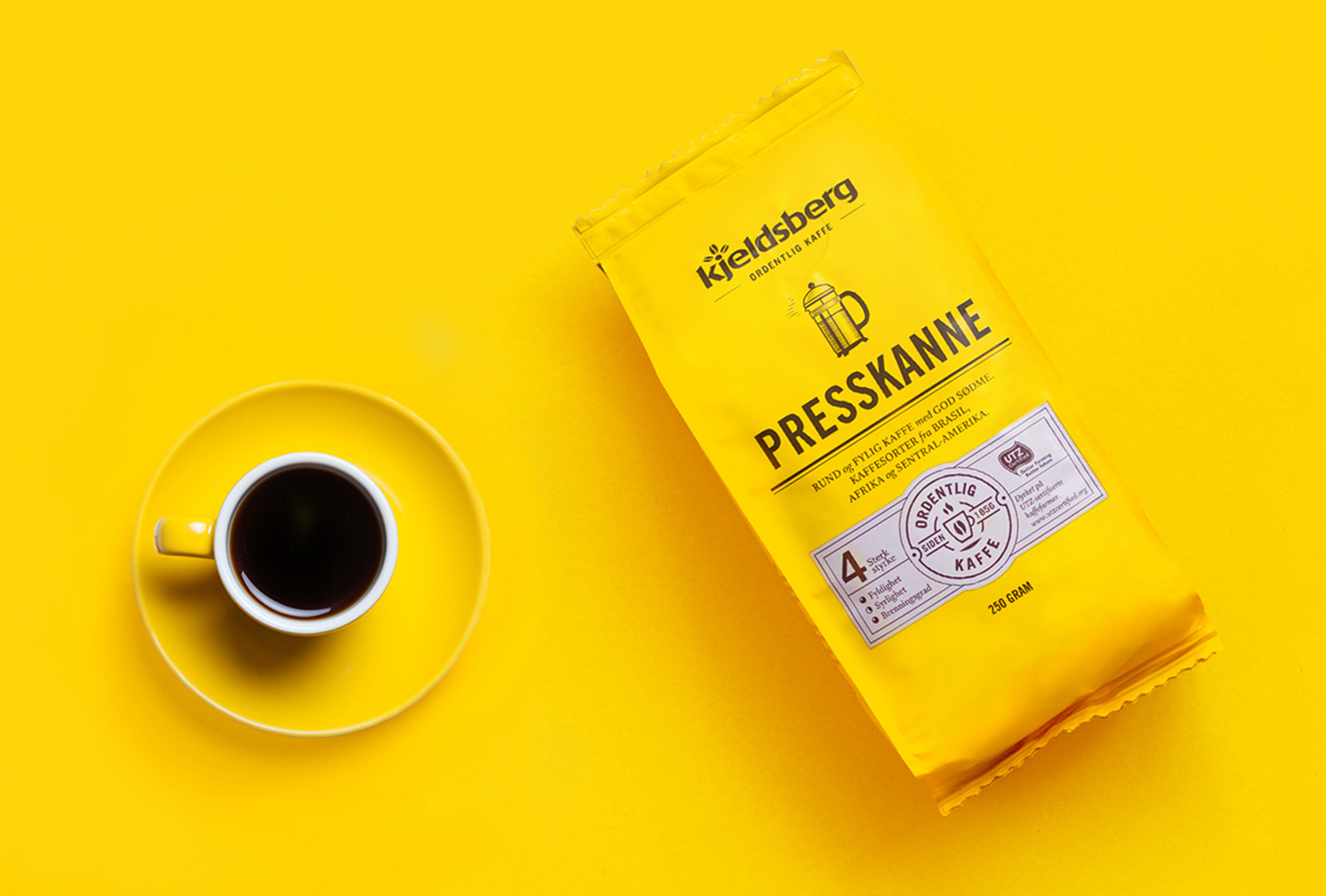
Kjeldsberg KaffePackaging Design

VosslineBrand identity / packaging

Lille PBrand Identity
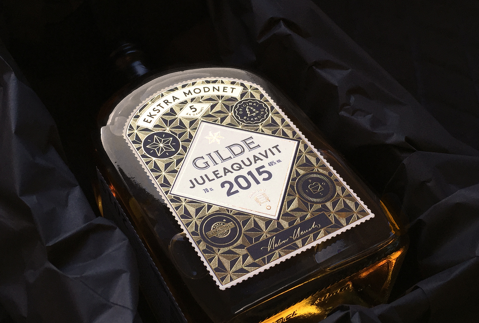
Gilde juleaquavitPackaging
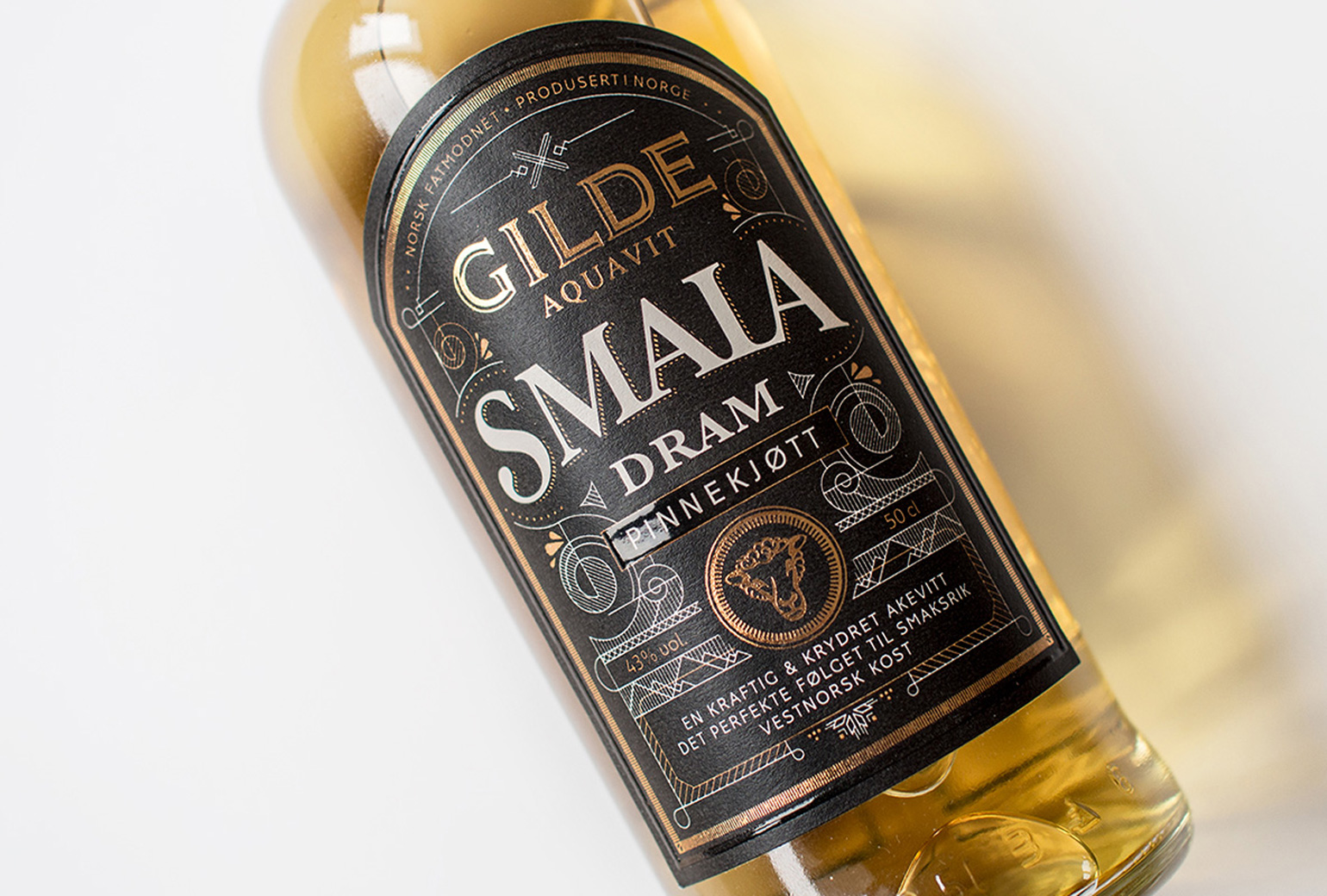
Gilde Aquavit - SmalaPackaging